Photography: Lucas Zarebinski — Rose Inc photography. Images belong to their respective owners.
Rose Inc

Translucent blush serum with tall white cap and quiet typography
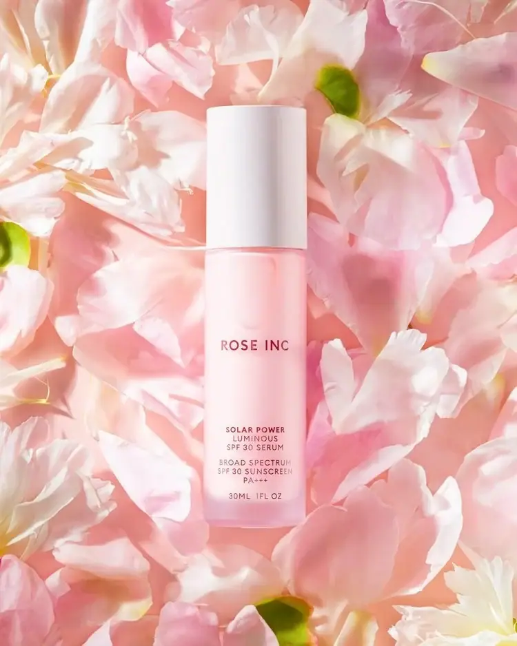
Solar Power Luminous SPF 30 Serum combines a pale translucent pink body with a tall opaque white cap. The isolated ROSE INC wordmark sits above a compact lower stack of product, protection and quantity information. Pink and white petals fill the surrounding photograph, extending the bottle's soft color family without adding botanical graphics to its front. The official product page documents a self-loading dropper and component-specific recycled content, details that cannot be established from the closed campaign image alone.
- Suncare
- Light pack
- Clinical minimal
- Pastel soft-touch
About this study
Selected blush Solar Power 30 ml bottle among petals. Official page rendering supplies component materials and self-loading-dropper instructions; photo documents the closed exterior only.
Sources & evidence · Reviewed 2026-10-19Color Palette
Approximate colours interpreted from photography. These are screen references, not official brand colours or print specifications.
Pack body
Translucent blush
#F2BFC5
Approximate pink body appearance under the petal-filled lighting; reflections and contents affect the visible tone.
Ink
Muted rose lettering
#8B4D5C
Maker and small information appear dark rose against the pale body rather than stark black.
Accent
Soft cap white
#F0ECEE
Tall opaque upper component contrasts through opacity as well as color, with gentle gray vertical shading.
Typography
Suggested visual alternatives, not confirmed brand typefaces. Any scale below is an illustrative estimate.
ROSE INC is a short, moderately spaced uppercase sans line isolated in the upper-middle body. The lower product block is much smaller, stacking Solar Power, Luminous and SPF 30 Serum. A separated group supplies broad-spectrum sunscreen wording and the visible PA+++ notation, followed by a quantity line. Protection information is integrated into the small typographic system instead of enlarged into a badge. The large gap between maker and function helps the two groups remain distinct on a narrow face.
Fonts
Short independent maker
Montserrat
- Looks like
- Clean open geometric sans
- Type
- Geometric sans-serif
- Weight
- Medium, SemiBold
- Case
- Uppercase
- Tracking
- Moderately open optical spacing
- Fallback
- Arial, sans-serif
Use for a new short maker with enough weight to remain visible against a translucent field. Avoid copying the source wordmark's exact proportions and spacing.
Small functional stack
Source Sans 3
- Looks like
- Narrow readable sans
- Type
- Humanist sans-serif
- Weight
- Regular, Medium
- Case
- Uppercase
- Tracking
- Slightly open small text
- Fallback
- Arial, sans-serif
Alternative for short product and quantity lines. Preserve logical groups and sufficient contrast; do not shrink essential information solely to imitate the source's airy appearance.
Structure & Proportions
Visual proportions and finish previews are illustrative. Confirmed construction details and uncertainties are distinguished in the study notes.
Proportions
| Purpose | Value | Preview |
|---|---|---|
| Substantial cap height | The white cap occupies a significant part of the full silhouette and is much taller than a shallow conventional cover. | — |
| Continuous narrow outline | Cap and body appear closely matched in width, producing a largely uninterrupted vertical form across their seam. | — |
| Separated text anchors | The maker sits well above the lower function block, with a generous unprinted interval between them. | — |
| Compact lower information | Several short centered lines fit within the narrow body while leaving a pale margin above the base edge. | — |
Shapes
| Element | Value | Preview |
|---|---|---|
| Bottle silhouette | Slender cylindrical-looking body with softly rounded lower edges. | |
| Tall closed cap | Opaque white upper cylinder with a broad flat-looking top and subtle curved side shading. | |
| Maker line | Short centered uppercase wordmark isolated above the function information. | |
| Lower information groups | Stacked short centered lines with small gaps separating product, protection and quantity. |
Finishes
Translucent pink appearance
Body allows softened internal shapes and light through; exact coloration and surface treatment unverified. · transparent
Diffuse white cap appearance
Tall cover shows soft tonal shading rather than mirror reflection; coating process not established. · matte
Formats and materials
| Formats | Tall narrow serum bottle with closed white cap; selected front and official listing agree on 30 ml / 1 fl oz |
| Materials | The official product page specifies a glass bottle with 50% post-industrial recycled content, a plastic cap with 50% post-consumer recycled content and a glass dropper with 20% post-industrial recycled content. These are source statements, not visual deductions or guarantees for every later revision., The same page describes a carton using FSC-certified paper and hemp with soy-based printing ink. That carton is not visible in the selected photograph, so its color, construction and typography are not reconstructed. Exact tinting, cap resin and front decoration processes remain unspecified. |
| Closures | Visually, the tall white cap sits flush above the pink body with a narrow seam. The selected image does not expose a conventional bulb or nozzle. The official instructions describe a twist-off self-loaded dropper that reloads when the cap is fully twisted back on. This mechanism is documented from the product source rather than inferred from the tall closed silhouette; internal parts and the pipette tip remain unseen here. |
| Decoration | Isolated short maker word, Small centered product stack near the base, Separate protection-information group, Low quantity statement, No printed petal illustration on the visible front |
Front Panel
Schematic reading order. The diagram’s zone heights do not represent measured artwork proportions.
The front uses a sparse two-anchor arrangement rather than a framed label panel. The maker is the first clear read, then the lower block supplies the long product name and protection details in small centered lines. The visible PA+++ mark stays within that functional group; it is not treated as a separate decorative emblem. No large color field or symbol interrupts the pink body. The result depends on alignment and spacing, with the white cap providing the strongest physical division.
| Zone | Content |
|---|---|
| Maker identity | ROSE INC sits alone in dark rose uppercase letters with open space around it. |
| Product name | Solar Power / Luminous / SPF 30 Serum forms a narrow centered stack near the lower front. |
| Protection wording | Broad-spectrum SPF30 sunscreen wording and PA+++ are visible as a separate small group; these are recorded label statements, not independent performance testing. |
| Net contents | 30ML 1FL OZ appears as the final lower line, matching the official product size. |
Range System
Only the selected Solar Power bottle is visually studied. The official page's component specifications support this product, while unrelated refillable makeup entries elsewhere on the same page do not establish refillability here. An original family can use a consistent cap/body relationship and two text anchors without adopting the same pink palette or copying the source identity. Other Rose Inc products would require their own photographs and specifications.
- Keep a short maker separate from longer function wording on narrow formats.
- Use opacity contrast between cap and body as a design cue independent of hue.
- Record recycled content by component and by post-consumer versus post-industrial origin.
Back of Pack & Shelf
The reverse, underside, open dropper and carton are not shown. Source disposal guidance is available, but its exact printed location on the retail pack is unknown.
- The brand distinguishes bottle/carton/insert recycling from disposal of the dropper and wiper; do not call the complete assembly universally recyclable.
- Local collection systems still determine practical disposal routes.
- Inspect the reverse before documenting full instructions, ingredients or regulatory layout.
On shelf
Interpretively, the tall white cap gives this small serum a distinctive two-part outline. The pink body and muted lettering create a gentle appearance, but the fine lower copy needs more attention than the larger maker. An independent design should be tested against both pale and dark backgrounds, because translucency changes contrast. If a closure's loading action is important to use, explain it clearly in supporting information rather than expecting the closed silhouette to reveal the mechanism.
Imagery
Pale pink and white petals surround the centered bottle in Lucas Zarebinski's approved photograph. Their curved overlapping edges contrast with the straight vertical package, while occasional green centers supply small scene accents. The cap remains clear because it is more uniform and opaque than the petals. The near-matching background makes the dark maker especially important for recognition. Petals are external styling and do not by themselves establish a rose-derived ingredient or floral fragrance in the formula.
Guidelines
Editorial principles for an original design brief, not official brand guidelines.
Do
- Separate visual closure shape from sourced mechanism.
- Record recycled percentages by component and origin.
- Keep product and protection wording in coherent groups.
- Test small text against changing translucent backgrounds.
- Distinguish floral styling from formula evidence.
Don't
- Do not claim the product page lacks material information.
- Do not equate recycled content with whole-pack recyclability.
- Do not assign the unseen carton a visual style.
- Do not infer a conventional exposed bulb from the closed cap.
- Do not copy protection claims into an unrelated concept.
Sources & evidence
- Rose Inc — Solar Power Luminous SPF30 Serumproduct
- Lucas Zarebinski — Still Life Photographyphotographer
How this study was built
structure · Sourced fact
Official page specifies bottle 50% post-industrial recycled glass, cap 50% post-consumer recycled plastic and dropper 20% post-industrial recycled glass.Rose Inc — Solar Power Luminous SPF30 Serumstructure · Sourced fact
Instructions describe a twist-off self-loading dropper; separate carton specifications and component-specific disposal are provided.Rose Inc — Solar Power Luminous SPF30 Serumtypography · Visual observation
Isolated maker sits above small centered product, protection and quantity groups.Lucas Zarebinski — Still Life Photographylabel · Visual observation
Visible front includes SPF30, PA+++ and 30ML / 1FL OZ; no botanical print or large protection badge.Lucas Zarebinski — Still Life Photographypalette · Visual observation
Blush translucent body, white opaque cap and muted rose copy define the package palette.Lucas Zarebinski — Still Life Photographyimagery · Visual observation
Pink/white petals and small green centers are external setting rather than ingredient evidence.Lucas Zarebinski — Still Life Photographyrange · Editorial interpretation
Opacity contrast and separated text anchors are transferable principles, not a universal brand or refill system.
What remains unverified
- Official page rendering is indexed with an older crawl date; no current-stock conclusion made.
- Exact tinting, cap resin and front print process unspecified.
- Open dropper, reverse, underside and carton unseen.
- Original fonts and measured proportions unknown; petal styling does not prove ingredients.
Give your AI
packaging taste
Give your design or image tool a packaging study: palette, type, structure, front panel and principles for an original brief.
Export this styleFree with an email. PACK.md works in Claude, ChatGPT, Cursor and image tools.
More like this

Cocokind
sideways lowercase on spa-water pastels

Herbivore
pastel tinted vessels with a white tag
ILIA
whispered capitals on skin-tone sleeves
Live Tinted
Pale peach stick, vertical lettering and exposed golden balm
Lixirskin
Peach archival tube with centered title and perpendicular maker

OSEA
sea-glass frosted bottles and a tidal wordmark

OUAI
sheer tinted bottles, small black capitals
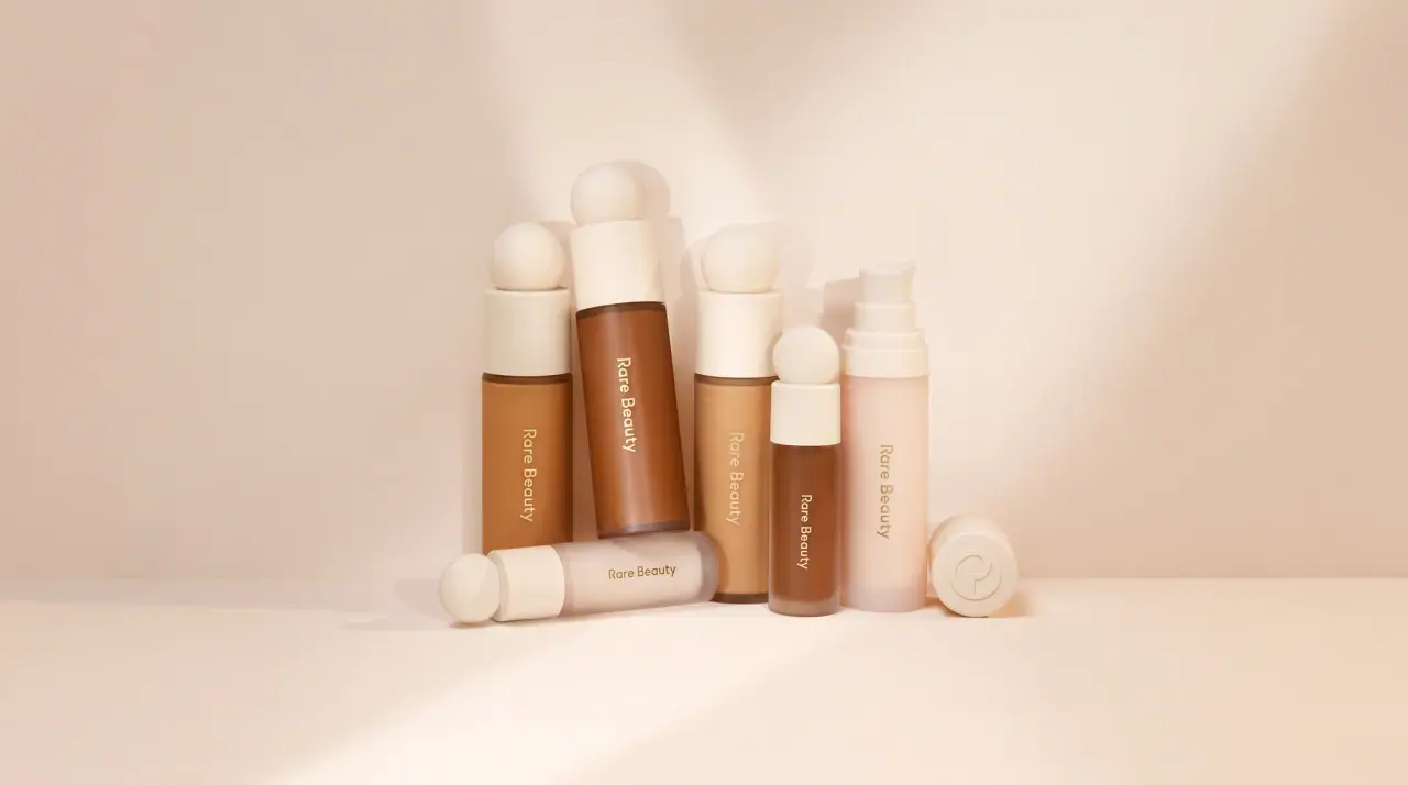
Rare Beauty
sculpted sphere caps in warm skin nudes