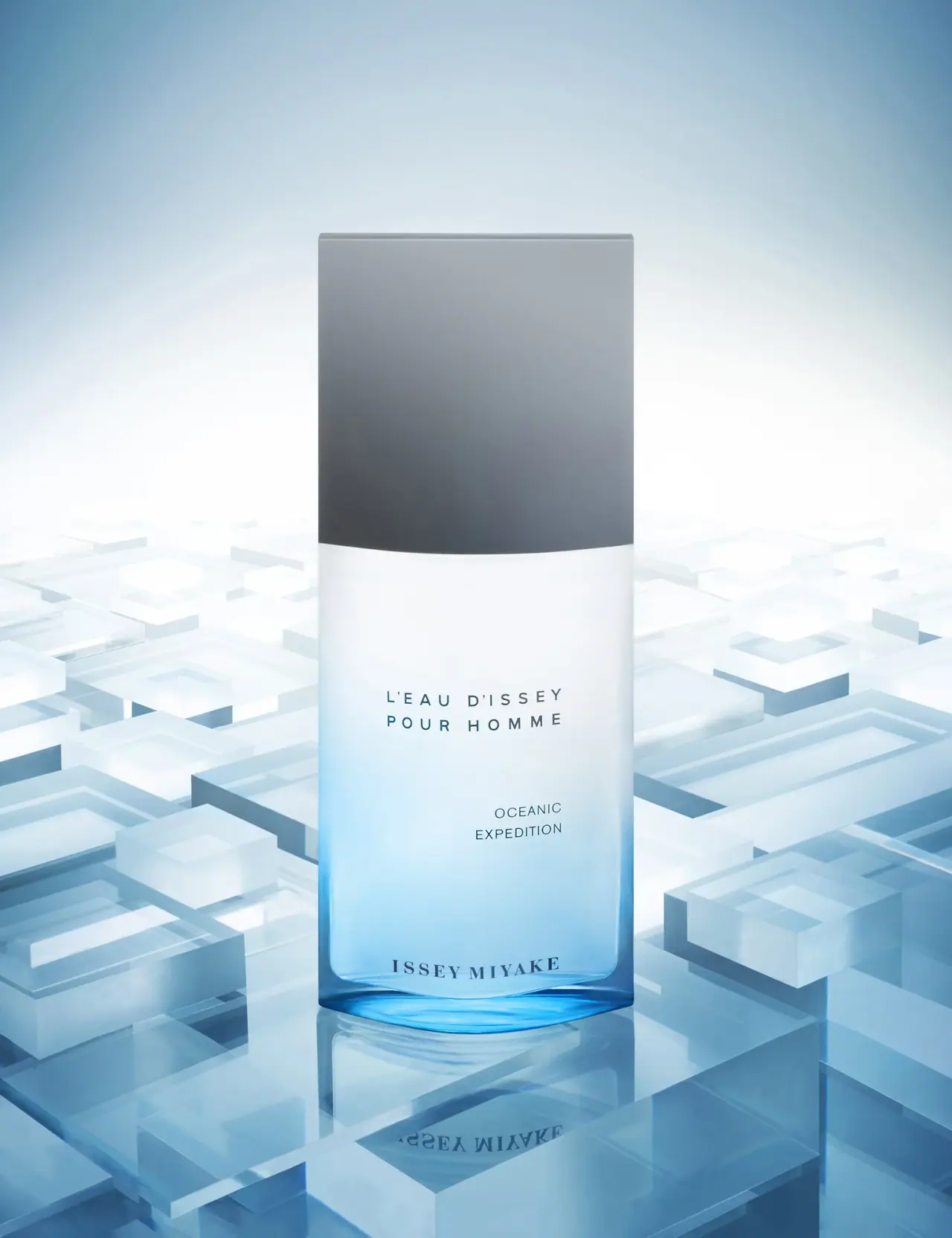
Photography: Josh Caudwell — fragrance still-life photography. Images belong to their respective owners.
Issey Miyake

Grey rectangular cap above a pale-to-blue oceanic gradient
Oceanic Expedition uses a broad grey cap and a pale-to-blue bottle treatment to create a restrained architectural fragrance object. The diffused light upper body transitions toward a clearer blue base, while three separated text blocks identify the fragrance, edition and house. The edition wording is offset toward the right, unlike the more central fragrance title and lower house name. The selected Josh Caudwell image places the bottle on a reflective geometric blue set. A separate SKENÉ dossier documents the Expedition retail grouping, but does not establish the bottle's designer, material specification or release date.
- Perfume
- Light pack
- Clinical minimal
- Colour-coded range
About this study
Archive Oceanic Expedition bottle in Josh Caudwell's selected image; SKENÉ dossier pages45–46 supplies separate retail-grouping context, not bottle-design attribution.
Sources & evidence · Reviewed 2026-10-19Color Palette
Approximate colours interpreted from photography. These are screen references, not official brand colours or print specifications.
Pack body
Cool grey cap
#858F98
Approximate fitted cap appearance, with darker lower shading. This is not evidence of a metallic substrate or a printed gradient on the cap.
Diffused pale body
#E6F0F4
Approximate upper bottle appearance. Frosting, coating and lighting contributions are not technically identified.
Clear blue base appearance
#3D9ACA
Approximate saturated lower region, affected by the blue set and reflected light. No exact glass tint or liquid colour is assigned.
Ink
Deep blue-grey lettering
#334D5A
Fragrance, edition and house text appear dark against the pale-to-blue body; ink specification unknown.
Typography
Suggested visual alternatives, not confirmed brand typefaces. Any scale below is an illustrative estimate.
L'EAU D'ISSEY and POUR HOMME appear in two widely spaced uppercase sans-serif lines near the middle of the bottle. OCEANIC EXPEDITION forms a smaller two-line block below, shifted toward the right rather than centred on the same axis. ISSEY MIYAKE sits close to the base in serif capitals, distinguishing the house from the fragrance naming. The large gaps make each level feel deliberate. There is no large opaque front label, and the changing pale-blue background remains visible between the type groups. The house is not the largest text despite its anchoring position.
Fonts
Original spaced fragrance alternative
Montserrat
- Looks like
- Restrained geometric sans capitals
- Type
- Geometric sans serif
- Weight
- Regular, Medium
- Case
- Uppercase
- Tracking
- Wide
- Fallback
- Arial, sans-serif
Build a new fragrance title with deliberate spacing and separate line lengths. Check that the name remains a readable phrase when the letters are spread across a pale reflective face.
Original house-signature alternative
Libre Baskerville
- Looks like
- Formal serif capitals
- Type
- Transitional serif
- Weight
- Regular, Bold
- Case
- Uppercase
- Tracking
- Slightly open
- Fallback
- Georgia, serif
A contrasting serif can distinguish a smaller house signature from a sans fragrance title. Use a different maker and position it where the darkest part of a gradient does not undermine legibility.
Structure & Proportions
Visual proportions and finish previews are illustrative. Confirmed construction details and uncertainties are distinguished in the study notes.
Proportions
| Purpose | Value | Preview |
|---|---|---|
| Broad upper mass | The cap occupies a substantial upper portion and nearly matches the bottle width, creating a block-like silhouette rather than a narrow-neck perfume shape. | — |
| Open body field | Large spaces separate the fragrance title, edition and house, allowing the gradient to remain visible as an independent design element. | — |
| Colour concentrated low | The strongest blue occurs near the lower edges and base, while the central title sits against a lighter field. | — |
| Offset edition | The smaller edition block sits rightward below the main title, introducing a quiet asymmetry within an otherwise balanced front. | — |
Shapes
| Element | Value | Preview |
|---|---|---|
| Bottle body | Tall broad rectangle with softened corners and a gently curved lower face. | |
| Fitted cap | Large grey rectangular block continuing the body's width. | |
| Fragrance title | Two separated widely spaced lines centred in the upper body region. | |
| Edition block | Smaller two-line wording shifted toward the right. |
Finishes
Quiet grey cap
Upper fitted component; material unspecified · matte
Pale diffused body appearance
Upper and middle bottle; process unverified · frosted
Clear blue lower appearance
Lower edges and base; tint mechanism unknown · transparent
Formats and materials
| Formats | Tall broad rectangular fragrance bottle with softly curved face, Large fitted grey rectangular cap aligned with body width, Diffused pale upper body and transparent-looking blue lower region, Selected image shows bottle only; cartons appear in separate retail documentation |
| Materials | The body has a glass-like transparent lower appearance, but the inspected sources do not provide an exact substrate specification for this archive edition., The grey cap's composition and surface treatment are unknown., The transition from pale diffuse to clear blue is visually observed; no etching, lacquer, tinting or coating process is asserted., No readable capacity, concentration mark or technical drawing is established from the selected front. |
| Closures | The fitted cap is unusually broad and tall, continuing the bottle's vertical sides with little change in width. Its lower boundary appears slightly curved across the front because of the object's shape and perspective. The neck, sprayer and cap insert are concealed. No magnetic fitting, thread arrangement, removal force or refill access is verified. The cap's darker lower appearance may include lighting effects and should not automatically be described as a separate material band. |
| Decoration | Controlled pale-to-blue visual transition, Widely tracked central fragrance title, Smaller offset Oceanic Expedition block, Serif house signature near the base |
Front Panel
Schematic reading order. The diagram’s zone heights do not represent measured artwork proportions.
The visible front uses separated lettering directly against the bottle's changing appearance, with no clearly bounded paper label. The fragrance title occupies the largest open central area. The edition name moves lower and right, and the serif house line sits almost at the base. These are three distinct alignment decisions rather than one uniformly centred stack. The transparent-looking lower boundary creates a visual floor beneath the house name, while the pale upper region gives the sans title contrast. The exact printing technique and which physical layer carries it remain unspecified.
| Zone | Content |
|---|---|
| Main fragrance | L'EAU D'ISSEY / POUR HOMME in widely spaced dark sans-serif capitals. |
| Edition | OCEANIC / EXPEDITION in a smaller rightward block. |
| House signature | ISSEY MIYAKE in serif capitals near the blue base. |
| Upper cap | Plain grey component with no readable front wording in the selected view. |
Range System
SKENÉ's project dossier documents an Issey Miyake Expeditions promotional podium at El Corte Inglés in Pozuelo, Madrid. Its photographs show Oceanic alongside Polar and Austral presentations, with cartons and a compass-themed retail environment. That primary documentation establishes a historical grouping, but not an exact launch date, formula relationship or shared bottle construction. It also does not credit SKENÉ with designing the fragrance bottle. The selected Caudwell still life is a separate visual source, so its geometric blue set is not presented as the same documented retail campaign.
- Oceanic Expedition is readable on the selected bottle and appears within the separately documented Expedition display.
- Polar and Austral provide verified grouping context; their packaging is not fully analysed in this individual study.
- An original special-edition system could vary surface colour while preserving naming roles, but each physical variant needs independent verification.
Back of Pack & Shelf
The selected photograph omits reverse, underside, opened closure and carton. The dossier's retail cartons are a separate contextual view, not a complete packaging inspection.
- No capacity, ingredients, barcode, batch code or regulatory text is transcribed.
- No refill mechanism or technical material specification is established.
- A PDF upload path or image filename is not used as a release or campaign date.
On shelf
The broad cap and strong lower blue edge should provide a recognisable silhouette before fine wording becomes legible. This is a visual inference rather than measured shelf performance. The pale middle protects the main title from the strongest colour, while the offset edition offers a secondary identification point. A neutral-background check is important because the selected blue environment intensifies the bottle's colour. The small house signature and edition should also be reviewed under flat lighting, where the dramatic reflection no longer reinforces their placement.
Imagery
Josh Caudwell's portfolio links the exact selected Oceanic Expedition image. The bottle stands above a reflective ground surrounded by translucent-looking rectangular blue forms at varying heights. Their repeated edges echo the bottle's rectilinear outline, while the pale centre behind the cap creates separation from the cooler perimeter. The reflection extends the blue base and house lettering downward. The set material and construction method are unverified; it may not be described as actual ice or a retail fixture. No commercial commission or shared authorship with the SKENÉ display is inferred.
Guidelines
Editorial principles for an original design brief, not official brand guidelines.
Do
- Separate fragrance, edition and house roles clearly.
- Use a lighter gradient region behind fine text.
- Distinguish photographer imagery from retail-display documentation.
- Keep archival dates and materials unassigned when not verified.
- Record deliberate alignment differences rather than calling every block centred.
Don't
- Do not place a carton in the selected photograph when none is visible.
- Do not credit bottle design to a retail-display studio without evidence.
- Do not infer glass treatment or cap material from appearance.
- Do not call geometric set pieces actual ice.
- Do not infer a release date from a file path.
Sources & evidence
- SKENÉ Project Dossier — Issey Miyake Expeditions, pages45–46designer
- Issey Miyake fragrance still life — Josh Caudwellphotographer
How this study was built
range · Sourced fact
Dossier pages45–46 document Expedition podium in Pozuelo with Oceanic, Polar and Austral presentations.SKENÉ Project Dossier — Issey Miyake Expeditions, pages45–46imagery · Sourced fact
Photographer homepage links the exact selected Oceanic Expedition asset.Issey Miyake fragrance still life — Josh Caudwelltypography · Visual observation
Main title uses spaced sans capitals, edition shifts right below, and house signature uses serif capitals near the base.Issey Miyake fragrance still life — Josh Caudwellstructure · Visual observation
Broad grey cap conceals the sprayer above a pale diffused body and blue transparent-looking base.Issey Miyake fragrance still life — Josh Caudwellimagery · Visual observation
Selected image contains geometric blue forms and reflection but no retail carton.Issey Miyake fragrance still life — Josh Caudwelledition · Editorial interpretation
Separate primary sources support grouping and photography without proving shared commission, production date or bottle authorship.SKENÉ Project Dossier — Issey Miyake Expeditions, pages45–46 · Issey Miyake fragrance still life — Josh Caudwell
What remains unverified
- Exact substrate, surface treatment, capacity and release date unverified.
- No opened cap, reverse or complete carton inspection.
- Retail-display documentation does not establish packaging-design authorship.
- Photographic set materials and commission status unknown.
Give your AI
packaging taste
Give your design or image tool a packaging study: palette, type, structure, front panel and principles for an original brief.
Export this styleFree with an email. PACK.md works in Claude, ChatGPT, Cursor and image tools.
More like this

Byoma
candy-coloured barrier science on a shelf
CeraVe
white pump bottles split by a coloured diagonal

Cocokind
sideways lowercase on spa-water pastels
FEKKAI
Green styling duo with vertical hairline maker and white actuators
Glossier
clean white tubes with candy accents

Herbivore
pastel tinted vessels with a white tag
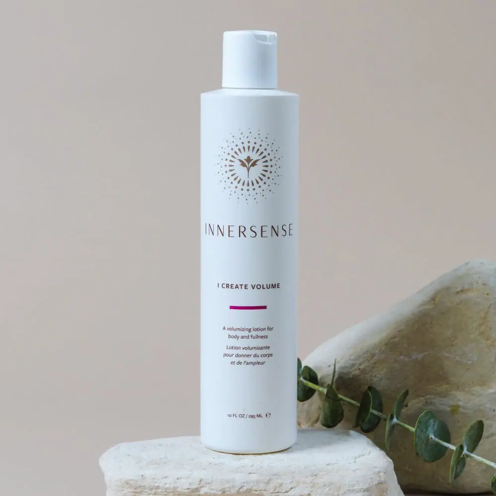
Innersense
Radiating bird emblem and magenta bar on a pale cylinder

Malin+Goetz
pharmacy label set in bracketed helvetica