Photography: David Lineton — fragrance still-life photography. Images belong to their respective owners.
Lancôme

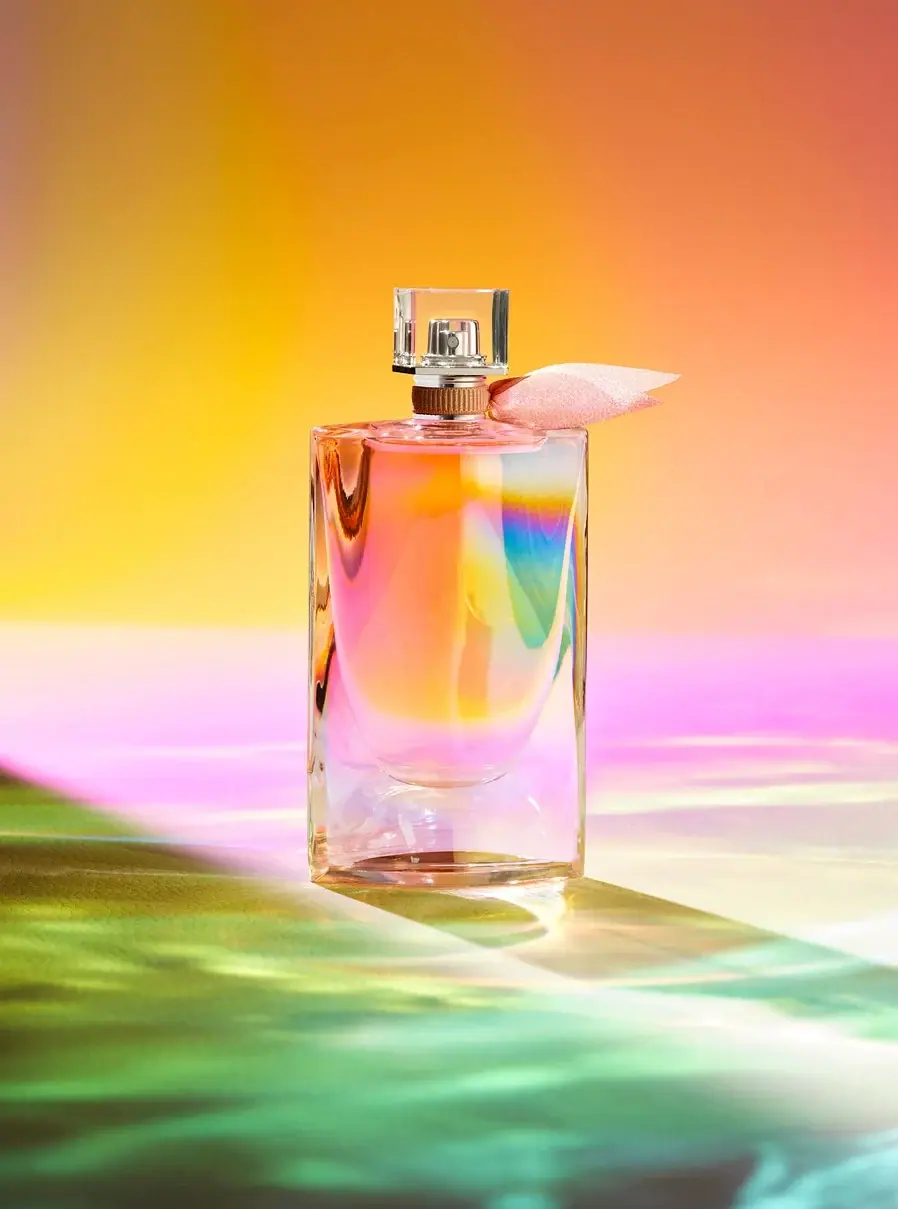
Iridescent glass with peach wings and a curved inner base
The selected La Vie Est Belle flacon is the iridescent Soleil Cristal presentation: a tall transparent rectangular body, a deep curved inner contour, a clear square cap and peach-colored wing-like neck fabric. The broad front has no readable printed identity in this view. Recognition comes from the silhouette, the contrasting hard and soft components, and the changing color of the glass. Lancôme describes this edition as holographic, while photographer David Lineton explains how he amplified its iridescence with carefully directed light. The image is an expressive study of the object, not a production color chart.
- Perfume
- Light pack
- Luxe monochrome
About this study
Selected Soleil Cristal iridescent presentation in David Lineton’s Technicolour personal series; not the generic La Vie Est Belle bottle specification.
Sources & evidence · Reviewed 2026-10-19Color Palette
Approximate colours interpreted from photography. These are screen references, not official brand colours or print specifications.
Pack body
Clear optical highlight
#F1E7D8
Representative neutral reflection on the transparent body and cap. The bottle does not have a uniform pale opaque base color.
Accent
Peach wing fabric
#E8B0A4
Soft neck decoration, visually distinct from the rigid transparent geometry and identified by Lancôme as peach-colored wings.
Iridescent rose impression
#E6A6CF
One observed surface-color effect within the flacon; angle and lighting dependent, not a fixed printing ink.
Iridescent blue-green impression
#72B9B9
A second observed spectral effect on the front face. The larger green floor projection belongs to the photographic lighting, not a separate package coating.
Typography
Suggested visual alternatives, not confirmed brand typefaces. Any scale below is an illustrative estimate.
The object itself supplies the hero identity through form and light. A companion information system should clearly state an original producer, fragrance name, concentration and amount without covering the optical face. A quiet hierarchy would support the sculptural bottle rather than competing with it.
Fonts
Companion fragrance identity
Bodoni Moda
- Looks like
- Fine high-contrast editorial serif
- Type
- Serif
- Weight
- Regular 400 / Medium 500
- Case
- Uppercase producer; title case fragrance
- Tracking
- Moderately open for short identity lines, with carefully maintained fine-stroke contrast.
- Fallback
- Georgia, serif
A proposed original carton or card identity that complements transparent geometric form. No large serif title is claimed to be printed on the photographed front.
Concentration and practical copy
Source Sans 3
- Looks like
- Quiet humanist sans
- Type
- Humanist sans-serif
- Weight
- Regular 400
- Case
- Sentence case and standard units
- Tracking
- Neutral for legibility at small sizes.
- Fallback
- Arial, sans-serif
Practical details on a verified separate surface. Keep exact edition and quantity explicit so a visually similar bottle from a different fragrance version is not confused with this one.
Structure & Proportions
Visual proportions and finish previews are illustrative. Confirmed construction details and uncertainties are distinguished in the study notes.
Proportions
| Purpose | Value | Preview |
|---|---|---|
| Tall outer frame | The body is appreciably taller than wide, with straight outer sides enclosing a much more curved inner silhouette. No exact dimension or capacity is inferred. | — |
| Deep clear foot | The inner chamber ends well above the exterior base, leaving a substantial transparent-looking lower zone that catches and redirects light. | — |
| Cap and wings | The small square cap sits on a narrower neck, while the fabric extends laterally beyond it, introducing a soft horizontal counterpoint to the vertical body. | — |
Shapes
| Element | Value | Preview |
|---|---|---|
| Rectangular flacon | Tall outer rectangle with softened edges and a broad largely unlettered face. | |
| Curved inner contour | Deep rounded lower chamber visible through the transparent outer body. | |
| Square cap | Clear angular cover around the silver-toned spray head, readable through transparency. | |
| Peach neck wings | Two pointed soft fabric ends extend sideways from the neck band. |
Finishes
Iridescent bottle effect
Glass body; brand-described holographic appearance · holographic
Clear angular cover
Cap; exact substrate unverified · transparent
Silver-toned actuator
Spray head visible through cap; material unspecified · metallic
Formats and materials
| Formats | Tall rectangular perfume flacon with softened outer edges and a pronounced curved inner lower contour, creating a thick-looking clear foot beneath the liquid chamber., A clear square cap sits over the silver-toned atomizer, with peach wing-like fabric attached around the neck. No carton or reliable volume marking is visible in the selected image. |
| Materials | The photographer explicitly discusses the bottle’s glass and its iridescent behavior. Exact glass composition, wall measurements and surface-treatment chemistry are not provided., The neck ornament is visibly fabric-like, but fiber type, weave specification and attachment process remain unverified. The cap’s transparency does not independently establish its precise substrate. |
| Closures | The clear square cover surrounds the silver-toned spray head in the selected view; the actuator is visible through the cover rather than shown as an uncovered separate component. Cap retention, collar material, pump construction and refill compatibility are not established. |
| Decoration | No readable conventional front label is visible; the broad clear face remains an optical field., Peach wing-like fabric introduces a small asymmetric flourish at the neck., The inner curved contour acts as a structural visual signature rather than a printed graphic. |
Front Panel
Schematic reading order. The diagram’s zone heights do not represent measured artwork proportions.
The selected face is visually unlettered, so label analysis concerns the deliberate absence of a front information panel. Keep a distinction between what this view shows and the product information that must exist elsewhere; neither the bottle base nor its carton is available for transcription here.
| Zone | Content |
|---|---|
| Main face | Broad clear iridescent field, with no readable producer or fragrance wording in the selected angle. |
| Inner lower contour | Rounded chamber shape provides a visible focal structure within the rectangular exterior. |
| Neck | Peach fabric wings and a warm-toned textured-looking band; exact material and construction unverified. |
| Cap | Clear square geometry reveals the atomizer beneath it. No reliable cap inscription is transcribed. |
Range System
The official article identifies Soleil Cristal as a particular La Vie Est Belle edition. Its optical treatment and peach wings should not be generalized to every La Vie Est Belle bottle, nor should a current refill system be assigned to it. For an original family, a stable silhouette can carry controlled edition-specific surface and textile changes.
- Use a clearly identified edition record when a familiar bottle shape receives a different optical finish.
- Keep neck-ornament color and surface behavior linked to the selected version rather than treating them as universal brand constants.
- Do not infer volume from the tall silhouette or substitute another collection member’s quantity because the general shape is similar.
Back of Pack & Shelf
The rear, underside and carton are absent. No ingredient panel, nominal amount, batch marking or paper-pack layout is reconstructed from the unlettered front.
- For an original perfume, specify an independent practical information surface before finalizing the visually quiet bottle face.
- Lancôme attributes recyclability to this bottle and FSC certification to its paper packaging; these remain scoped brand statements, not evidence that the cap or fabric is universally collected.
- No refill mechanism or component-disassembly instructions were established for this photographed edition.
On shelf
The clear rectangular outline, curved interior and fabric wings form a recognizable combination even without readable front lettering. Iridescence adds change with viewpoint, but it also makes photographic comparison harder: the same object may appear predominantly pink, gold or blue-green under different light. For catalogue use, retain the entire contour and neck decoration and explicitly identify the edition in adjacent text. These are design observations, not measured recognition or sales results.
Imagery
David Lineton describes Technicolour as a personal in-camera lighting series, using the already iridescent bottle as a prism and directing light through and onto it. The low light creates elongated shadows and colored projections around the object. The intense coral, pink, green and yellow environment therefore combines package optics with deliberate photographic construction. It should not be read as four fixed bottle inks or a digitally printed rainbow wrap. A neutral-light companion view would be needed for practical color comparison.
Guidelines
Editorial principles for an original design brief, not official brand guidelines.
Do
- Identify the Soleil Cristal edition rather than applying generic collection specifications.
- Separate the bottle’s iridescence from the photographer’s amplified colored lighting.
- Keep the cap’s transparent enclosure relationship clear when describing the visible atomizer.
- Use adjacent product text to identify the fragrance when the selected face is unlettered.
Don't
- Do not describe the selected cap as floating or removed when it surrounds the spray head.
- Do not convert spectral reflections into fixed production ink values.
- Do not infer silk, solid-metal hardware, coating chemistry or refillability from appearance.
- Do not invent a front logo, volume or carton layout absent from the selected view.
Sources & evidence
- Lancôme Canada — La Vie Est Belle Soleil Cristalproduct
- David Lineton — Technicolourphotographer
How this study was built
edition · Sourced fact
Brand article identifies Soleil Cristal holographic presentation and peach wings.Lancôme Canada — La Vie Est Belle Soleil Cristalstructure · Visual observation
Clear cap surrounds visible atomizer rather than being detached in this selected view.palette · Sourced fact
Photographer identifies existing iridescent glass and additional directed-light construction.David Lineton — Technicolourtypography · Editorial interpretation
No readable front type; proposed fonts apply to original companion information only.label · Visual observation
Broad front face is unlettered in selected image; hidden information untranscribed.imagery · Sourced fact
Technicolour is a personal in-camera series with prism-like light and colored projections.David Lineton — Technicolourrange · Sourced fact
Recyclable-bottle/FSC-paper claims are edition-scoped brand statements, not refill proof.Lancôme Canada — La Vie Est Belle Soleil Cristal
What remains unverified
- Exact volume, cap substrate, fabric fiber and surface-treatment chemistry unknown.
- No readable front typography; alternatives are proposed companion fonts.
- Base/reverse/carton and refill mechanism not shown.
- HEX values are representative optical impressions, not production colors.
Give your AI
packaging taste
Give your design or image tool a packaging study: palette, type, structure, front panel and principles for an original brief.
Export this styleFree with an email. PACK.md works in Claude, ChatGPT, Cursor and image tools.
More like this

Aerangis
a quiet numbered object, an intimate scent memory

Akro
soft pink interrupted by an assertive black signature

Alexander McQueen
An oval flacon crowned with dense black relief

Arquiste
blush transparency, white lettering and a stepped gold cap
Avon
A clear flacon with a warm handwritten heart
Black Blaze
Warm amber, quiet paper and a deliberate vertical rhythm
Blake Brown
sculptural rose-brown fragrance with a jewel-like centre
Byredo
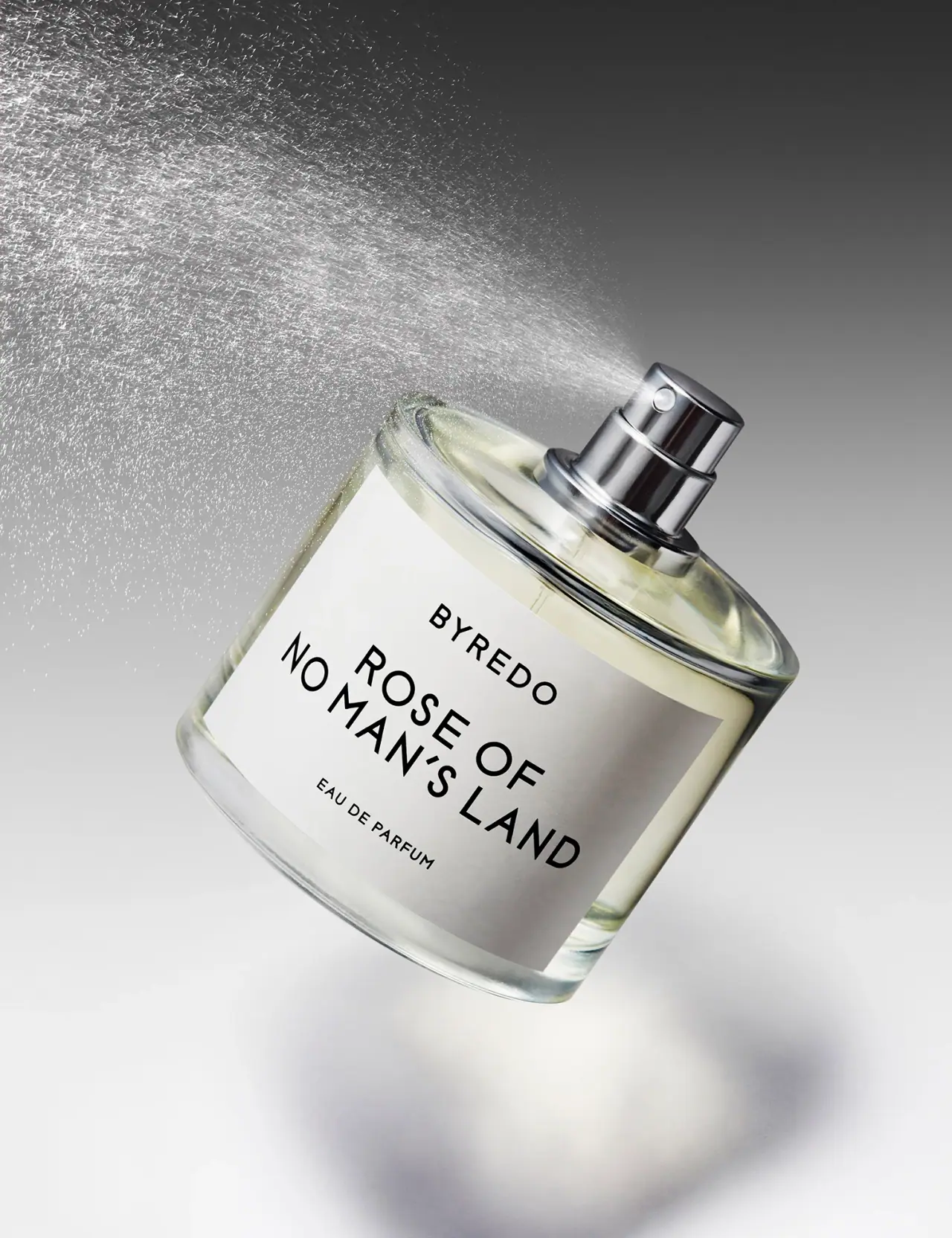
Broad white fragrance label, clear round bottle, exposed silver atomizer