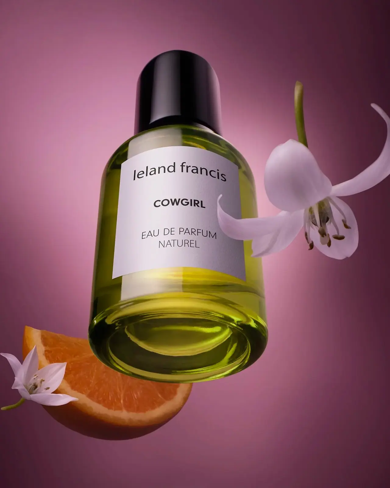
Photography: ATS Studio — Leland Francis photography. Images belong to their respective owners.
Leland Francis

quiet cream label against luminous botanical perfume
Cowgirl pairs a clear cylindrical fragrance bottle with a broad black cap and an almost square pale front label. Three separated text groups keep the presentation calm: a lowercase maker at the top, the compact bold scent name in the centre, and a lighter fragrance descriptor below. In the selected campaign photograph, green-yellow liquid, rounded glass and a low viewing angle add depth around this flat graphic panel.
- Perfume
- Light pack
- Clinical minimal
- Botanical
About this study
Selected Cowgirl campaign bottle only; official product context is separated from visible front-label observations.
Sources & evidence · Reviewed 2026-10-19Color Palette
Approximate colours interpreted from photography. These are screen references, not official brand colours or print specifications.
Pack body
Gloss black
#151614
Approximate cap and dark label lettering.
Label
Warm pale label
#E5E3C9
Approximate photographed label colour, affected by warm light and surrounding liquid.
Accent
Yellow green appearance
#A7AF4B
Approximate liquid-through-glass appearance; not proof of tinted glass or a specified formula colour.
Typography
Suggested visual alternatives, not confirmed brand typefaces. Any scale below is an illustrative estimate.
The lowercase leland francis line stretches broadly across the upper label. COWGIRL sits beneath in a smaller but heavier uppercase treatment, with much more open space around it than between its letters. The final EAU DE PARFUM and NATUREL lines use lighter widely spaced capitals. This produces three distinct reading speeds: a broad maker, a short emphatic scent name and a calm technical descriptor. The contrast comes from width, weight and spacing rather than numerous font families.
Fonts
Maker alternative
DM Sans
- Looks like
- DM Sans as an independent visual alternative
- Type
- Sans serif
- Weight
- Regular 400
- Case
- Lowercase
- Tracking
- Near natural
- Fallback
- Arial, sans-serif
Use a broad plain lowercase maker with enough width to establish the upper edge of a label. Avoid copying the original wordmark proportions or letter spacing. Test the line optically against the curved bottle, because the edges may recede.
Product alternative
Archivo
- Looks like
- Archivo as an independent visual alternative
- Type
- Sans serif
- Weight
- Bold 700
- Case
- Uppercase
- Tracking
- Slightly open
- Fallback
- Arial, sans-serif
Use a compact bold scent name with substantial empty space above and below. Keep descriptor text lighter and smaller. One strong short line is enough; adding bold claims would weaken the quiet hierarchy.
Structure & Proportions
Visual proportions and finish previews are illustrative. Confirmed construction details and uncertainties are distinguished in the study notes.
Proportions
| Purpose | Value | Preview |
|---|---|---|
| Closure weight | The broad cap occupies a substantial part of the silhouette and sits close to the body width. | — |
| Front label | An almost square panel occupies the central body while leaving shoulder and base exposed. | — |
| Reading rhythm | Large vertical gaps separate maker, scent name and descriptor. | — |
Shapes
| Element | Value | Preview |
|---|---|---|
| Bottle | Cylinder with gently rounded shoulder and heavy-looking rounded base. | |
| Cap | Broad glossy cylinder with softened top edge. | |
| Label | Near-square pale panel following the body curve. |
Finishes
Reflective cap
Black closure with broad white highlights; material unverified. · gloss
Diffuse label
Pale front panel with subtle visible texture; stock unverified. · matte
Formats and materials
| Formats | Selected cylindrical fragrance bottle with rounded shoulders, substantial clear base, large cylindrical cap and pale front label. Official Cowgirl listing identifies a 30 mL eau de parfum. |
| Materials | The transparent body has a glass-like thickness and refraction in the photograph; a complete material specification is not provided by the consulted product description., Label texture appears paper-like, but stock, adhesive and coating are unverified. The black cap’s resin, metal content or internal construction cannot be inferred from gloss. |
| Closures | The broad cap covers the neck completely and has a rounded upper edge. Its height gives it considerable visual weight, balanced by the clear thick-looking base below. The actuator and attachment are not exposed. This view cannot establish a magnetic closure, threaded connection, snap fit or refill mechanism. The seam between cap and shoulder is visible, but does not identify the engineering beneath it. A new package should specify the closure through component drawings and usability trials rather than deriving it from this exterior photograph. |
| Decoration | Three centred dark text groups on a pale label., No illustrated botanical motif is visible on the bottle., No confirmed foil, embossing or special print process. |
Front Panel
Schematic reading order. The diagram’s zone heights do not represent measured artwork proportions.
The label maintains one central axis but gives each group a different width. The maker is wide and regular, the scent name narrower and heavier, and the descriptor expands again through spacing. The generous intervals matter more than a rigid equal-row grid. The pale panel also creates a stable area for dark type despite the shifting greenish appearance of the bottle behind it. No quantity is legible on this selected front, so the source-listed capacity belongs in the research context rather than being inserted into the observed label map.
| Zone | Content |
|---|---|
| Upper identity | Lowercase leland francis maker. |
| Central scent | Bold uppercase COWGIRL. |
| Lower descriptor | EAU DE PARFUM and NATUREL in lighter spaced capitals. |
Range System
The official product page establishes Cowgirl Eau de Parfum and the listed 30 mL format. Its fragrance notes include bergamot, tuberose, orange blossom, geranium, jasmine, patchouli, sandalwood and Peru balsam. Those notes describe the fragrance, not package materials or a verified explanation of every campaign prop. This study is limited to the photographed Cowgirl bottle and does not assume that all Leland Francis fragrances share this cap, label or concentration wording.
- Selected Cowgirl bottle in a botanical campaign composition.
- Official Cowgirl 30 mL listing provides product context without a component bill of materials.
Back of Pack & Shelf
The reverse, underside and any retail carton are unseen. Ingredient disclosure, batch code, quantity placement and disposal guidance cannot be reconstructed from this front. The pale label’s apparent edge does not establish whether it wraps around the bottle or is paired with a separate reverse label.
- Inspect the reverse for regulatory and ingredient text.
- Confirm quantity and batch marking on the physical edition.
- Request component specifications before making material claims.
On shelf
Interpretation: the strong black cap and pale square panel give the small bottle an easily organised silhouette. The short bold scent name provides a useful second read after the maker. However, the refined descriptor may become difficult at shelf distance, and the wide maker line should be tested around a curved surface. The campaign’s dramatic perspective increases presence but does not prove that the pack will have the same prominence in a crowded retail display.
Imagery
The bottle is photographed from a low angle against a mauve-purple setting, surrounded by white flowers and an orange slice. These objects create a floral-citrus association and make the bottle seem suspended or rising through the scene. They are props, not included accessories. Purple belongs to the photographic setting, not the package palette. Reflections, transparent walls and the coloured contents complicate colour sampling; the green-yellow swatch should remain an appearance reference rather than a claim about dyed glass.
Guidelines
Editorial principles for an original design brief, not official brand guidelines.
Do
- Separate maker, scent and concentration into clear groups.
- Test label readability on the curved bottle.
- Distinguish liquid colour from glass treatment.
- Keep source-listed capacity separate from unreadable front text.
Don't
- Do not identify cap material from gloss.
- Do not treat campaign flowers as included contents.
- Do not infer refillability from the exterior.
- Do not copy the selected wordmark or exact label composition.
Sources & evidence
How this study was built
context · Sourced fact
Official listing identifies Cowgirl Eau de Parfum in a 30 mL format.Leland Francis — Cowgirl Eau de Parfumtypography · Visual observation
Lowercase maker, bold scent and lighter descriptor form three separated groups.Leland Francis — Cowgirl Eau de Parfumstructure · Visual observation
Rounded transparent cylinder sits beneath a broad glossy dark cap.Leland Francis — Cowgirl Eau de Parfumlabel · Visual observation
Pale near-square front has no clearly readable quantity in the selected view.Leland Francis — Cowgirl Eau de Parfumimagery · Visual observation
White flowers and orange slice surround the bottle against a purple setting.Leland Francis — Cowgirl Eau de Parfumshelf · Editorial interpretation
Closure and pale panel create a strong two-part silhouette; retail performance is untested.
What remains unverified
- Original fonts, cap construction and label stock unverified.
- Reverse, actuator, underside and carton unseen.
- Palette is approximate and affected by lighting, liquid and reflections.
Give your AI
packaging taste
Give your design or image tool a packaging study: palette, type, structure, front panel and principles for an original brief.
Export this styleFree with an email. PACK.md works in Claude, ChatGPT, Cursor and image tools.
More like this
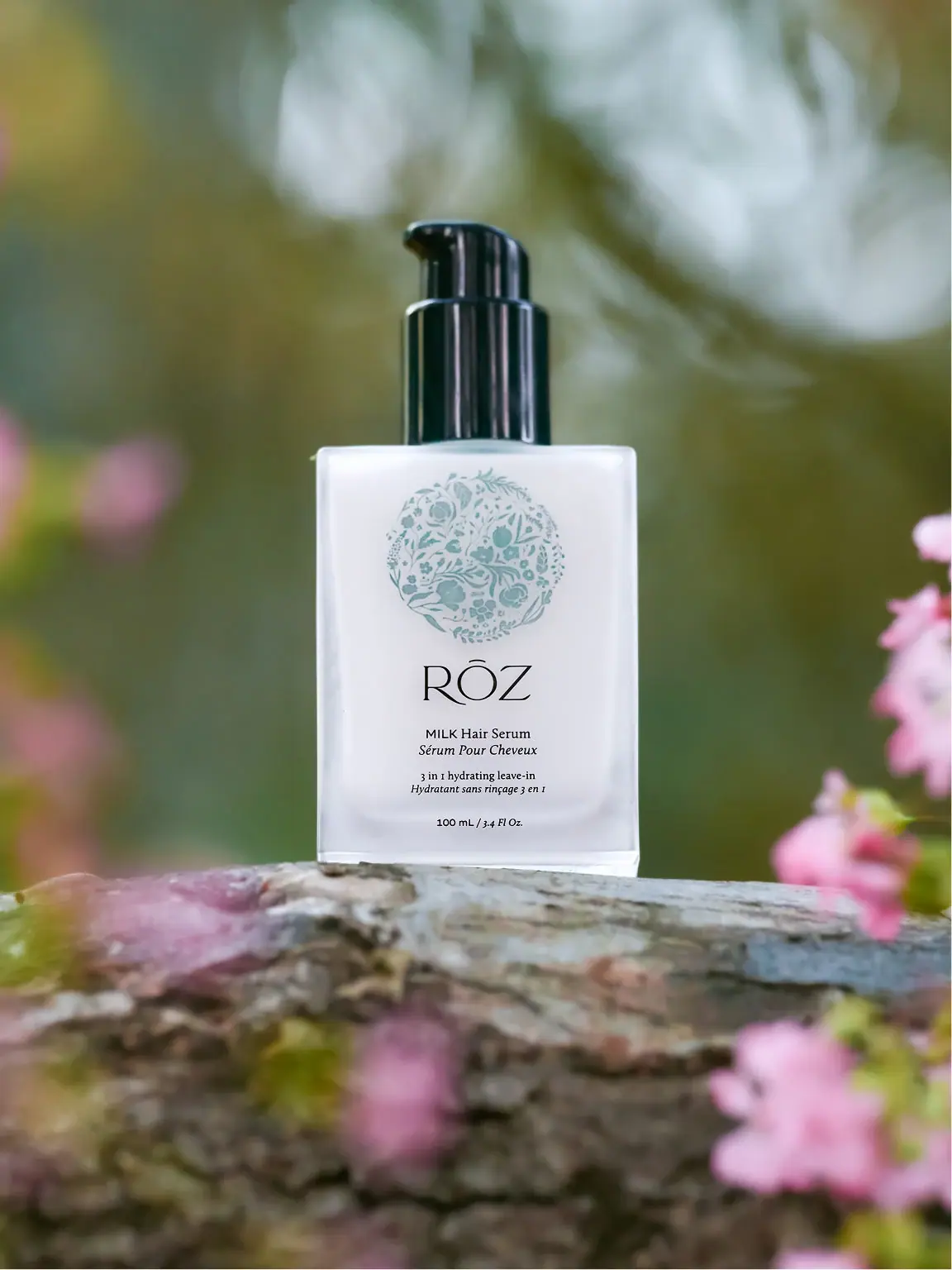
RŌZ
pale botanical medallion above fine lettering and a black pump
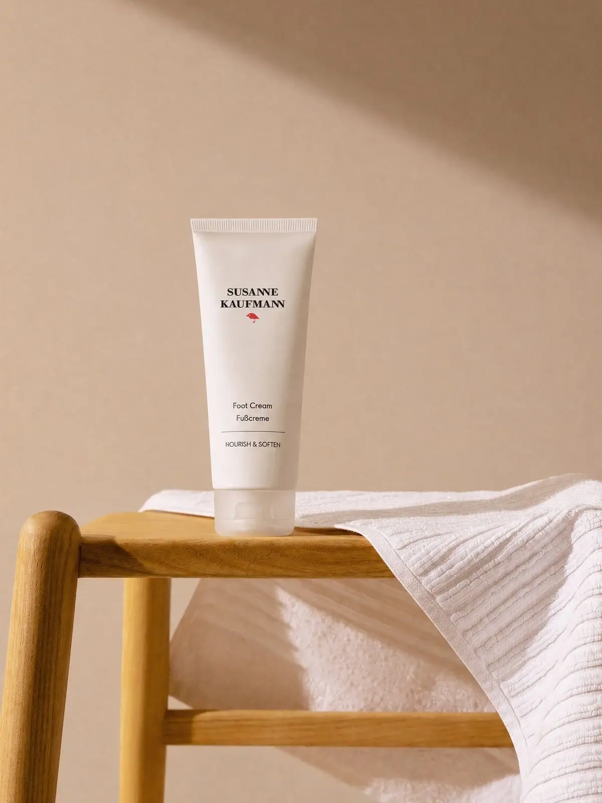
Susanne Kaufmann
airy white tube with a small red signature
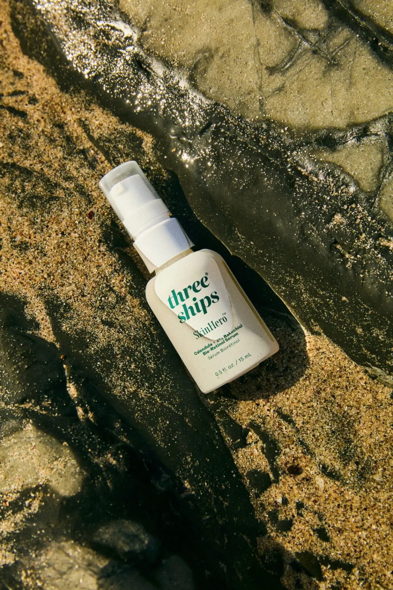
Three Ships
green stacked serif identity on a pale miniature pump bottle
Byredo
Broad white fragrance label, clear round bottle, exposed silver atomizer
Fugazzi
Clear yellow flacon, bold black name and glossy cap
Gallivant
Clear cylinder, peach marbled cap and restrained destination label
Good & Well Supply Co.
Pale winter bird illustration on a grey amber-jar label
Issey Miyake
Grey rectangular cap above a pale-to-blue oceanic gradient