Photography: Gallivant official photography. Images belong to their respective owners.
Gallivant

Clear cylinder, peach marbled cap and restrained destination label
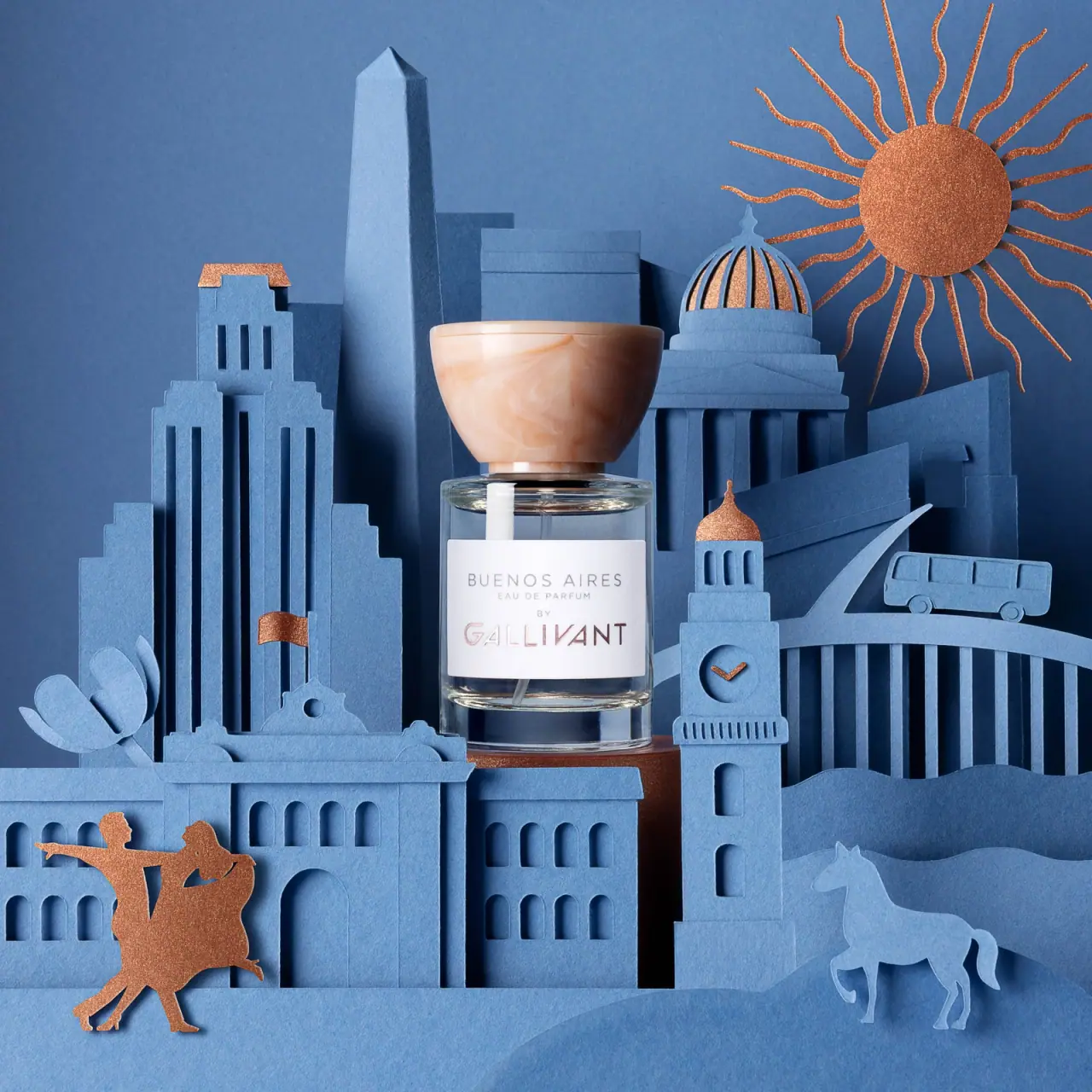
Buenos Aires pairs a compact clear cylindrical bottle with an oversized peach cap whose broad rounded form and swirling appearance carry much of the package's character. The white front label is restrained: a spaced destination name above small category wording and a larger GALLIVANT signature below. The blue architectural scene provides a separate layer of place storytelling. It should not obscure the bottle's actual cylindrical construction or turn its cap into an unverified natural-stone material claim.
- Perfume
- Light pack
- Clinical minimal
- Pastel soft-touch
About this study
Selected cylindrical Buenos Aires bottle with broad peach marbled cap in blue city still life. Official capacities are separate from the source filename's 30ml cue and unseen front quantity.
Sources & evidence · Reviewed 2026-10-19Color Palette
Approximate colours interpreted from photography. These are screen references, not official brand colours or print specifications.
Pack body
Clear body
#E5E2D9
Illustrative neutral for the transparent bottle; blue areas visible through it come from the surrounding set rather than confirmed blue glass.
Label
White label
#F3F0F1
Quiet opaque front field separating the fine typography from the transparent body and busy architecture.
Ink
Soft gray information
#A8A2A3
Spaced destination, category and small linking word appear subdued in the selected lighting.
Copper-pink maker appearance
#98716C
Maker letters vary from pale pink to dark copper-looking reflections; exact printing or foil process unverified.
Accent
Peach cap
#D6A68E
Dominant warm cap tone with pale cream swirls and darker peach shading.
Typography
Suggested visual alternatives, not confirmed brand typefaces. Any scale below is an illustrative estimate.
BUENOS AIRES appears in widely spaced, fine uppercase sans lettering near the top of the label. Much smaller EAU DE PARFUM follows, then a tiny BY on its own line. The lower GALLIVANT word is larger and more distinctive, with angular customized letterforms and a reflective-looking pink-copper appearance. The destination is the first line but not the largest type. This is a centered four-level stack, not a long vertical label or a rotated maker system.
Fonts
Destination and category
Raleway
- Looks like
- Light spaced geometric sans
- Type
- Geometric sans-serif
- Weight
- Light, Regular
- Case
- Uppercase
- Tracking
- Wide destination spacing; modest category spacing
- Fallback
- Arial, sans-serif
Use for an original destination or fragrance name. Keep the category much smaller, with generous separation so the pale text remains readable.
Independent maker signature
Josefin Sans
- Looks like
- Angular modern sans
- Type
- Geometric sans-serif
- Weight
- Regular, Medium
- Case
- Uppercase
- Tracking
- Open optical spacing
- Fallback
- Arial, sans-serif
A direction for an original maker with geometric character, not a match for GALLIVANT's customized wordmark. Do not copy the source's modified letters or their exact arrangement.
Structure & Proportions
Visual proportions and finish previews are illustrative. Confirmed construction details and uncertainties are distinguished in the study notes.
Proportions
| Purpose | Value | Preview |
|---|---|---|
| Broad sculptural cap | The cap is wider than the neck and visually substantial compared with the compact bottle, creating a strong upper silhouette. | — |
| Cylindrical body | Elliptical shoulder and base edges reveal the round vessel despite straight side contours in the front view. | — |
| Label breathing room | The white panel leaves clear body visible above and below, including the thick base zone. | — |
| Centered stack | Destination, category, linking word and maker share one axis, with the maker occupying the widest and largest lower text area. | — |
Shapes
| Element | Value | Preview |
|---|---|---|
| Bottle body | Short cylindrical vessel with rounded shoulder and thick clear-looking base. | |
| Marbled cap | Broad rounded bowl-like form that widens upward from the neck. | |
| Front panel | White rectangular label with softly rounded corners, curved around the body. | |
| Information stack | Four centered text levels, with the maker larger than the destination. |
Finishes
Clear reflected edges
Shoulder and thick base transmit and reflect the blue surroundings; not a blue vessel pigment claim. · transparent
Smooth marbled cap
Peach and cream swirls across a softly glossy surface; material and marbling process unverified. · gloss
Reflective-looking maker
Lower label signature changes in apparent pink-copper brightness; metallic process not confirmed. · metallic
Formats and materials
| Formats | Compact clear cylindrical perfume bottle with broad peach cap; official product offers 30 ml and 100 ml, while the selected source filename carries a 30ml cue |
| Materials | The transparent vessel shows a thick clear-looking base, rounded shoulder and visible dip tube. Its exact material specification is not stated in the accessed product text; the photo supports a glass-like appearance, not a verified glass composition., The cap has a smooth peach-and-cream marbled appearance. Natural marble, stone, resin, recycled content and production method are not confirmed. The white rectangular label's stock and the maker's reflective-looking printing also remain unspecified. |
| Closures | A broad bowl-like peach cap sits over a narrow neck, widening toward a nearly flat top. A fine horizontal edge is visible near its upper rim, and a narrow matching lower collar meets a darker neck section. The cap is closed, hiding the atomizer. Magnetic retention, friction fit, threading and refill access cannot be determined from this view. |
| Decoration | Spaced destination name, Small category and linking word, Larger custom maker below, Cap marbling as the principal package pattern |
Front Panel
Schematic reading order. The diagram’s zone heights do not represent measured artwork proportions.
The white front panel acts as a calm index within a complex still life. Its destination line is visually light and widely tracked, while the maker below has greater size and more distinctive construction. Small EAU DE PARFUM and BY lines connect the two identities without creating a paragraph. The panel contains no skyline, map or illustrated landmark; the city reference is expressed through the name and through external staging, while cap marbling supplies the package's own pattern.
| Zone | Content |
|---|---|
| Destination | BUENOS AIRES sits near the top in fine spaced capitals. |
| Fragrance category | EAU DE PARFUM appears directly below in much smaller lettering. |
| Linking word | Tiny BY occupies its own centered line between category and maker. |
| Maker identity | Larger GALLIVANT lettering anchors the lower label with angular custom forms and pink-copper-looking variation. |
Range System
The official page establishes a city-inspired perfume identity and offers two capacities, but this study analyzes one selected photographed bottle. The useful principle is to keep a calm destination-and-maker label while allowing the cap and campaign to add character. No universal cap material, color coding or label specification is inferred for all GALLIVANT fragrances. A second bottle size would need its own image before transferring these visual proportions.
- Keep destination and fragrance category legible without printing an entire travel scene on the pack.
- Use a distinctive cap silhouette as a separate recognition cue from label typography.
- Document source-filename capacity cues separately from volume actually printed on the visible front.
Back of Pack & Shelf
The rear, underside and open atomizer are not shown. The visible front contains no clearly readable volume statement, and the selected image does not show a carton.
- Inspect the base or reverse to verify the photographed capacity.
- Do not specify a refill mechanism from the closed cap.
- Keep outer-carton construction separate from the staged architectural props.
On shelf
Interpretively, the oversized marbled cap is likely to remain recognizable when small destination lettering becomes difficult to read. The white label gives the front a stable information surface regardless of the color behind the transparent body. Fine gray text and reflective-looking maker details still need testing under ordinary retail lighting. An original package can preserve the contrast between sculptural top and quiet label without copying the distinctive cap proportions or custom wordmark.
Imagery
Layered blue paper-like buildings surround the bottle, with an obelisk form, dome, clocktower, bridge and bus creating a miniature city. A horse and dancing figures add narrative details, while copper-colored roofs, a sun and small accents echo the warm cap and maker. The bottle remains centrally readable because its white label interrupts the blue scene. These buildings are props, not a printed carton or label pattern, and the blue visible through the transparent vessel is environmental color.
Guidelines
Editorial principles for an original design brief, not official brand guidelines.
Do
- Describe the actual cylindrical form.
- Give cap shape its proper role in the design.
- Separate label hierarchy from first-line reading order.
- Keep blue set color outside the package palette.
- Record material and capacity uncertainties precisely.
Don't
- Do not call the body rectangular.
- Do not describe the destination as the largest lettering.
- Do not infer natural marble from cap swirls.
- Do not claim foil from reflective-looking lettering alone.
- Do not turn paper architecture into package decoration.
Sources & evidence
How this study was built
edition · Sourced fact
Official page identifies Buenos Aires Eau de Parfum and 30 ml / 100 ml options; selected image capacity not assigned from those options alone.GALLIVANT — Buenos Aires Eau de Parfumstructure · Visual observation
Elliptical shoulder and base show a cylindrical bottle beneath a broad bowl-like marbled cap.GALLIVANT — Buenos Aires Eau de Parfumtypography · Visual observation
Maker is larger than destination; category and BY create two tiny intermediate lines.GALLIVANT — Buenos Aires Eau de Parfumlabel · Visual observation
White front panel contains text only; skyline remains external staging.GALLIVANT — Buenos Aires Eau de Parfumpalette · Visual observation
Peach cap, white label and subdued gray/copper-looking type define the pack; blue transmitted surroundings are not a confirmed vessel tint.GALLIVANT — Buenos Aires Eau de Parfumimagery · Visual observation
Layered blue architecture and copper accents create a destination scene around the central bottle.GALLIVANT — Buenos Aires Eau de Parfumrange · Editorial interpretation
A sculptural cap plus quiet destination label is transferable, but universal brand construction rules are not established.
What remains unverified
- Bottle and cap composition, marbling and reflective-letter processes unverified.
- Selected capacity suggested by source filename but not readable on front.
- Reverse, underside, open atomizer and carton unseen.
- Original lettering and measured dimensions unknown.
Give your AI
packaging taste
Give your design or image tool a packaging study: palette, type, structure, front panel and principles for an original brief.
Export this styleFree with an email. PACK.md works in Claude, ChatGPT, Cursor and image tools.
More like this

Cocokind
sideways lowercase on spa-water pastels

Herbivore
pastel tinted vessels with a white tag
ILIA
whispered capitals on skin-tone sleeves
Live Tinted
Pale peach stick, vertical lettering and exposed golden balm
Lixirskin
Peach archival tube with centered title and perpendicular maker

OSEA
sea-glass frosted bottles and a tidal wordmark

OUAI
sheer tinted bottles, small black capitals
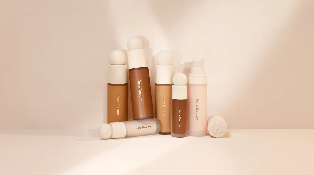
Rare Beauty
sculpted sphere caps in warm skin nudes