Photography: Susanne Kaufmann official photography. Images belong to their respective owners.
Susanne Kaufmann

airy white tube with a small red signature
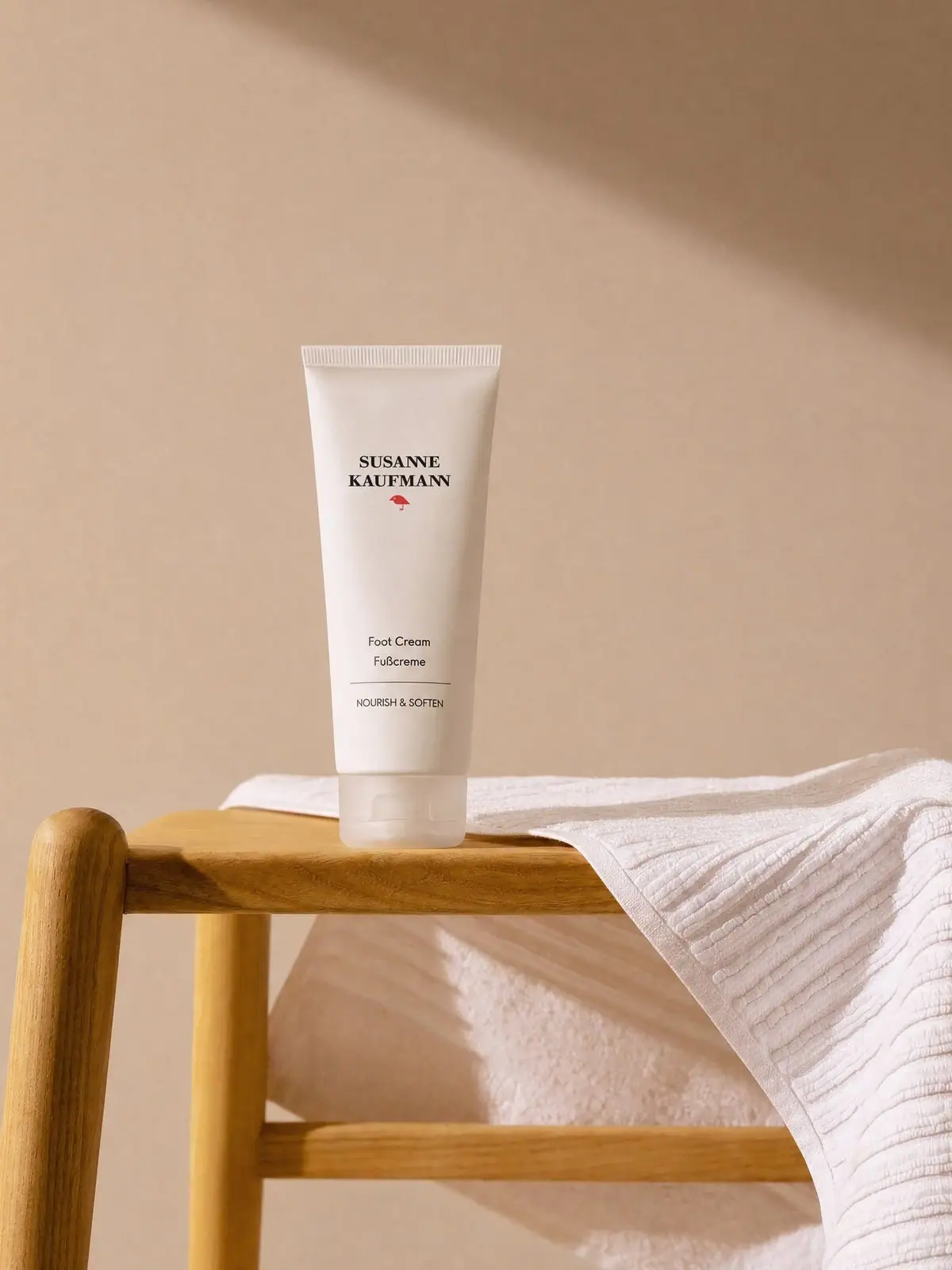
The selected Foot Cream tube uses an unusually large quiet centre between the upper brand identity and the lower product information. A two-line dark serif maker and a small red bird-like mark sit near the sealed end. Foot Cream and Fußcreme appear much lower, followed by a thin rule and a restrained benefit line. The pale cap-down silhouette keeps the entire composition soft while the red mark provides a precise point of recognition.
- Body & bath
- Light pack
- Clinical minimal
- Botanical
About this study
Selected Foot Cream tube only. Current official product information is contextual and does not establish all specifications of the photographed edition.
Sources & evidence · Reviewed 2026-10-19Color Palette
Approximate colours interpreted from photography. These are screen references, not official brand colours or print specifications.
Pack body
Soft white
#EAE9E4
Approximate tube appearance under warm campaign light; not a specified resin or ink colour.
Translucent pale cap
#D4D2C8
Approximate cap appearance, influenced by the wooden support and warm light.
Ink
Dark charcoal
#292B2A
Approximate maker and lower product lettering.
Accent
Muted red
#B33B32
Approximate small bird-like brand mark below the maker.
Typography
Suggested visual alternatives, not confirmed brand typefaces. Any scale below is an illustrative estimate.
SUSANNE KAUFMANN forms two bold uppercase serif lines at the upper end of the front. Its compact block is followed by a small red emblem and then a very generous blank interval. Lower down, Foot Cream and Fußcreme use a quieter sans-serif voice. A thin horizontal rule separates these names from the small uppercase NOURISH & SOFTEN line. This layout makes the maker expressive and the product name practical without filling the centre with claims.
Fonts
Identity alternative
Libre Baskerville
- Looks like
- Libre Baskerville as an independent visual alternative
- Type
- Serif
- Weight
- Bold 700
- Case
- Uppercase
- Tracking
- Restrained
- Fallback
- Arial, sans-serif
Use a sturdy serif identity in a compact block with sufficient contrast at small size. Do not reconstruct the Susanne Kaufmann wordmark or its exact two-line proportions. Keep any new emblem original and subordinate to the maker.
Product information alternative
Source Sans 3
- Looks like
- Source Sans 3 as an independent visual alternative
- Type
- Sans serif
- Weight
- Regular 400
- Case
- Title case and uppercase
- Tracking
- Natural names, slightly spaced benefits
- Fallback
- Arial, sans-serif
Use a clear sans-serif for bilingual product names and a smaller benefit statement. Maintain real readability rather than reducing the lower text to a decorative grey block. Leave a deliberate gap between identity and function.
Structure & Proportions
Visual proportions and finish previews are illustrative. Confirmed construction details and uncertainties are distinguished in the study notes.
Proportions
| Purpose | Value | Preview |
|---|---|---|
| Central space | A long open interval separates the upper identity from lower functional copy. | — |
| Tube taper | The sealed upper end is visibly wider than the cap-down lower end. | — |
| Accent restraint | The red mark occupies a very small part of the otherwise neutral front. | — |
Shapes
| Element | Value | Preview |
|---|---|---|
| Tube | Tall tapered body with flattened ribbed crimp at the top. | |
| Closure | Broad low pale cap with a front tab. | |
| Graphic rule | Fine horizontal separator above the benefit statement. |
Finishes
Diffuse white body
Front tube surface; matte-looking appearance does not establish a coating. · matte
Pale translucent closure
Bottom cap catches light through and across its surface. · gloss
Formats and materials
| Formats | Selected cap-down tapered Foot Cream tube, photographed upright on a wooden support. The current official page lists a 100 mL product in a practical tube. |
| Materials | The body looks opaque pale and flexible, with a visibly sealed ribbed upper edge. Its polymer, laminate layers and barrier specification are not established., The cap is translucent-looking and has a visible front opening tab. Its exact material, hinge construction and compatibility with the body are not documented by the photograph. |
| Closures | A broad pale closure supports the tube at the bottom. The front tab suggests a flip-top opening and the cap sits within the overall taper without adding a strongly contrasting colour. The upper crimp is a manufacturing closure rather than the dispensing end. No open view shows the orifice, inner seal or product flow. The image does not establish whether the cap can be removed for disposal, whether the package is monomaterial or whether a recycling programme accepts it. Those details require a specification or explicit disposal instructions for this edition. |
| Decoration | Upper two-line serif maker and small red mark., Large visually quiet central field., Lower bilingual name, fine rule and benefit line. |
Front Panel
Schematic reading order. The diagram’s zone heights do not represent measured artwork proportions.
The front is organised into two distant islands. The upper island combines the maker and red mark, while the lower island names the product in English and German and explains its function. Both share a central axis. The lower rule gives a quiet boundary without adding a box around the copy. No distinct adhesive-label edge is visible, so the method is described as front decoration rather than confirmed direct printing or a specific label process. Quantity is not legible in the selected photo and is not inserted into the observed map.
| Zone | Content |
|---|---|
| Upper identity | Two-line SUSANNE KAUFMANN serif maker. |
| Small signature | Red bird-like mark beneath the maker. |
| Lower product | Foot Cream and Fußcreme. |
| Benefit | Thin rule followed by NOURISH & SOFTEN. |
Range System
This study covers the selected Foot Cream tube, not the brand’s jars, bottles or a universal packaging system. The current official page describes a 100 mL cream now offered in a practical tube. That provides current product context without proving the exact date or specifications of the selected photographed edition. The page says free from added fragrance while also listing essential oils; this should not be simplified into a claim that the product is unscented or contains no aromatic ingredients. Formula language is separate from packaging analysis.
- Selected cap-down Foot Cream tube in a warm still-life setting.
- Current 100 mL official listing used for product context with edition limits.
Back of Pack & Shelf
The reverse panel, orifice, bottom marking and any outer carton are unseen. Ingredient text, manufacturing code, capacity location and disposal instructions cannot be mapped from the front. The generous front blank area does not imply that the package lacks required practical information elsewhere.
- Inspect the back before documenting ingredient and use instructions.
- Confirm material and disposal details for the precise tube edition.
- Check the opening and seal before describing dispensing ergonomics.
On shelf
Interpretation: the distant upper and lower text groups can make the tube feel composed and premium, but the product name may require close inspection when several white tubes sit together. The red mark is a useful small recognition cue rather than a large category code. An original design using similarly generous space should test the lower product name at actual shelf distance and ensure that bilingual text remains readable without relying on the campaign scene.
Imagery
A wooden stool or support and a folded white towel place the tube in a calm domestic care setting. Warm beige surroundings soften the white body and influence the apparent cap colour. These scene elements are not included packaging and do not establish wood, cotton or other natural materials in the tube itself. The low-contrast setting makes the small red mark more noticeable, while the upright cap-down position keeps the product name readable without a hand holding the pack.
Guidelines
Editorial principles for an original design brief, not official brand guidelines.
Do
- Keep the bilingual product name readable at actual size.
- Use blank space as part of the hierarchy.
- Separate current product facts from photographed edition details.
- Describe materials only when supported by component evidence.
Don't
- Do not assume a white tube is recyclable or monomaterial.
- Do not identify the original fonts from resemblance.
- Do not treat the towel and wood as package components.
- Do not equate no added fragrance with an unscented formula.
Sources & evidence
How this study was built
context · Sourced fact
Current official page lists 100 mL Foot Cream in a tube and distinguishes no added fragrance from the essential oils in the formula.Susanne Kaufmann — Foot Creamtypography · Visual observation
Upper two-line serif maker and lower sans-serif product names are separated by a large blank interval.Susanne Kaufmann — Foot Creamlabel · Visual observation
Small red mark, bilingual name, fine rule and benefit line are visible.Susanne Kaufmann — Foot Creamstructure · Visual observation
Cap-down tapered tube has a ribbed upper crimp and a pale closure with front tab.Susanne Kaufmann — Foot Creamimagery · Visual observation
Wood and folded towel are surrounding scene objects.Susanne Kaufmann — Foot Creamshelf · Editorial interpretation
Sparse hierarchy requires a legibility check for the lower product name.
What remains unverified
- Tube layers, cap material and recycling route unverified.
- Original fonts, decoration process and precise edition date unknown.
- Reverse, opening, seal and carton unseen.
Give your AI
packaging taste
Give your design or image tool a packaging study: palette, type, structure, front panel and principles for an original brief.
Export this styleFree with an email. PACK.md works in Claude, ChatGPT, Cursor and image tools.
More like this
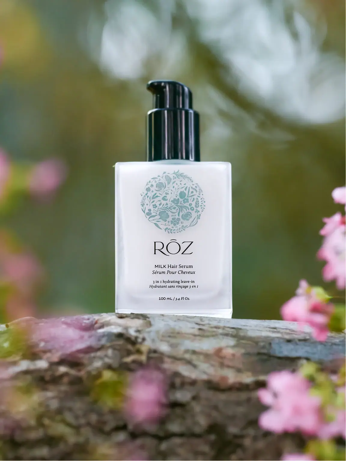
RŌZ
pale botanical medallion above fine lettering and a black pump
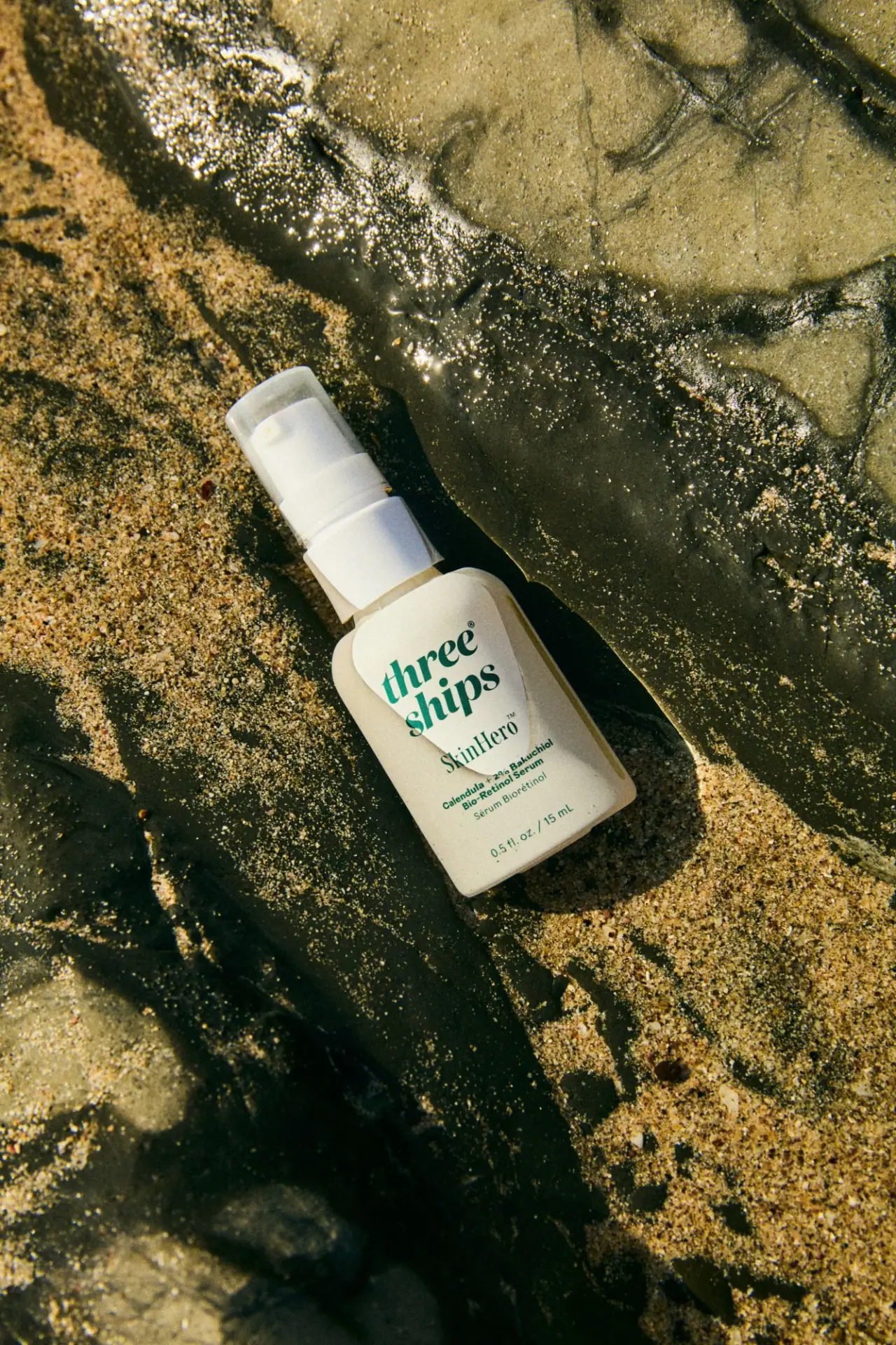
Three Ships
green stacked serif identity on a pale miniature pump bottle
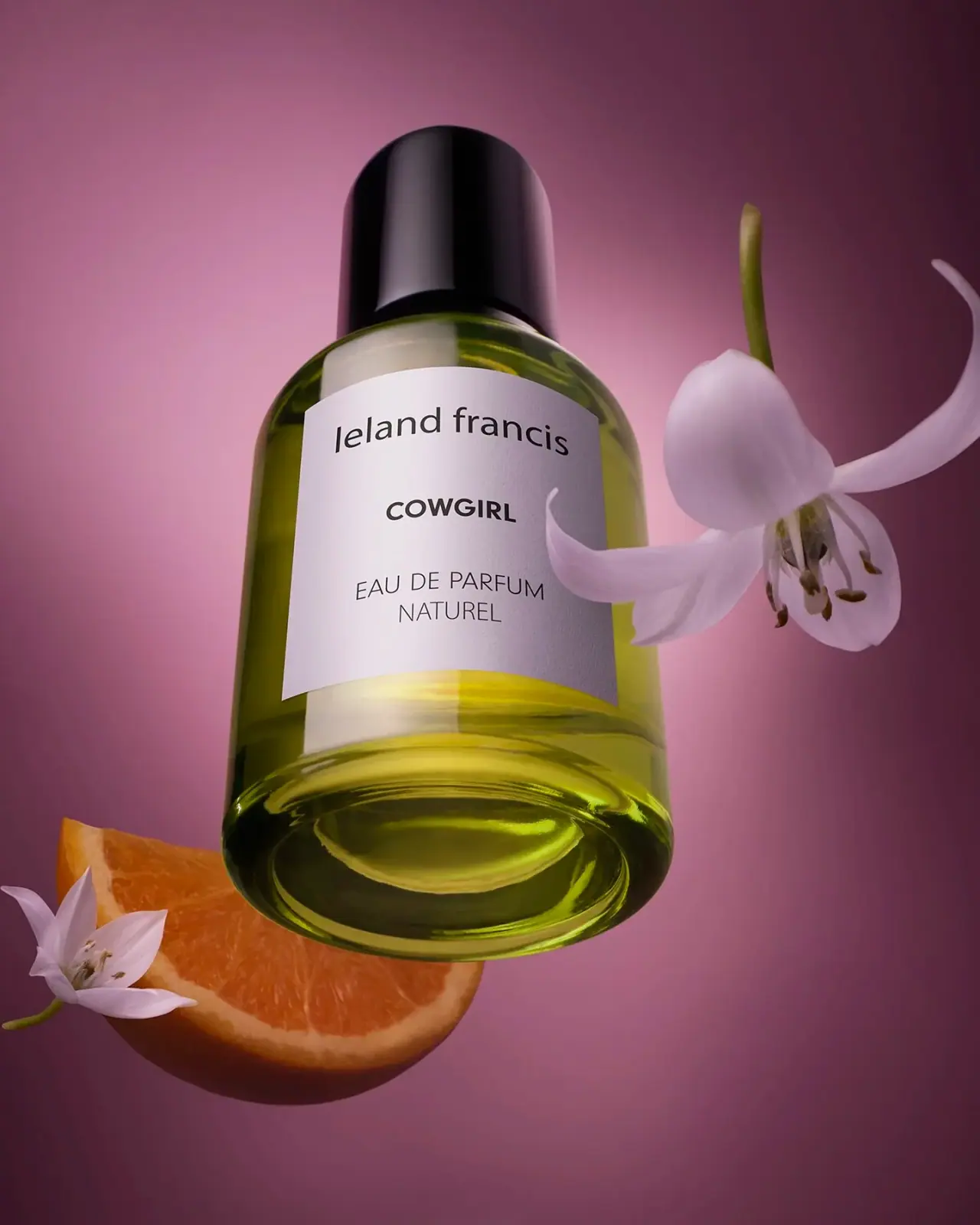
Leland Francis
quiet cream label against luminous botanical perfume

African Botanics
Technical black label with a low serif signature

AussieZinc
Sun-yellow numerals on a tall, information-rich white cylinder

bareMinerals
a restrained black compact framing the powder itself

BeautyPWR
Clear square shell, white cream cup, black serif identity

Benamôr
Ornamental lilac medallion suspended above golden botanical oil