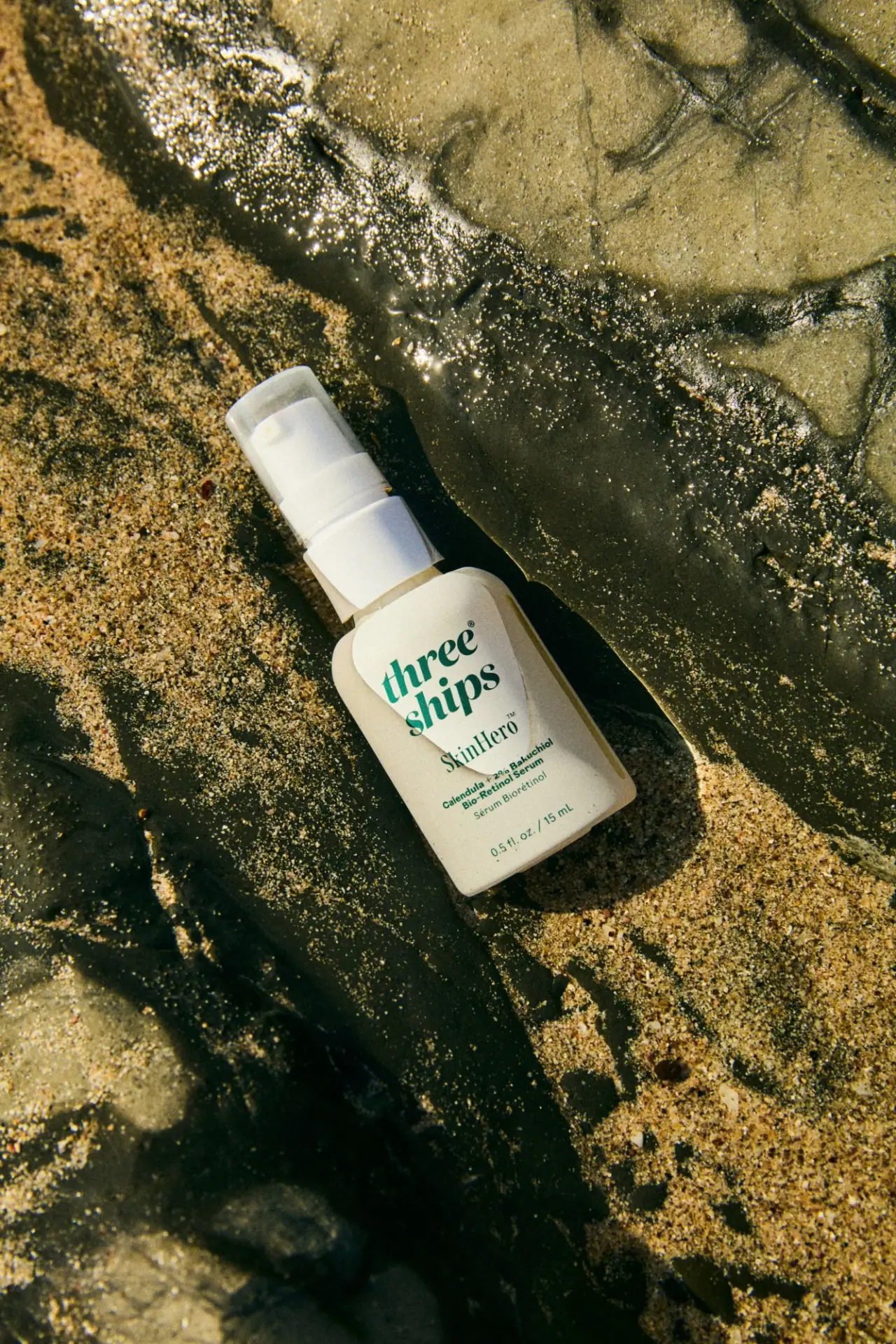
Photography: Carmen Cheung / The Co-Lab — Three Ships photography. Images belong to their respective owners.
Three Ships

green stacked serif identity on a pale miniature pump bottle
SkinHero's 15 mL mini presents a compact rounded rectangular body beneath a comparatively tall white pump assembly and translucent overcap. The front gives most emphasis to a two-line green three ships identity. A smaller serif product name, compact ingredient-and-category wording, French descriptor and net quantity follow below. A pale organic-looking field behind the upper lettering softens the otherwise regular bottle outline. The selected selected photograph places the mini on wet rock and sand, bringing a textured natural setting around a quiet typographic package.
- Skincare
- Light pack
- Clinical minimal
- Botanical
About this study
SkinHero Calendula + 2% Bakuchiol Bio-Retinol Serum mini, visibly marked 15 mL in the approved rock-and-sand photograph. No measured comparison with the standard size is claimed.
Sources & evidence · Reviewed 2026-10-19Color Palette
Approximate colours interpreted from photography. These are screen references, not official brand colours or print specifications.
Pack body
Warm pale bottle field
#D5D1B4
Approximate body appearance in warm outdoor light. Exact tint, opacity and contribution of contents are unverified.
Label
Light identity field
#E4E2CF
Approximate pale irregular area behind the maker and product name. Its visual edge does not establish a separate paper layer or application process.
Ink
Deep green lettering
#17654E
Approximate shared colour of maker, product and supporting text. Darker rocks and olive sand in the scene are not included as brand colours.
Accent
White pump assembly
#EBEDE5
Approximate pump and collar appearance. The translucent overcap adds its own reflections and softened edges.
Typography
Suggested visual alternatives, not confirmed brand typefaces. Any scale below is an illustrative estimate.
The largest element is the lowercase maker name, broken into two closely grouped lines with substantial serif strokes. SkinHero follows in a smaller, lighter serif voice. The ingredient-and-category block below uses more compact sans-serif lettering, followed by a French line. Net volume sits separately near the base. All copy uses a related green appearance, so scale, stroke weight and spacing carry the hierarchy instead of several competing colours. The maker and product title should not be described as the same typographic weight.
Fonts
Maker and product alternative
Lora
- Looks like
- Lora for contrasting serif weights
- Type
- Contemporary serif
- Weight
- Bold 700 / Regular 400
- Case
- Lowercase maker, mixed-case product
- Tracking
- Compact maker grouping, natural product spacing
- Fallback
- Georgia, serif
Use a strong two-line original maker name, then reduce weight as well as size for the product title. Lora is a practical expressive alternative, not an identification of the Three Ships wordmark. Evaluate the exact new words rather than copying the source line lengths.
Descriptor alternative
Inter
- Looks like
- Inter for compact ingredients, category and quantity
- Type
- Sans serif
- Weight
- SemiBold 600 / Regular 400
- Case
- Mixed case and numerals
- Tracking
- Normal, avoiding compressed small text
- Fallback
- Arial, sans-serif
Group ingredient and category wording closely, then give net quantity a separate position. At mini scale, edit copy and test a physical proof before reducing all type proportionally. This recommendation is not a measured statement about the original label.
Structure & Proportions
Visual proportions and finish previews are illustrative. Confirmed construction details and uncertainties are distinguished in the study notes.
Proportions
| Purpose | Value | Preview |
|---|---|---|
| Tall closure assembly | Pump, collar and cap together occupy a substantial share of the mini's overall height. This makes the dispensing assembly part of the silhouette rather than a minor finishing detail. | — |
| Large maker on a small face | The two-line identity occupies much of the upper front width, with supporting text progressively smaller below. Exact comparison with a full-size bottle has not been established. | — |
| Soft body outline | Rounded shoulders and lower corners soften a broad rectangular face while preserving a relatively stable central reading area. | — |
Shapes
| Element | Value | Preview |
|---|---|---|
| Mini body | Rounded rectangular front with gently curved shoulders and corners. | |
| Pump assembly | Narrow upper dispenser above a broader white collar. | |
| Pale front field | Irregular curved pale area behind the upper lettering, with construction unverified. | |
| Overcap | Tall translucent cover with rounded upper edges. |
Finishes
Quiet pale appearance
Bottle face and upper identity area; no verified paper stock or soft-touch coating. · matte
Translucent cap appearance
Protective-looking cover around the dispenser, with white components visible beneath. · transparent
Formats and materials
| Formats | Selected 15 mL serum mini with a small rounded rectangular body, white pump and translucent protective-looking overcap. |
| Materials | Bottle, collar, pump and overcap component materials are not identified by the inspected official product text., The pale front treatment's substrate, adhesive and print method are unverified; no recycled-content or environmental claim is derived from the natural setting. |
| Closures | A white collar rises above the bottle's narrow neck and supports the white dispenser. A translucent cap encloses the upper assembly while allowing its silhouette to remain visible. The cap is on in the selected photo, so the pump's exact stroke, output and attachment are not documented. A pump format alone does not establish an airless system, leak resistance, refillability or ease of recycling. |
| Decoration | Large stacked lowercase serif maker identity., Smaller serif SkinHero title beneath the maker., Pale irregular curved field behind the upper text., Compact bilingual descriptor and separate quantity line. |
Front Panel
Schematic reading order. The diagram’s zone heights do not represent measured artwork proportions.
The maker leads from the upper face, with two stacked lines producing a broad compact silhouette. SkinHero sits below at a lighter visual weight. The ingredient-and-category lines gather into a small block, then the French descriptor and quantity complete the lower area. A pale irregular field sits behind the upper identity and curves towards the centre. The image does not reveal whether that boundary is a separate applied layer, printed shading or another surface treatment, so it is recorded as a visual feature rather than a manufacturing instruction.
| Zone | Content |
|---|---|
| Visible dispenser | White pump assembly enclosed by the translucent upper cap. |
| Maker identity | Large green lowercase three ships mark on two lines. |
| Product title | Smaller, lighter SkinHero serif wording. |
| Descriptor group | Compact calendula/bakuchiol and serum wording with French information below. |
| Quantity | Separate 0.5 fl. oz. / 15 mL line near the rounded base. |
Range System
The exact official page offers a standard 1 oz and a mini 0.5 oz choice. The selected front visibly identifies 15 mL, giving a firm basis for mini scope. This does not prove that the two formats share measured proportions, an identical pump mechanism or a mechanically scaled label. The useful design question is how a small pack maintains clear maker, product and category identification with less surface area.
- Selected study: SkinHero mini, visibly marked 15 mL.
- Official alternative: standard 1 oz size, not directly compared for construction or layout here.
- Original-design exercise: simplify copy deliberately when reducing size, while testing hierarchy and handling independently.
Back of Pack & Shelf
The reverse, underside and uncapped dispenser are unseen. The selected front cannot establish the position of instructions, ingredients or any batch code. The available online product text is not a substitute for a physical reverse-panel photograph.
- Inspect the back before describing the complete bilingual information system.
- Obtain a cap-off view before specifying dispenser geometry.
- For a new mini, proof the smallest text at actual size and with the curvature of the chosen vessel.
On shelf
Interpretation: the large green maker name may remain recognisable when the mini is small in a grid, while the lighter product name and compact descriptor require closer inspection. The visible pump can communicate a different use gesture from a dropper bottle without making the internal mechanism known. Test recognition and reading at the intended retail or screen size, especially where the pale field and surrounding bottle have only modest tonal separation.
Imagery
Strong directional light falls across wet rock and coarse sand, creating a rough, irregular setting around the pale mini. The bottle lies diagonally rather than standing on a display plinth. Bright reflections in the water and deep rock shadows make the simple front field easier to isolate. These surroundings contribute an outdoors association, but they do not demonstrate ingredient origin, packaging biodegradability or resistance to water. Their olive and brown colours remain photographic context rather than packaging colour tokens.
Guidelines
Editorial principles for an original design brief, not official brand guidelines.
Do
- Use size and weight together to separate maker, product and descriptor.
- Check a mini's typography at actual scale rather than only in enlarged photographs.
- Record the visible quantity to distinguish the studied size from other variants.
- Describe translucent covers and hidden mechanisms separately.
Don't
- Do not assume mini and full-size proportions are identical without comparison.
- Do not identify glass, label stock or cap resin from appearance alone.
- Do not infer airless dispensing or refillability from the pump silhouette.
- Do not convert outdoor scenery into packaging sustainability claims.
Sources & evidence
- Three Ships — SkinHero, official product and size choicesproduct
- Carmen Cheung — The Co-Lab, selected Three Ships photographyphotographer
How this study was built
range · Sourced fact
Official page offers standard 1 oz and mini 0.5 oz options.Three Ships — SkinHero, official product and size choicesedition · Visual observation
Selected front visibly reads 0.5 fl. oz. / 15 mL, identifying the mini.Carmen Cheung — The Co-Lab, selected Three Ships photographytypography · Visual observation
Bold stacked serif maker precedes a lighter serif product name and compact sans-serif descriptor.Carmen Cheung — The Co-Lab, selected Three Ships photographystructure · Visual observation
Translucent overcap reveals the white pump silhouette without revealing the complete internal mechanism.Carmen Cheung — The Co-Lab, selected Three Ships photographylabel · Visual observation
A pale irregular field sits behind the upper text; its physical construction is unverified.Carmen Cheung — The Co-Lab, selected Three Ships photographyshelf · Editorial interpretation
The hierarchy should be tested at mini scale instead of assuming a full-size layout can simply be reduced.
What remains unverified
- Bottle, pump, cap and front treatment materials and application processes are unverified.
- Original fonts, dimensions and full-size comparison are unidentified.
- Reverse, underside and uncapped dispenser are unseen; no airless or refill mechanism inferred.
- Colour values are approximate; sand and wet rock are scenery rather than packaging finishes.
Give your AI
packaging taste
Give your design or image tool a packaging study: palette, type, structure, front panel and principles for an original brief.
Export this styleFree with an email. PACK.md works in Claude, ChatGPT, Cursor and image tools.
More like this
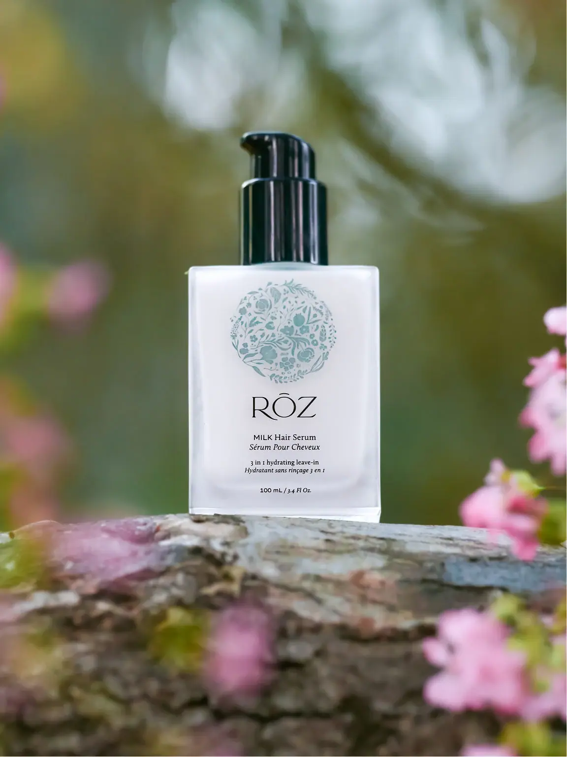
RŌZ
pale botanical medallion above fine lettering and a black pump
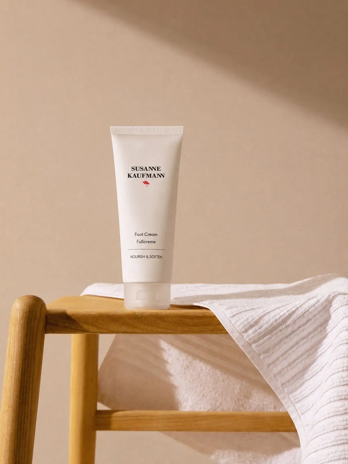
Susanne Kaufmann
airy white tube with a small red signature
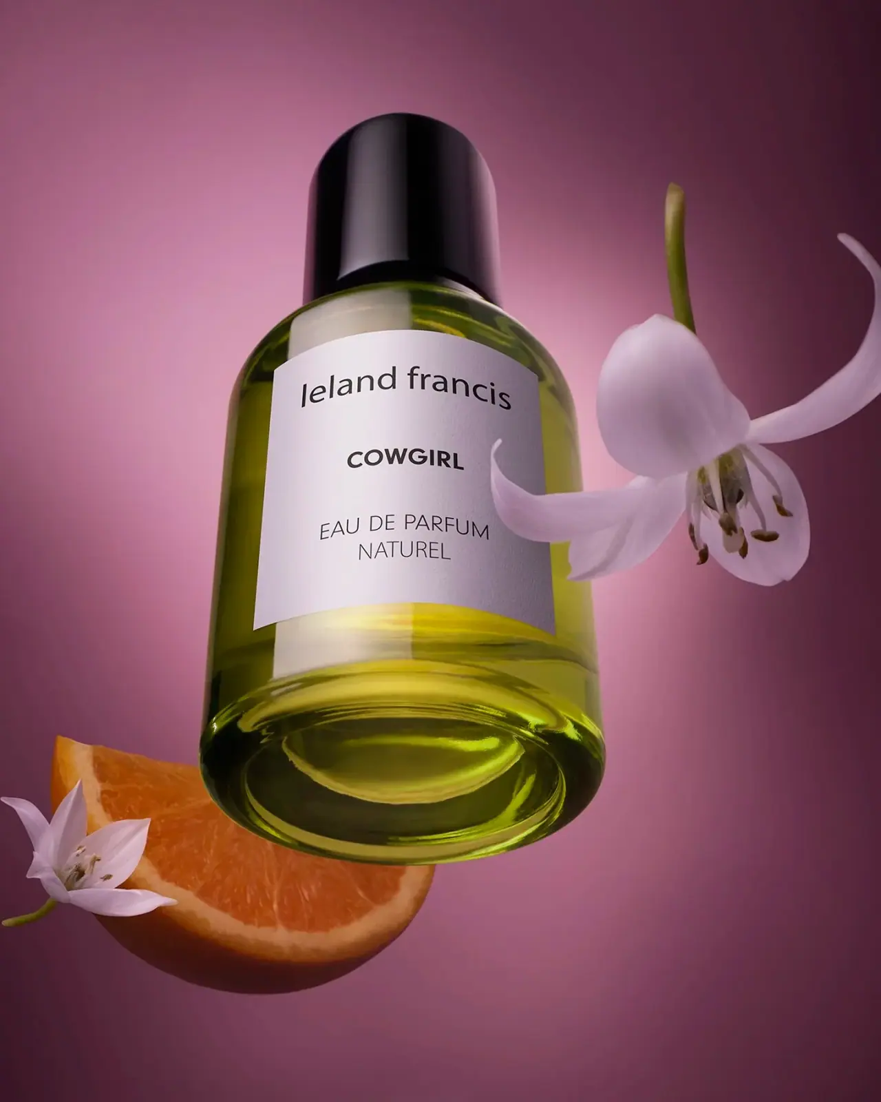
Leland Francis
quiet cream label against luminous botanical perfume

African Botanics
Technical black label with a low serif signature

AussieZinc
Sun-yellow numerals on a tall, information-rich white cylinder

bareMinerals
a restrained black compact framing the powder itself

BeautyPWR
Clear square shell, white cream cup, black serif identity

Benamôr
Ornamental lilac medallion suspended above golden botanical oil