
Photography: Maria Nila official photography. Images belong to their respective owners.
Maria Nila

Lilac aerosol with medallion, white panel and hold dots
Texture Spray combines a tall lilac aerosol with a short black cap and an upper white information panel. An ornamental circular emblem interrupts the panel's top edge, while a small lowercase maker sits independently near the base. The front mixes a strong two-line product title, bilingual functional description, a five-circle hold scale and compact supporting statements. A long lilac interval between the information panel and maker keeps the bottle from reading as one continuous column of text.
- Hair
- Light pack
- Pastel soft-touch
- Heritage label
About this study
Selected lilac Texture Spray aerosol in the block-tower still life. Photograph quantity and current online imperial quantity differ; both are explicitly attributed.
Sources & evidence · Reviewed 2026-10-19Color Palette
Approximate colours interpreted from photography. These are screen references, not official brand colours or print specifications.
Pack body
Pale lilac
#D1CDDF
Approximate softly shaded can color. The pale field also shows through the circular emblem and visually connects it to the vessel.
Label
Warm white panel
#F0F0EB
Light central rectangle creates a stable background for compact text without wrapping the whole visible can in white.
Ink
Near-black lettering
#181518
Strong product name, ornamental emblem and lower maker; the cap repeats this dark tone structurally.
Typography
Suggested visual alternatives, not confirmed brand typefaces. Any scale below is an illustrative estimate.
The product title is a bold uppercase sans arranged as TEXTURE over SPRAY. Beneath it, a small uppercase serif English descriptor and an italic French line create a more traditional editorial register. HOLD returns to a compact sans above the five dots; the claims block uses narrow small lettering. Far below, maria nila is a lighter lowercase sans with a tiny tracked city line. This is not an all-sans label: the small serif pair contributes materially to the visual character.
Fonts
Product and utility sans
Archivo
- Looks like
- Clear compact grotesque
- Type
- Grotesque sans-serif
- Weight
- Regular, Bold
- Case
- Uppercase title; mixed-case details
- Tracking
- Compact title; natural small text
- Fallback
- Arial, sans-serif
Use a bold two-line title with lighter utility copy. The separate maker should have its own original construction rather than simply duplicate the title's weight.
Bilingual descriptive pair
Libre Baskerville
- Looks like
- Small traditional serif with italic
- Type
- Serif
- Weight
- Regular, Italic
- Case
- Uppercase English; title-case French
- Tracking
- Natural serif spacing
- Fallback
- Georgia, serif
Use a short roman descriptor and a carefully sized italic translation. This contrast should remain readable and functional, not become decorative microtext beneath an oversized title.
Structure & Proportions
Visual proportions and finish previews are illustrative. Confirmed construction details and uncertainties are distinguished in the study notes.
Proportions
| Purpose | Value | Preview |
|---|---|---|
| Upper information island | The white field occupies the upper-middle can, leaving lilac visible on both sides and a substantial clear interval below. | — |
| Compact cap | The short dark cap creates a strong top stop without matching the full height or width of the information panel. | — |
| Detached maker | A small low wordmark signs the vessel after a long quiet lilac area rather than joining the dense product-information stack. | — |
| Boundary-crossing emblem | The circular medallion is centered on the white panel's top edge, linking the colored shoulder area with the information rectangle. | — |
Shapes
| Element | Value | Preview |
|---|---|---|
| Can silhouette | Long cylinder with inward-curving shoulder and short straight overcap. | |
| Information field | Tall white rectangle that curves with the front surface. | |
| Ornamental emblem | Round dark-bordered medallion containing an angular monogram and a ring of small circular motifs. | |
| Hold indicator | Five small aligned circles, two filled and three outlined in the selected photograph. |
Finishes
Diffuse lilac appearance
Can front reflects broad soft light; this does not confirm a tactile coating. · matte
Formats and materials
| Formats | Tall cylindrical aerosol with black overcap; photographed front states 250 ml / 8.5 fl oz and net weight 179 g / 6.3 oz |
| Materials | The smooth opaque can and black cap are visible, but the accessed product page does not specify their material composition. Do not assign aluminum, steel, a particular resin or recycled percentages from the image., The white information field appears closely integrated with the curved can. A separate adhesive-label edge is not resolved clearly enough to identify label stock or a direct-print process. |
| Closures | A short cylindrical black overcap covers the actuator. Its diameter is narrower than the main body, above curved shoulders that ease inward toward the top. The cap has a softly textured highlight, while the can reflects a broad pale strip. No nozzle, valve, internal pressure mechanism or cap-retention detail is visible, so only the closed aerosol format is documented. |
| Decoration | Circular monogram medallion crossing the panel top, Two-line uppercase product name, Small roman and italic descriptor pair, Five-dot hold indicator, Separate lowercase maker near the base |
Front Panel
Schematic reading order. The diagram’s zone heights do not represent measured artwork proportions.
The information panel has a centered reading axis throughout, but differentiation comes from changing type style, weight and gaps. The medallion acts as a top anchor, the product name is the strongest verbal element, and the serif descriptors give a second register before the hold scale. Supporting statements and quantity form the lower part of the white panel. The maker remains outside it, allowing the label to describe the product while the vessel base carries brand recognition.
| Zone | Content |
|---|---|
| Medallion | Dark ornamental ring and angular central mark overlap the white panel's upper boundary; this is not a certification seal established by the research. |
| Product title | Bold TEXTURE / SPRAY sits above smaller English and French functional descriptors. |
| Performance scale | HOLD sits above five circles with two filled, consistent with the official 2/5 classification. |
| Supporting statements | Vegan, texture/volume and CO2-compensated-packaging wording are visible. The environmental line is transcribed as package messaging, not independently audited performance. |
| Quantity | Photographed front uses 250 ml / 8.5 fl oz and Net Wt 179 g / 6.3 oz. Current online text instead lists 8.4 fl oz; the two records are kept distinct. |
| Lower maker | Small lowercase maria nila and a tiny Stockholm line sit near the bottom of the lilac body. |
Range System
Only this photographed Texture Spray is analyzed visually. The official page lists standard and travel options, but the study does not assume identical geometry or graphics on the smaller format. A dot scale can express different hold levels within an original styling family, provided its meaning is stated consistently and the values come from product specifications. Color alone should not carry functional distinctions. The selected image provides a lilac product example, not a verified color map for the entire brand.
- Keep a hold scale in a fixed location while changing verified values by product.
- Preserve the relationship between the white panel and detached maker when resizing, rather than shrinking all copy uniformly.
- Audit quantity copy for each edition and market; the photograph and current page show different imperial rounding.
Back of Pack & Shelf
The reverse and underside are not shown, and the overcap conceals the actuator. The visible front does not establish the complete safety or disposal layout.
- Inspect the rear for directions, ingredients and aerosol warnings before describing their typographic organization.
- Confirm can and cap specifications separately from a sustainability statement on the front.
- Do not infer a refill system or spray pattern from a closed cap.
On shelf
Interpretively, the white panel supports reading on a curved colored surface and the cap gives the tall silhouette a strong endpoint. The medallion supplies a recognizable graphic before the smaller maker is legible. The dot scale is useful only at closer distance: its pale outlines could disappear in a thumbnail. A product page should therefore provide a close front view rather than rely entirely on the wider still life to communicate the functional details.
Imagery
The upright can stands beside a tall irregular tower of plum and blush rectangular blocks, with loose blocks around the base. Their hard horizontal edges contrast with the can's tall rounded profile, while their muted colors complement the pale lilac. They are external styling props, not outer cartons or included accessories. The neutral floor and wall allow the dark cap, black title and medallion to remain visible without introducing another bright graphic color on the package.
Guidelines
Editorial principles for an original design brief, not official brand guidelines.
Do
- Separate product information from the lower maker.
- Use a labeled scale with verified values.
- Retain serif/sans contrast in the hierarchy analysis.
- Distinguish net weight from fluid volume.
- Keep photo-specific claims separate from material verification.
Don't
- Do not describe every font as sans-serif.
- Do not count scene blocks as packaging.
- Do not replace photographed quantity with current website rounding.
- Do not interpret the medallion as a certification without evidence.
- Do not infer soft-touch treatment from diffuse lighting.
Sources & evidence
- Texture Spray — Maria Nilaproduct
How this study was built
edition · Sourced fact
Official page identifies 250 ml dry texturizing spray and hold 2/5; current imperial listing differs from photo.Texture Spray — Maria Nilastructure · Visual observation
Tall lilac can has curved shoulders and short black overcap.typography · Visual observation
Bold sans title contrasts with small roman/italic serif descriptors and separate lowercase maker.label · Visual observation
Medallion overlaps white panel; two filled and three outlined hold dots appear below descriptors.palette · Visual observation
Lilac, white and dark lettering belong to pack; plum and blush blocks are external.imagery · Visual observation
Stacked rectangular props emphasize verticality and texture without being outer packaging.range · Editorial interpretation
A fixed scale and separate maker could extend to an original family; no universal brand color code established.
What remains unverified
- Can and cap composition, print process and original fonts unverified.
- Reverse, base and covered actuator unseen.
- Hex values are visual approximations; finish descriptions do not verify tactile coatings.
- Current 8.4 fl oz listing is not substituted for photographed 8.5 fl oz.
Give your AI
packaging taste
Give your design or image tool a packaging study: palette, type, structure, front panel and principles for an original brief.
Export this styleFree with an email. PACK.md works in Claude, ChatGPT, Cursor and image tools.
More like this

Aesop
a botanical still life around a disciplined apothecary label

ARRAN
Festive golden linework on garnet with a grain-textured collar

Benamôr
Ornamental lilac medallion suspended above golden botanical oil
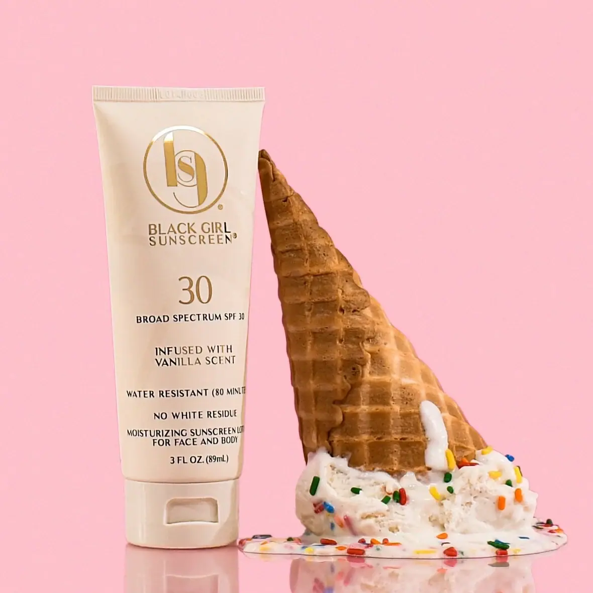
Black Girl Sunscreen
Cream tube with gold crest and an isolated SPF numeral

Bread Beauty Supply
bubblegum pumps and a fat black wordmark
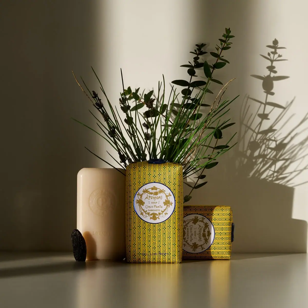
Claus Porto
Golden geometric wrapping around a pale floral medallion

Cocokind
sideways lowercase on spa-water pastels
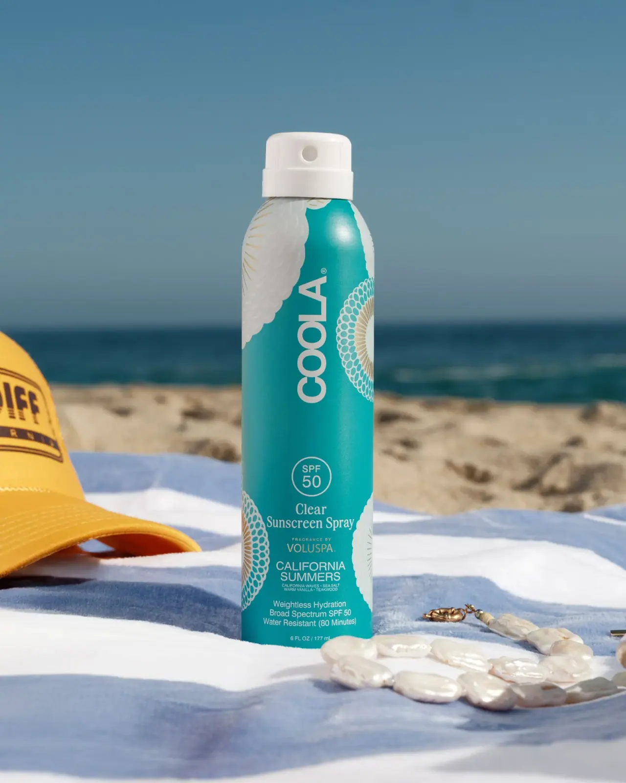
COOLA
Turquoise cylinder, cropped rosettes, vertical brand and fragrance attribution