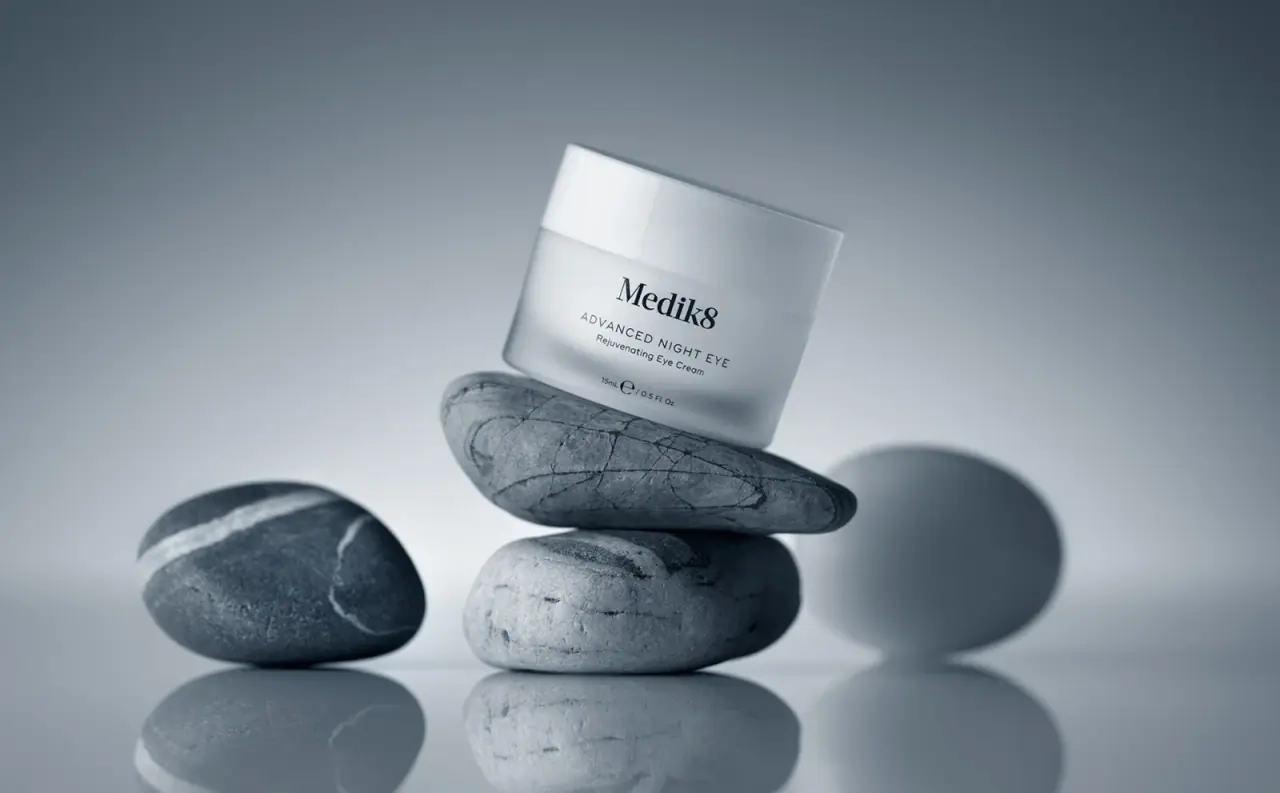
Photography: Leo Acker — Medik8 still-life photography. Images belong to their respective owners.
Medik8

Frosted eye-cream jar with a broad white lid
The selected Advanced Night Eye jar combines a pale frosted-looking body with a broad opaque white lid and a compact centred black text block. A large serif producer name sits above widely spaced uppercase naming, a small eye-cream descriptor and the 15 ml quantity line. Balanced on smooth stones in the photograph, the jar gains atmosphere from the scene while its own decoration remains almost entirely typographic. The official page confirms the size and warns that packaging can vary by region.
- Skincare
- Light pack
- Clinical minimal
About this study
Selected closed 15 ml frosted-looking Advanced Night Eye jar on stones. Regional variation and unverified component materials remain explicit.
Sources & evidence · Reviewed 2026-10-19Color Palette
Approximate colours interpreted from photography. These are screen references, not official brand colours or print specifications.
Pack body
Frosted pale grey
#D0D5D7
Approximate body appearance under cool light. The frosted wall softens tonal transitions without establishing its substrate.
Opaque lid white
#E4E8E9
The broad lid appears brighter and more opaque than the body. Its cool cast comes partly from scene lighting.
Ink
Near-black text
#20282D
Single visible information colour, from large producer to the small capacity line. The darker blue-grey stone and backdrop colours are excluded.
Typography
Suggested visual alternatives, not confirmed brand typefaces. Any scale below is an illustrative estimate.
Medik8 occupies the largest line with a strong serif silhouette. ADVANCED NIGHT EYE follows in much smaller, lightly spaced uppercase sans serif, with Rejuvenating Eye Cream below in sentence case. A separate quantity line sits near the base, including 15 ml and 0.5 fl oz. The producer, product and descriptor share a centred axis, but the space before the quantity creates a distinct bottom register. This small hierarchy is sufficient to explain the product without a coloured badge or front illustration.
Fonts
Producer alternative
Libre Baskerville
- Looks like
- Libre Baskerville
- Type
- Serif
- Weight
- Regular 400 / Bold 700
- Case
- Mixed case
- Tracking
- Neutral to close
- Fallback
- serif
A proposed strong serif identity for an original skincare producer. Keep the name compact enough to leave clear space above the product line, and develop distinct lettering rather than tracing the existing mark.
Product and information alternative
Inter
- Looks like
- Inter
- Type
- Sans serif
- Weight
- Regular 400 / Medium 500
- Case
- Uppercase product; sentence-case descriptor
- Tracking
- Moderately open product capitals; neutral small text
- Fallback
- sans-serif
Use a quiet sans serif to distinguish category information from the larger identity. Test the small descriptor on the real curved surface rather than judging only a flat artwork proof.
Structure & Proportions
Visual proportions and finish previews are illustrative. Confirmed construction details and uncertainties are distinguished in the study notes.
Proportions
| Purpose | Value | Preview |
|---|---|---|
| Lid and body balance | The lid is a substantial band above the lower jar, making the clean top plane an important part of the silhouette. | — |
| Centred text block | The compact front text occupies a limited middle area, with pale space around the producer and below the descriptor. | — |
| Quantity register | A small separate line near the bottom anchors the information without expanding the product-name block. | — |
Shapes
| Element | Value | Preview |
|---|---|---|
| Jar silhouette | Low cylindrical container with softened bottom edge. | |
| Lid plane | Broad circular top with a smooth straight side band. | |
| Information block | Centred stack of producer, uppercase name and smaller descriptor. |
Finishes
Frosted body appearance
Lower jar wall; exact material and frosting process unverified. · frosted
Smooth white lid
Opaque closure with a broad reflected highlight. · gloss
Formats and materials
| Formats | A small closed cylindrical eye-cream jar with a broad flat-topped white lid. The official page and visible front both identify 15 ml. |
| Materials | Medik8’s published recycling guide places Advanced Night Eye in its frosted-jar group and says that group is not currently recyclable. This establishes the brand’s stated category and guidance, not the exact substrate of the photographed specimen., The accessed pages do not establish body polymer or glass, lid material, inner cup construction or recycled-content percentage for this selected regional edition. The opaque white upper component should not be assigned a resin from colour alone. |
| Closures | A broad white lid meets the jar body at a clear horizontal seam. The photographed jar is closed, so internal threads, liner, seal and mouth geometry remain unseen. No refill mechanism is established by the selected photograph. |
| Decoration | Black typography forms the entire visible front information system. No separate paper-label edge is apparent, but direct printing is not confirmed from the photograph., There is no printed stone pattern on the jar: the veining belongs to the supporting photographic props. |
Front Panel
Schematic reading order. The diagram’s zone heights do not represent measured artwork proportions.
A centred typographic stack uses changes in size, case and type category to make the small jar readable. The large serif producer is followed by a longer uppercase product name, then a short descriptor. The quantity sits lower with enough separation to remain a distinct informational unit. The lid is left quiet, so the front body carries all the visible product identification.
| Zone | Content |
|---|---|
| Producer | The black serif identity provides the largest dark shape on the otherwise pale jar. Its width is narrower than the product-name line beneath it. |
| Product name | ADVANCED NIGHT EYE stretches across a longer line in small spaced capitals. It differentiates the product without changing the monochrome palette. |
| Category descriptor | Rejuvenating Eye Cream explains the format in a smaller sentence-case line. The wording is visible packaging copy, not an independent assessment of performance. |
| Capacity | The small 15 ml / 0.5 fl oz line sits near the bottom edge. Perspective and curved walls require care when judging its exact spacing. |
Range System
The official product page presents Advanced Night Eye alongside Advanced Night Restore, and the recycling guide groups them within frosted jars. Those sources support a related product context, but this study visually audits only the selected eye jar. Regional packaging variation is explicitly acknowledged by the brand, so a single image cannot establish one universal construction or exact label for every market.
- An original family of small and large jars can retain a shared producer position while making the product name clearly readable at each size. This is a transferable design principle, not a measured specification of the full Medik8 range.
- If construction changes by market or edition, keep catalogue material fields tied to a documented specimen. A familiar frosted appearance alone is insufficient to carry forward an older recycling statement.
Back of Pack & Shelf
The reverse, underside, inner lid and outer carton are absent from the selected composition. The official product page’s online details cannot establish where those details appear on this jar.
- Obtain a reverse and base view before describing ingredient, batch or instruction layout.
- Check the exact regional edition before presenting material or disposal instructions as applicable to a specimen.
- Do not infer a refill cup or removable inner vessel from the frosted outer wall.
On shelf
The serif producer is the clearest recognition cue when the image becomes small, followed by the long uppercase product line. The quiet lid and pale body make dark text do most of the work. This is a visual interpretation rather than a consumer test. For a reference catalogue, the atmospheric stone image should be complemented by an upright front view so that the small descriptor and quantity can be assessed without tilt or reflections.
Imagery
The jar leans on two stacked smooth stones, with another stone to the left, a cool grey background and a reflective base. Harder directional light creates a strong shadow behind the jar and makes stone veining visible. The product itself remains pale and calm against that texture. The composition suggests balance through physical arrangement, but it does not prove a mineral ingredient, stone component or ecological benefit. The photographer source URL could not be reopened during this review; the approved local asset was inspected directly.
Guidelines
Editorial principles for an original design brief, not official brand guidelines.
Do
- Keep the long uppercase product line distinct from the producer.
- Separate photographed appearance from verified component materials.
- Record regional packaging variation alongside material claims.
- Use neutral upright imagery to check the smallest text.
Don't
- Do not infer glass from a frosted wall.
- Do not turn stone props into an ingredient or material claim.
- Do not assume a refill insert is hidden inside the jar.
- Do not apply one recycling statement to every future or regional edition.
Sources & evidence
How this study was built
edition · Sourced fact
Official page confirms 15 ml and explicitly notes regional packaging variation.Advanced Night Eye — Medik8structure · Sourced fact
Brand guide groups Advanced Night Eye with frosted jars described as not currently recyclable; no exact substrate assigned.Recyclability Guide — Medik8typography · Visual observation
Large serif producer sits above spaced uppercase sans-serif name and smaller descriptor.label · Visual observation
Centred main block is separated from a small lower capacity line.palette · Visual observation
Pale frosted body, white lid and near-black text exclude grey stones from print palette.imagery · Visual observation
Closed jar balances on stones above a reflective surface with strong cast shadow.range · Editorial interpretation
Single regional specimen does not establish universal materials or all range labelling.
What remains unverified
- Body and lid substrate and frosting process unverified.
- Brand warns of regional packaging variation.
- Reverse, base, interior and carton not visible.
- Photographer page failed to reopen; local approved image inspected.
- Fonts proposed and colours approximate under cool scene lighting.
Give your AI
packaging taste
Give your design or image tool a packaging study: palette, type, structure, front panel and principles for an original brief.
Export this styleFree with an email. PACK.md works in Claude, ChatGPT, Cursor and image tools.
More like this

African Botanics
Technical black label with a low serif signature

AussieZinc
Sun-yellow numerals on a tall, information-rich white cylinder

bareMinerals
a restrained black compact framing the powder itself

BeautyPWR
Clear square shell, white cream cup, black serif identity

BioSeivas
Vertical serif identity on a mauve treatment band

Byoma
candy-coloured barrier science on a shelf
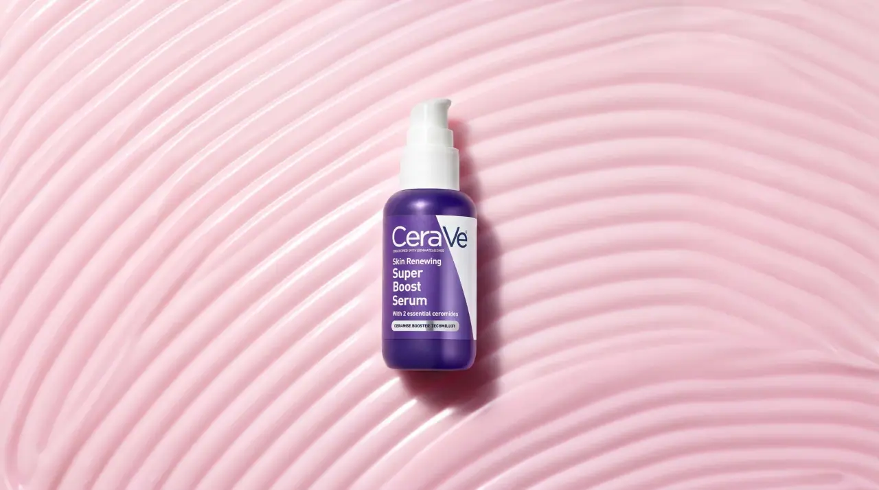
CeraVe
white pump bottles split by a coloured diagonal

Cocokind
sideways lowercase on spa-water pastels