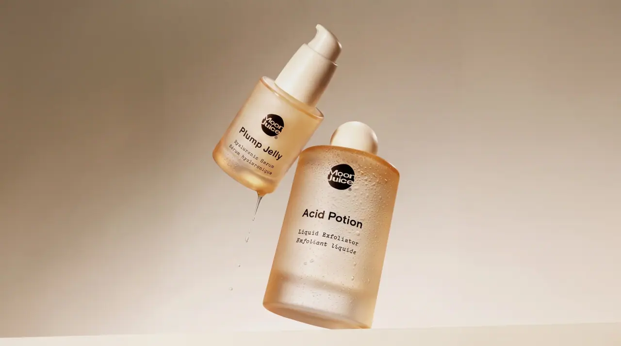
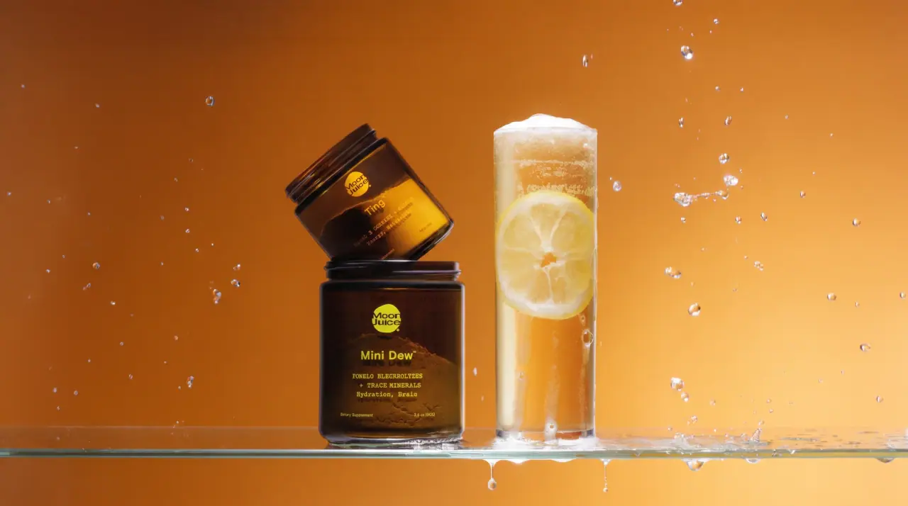
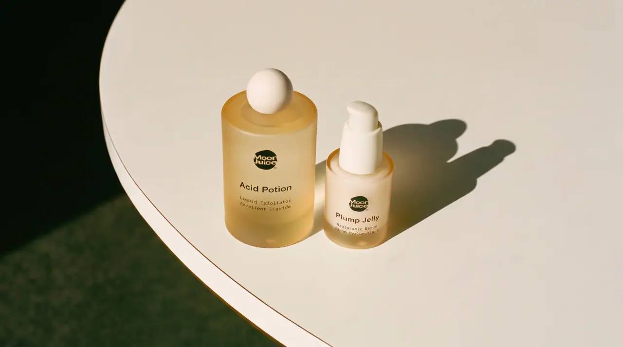
Campaign images © Moon Juice, from moonjuice.com
Moon Juice
amber apothecary jars at desert dusk
Moon Juice keeps its powders and capsules in amber glass (#6b300c) jars and bottles with wide black ribbed lids, printing straight onto the glass so the dark contents glow through. A ragged, brushy dark horizon band crosses the upper glass, and just under it a small solid circle holds the stacked rounded wordmark; the product name, an optional playful prefix ('NEURO', 'SLEEPY') and two lines of monospace ingredients and benefits are all printed in that same circle colour, so salmon, mint, lime, red or bone cream code the formula. Stick packs, cartons and books switch to warm cream paper (#efe7da) with large soft overlapping colour discs and a black wordmark roundel.
- Wellness & supplements
- Dark pack
- Apothecary
- Colour-coded range
Color Palette
Approximate colours interpreted from photography. These are screen references, not official brand colours or print specifications.
Pack body
Amber Glass
#6b300c
Tinted jars and capsule bottles, reading deep brown with the contents inside
Black Lid
#141111
Wide black ribbed screw lids on every jar and bottle
Label
Paper Cream
#efe7da
Ground of stick packs, cartons and the book cover
Ink
Bone Cream
#e7ddca
Badge and type on the capsule bottles
Accent
Horizon Umber
#3a1a0a
Ragged dark horizon band printed across the upper glass
Sunset Orange
#e97b2d
One of the soft overlapping discs on cream stick packs and cartons
Sage Disc
#8fb27a
Second overlapping disc colour on cream cartons
Range coding
Rose Clay
#e98a7b
Badge, product name and monospace lines on the relaxation magnesium jar
Dew Mint
#8fd2a6
Badge, product name and monospace lines on the electrolyte jar
Neuro Lime
#9ccf2c
Badge, prefix, product name and lines on the focus magnesium jar
Sleepy Red
#e2323b
Badge, prefix, product name and lines on the sleep magnesium jar
Typography
Suggested visual alternatives, not confirmed brand typefaces. Any scale below is an illustrative estimate.
The circular wordmark badge sits highest, just under the horizon band. Below it a small prefix in a quirky serif (on some products), then the product name in a larger soft geometric sans, then two or three short lines of monospace: key ingredients in capitals joined by plus signs and a benefit pair in title case. Supplement line and net weight are tiny at the base.
Type scale
Estimated cap size as a share of the panel · Front of the 4.2 oz magnesium powder jar, about 95 mm of glass below the lid
badge-circle
6% · Regular · Display
Star Tonic
product-name
6% · Medium · Headline
Calm-Ease
prefix
4% · SemiBold · Label
DREAMY
ingredients
2.2% · Regular · Body
BERRY CALM + L-THEANINE
benefits
2.2% · Regular · Body
Rest, Relaxation
supplement-line
1.2% · Regular · Body
Dietary Supplement
Fonts
Display
Caprasimo
- Looks like
- Cooper Black, Recoleta Black
- Type
- Bold soft rounded display serif
- Weight
- Regular (single heavy weight)
- Case
- Title case, stacked on two lines
- Tracking
- Tight, about -2%
- Fallback
- Cooper Black, Georgia Bold, serif
The stacked two-word wordmark inside the small solid circle, knocked out of the circle colour.
Headline
DM Sans
- Looks like
- Circular Medium, Gilroy Medium
- Type
- Soft geometric sans
- Weight
- Medium
- Case
- Title case with trademark
- Tracking
- Normal
- Fallback
- Avenir, Helvetica Neue, sans-serif
Product names ('Magnesi-Om', 'Mini Dew', 'SuperHair') in the circle colour.
Label
Fraunces
- Looks like
- Windsor, quirky display serif small caps
- Type
- Wonky soft serif
- Weight
- SemiBold
- Case
- Uppercase with a taller first letter
- Tracking
- Normal
- Fallback
- Cooper, Georgia, serif
Short prefix words above the product name on line extensions ('NEURO', 'SLEEPY').
Body
IBM Plex Mono
- Looks like
- GT America Mono, Maison Neue Mono
- Type
- Monospace
- Weight
- Regular
- Case
- Uppercase for ingredients, title case for benefits
- Tracking
- Wide, about +5%
- Fallback
- Courier, monospace
Ingredient line joined by plus signs, benefit pair, supplement line and net weight.
Structure & Proportions
Proportions
| Purpose | Value | Preview |
|---|---|---|
| Printed area on glass | About 25% of the jar front carries print; the rest is clear amber | |
| Horizon band | About 12% of glass height, just under the lid | |
| Badge diameter | About 15% of jar width | |
| Text column | Upper half of the glass only; lower half left clear | |
| Colours per jar | One print colour on amber, plus the dark horizon band | — |
| Density | Sparse: a small centred column with large empty glass below | — |
Shapes
| Element | Value | Preview |
|---|---|---|
| Powder jar | Wide straight-sided amber jar | |
| Wordmark badge | Small solid circle | |
| Horizon band | Ragged brushed edge like a desert ridge | |
| Lid | Wide black ribbed screw lid | |
| Paper discs | Large soft overlapping circles bleeding off carton edges |
Finishes
Glossy amber glass
Jars and capsule bottles · gloss
Matte cream paper
Stick packs, cartons and book · uncoated
Matte black lid
Every jar and bottle · matte
Formats and materials
| Formats | Wide powder jar, Capsule bottle, Single-serve stick pack, Stick-pack carton, Hardback book |
| Materials | Amber glass, Paper-look sachet film, Paperboard |
| Closures | Wide black ribbed screw lids on jars and bottles |
| Decoration | Direct print on glass, Circular wordmark badge, Brushy dark horizon band across the upper glass, Overlapping colour discs on paper |
Front Panel
Schematic reading order. The diagram’s zone heights do not represent measured artwork proportions.
Printed directly on the glass in a centred column on the upper half; the lower half is left as clear amber so the powder or capsules show.
| Zone | Content |
|---|---|
| Upper glass | Ragged dark horizon band, then the circular wordmark badge |
| Centre | Prefix and product name in the badge colour, monospace ingredient and benefit lines |
| Base | Dietary supplement line and net weight, small |
Range System
One vessel and one layout for everything; each formula owns a single colour applied to the wordmark badge and all the type, while paper formats reuse the same colours as soft discs on cream.
- Relaxation magnesium = rose clay badge + type
- Electrolytes = mint badge + type
- Focus magnesium = lime badge + 'NEURO' prefix
- Sleep magnesium = red badge + 'SLEEPY' prefix
- Hair and beauty capsules = bone cream badge + type
- Stick-pack carton = cream with orange, sage and pink discs
Back of Pack & Shelf
The back of the glass carries a supplement facts panel and short directions printed in the same colour as the front, with the ingredient list and a small brand line; the lower back is left clear like the front.
- Supplement facts table in the formula colour
- Suggested use in one or two monospace lines
- Other ingredients and allergen statement
- Short brand line and website
- Barcode and lot number printed small near the base
On shelf
Grouped together the jars read as a row of dark amber blocks with small glowing circles of colour at the top, so the system billboards by vessel and badge rather than by any large logo.
Imagery
No pictures on the jars; the contents through amber glass are the image, with only a brushy dark horizon line across the top. Paper packs use large soft-edged colour circles that overlap, and the book cover a blurred pastel orb.
Guidelines
Do
- Use amber glass (#6b300c) with a wide black ribbed lid for every powder and capsule product.
- Print a ragged dark horizon band across the top 12% of the glass.
- Place a small solid circle about 15% of jar width holding the stacked wordmark just under the band.
- Print the product name and all type in the same colour as the circle, and change that colour per formula.
- List ingredients and benefits in a monospace face, capitals for ingredients and title case for benefits.
- Leave the lower half of the jar clear so the contents show.
- On paper sachets and cartons, switch to cream (#efe7da) with large overlapping colour discs.
Don't
- Don't use clear or white jars; the amber tint is the system.
- Don't add paper labels or framed panels on the glass.
- Don't use more than one print colour per jar.
- Don't set ingredient lines in the rounded display face.
- Don't add botanical illustration or photography on pack.
- Don't print below the middle of the jar front.
Give your AI
packaging taste
Give your design or image tool a packaging study: palette, type, structure, front panel and principles for an original brief.
Export this styleFree with an email. PACK.md works in Claude, ChatGPT, Cursor and image tools.
More like this
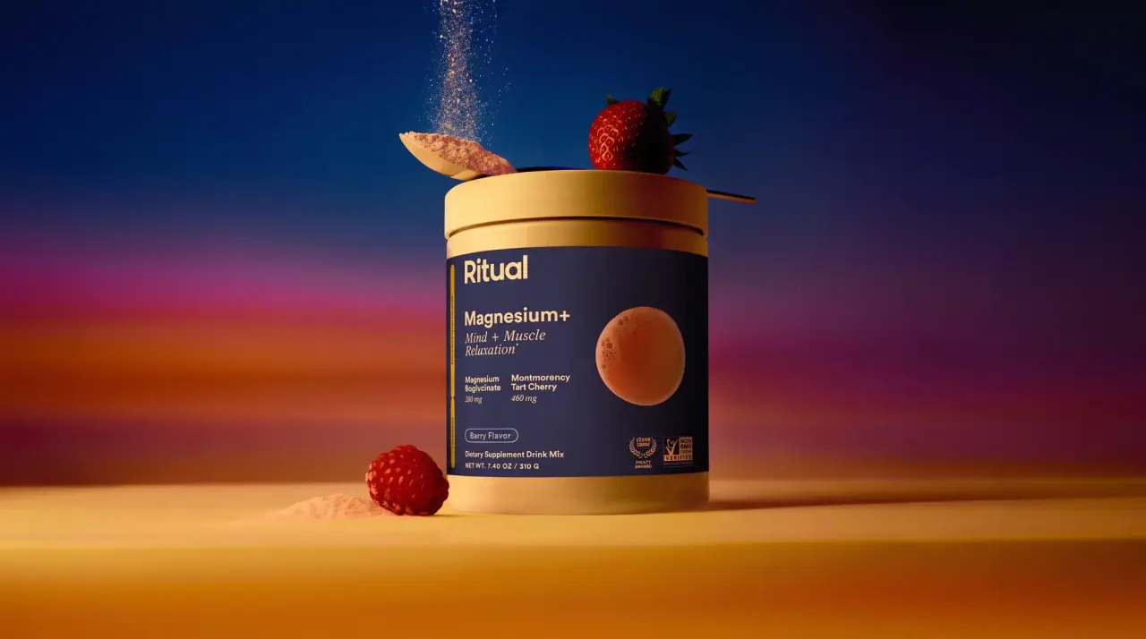
Ritual
see-through bottles and a single white dot

Aesop
a botanical still life around a disciplined apothecary label

AKT
Lilac stage directions with a quiet metallic detail

al.ive body
warm architectural calm, built as a paired vanity object
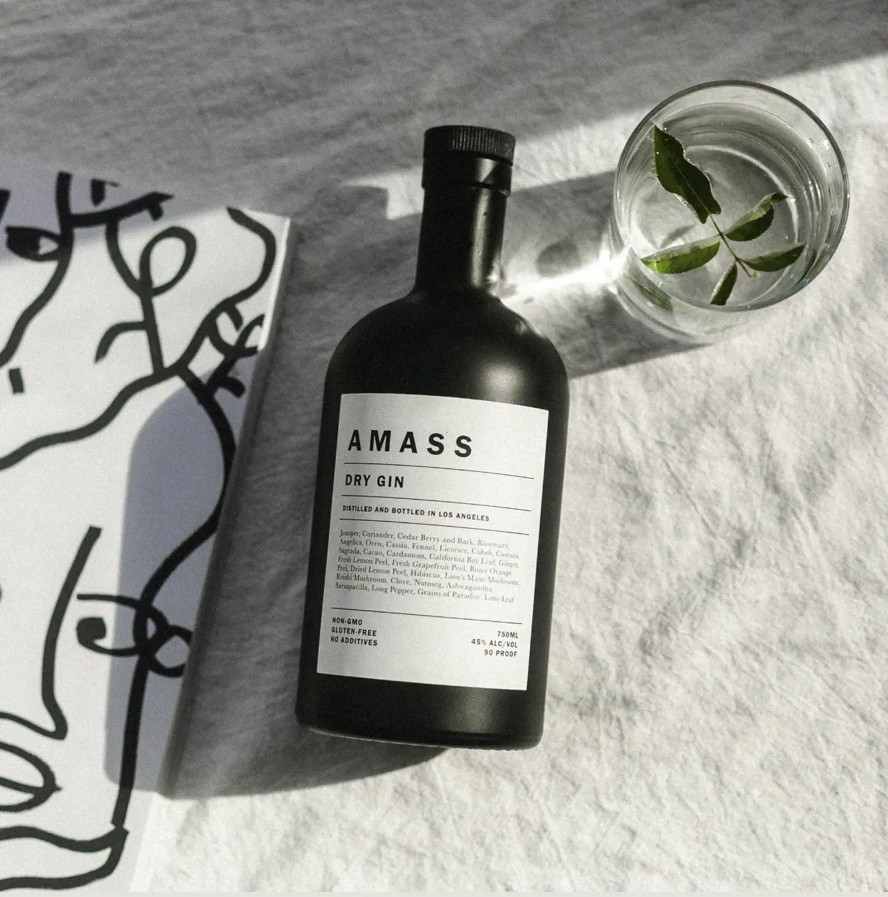
AMASS
A ruled botanical document on a dark rounded bottle
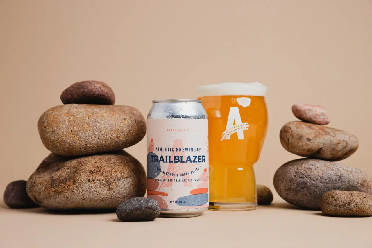
Athletic Brewing
trailhead poster cans under a wheat-stalk monogram

Bachan's
octopus mascot on a red-capped squeeze

Behave
struck-through wordmark on sour neon pouches