Campaign images © Ritual, from ritual.com
Ritual

see-through bottles and a single white dot
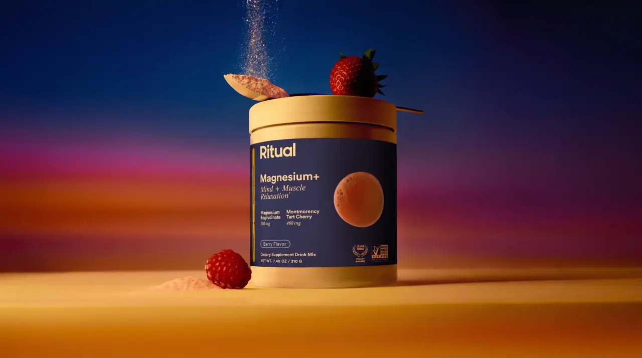
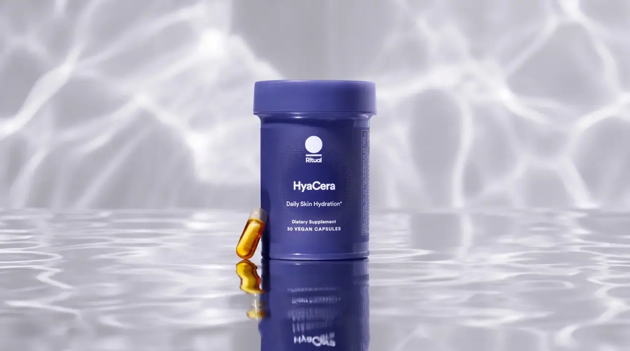
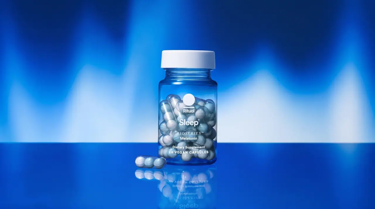
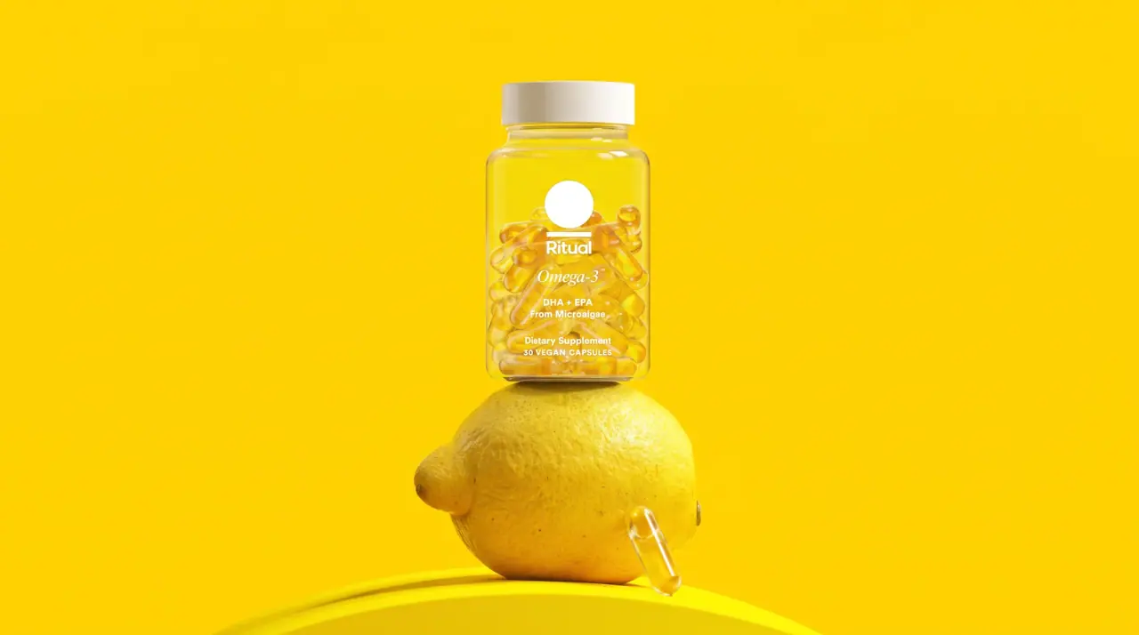
Ritual's core pack is a transparent PET bottle with a ribbed white cap, printed directly in white so the capsules themselves (amber oil softgels, clear capsules holding beadlets) become the colour and texture of the pack. A solid white circle sits above a medium-weight title-case wordmark, the product name follows as the largest text in a bold geometric sans with a serif-italic modifier line beneath, and a few small lines of supplement category and count close the stack; special lines tint the bottle itself, like the blue Sleep bottle. Powders move the same system onto a tub or pouch, where a flat field (Dusk Navy #1e2a4a, sage, silver) holds the type stack and a large circle on the side shows the colour of the powder.
- Wellness & supplements
- Light pack
- Clinical minimal
- Colour-coded range
Color Palette
Approximate colours interpreted from photography. These are screen references, not official brand colours or print specifications.
Pack body
Clear PET
#eef0ee
Transparent bottle that displays the capsules as the main colour
Cap White
#f7f6f2
Ribbed white screw cap on every bottle and the cream body of the powder tub
Ink
Print White
#ffffff
Dot, wordmark and all copy printed directly on clear and tinted bottles
Dusk Navy
#1e2a4a
Type on silver and sage pouches, and the label field on the magnesium tub
Accent
Capsule Gold
#e3c070
Colour of the visible oil softgels and beadlets, which reads through the clear bottle
Range coding
Sleep Blue
#2f6fae
Tinted blue bottle for the Sleep supplement
Greens Sage
#8fa877
Flat pouch colour for the creatine and greens powder
Shake Silver
#d9dade
Silver pouch for the protein shake, printed in navy
Powder Apricot
#f0a77a
Large circle showing the powder colour on the magnesium tub label
Typography
Suggested visual alternatives, not confirmed brand typefaces. Any scale below is an illustrative estimate.
A white dot leads, the wordmark sits directly under it, and the product name is the largest text, with a modifier in serif italic on the line below. Smaller lines name the supplement category and the capsule count at the bottom of the stack.
Type scale
Estimated cap size as a share of the panel · Front of the 30-count multivitamin bottle body, about 95 mm tall excluding cap
product-name
7% · Bold · Headline
Daily Iron+
wordmark
4.5% · Medium · Headline
Cadence
modifier
4% · Italic · Script
For Women 18+
nutrient-pair
2.5% · Medium · Body
300 mg Magnesium
category
2% · Regular · Body
Dietary supplement
count
1.8% · Medium · Body
30 DELAYED-RELEASE CAPSULES
Fonts
Headline
DM Sans
- Looks like
- Circular Bold, Avenir Next Bold
- Type
- Bold geometric sans
- Weight
- Medium, Bold
- Case
- Title case
- Tracking
- Slightly tight, about -1%
- Fallback
- Avenir Next, Helvetica
Wordmark (medium) under the dot and the product name (bold), the largest text on the pack.
Script
Newsreader
- Looks like
- Tiempos Text Italic, Freight Text Italic
- Type
- Text serif italic
- Weight
- Italic
- Case
- Title case or sentence case
- Tracking
- Normal
- Fallback
- Georgia Italic, Times Italic
Modifier line under the product name (target group or format), and italic units on nutrient pairs.
Body
DM Sans
- Looks like
- Circular Book
- Type
- Geometric sans, small sizes
- Weight
- Regular, Medium
- Case
- Mixed; tracked capitals for counts
- Tracking
- Normal; counts about +8%
- Fallback
- Avenir, Helvetica
Supplement category line, capsule count, nutrient amounts and back copy.
Structure & Proportions
Proportions
| Purpose | Value | Preview |
|---|---|---|
| Print coverage | About 20% of the bottle front; the rest is see-through | |
| Brand dot | About 8% of bottle width, centred above the wordmark | |
| Text stack width | About 70% of bottle width | |
| Stack position | Starts about 25% down the bottle body, reads top to bottom | — |
| Powder circle | About 55% of the tub label height, on the right side | |
| Colours per pack | One ink (white or navy) on clear, tinted or one flat field | — |
| Density | Sparse: a short text column and a lot of visible product | — |
Shapes
| Element | Value | Preview |
|---|---|---|
| Brand dot | Solid small circle above the wordmark | |
| Powder swatch | Large filled circle on tub and pouch labels | |
| Bottle | Round-shouldered cylinder | |
| Cap | Ribbed white screw cap | |
| Capsule | Clear pill-shaped capsule holding beadlets or oil |
Finishes
Clear gloss PET
Core supplement bottles · transparent
Tinted PET
Sleep bottle · transparent
Matte film
Sage and silver pouches · matte
Metallic film
Protein shake pouch · metallic
Formats and materials
| Formats | Supplement bottle, Stand-up pouch, Powder tub |
| Materials | Clear PET, Tinted PET, Flexible film, Plastic |
| Closures | Ribbed white screw caps on bottles, resealable zip on pouches, deep screw lid on the tub |
| Decoration | Direct white print on clear, Solid circle device, Large colour circle showing the product on powders |
Front Panel
Schematic reading order. The diagram’s zone heights do not represent measured artwork proportions.
No label on bottles: a short centred-left text stack printed in white across the front of the clear body. Powder packs hold the same stack on a flat colour field with a large circle on the right.
| Zone | Content |
|---|---|
| Top | Solid white dot and wordmark |
| Middle | Product name in bold sans, modifier in serif italic |
| Lower | Supplement category, capsule count or net weight |
| Powder right side | Large circle filled with the product's colour or a photographic texture of it |
Range System
On bottles, colour comes from what is inside (capsule colour) or from tinting the bottle itself; on powders, each product gets one flat field colour plus a circle in the powder's colour, while the dot, wordmark and type stack stay identical.
- Multivitamins = clear bottle showing gold softgels and beaded capsules
- Sleep = blue-tinted bottle
- Creatine greens = sage pouch with a green and yellow circle
- Protein shake = silver pouch with a cocoa-brown circle
- Magnesium = navy label on a cream tub with an apricot circle
Back of Pack & Shelf
The back of the bottle carries the supplement facts panel printed in white so the capsules still show through, with directions and warnings beside it; tubs and pouches put the same panel on the flat field.
- Supplement facts table with serving size and amounts per serving
- Other ingredients and allergen statement
- Suggested use and storage directions
- Third-party testing and traceability marks
- Barcode, lot number and distributor address
- Recycling note for the bottle and cap
On shelf
Lined up, the clear bottles read as a row of glowing capsules with an identical white dot-and-wordmark stack, so the brand is recognised by the transparency itself; tinted and powder packs stand out as single flat colours.
Imagery
The product is the image: visible capsules (amber softgels, clear capsules with beadlets) through clear plastic, or a single circle of powder colour on powder packs. No illustration.
Guidelines
Do
- Use a fully transparent bottle so the capsules provide the colour; print no more than about 20% of the front.
- Print all bottle copy in Print White (#ffffff) directly on the plastic, no paper label.
- Put a solid circle about 8% of bottle width above the wordmark as the brand device.
- Set the product name in the bold Headline sans and its modifier in the Script serif italic.
- Tint the bottle itself, e.g. Sleep Blue (#2f6fae), when a line needs its own identity.
- On powders, give each product one flat field colour and a large circle showing the powder.
Don't
- Don't wrap bottles in opaque labels that hide the contents.
- Don't use more than one ink colour on a bottle.
- Don't add illustrations, patterns or botanical drawings.
- Don't set the product name itself in the serif italic; it is only for modifiers.
- Don't use coloured caps; caps stay white.
- Don't make the wordmark larger than the product name.
Give your AI
packaging taste
Give your design or image tool a packaging study: palette, type, structure, front panel and principles for an original brief.
Export this styleFree with an email. PACK.md works in Claude, ChatGPT, Cursor and image tools.
More like this

Byoma
candy-coloured barrier science on a shelf
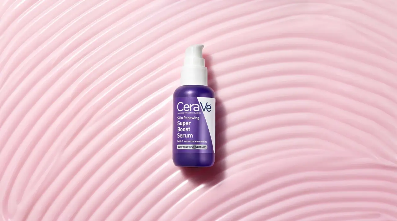
CeraVe
white pump bottles split by a coloured diagonal

Cocokind
sideways lowercase on spa-water pastels
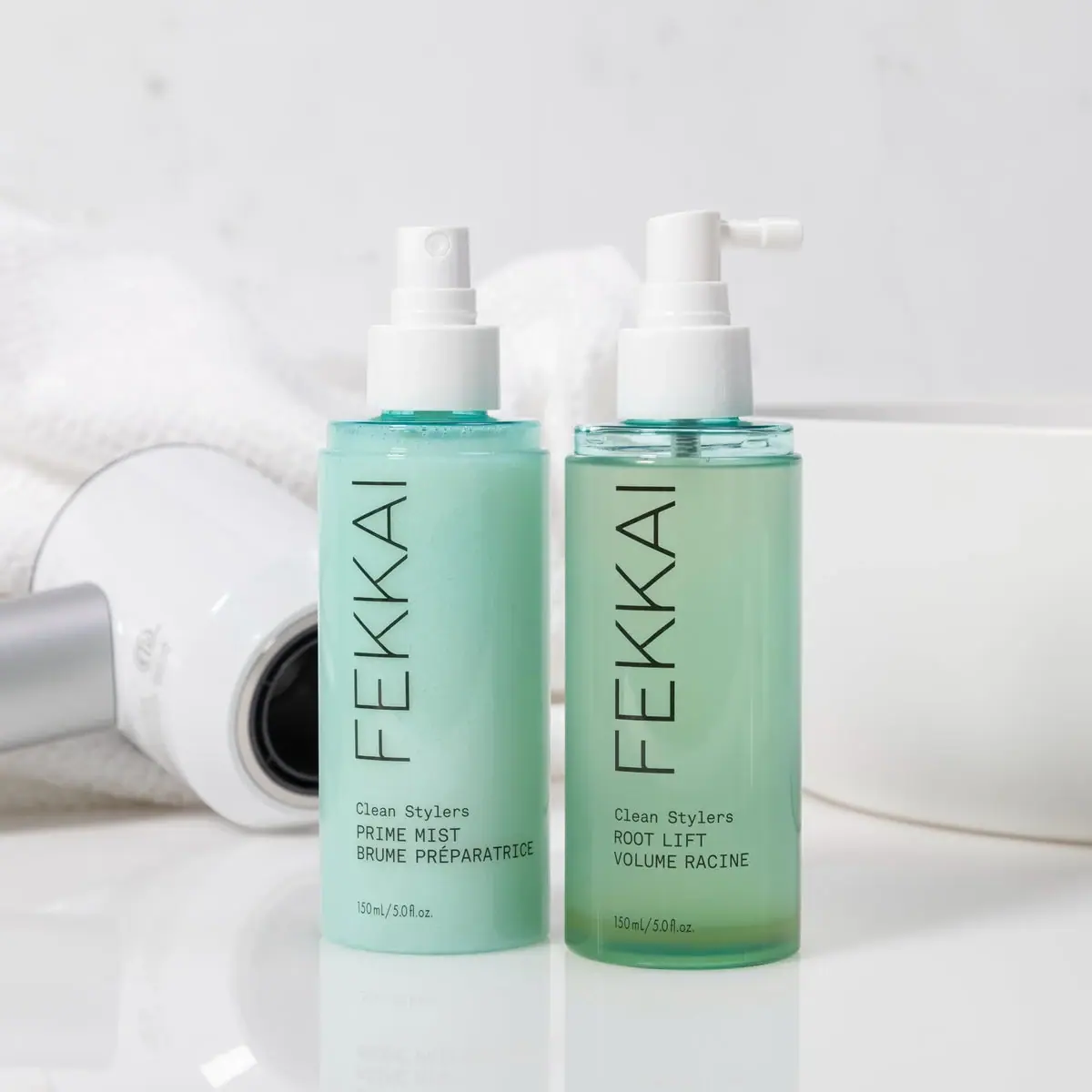
FEKKAI
Green styling duo with vertical hairline maker and white actuators
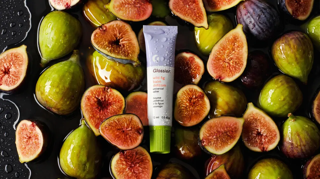
Glossier
clean white tubes with candy accents

Herbivore
pastel tinted vessels with a white tag
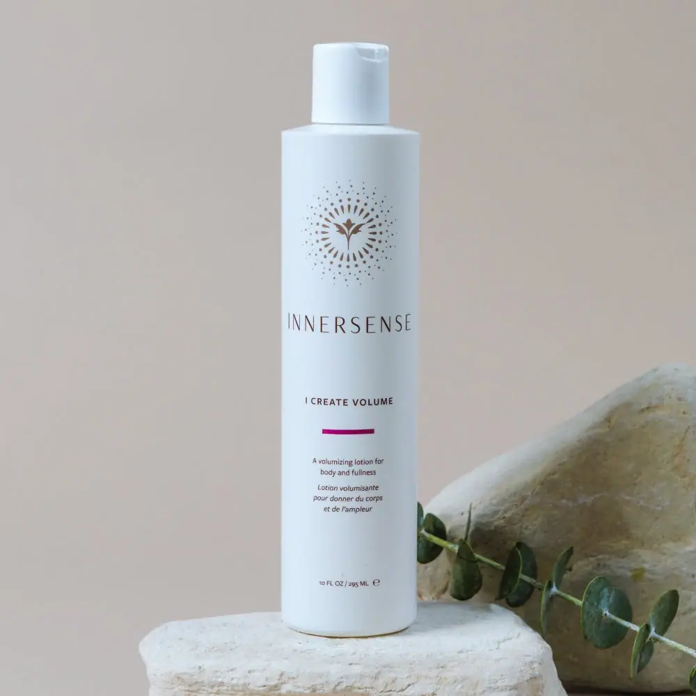
Innersense
Radiating bird emblem and magenta bar on a pale cylinder
Issey Miyake
Grey rectangular cap above a pale-to-blue oceanic gradient