Photography: MUTHA official photography. Images belong to their respective owners.
MUTHA

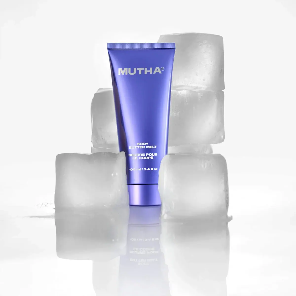
Reflective violet tube with bold maker and spacious middle
Body Butter Melt concentrates its identity in a reflective violet tube with a matching base cap. Heavy pale MUTHA capitals sit high on the broad front, while small centered English/French product blocks and a quantity line cluster near the lower end. A long blank interval gives the colored surface room to carry the design. The selected ice-block scene increases the cool optical impression, but the package's metallic-looking sheen is not proof of a metal tube or a particular coating process.
- Body & bath
- Light pack
- Bold typographic
- Luxe monochrome
About this study
Selected reflective violet Body Butter Melt tube with visible 100 ml / 3.4 fl oz front, photographed among ice blocks. No closure or material specification inferred from appearance.
Sources & evidence · Reviewed 2026-10-19Color Palette
Approximate colours interpreted from photography. These are screen references, not official brand colours or print specifications.
Pack body
Reflective violet
#5659B7
Approximate main tube and cap hue, with darker violet edges and pale lavender reflections caused by the curved surface and lighting.
Ink
Pale silver-white copy
#E6E5DA
Maker name and small product details provide the only clear printed contrast; the large maker appears slightly warmer than its brightest reflections.
Accent
Lavender highlight
#A09BED
Illustrative light band across the reflective-looking body, not an independently verified printed gradient or second material color.
Typography
Suggested visual alternatives, not confirmed brand typefaces. Any scale below is an illustrative estimate.
The maker name is a heavy, broad uppercase sans word placed near the top. Much lower down, BODY and BUTTER MELT form a small two-line block, followed by a similarly compact French description and a separate quantity line. The same firm sans character connects all the information, so the hierarchy comes from scale and distance more than font variety. The product blocks are centered within the narrowing lower body, while the large upper maker takes advantage of the wider area below the seal.
Fonts
Original bold maker
Montserrat
- Looks like
- Broad heavy geometric sans
- Type
- Geometric sans-serif
- Weight
- ExtraBold, Black
- Case
- Uppercase
- Tracking
- Compact optical spacing
- Fallback
- Arial, sans-serif
Use for a new short maker name with broad letterforms. Preserve space from the sloping tube edges and avoid copying the source's individual letter proportions.
Product and bilingual details
Archivo
- Looks like
- Compact sturdy sans
- Type
- Grotesque sans-serif
- Weight
- SemiBold, Bold
- Case
- Uppercase product blocks; mixed-case units
- Tracking
- Natural compact spacing
- Fallback
- Arial, sans-serif
Alternative for the small low-front information. A firm weight can withstand the reflective field, but the shortest lines should still have enough breathing room to remain distinct.
Structure & Proportions
Visual proportions and finish previews are illustrative. Confirmed construction details and uncertainties are distinguished in the study notes.
Proportions
| Purpose | Value | Preview |
|---|---|---|
| Upper width | The straight sealed edge is broader than the cap end, allowing the maker name to sit within a generous upper field. | — |
| Large open middle | Most of the interval between maker and product wording remains unprinted, emphasizing color and reflective curvature rather than a dense list of claims. | — |
| Small lower cluster | English and French wording forms short centered rows that fit the narrowing body, with a distinct gap before the quantity. | — |
| Short matching base | The cap is a compact lower segment that continues the violet object without a contrasting color break; its seam remains visible. | — |
Shapes
| Element | Value | Preview |
|---|---|---|
| Tube silhouette | Tall tapered body with straight ribbed top seal and softly curved sides. | |
| Closed base cap | Short matching cover divided from the body by a dark horizontal seam. | |
| Maker block | Broad uppercase word across the upper front. | |
| Product cluster | Several short centered text blocks grouped low on the body. |
Finishes
Violet metallic-looking surface
Body and cap display bright lavender bands and dark edge reflections; exact process unverified. · metallic
Smooth reflective curvature
Long front highlights define the taper; no separate gloss coating specification confirmed. · gloss
Formats and materials
| Formats | Upright tapered tube with matching lower cap; selected front visibly states 100 ml / 3.4 fl oz |
| Materials | The tube has a smooth reflective violet appearance. Exact substrate, barrier layers, metal content, recycled content and coating method are not identified in the accessed official product information., The cap shares the color and reflective look, but that visual match does not prove identical materials. Ice props and condensation-like scene details do not establish package temperature resistance. |
| Closures | The matching base cap is closed and separated from the tube by a narrow dark seam. Its sides continue the lower silhouette with a slightly different curvature. The front view does not reveal a hinge, threading, dispensing opening or internal seal clearly enough to specify a mechanism. The upper end is visibly flattened and ribbed, providing the tube's broad horizontal termination. |
| Decoration | Large heavy maker word high on the body, Uninterrupted violet middle field, Small centered English and French product descriptions near the base, Separated lower quantity statement |
Front Panel
Schematic reading order. The diagram’s zone heights do not represent measured artwork proportions.
The front has two distant information anchors: maker above and product below. There is no visible separate paper panel, frame or large illustration. Small English and French blocks share a centered alignment, followed by a clearly isolated volume line. The blank middle is active design space because it displays a continuous reflected gradient. Those light bands should not be reconstructed as printed stripes without production evidence; they are part of how the object is lit and curved.
| Zone | Content |
|---|---|
| Maker identity | Large pale MUTHA capitals and a small registration mark sit beneath the broad sealed top. |
| Open color field | A long uninterrupted violet area separates maker and function, allowing the reflective surface to define the object. |
| English product | BODY BUTTER MELT is arranged as a short two-line lower block in heavy small capitals. |
| French category | A separate French body-butter description follows in similarly weighted centered lines, providing category context rather than a new graphic badge. |
| Net contents | 100 ml / 3.4 fl oz appears beneath the product blocks above the cap seam, readable in the selected photo. |
Range System
The official page presents Melt as a lighter-textured variation of the brand's body butter. That product relationship does not establish that other MUTHA packs share the same tube, exact violet or reflective process. Only this selected object is visually analyzed. An independent family can borrow the idea of consistent color plus a stable maker/product separation without copying the source identity.
- Keep a large maker anchor in a similar location while adapting lower product blocks to each format's available width.
- Use explicit function names when several products share a strong common color.
- Treat a new cap or vessel material as a separate specification even when a matching finish makes the components look continuous.
Back of Pack & Shelf
The reverse, underside and open cap are not shown. Front bilingual wording and quantity do not establish the location of complete ingredients or use information.
- Inspect the back before documenting the full information hierarchy.
- Confirm the closure mechanism before calling it flip-top or screw closure.
- Do not turn an ice-styled campaign into unsupported storage instructions.
On shelf
Interpretively, the single saturated color and large maker can support recognition even when fine lower copy is too small to read. The reflective surface adds visual interest without pattern, but its highlights may also reduce contrast over the small text. An original design should be checked under diffuse and hard light, with the tube empty or squeezed as well as pristine. Matching cap color creates continuity, while the dark seam remains a useful clue to component separation.
Imagery
Large translucent ice blocks surround the upright tube on a wet-looking reflective surface. Some sit behind the upper body and others partly obscure the lower side edges, while the main text stays readable. The white-gray set makes violet the only saturated object color and produces a soft inverted reflection below. The current product page separately notes seasonal ice-pack shipping, but the campaign does not demonstrate user refrigeration requirements or a cooling skincare effect. The scene's texture is external to the package.
Guidelines
Editorial principles for an original design brief, not official brand guidelines.
Do
- Use the broad upper area for a clear maker name.
- Keep bilingual function blocks distinct from quantity.
- Leave sufficient open space for a reflective surface to read.
- Distinguish optical sheen from material composition.
- Check small text across changing highlights.
Don't
- Do not infer an aluminum tube from metallic-looking color.
- Do not assume cap and body share material because they match.
- Do not specify a hidden closure mechanism.
- Do not claim the ice scene proves cooling benefits or storage requirements.
- Do not copy the maker lettering and exact violet arrangement.
Sources & evidence
- MUTHA — Body Butter Meltproduct
- MUTHA — 360° Clean Routineproduct
How this study was built
edition · Sourced fact
Official page identifies Body Butter Melt as a variation of the body-butter product; selected front supplies visible quantity.MUTHA — Body Butter Meltstructure · Visual observation
Tapered violet tube has a ribbed top seal and matching closed lower cap separated by a dark seam.MUTHA — Body Butter Melttypography · Visual observation
Heavy maker sits high; small centered bilingual blocks and quantity cluster near the base.MUTHA — Body Butter Meltlabel · Visual observation
Long blank middle displays reflective color without a separate label panel or illustration.MUTHA — Body Butter Meltpalette · Visual observation
Violet and pale copy define the pack; lavender bands are optical highlights rather than verified printed gradients.MUTHA — Body Butter Meltimagery · Visual observation
Ice blocks and wet reflection surround the object without proving skincare temperature effects.MUTHA — 360° Clean Routinerange · Editorial interpretation
A consistent maker/product separation can organize an original family; no universal MUTHA color or construction rule asserted.
What remains unverified
- Tube layers, cap material and reflective finish process unverified.
- Closed cap mechanism, reverse and underside unseen.
- Original fonts and exact dimensions unknown.
- Ice styling does not establish consumer storage or cooling effects.
Give your AI
packaging taste
Give your design or image tool a packaging study: palette, type, structure, front panel and principles for an original brief.
Export this styleFree with an email. PACK.md works in Claude, ChatGPT, Cursor and image tools.
More like this

Color Wow
Tall condensed naming on a broad reflective silver jar
DIZZIAK
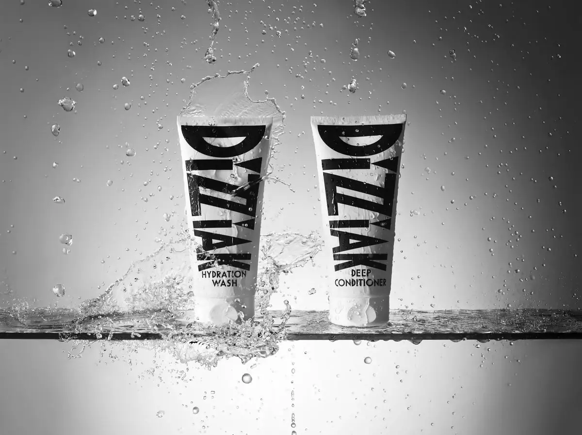
Oversized black lettering unites two pale haircare tubes

EADEM
Mirror-bright tube, oversized black identity, juicy campaign color
MAKE UP FOR EVER
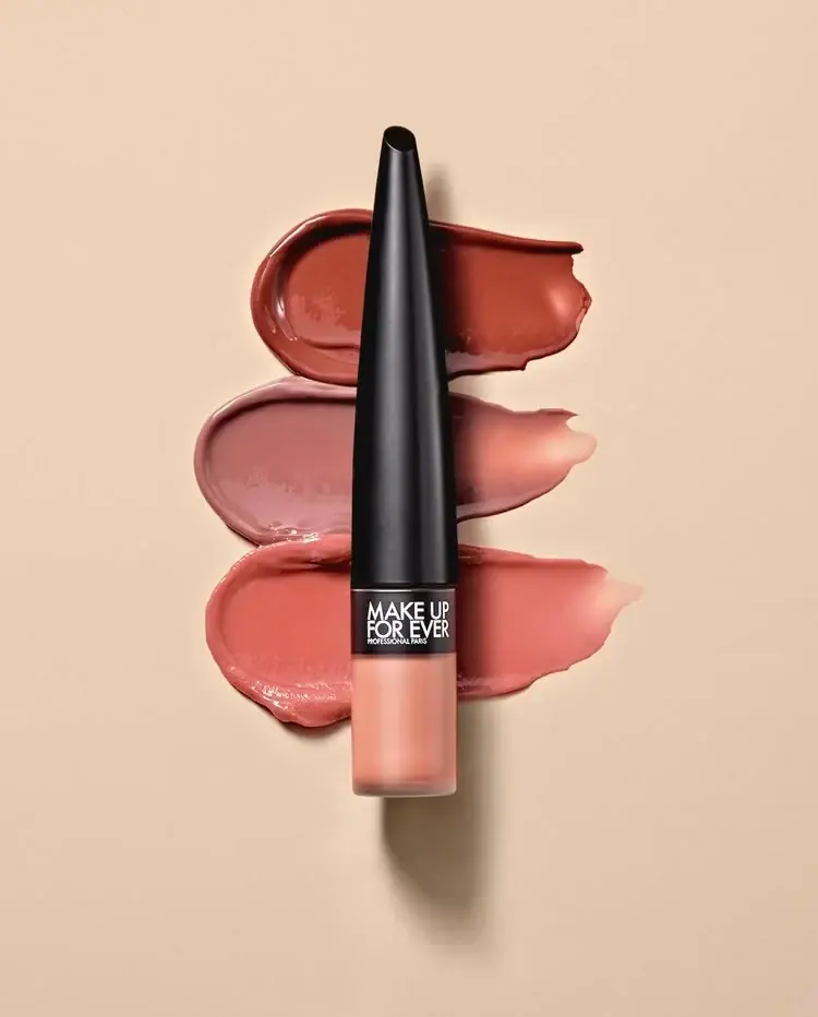
Long tapered black cap above a compact colour chamber
NARS
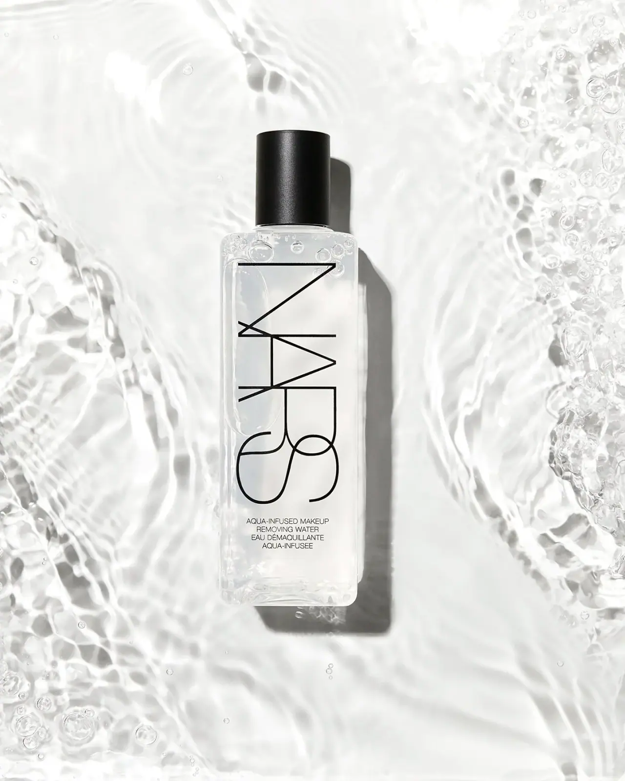
Clear elongated bottle with oversized interlocking mark and black cap

Pat McGrath Labs
Gold pigment kit with sparse labelling and sequin-filled pouch
Rodial
Reflective silver with parallel vertical foundation lettering

Saie
giant lowercase wordmark over frosted shade