Photography: Pat McGrath Labs official photography. Images belong to their respective owners.
Pat McGrath Labs

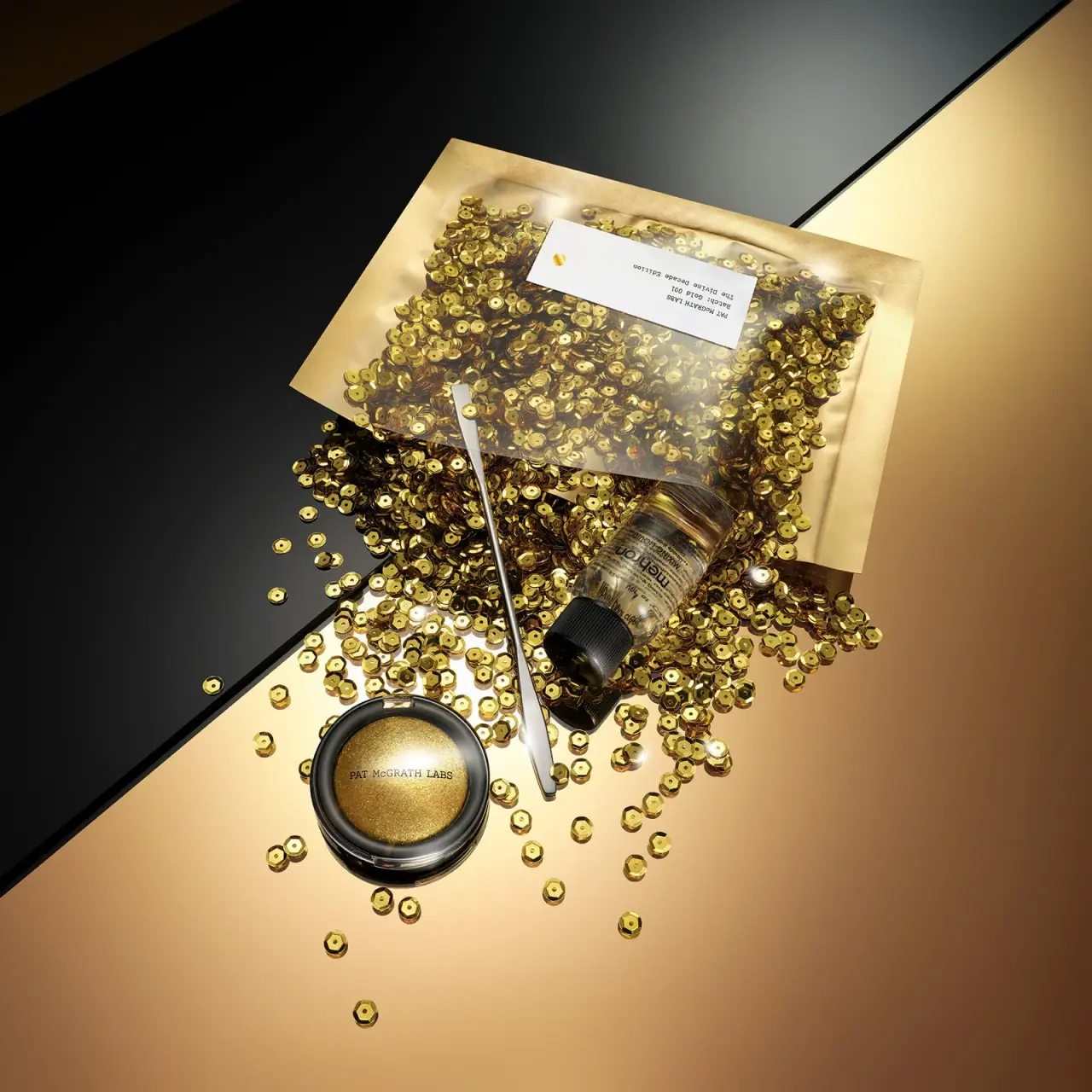
Gold pigment kit with sparse labelling and sequin-filled pouch
The selected Divine Decade image brings together a small round Gold 001 compact, a mixing-liquid bottle, a metal spatula and a transparent-window pouch filled with gold sequins. The pouch’s large white label uses tiny black type and a single gold dot, while the compact reveals the pigment through its clear-looking lid. The contrast between sparse identification and abundant reflective texture makes the anniversary presentation theatrical. The official set lists pigment, mixing liquid and spatula; pouch inclusion is not independently confirmed by that contents list.
- Make-up
- Light pack
- Luxe monochrome
- Bold typographic
About this study
Selected Divine Decade editorial kit scene. Pigment, 1 oz mixing liquid and metal spatula source-confirmed; pouch/sequins treated as photographed presentation without guaranteed inclusion.
Sources & evidence · Reviewed 2026-10-19Color Palette
Approximate colours interpreted from photography. These are screen references, not official brand colours or print specifications.
Pack body
Black compact and bottle cap
#181715
Dark circular compact rim and ribbed mixing-bottle cap create defined functional shapes among the sequins.
Label
White identification panel
#F2F1EB
Rectangular pouch label with extensive empty space around small black text and gold dot.
Ink
Black information
#28251F
Tiny pouch identification, compact producer and mixing-bottle copy.
Accent
Reflective gold presentation
#C8A752
Approximate pouch border and sequin appearance. Highlights and shadows vary widely; this is not a single fixed metallic ink specification.
Silver tool
#C9CBC5
Metal spatula confirmed by the official contents list. Reflected gold from the scene can warm its appearance.
Typography
Suggested visual alternatives, not confirmed brand typefaces. Any scale below is an illustrative estimate.
The pouch identification is deliberately small relative to its white rectangle: producer, Batch: Gold 001 and the edition title form a short text block near one end, with a gold dot separated by a large blank interval. The compact carries a single PAT McGRATH LABS line across its transparent-looking lid, letting the gold pigment remain visible behind it. The Mehron bottle retains its own denser black information system. The set is unified through colour and staging rather than identical typography on every component.
Fonts
Pouch identification alternative
IBM Plex Mono
- Looks like
- IBM Plex Mono
- Type
- Monospace
- Weight
- Regular 400
- Case
- Uppercase producer with mixed-case batch and edition
- Tracking
- Natural monospace rhythm
- Fallback
- monospace
A proposed laboratory-like voice for an original set label. Keep information intentionally sparse, but ensure it remains readable at the actual pouch size rather than relying on a large editorial image.
Compact producer alternative
Libre Baskerville
- Looks like
- Libre Baskerville
- Type
- Serif
- Weight
- Regular 400
- Case
- Uppercase with distinctive mixed-case treatment if appropriate
- Tracking
- Neutral
- Fallback
- serif
A small serif attribution can sit over visible product colour. Develop a unique producer name and verify contrast against both light and dark pigment reflections.
Structure & Proportions
Visual proportions and finish previews are illustrative. Confirmed construction details and uncertainties are distinguished in the study notes.
Proportions
| Purpose | Value | Preview |
|---|---|---|
| Pouch versus compact | The pouch occupies a broad rectangular area above the much smaller round compact, creating a large presentation field around the core pigment. | — |
| White label | The identification rectangle is broad relative to its tiny text, making empty space a deliberate visual component. | — |
| Long tool | The narrow spatula spans much of the distance between pouch and compact, connecting the separate kit pieces in the composition. | — |
Shapes
| Element | Value | Preview |
|---|---|---|
| Presentation pouch | Broad rectangular transparent-window form with a gold-coloured border. | |
| Pigment compact | Small circular black-rimmed case with transparent-looking lid. | |
| Mixing bottle cap | Short ribbed black cylindrical closure. | |
| Spatula | Long narrow metal tool with flattened ends. | |
| Sequin discs | Small reflective round pieces with centre holes, shown loose and behind pouch window. |
Finishes
Gold presentation reflections
Pouch border and sequins; material and coating unknown. · metallic
Transparent viewing areas
Pouch window and compact lid; substrate unverified. · transparent
Black compact rim
Circular pigment case. · gloss
Metal spatula
Source-confirmed tool, exact alloy unspecified. · metallic
Formats and materials
| Formats | The official set contains Gold 001 pigment, a metal spatula and 1 oz Mehron Mixing Liquid. The selected photograph displays those objects with a rectangular transparent-window pouch and loose sequins., The pigment sits in a small round black-rimmed compact with a clear-looking lid. The mixing liquid is in a small transparent-looking bottle with a ribbed black cap. |
| Materials | Metal is explicitly stated for the spatula. Pouch film, border laminate, sequins, compact body/lid and mixing-bottle substrate are not specified in the accessed official page., Gold appearance is distributed across product, pouch and loose decoration. It does not establish gold metal content, foil construction or a common material across those elements. |
| Closures | The compact appears closed, with its transparent-looking lid showing the pigment and a small edge catch visible. The bottle has a closed ribbed cap. The pouch is partly covered and arranged at an angle; an exact zipper, reseal mechanism or shipping seal is not confirmed from this view. |
| Decoration | The pouch label balances a very small black text block against a single gold dot and generous blank space., The compact uses minimal producer lettering over the visible gold pigment, while the mixing-liquid bottle retains a separate supplier label rather than being disguised as an identical house container. |
Front Panel
Schematic reading order. The diagram’s zone heights do not represent measured artwork proportions.
The presentation has three separate information systems. The pouch uses a sparse batch-style white label; the compact uses a single producer line; the mixing bottle carries its own supplier identity and dense functional copy. Their coexistence makes the set feel like a collection of working materials rather than one uniform decorative object. Gold colour and the sequin field provide visual continuity across those differences.
| Zone | Content |
|---|---|
| Pouch identification | Small black producer, batch and edition text sits near one end of the white rectangle. The image is rotated, so its reading orientation follows the pouch rather than the page. |
| Isolated gold dot | A small round accent occupies the opposite part of the label, separated from the text by substantial white space. |
| Compact lid | A narrow producer line crosses the transparent-looking lid above the visible gold pigment. The pigment colour is content, not printed gold fill. |
| Mixing-bottle information | The supplier name and smaller copy remain visible on the clear-looking bottle. The exact complete text is not transcribed from the oblique image. |
Range System
The official page describes a limited-edition return of Gold 001 in the Divine Decade set and identifies the original launch context. This study focuses on that selected kit presentation. It does not claim that every Pat McGrath product uses a sequin pouch or that the photographed pouch is guaranteed by the listed set contents.
- An original anniversary kit can reveal working tools alongside a hero pigment, using a shared colour story to connect components with different labels. Keep supplier identity clear where a separate branded medium is included.
- A sparse outer label can contrast with an expressive presentation, but the product contents and optional styling must be documented separately. Do not let a dramatic image become an inaccurate inventory list.
Back of Pack & Shelf
The compact underside, pouch reverse and complete mixing-bottle label are unseen. The official contents list establishes the three functional items but does not document every photographed presentation element or its rear information.
- Verify the final sale pack before stating that a pouch or sequins are included.
- Obtain the compact base before assigning pigment weight or shade-label layout.
- Do not infer pouch resealability or bottle dispensing details from the closed oblique view.
On shelf
The sequin-filled window and white label create the first presentation-level recognition, while the compact’s gold contents become the focal product below. Tiny text has less visibility than the dramatic colour and texture. This is visual interpretation rather than a shelf or conversion test. A reference catalogue should distinguish the full editorial scene from confirmed set inventory and provide a close view of the compact and functional labels.
Imagery
The objects are scattered diagonally across adjoining black and warm gold reflective planes. Sequins spill from the pouch area around the mixing bottle, spatula and compact, turning the small pigment into part of a much larger gold field. The metal tool provides a straight directional line through the round discs. Strong reflections make the scene feel rich but can hide edges, so individual neutral component images would be necessary to document actual construction.
Guidelines
Editorial principles for an original design brief, not official brand guidelines.
Do
- Separate confirmed set contents from photographed presentation elements.
- Keep supplier identity readable on the mixing medium.
- Document pigment colour separately from gold packaging decoration.
- Use close component views to clarify reflective edges and closures.
Don't
- Do not guarantee pouch or sequin inclusion from the image alone.
- Do not call every gold surface foil or gold metal.
- Do not infer a pouch zipper from a partially obscured edge.
- Do not invent pigment weight or compact refillability.
Sources & evidence
How this study was built
edition · Sourced fact
Official page describes limited-edition Gold 001 return in Divine Decade context.Gold 001: The Divine Decade Edition — Pat McGrath Labsstructure · Sourced fact
Contents list names pigment, metal spatula and 1 oz Mehron Mixing Liquid.Gold 001: The Divine Decade Edition — Pat McGrath Labstypography · Visual observation
Tiny batch-style pouch text contrasts with compact serif producer and separate supplier bottle copy.label · Visual observation
White rectangle contains a small text block and isolated gold dot.palette · Visual observation
Gold reflections, white label and black functional components unify the presentation.imagery · Visual observation
Sequin field surrounds compact, bottle and long spatula on black/gold planes.range · Editorial interpretation
Editorial scene does not by itself establish final sale inventory or a universal brand packaging rule.
What remains unverified
- Pouch and sequins not explicitly listed among confirmed functional set contents.
- Pouch film, sequin, compact and bottle materials unverified; spatula metal confirmed only.
- Pouch closure, compact underside and full bottle label unseen.
- Fonts proposed and reflective colours approximate.
Give your AI
packaging taste
Give your design or image tool a packaging study: palette, type, structure, front panel and principles for an original brief.
Export this styleFree with an email. PACK.md works in Claude, ChatGPT, Cursor and image tools.
More like this

Color Wow
Tall condensed naming on a broad reflective silver jar
DIZZIAK
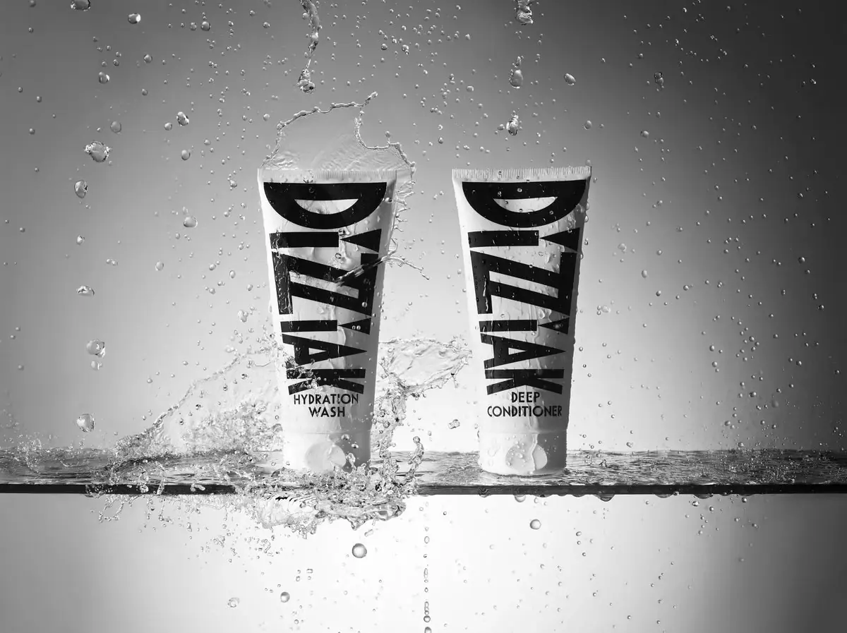
Oversized black lettering unites two pale haircare tubes

EADEM
Mirror-bright tube, oversized black identity, juicy campaign color
MAKE UP FOR EVER
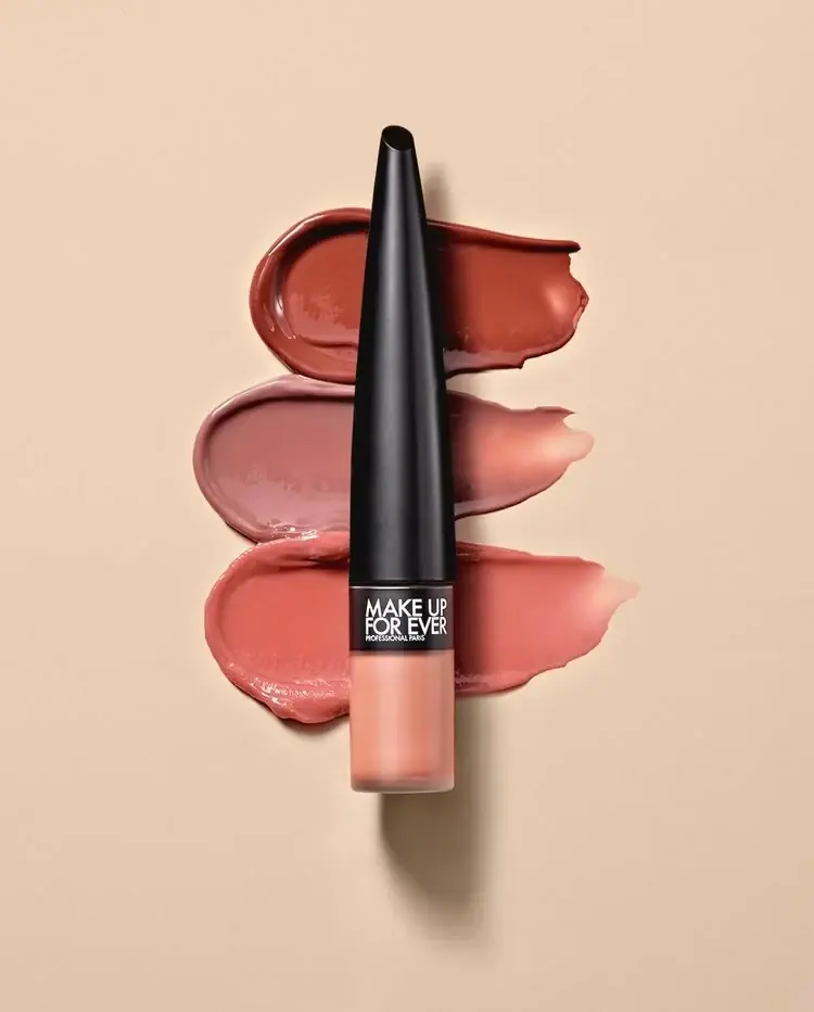
Long tapered black cap above a compact colour chamber
MUTHA
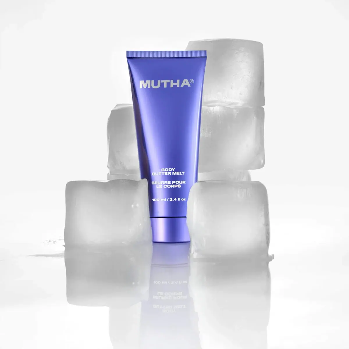
Reflective violet tube with bold maker and spacious middle
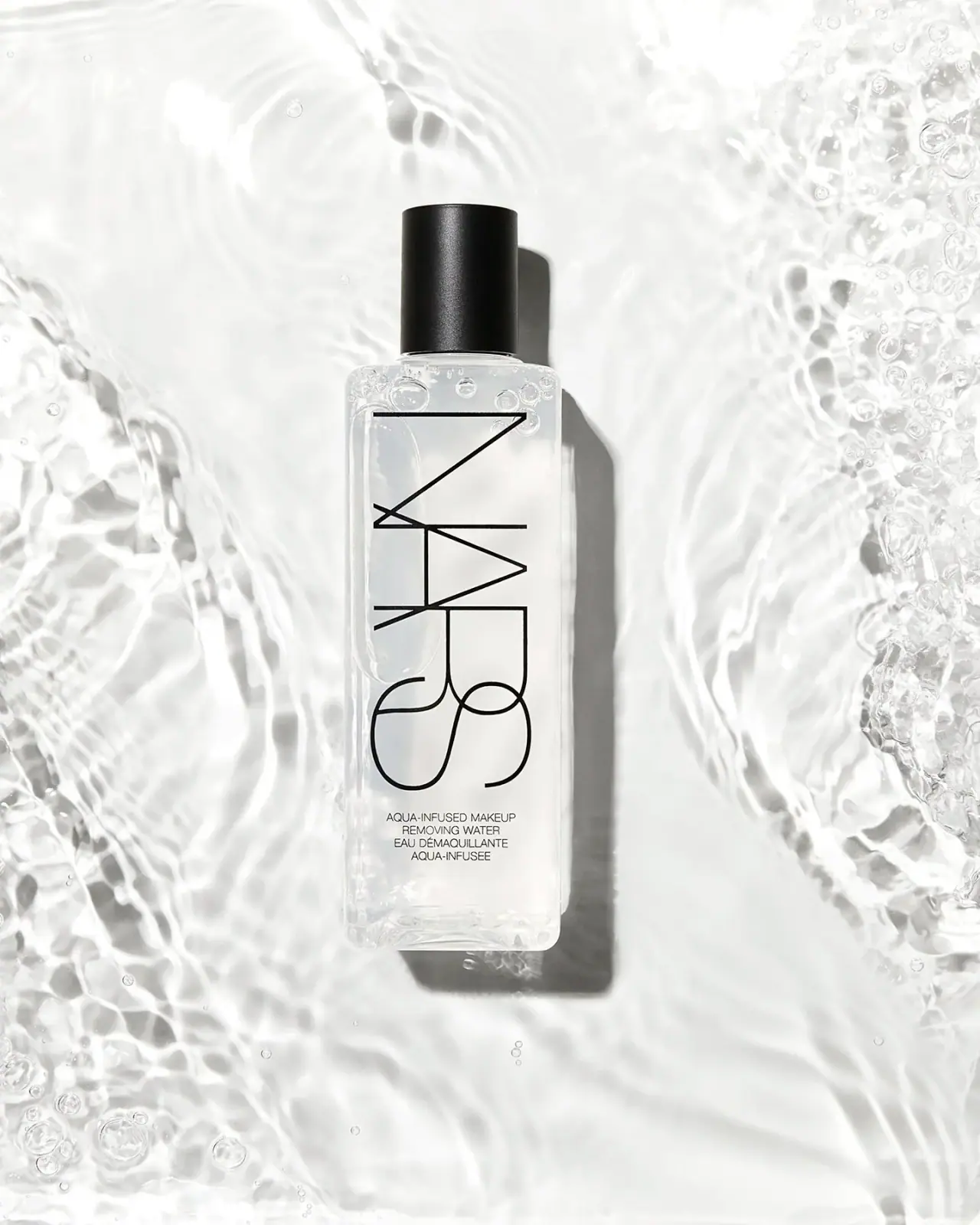
NARS
Clear elongated bottle with oversized interlocking mark and black cap
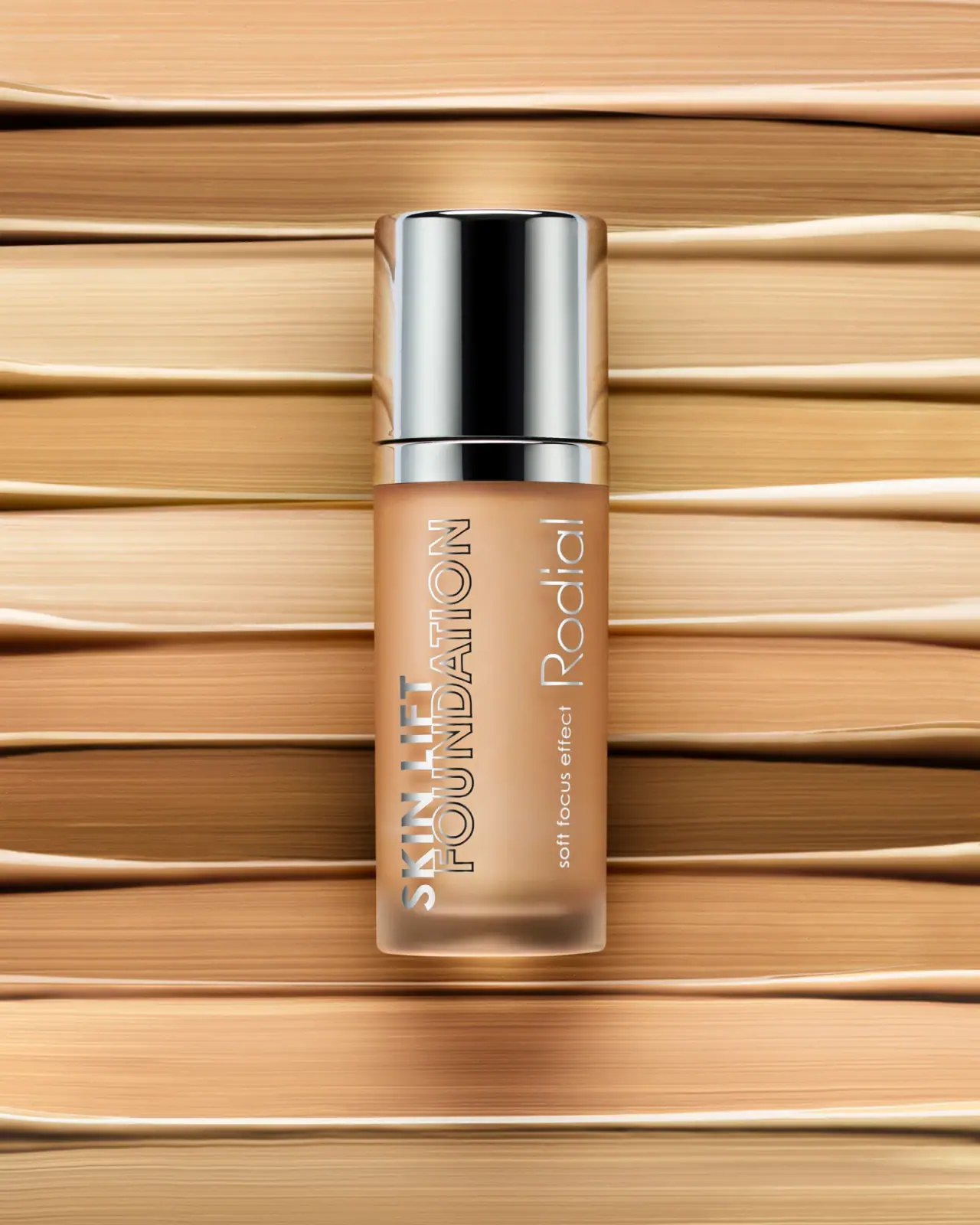
Rodial
Reflective silver with parallel vertical foundation lettering

Saie
giant lowercase wordmark over frosted shade