Photography: Alana Tyler Slutsky / ATS Studio — product photography. Images belong to their respective owners.
NARS

Clear elongated bottle with oversized interlocking mark and black cap
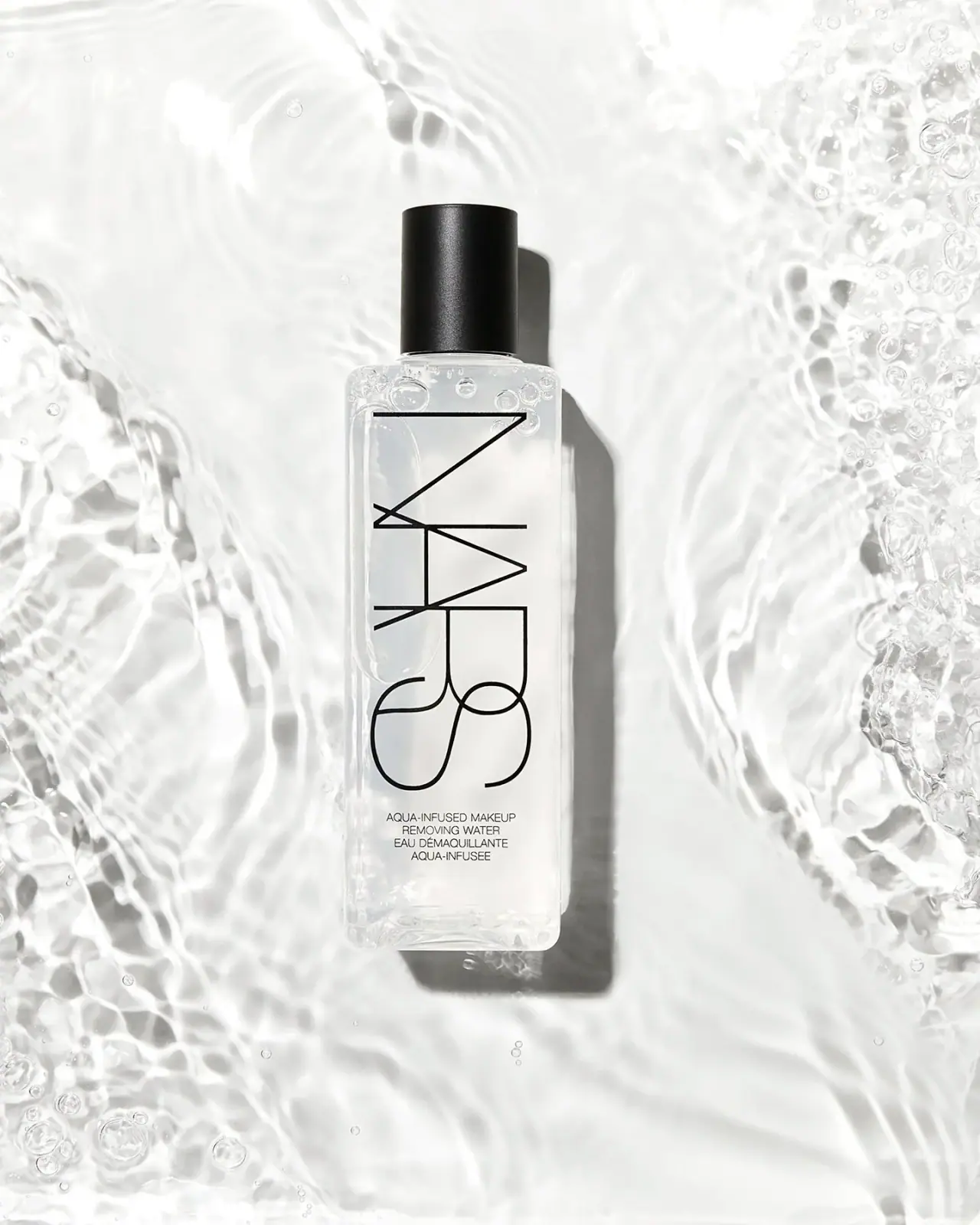
Aqua-Infused Makeup Removing Water places an oversized, interlocking NARS mark across most of a clear elongated bottle face. The thin black letter strokes allow the transparent field to remain visible through and around the identity, while a tall black cylindrical cap provides a solid dark endpoint. A small bilingual product block sits just below the large mark. The watery campaign enhances transparency, but the design's openness comes mainly from the lettering itself rather than a large empty gap between logo and product copy.
- Skincare
- Light pack
- Bold typographic
- Luxe monochrome
About this study
Selected clear Aqua-Infused Makeup Removing Water bottle in ATS Studio's watery photograph. Official heading and body confirm identity and 200 ml; front quantity and substrate remain unverified visually.
Sources & evidence · Reviewed 2026-10-19Color Palette
Approximate colours interpreted from photography. These are screen references, not official brand colours or print specifications.
Pack body
Clear neutral body
#EEEFEA
Illustrative pale neutral representing the transparent vessel against a white watery scene, not a verified opaque bottle color.
Ink
Black linework
#151614
Custom overlapping maker and small bilingual wording share a dark appearance.
Accent
Soft black cap
#171817
Solid dark closure contrasts with the transparent body and thin printed strokes.
Typography
Suggested visual alternatives, not confirmed brand typefaces. Any scale below is an illustrative estimate.
The custom NARS identity is rotated clockwise, reading along the bottle's long axis from the shoulder toward the lower body. Its elongated, overlapping lines combine straight strokes and large curves, making the mark both lettering and a graphic structure. Below it, four small centered uppercase lines identify the product in English and French. The supporting text has a conventional sans appearance and much denser rhythm. No standard font should be presented as an exact match for the proprietary interlocking mark.
Fonts
Independent open-line maker
Raleway
- Looks like
- Very light geometric display sans
- Type
- Geometric sans-serif
- Weight
- Thin, Light
- Case
- Uppercase
- Tracking
- Open optical spacing without overlapping letters
- Fallback
- Arial, sans-serif
Use for an original large maker line with generous internal space. Preserve a light visual density while avoiding the source's interlocking letter geometry.
Bilingual product information
Roboto
- Looks like
- Compact neutral sans
- Type
- Neo-grotesque sans-serif
- Weight
- Regular, Medium
- Case
- Uppercase
- Tracking
- Natural compact spacing
- Fallback
- Arial, sans-serif
Alternative for a short centered product block below the main identity. Keep it readable without matching the extreme scale or thinness of the display mark.
Structure & Proportions
Visual proportions and finish previews are illustrative. Confirmed construction details and uncertainties are distinguished in the study notes.
Proportions
| Purpose | Value | Preview |
|---|---|---|
| Long clear face | The body is substantially taller than its width, giving the enlarged rotated maker a continuous vertical field. | — |
| Dominant open lettering | The maker occupies most of the central front height, but thin strokes leave large transparent spaces inside its forms. | — |
| Compact lower block | Four small lines sit beneath the large mark with a modest separation, followed by a clearer base interval. | — |
| Solid cap endpoint | The cap is narrower than the broad bottle body but visually weighty because it is entirely black. | — |
Shapes
| Element | Value | Preview |
|---|---|---|
| Bottle body | Elongated rounded rectangle with visible clear base and softly curved shoulders. | |
| Closed cap | Tall black cylindrical cover above a narrow clear neck. | |
| Maker graphic | Large overlapping straight and curved letter strokes rotated along the long axis. | |
| Product block | Four short centered horizontal lines near the lower front. |
Finishes
Transparent body appearance
Clear front and edge reflections reveal the white water scene behind; substrate unverified. · transparent
Fine black cap sheen
A narrow highlight defines the cylindrical cover without proving a soft-touch coating. · matte
Formats and materials
| Formats | Elongated clear rectangular bottle with rounded corners and black cylindrical cap; official UK page identifies the product at 200 ml |
| Materials | The bottle is transparent with visible edge thickness and a clear lower base. The accessed official text does not specify glass, plastic resin, recycled content or decoration method, so transparency is recorded as appearance rather than a material conclusion., The cap is opaque black with a fine satin-looking surface. Rubberized coating, soft-touch treatment, exact polymer and internal closure components are unverified. Water and bubbles surrounding the package are photographic context, not a packaging material. |
| Closures | A tall black cylindrical cap sits above a narrow clear neck and softly rounded shoulders. It is closed, so threads, dispensing orifice and any inner seal remain hidden. A slight ring at the neck marks the transition between body and closure. The cap's nearly straight sides contrast with the bottle's broad flat front and rounded rectangular corners, creating a clear change of geometry at the top. |
| Decoration | Oversized custom overlapping maker rotated along the bottle axis, Small four-line bilingual product block, No visible opaque front label rectangle, No printed botanical motif or additional color band |
Front Panel
Schematic reading order. The diagram’s zone heights do not represent measured artwork proportions.
The front is dominated by a custom maker whose outline-like density preserves visibility through the bottle. There is no large blank band between maker and function; instead, the small product block follows fairly closely beneath the lower letter curves. Transparent margins around the mark and the space inside its strokes keep the composition from feeling solid or crowded. The low bilingual block provides a conventional reading zone beneath the expressive identity, with no visible separate paper panel.
| Zone | Content |
|---|---|
| Large maker | Black interlocking NARS letters rotate clockwise and extend from near the shoulder through most of the front. |
| English function | Aqua-Infused Makeup / Removing Water appears in small centered uppercase lines. |
| French function | Two French lines follow in the same compact centered treatment. |
| Clear lower interval | The transparent base region remains visible beneath the product wording; no quantity is confidently readable on this selected face. |
Range System
This study analyzes the single selected removing-water bottle. The official page's H1 and body confirm that identity and 200 ml size even though its browser title uses a gel-texture description. The visual principles are an open large maker, transparent body and conventional small function block. They do not establish that other NARS skincare products use identical materials, caps or relative type sizes.
- Let large lettering remain visually light through thin strokes and generous counters rather than reducing its overall size.
- Provide a conventional horizontal function block when a display identity uses a different reading direction.
- Resolve product identity from the actual official heading and photographed label when browser metadata differs.
Back of Pack & Shelf
The reverse, underside and open neck are not shown. The official 200 ml size is a source statement, not a visible quantity transcription from this front image.
- Inspect the rear before documenting ingredients, quantity placement or disposal marks.
- Confirm the dispensing opening before describing a pour, pump or other mechanism.
- Do not convert watery campaign styling into instructions to rinse the product; official use is a separate source matter.
On shelf
Interpretively, the large recognizable mark can retain presence even when the product title becomes too small to read. Because much of the front is transparent, contrast will change with the background and remaining contents. The solid cap helps locate the silhouette when the bottle edges disappear against a pale shelf. An independent design should test its own lettering over both light and dark backgrounds instead of relying on the source's bright studio setting.
Imagery
The bottle lies centrally in a bright watery composition with flowing ripples and clusters of bubbles around the sides. A hard shadow falls to the right, making the otherwise transparent object easier to locate. The black cap and maker remain crisp while the scene is nearly all white and clear. Bubble-like details near the upper body are visible, but the photograph does not establish a stable foaming formulation or internal texture specification. The image's water motif is an aesthetic treatment rather than a complete usage demonstration.
Guidelines
Editorial principles for an original design brief, not official brand guidelines.
Do
- Describe negative space inside and around the lettering accurately.
- Keep product information conventional when the maker is expressive.
- Separate source size from visible label transcription.
- Check transparency against multiple backgrounds.
- Treat the custom identity as proprietary lettering rather than a font match.
Don't
- Do not invent a large blank gap beneath the logo.
- Do not infer glass from clear appearance.
- Do not call the cap rubberized without a specification.
- Do not infer foaming or rinsing behavior from the scene.
- Do not reproduce the distinctive overlapping maker construction.
Sources & evidence
- NARS — Aqua-Infused Makeup Removing Waterproduct
- Alana Tyler Slutsky — ATS Studio Portfoliophotographer
How this study was built
edition · Sourced fact
Official H1/body identify Aqua-Infused Makeup Removing Water at 200 ml despite different browser-title wording.NARS — Aqua-Infused Makeup Removing Waterstructure · Visual observation
Clear elongated rounded-rectangle body supports a tall black cylindrical cap.Alana Tyler Slutsky — ATS Studio Portfoliotypography · Visual observation
Custom overlapping maker rotates clockwise and fills most of the front; supporting bilingual text is small and horizontal.Alana Tyler Slutsky — ATS Studio Portfoliolabel · Visual observation
Negative space is mainly within and around the thin letter strokes, not a large empty band before the product name.Alana Tyler Slutsky — ATS Studio Portfoliopalette · Visual observation
Transparent body and black cap/copy form the pack palette; pale water tones are scene-dependent.Alana Tyler Slutsky — ATS Studio Portfolioimagery · Visual observation
Ripples, bubbles and hard side shadow frame the clear object without establishing use instructions.Alana Tyler Slutsky — ATS Studio Portfoliorange · Editorial interpretation
Large open lettering plus a small conventional function block is transferable without copying the source identity.
What remains unverified
- Bottle material, cap resin/coating and printing process unverified.
- Reverse, underside and open dispensing neck unseen.
- Official 200 ml size not visibly printed on selected front.
- Original supporting font and measured dimensions unknown; custom maker not treated as a standard-font match.
Give your AI
packaging taste
Give your design or image tool a packaging study: palette, type, structure, front panel and principles for an original brief.
Export this styleFree with an email. PACK.md works in Claude, ChatGPT, Cursor and image tools.
More like this

Color Wow
Tall condensed naming on a broad reflective silver jar
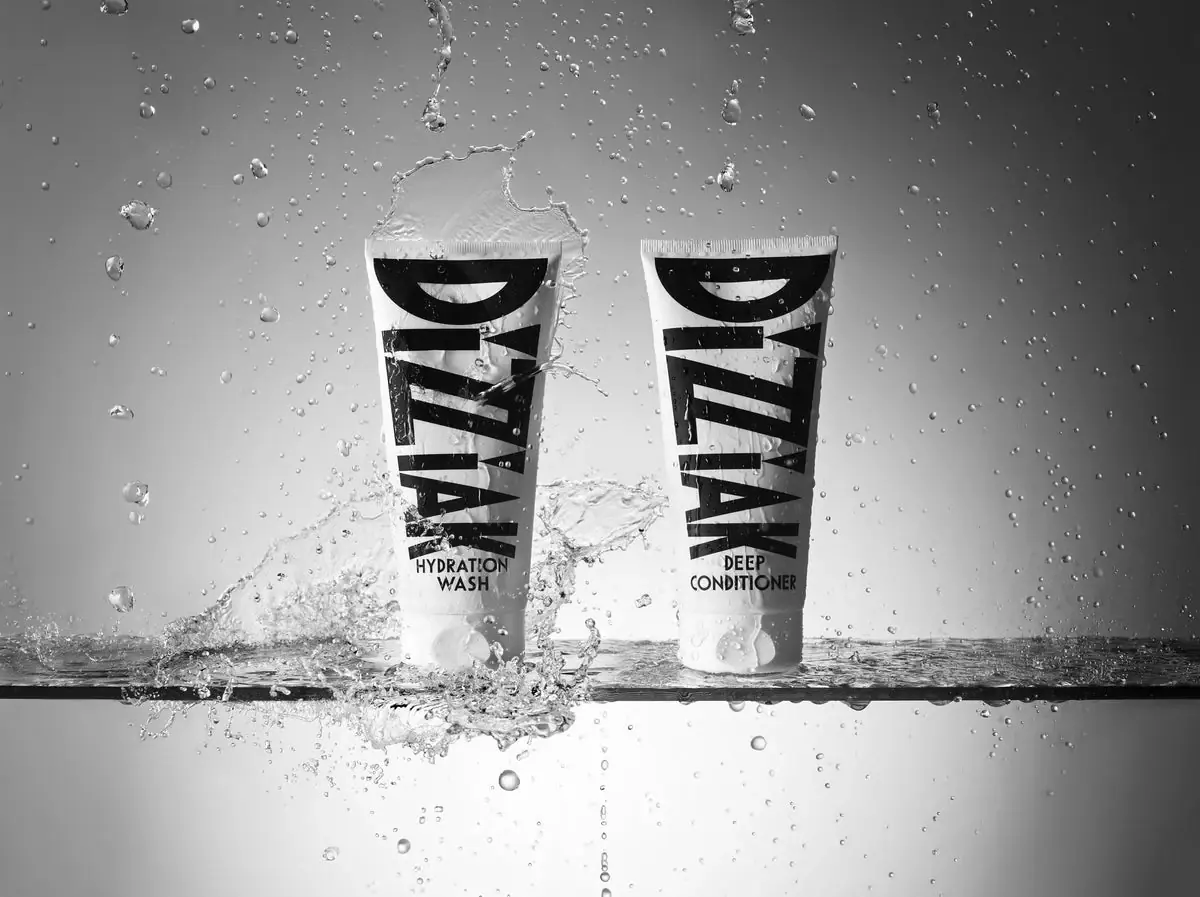
DIZZIAK
Oversized black lettering unites two pale haircare tubes

EADEM
Mirror-bright tube, oversized black identity, juicy campaign color
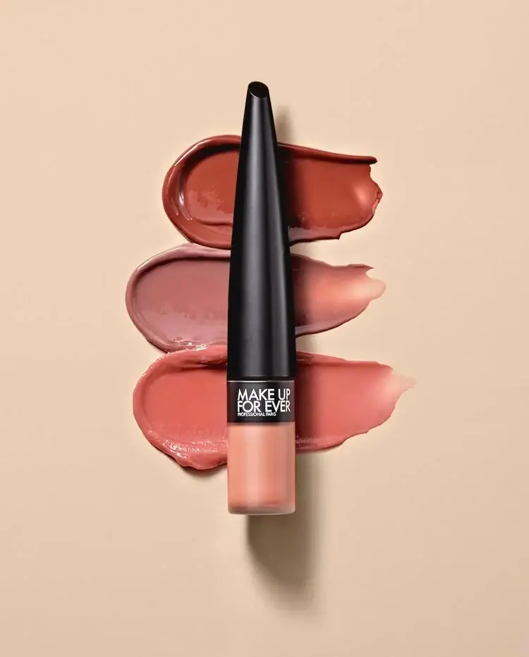
MAKE UP FOR EVER
Long tapered black cap above a compact colour chamber
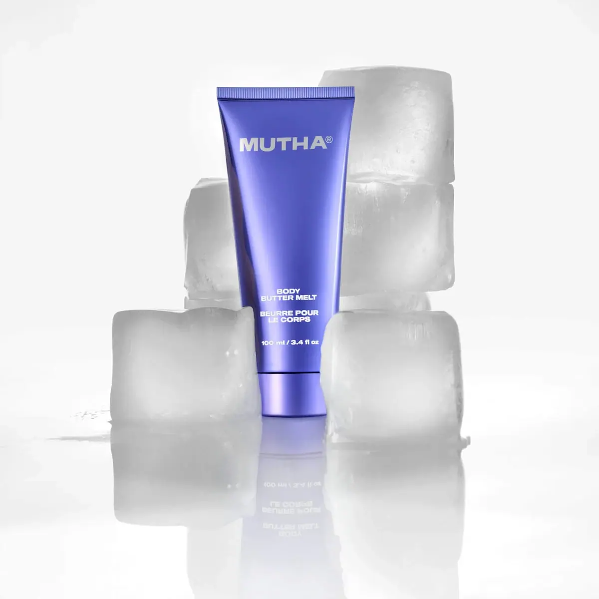
MUTHA
Reflective violet tube with bold maker and spacious middle
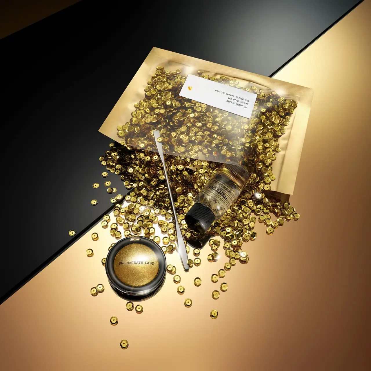
Pat McGrath Labs
Gold pigment kit with sparse labelling and sequin-filled pouch
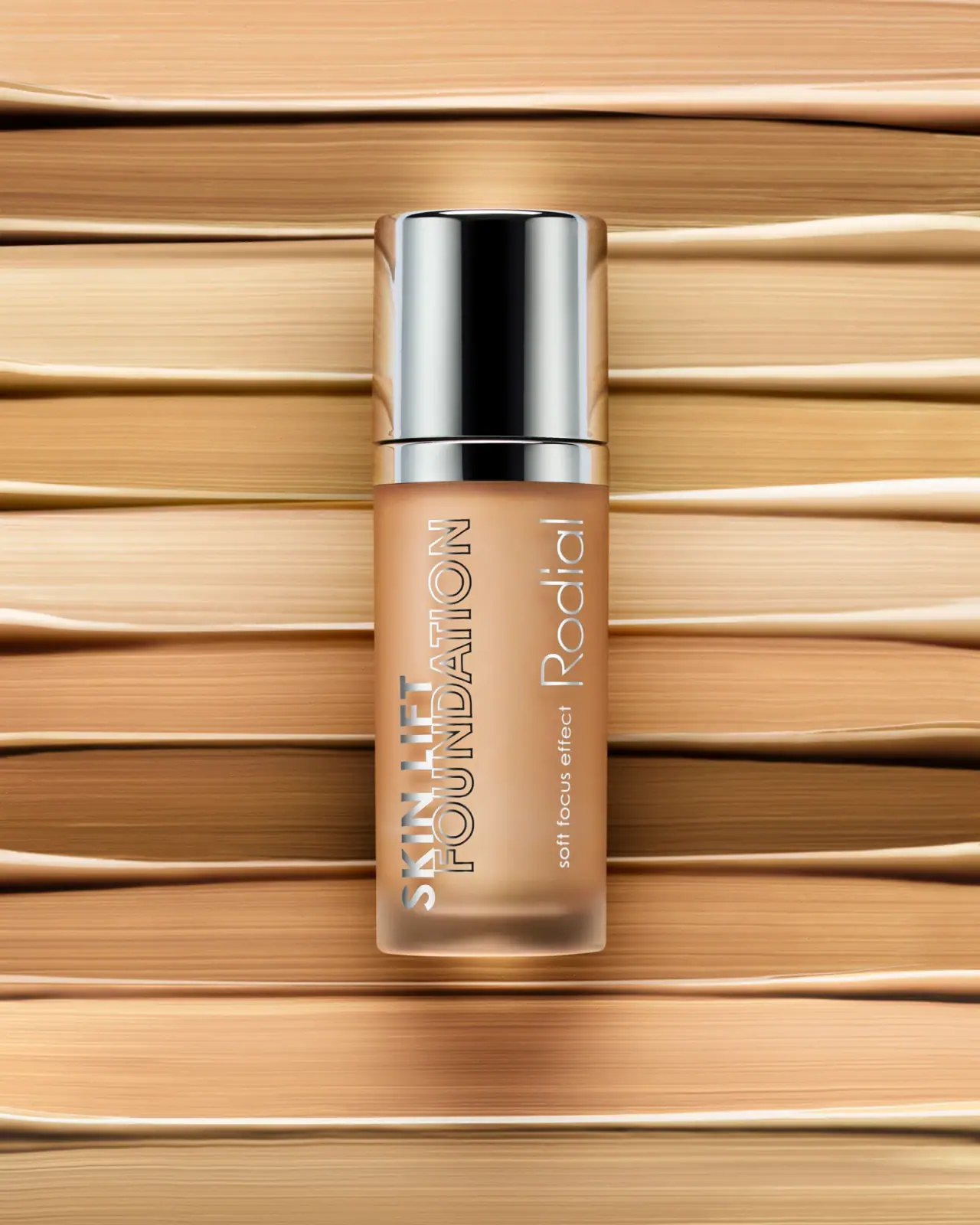
Rodial
Reflective silver with parallel vertical foundation lettering

Saie
giant lowercase wordmark over frosted shade