Photography: Ian Oliver Walsh — product photography. Images belong to their respective owners.
Rodial

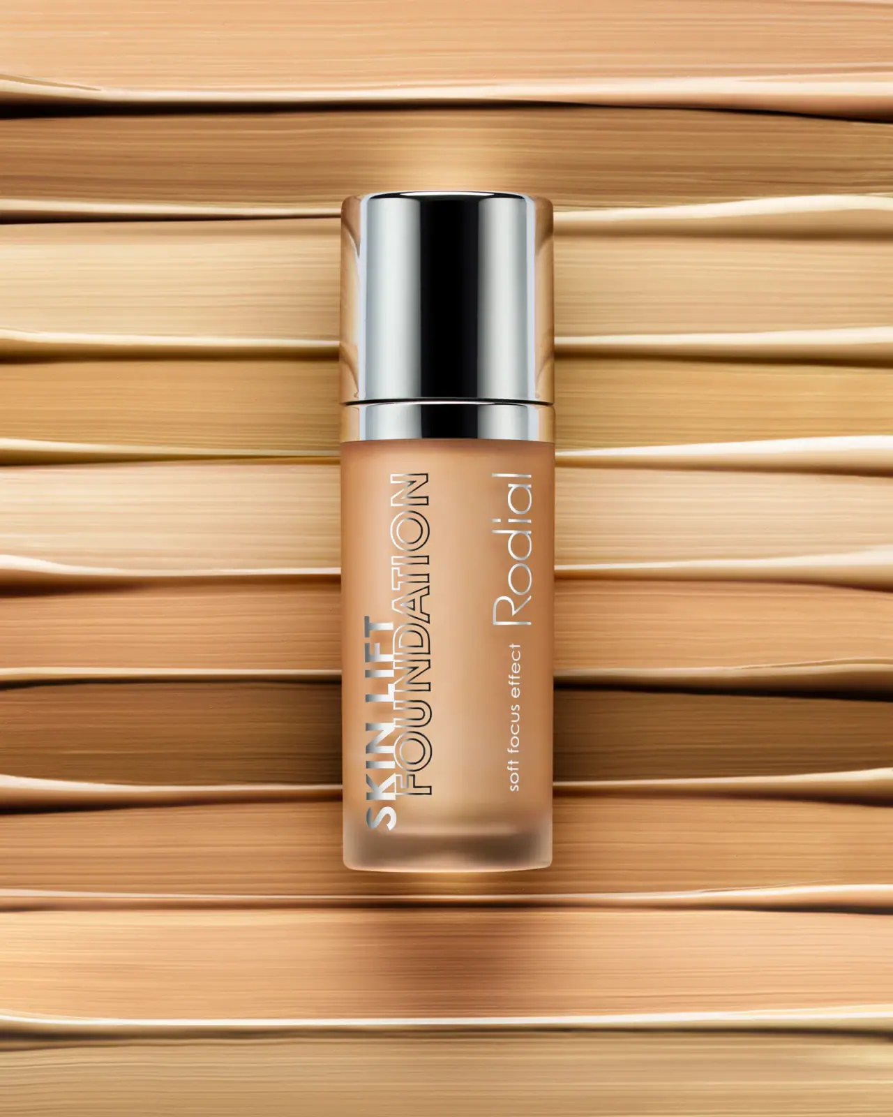
Reflective silver with parallel vertical foundation lettering
Skin Lift Foundation uses a long frosted-looking cylindrical body and an unusually tall mirror-like silver cap. The visible beige formula supplies warmth beneath two vertical typographic groups: bold solid Skin Lift with outlined Foundation on the left, and a lighter Rodial name with a small soft-focus descriptor on the right. These are rotated words, not letters stacked individually. The selected photograph emphasizes the tension between soft formula color, diffuse bottle surface and sharp reflective hardware. Its shade is unidentified; the official product page establishes 30 ml and a doe-foot applicator, not the photographed shade.
- Make-up
- Light pack
- Bold typographic
- Luxe monochrome
About this study
Selected closed Skin Lift Foundation studio photograph; shade unknown. Current 30 ml and doe-foot facts supplied separately by official listing.
Sources & evidence · Reviewed 2026-10-19Color Palette
Approximate colours interpreted from photography. These are screen references, not official brand colours or print specifications.
Pack body
Warm foundation appearance
#C89970
Visible formula color through the softly translucent body, not a fixed package ink or a verified shade match.
Ink
Pale lettering highlight
#F0EFE6
Light-looking producer and small descriptor against the warm contents; no separate white-ink process is established.
Accent
Reflective silver
#C6CDCD
Cap, collar and silver-looking lettering. A representative midtone only: actual appearance depends strongly on reflected surroundings.
Typography
Suggested visual alternatives, not confirmed brand typefaces. Any scale below is an illustrative estimate.
The large product group runs up the left side: solid Skin Lift and an outlined Foundation line. A parallel right-side group combines a slender producer name with the smaller soft-focus descriptor. Rotating complete text lines maintains normal word shapes while exploiting the bottle’s height.
Fonts
Vertical product heading
Montserrat
- Looks like
- Strong geometric sans capitals
- Type
- Geometric sans-serif
- Weight
- SemiBold 600 / Bold 700
- Case
- Uppercase
- Tracking
- Compact but open enough for the outlined counters to survive small reproduction.
- Fallback
- Arial, sans-serif
For a fictional product, contrast one solid phrase with one outlined category line. Rotate the complete block as a unit and keep the outline heavy enough to remain visible against changing formula colors.
Producer and fine descriptor
Raleway
- Looks like
- Light rounded geometric sans
- Type
- Geometric sans-serif
- Weight
- Light 300 / Regular 400
- Case
- Title case producer; lowercase descriptor
- Tracking
- Airier than the product heading, without overly fragile spacing.
- Fallback
- Arial, sans-serif
A separate parallel identity group that feels lighter than the product claim. Do not reproduce the Rodial wordmark; test a new name with a similar balance of long ascenders and open counters.
Structure & Proportions
Visual proportions and finish previews are illustrative. Confirmed construction details and uncertainties are distinguished in the study notes.
Proportions
| Purpose | Value | Preview |
|---|---|---|
| Cap height | The cap forms a substantial upper portion, roughly a third of the closed silhouette in this front view. This is a visual estimate, not a measured specification. | — |
| Continuous diameter | Cap, collar and body align closely in width, creating a long column with only small seam interruptions. | — |
| Copy orientation | The longer Foundation line occupies most of the body length while the shorter Skin Lift phrase shares its lower origin. | — |
Shapes
| Element | Value | Preview |
|---|---|---|
| Cylindrical body | Straight vertical sides soften into rounded base corners; a thick-looking lower edge remains visible. | |
| Tall cap | Plain reflective cylinder with a shallow rounded top edge and no visible grip texture. | |
| Parallel word groups | Two long vertical zones made from rotated horizontal words, separated by clear space rather than a rule. |
Finishes
Diffuse translucent body
Foundation bottle surface; process unknown · frosted
Mirror-like cap and collar
Silver-toned exterior; substrate unknown · metallic
Reflective letter appearance
Main product text; application method unverified · metallic
Formats and materials
| Formats | Narrow upright foundation bottle with rounded lower corners and a tall cylindrical cap over a short reflective collar., Official product size is 30 ml. The amount is not clearly shown on the selected front, so this is source-backed context rather than a visible-label transcription. |
| Materials | The body appears translucent and frosted, revealing a warm foundation tone. Exact glass or polymer specification and frosting method are not established., Silver appearance on the cap and collar does not establish solid metal, alloy, plating or metallized plastic. The reflective text likewise does not prove foil application. |
| Closures | The selected bottle is closed. The official description identifies a doe-foot applicator, which explains application format but does not reveal the photographed wand length, wiper or attachment details. No pump is visible and none is inferred. |
| Decoration | Two parallel groups of rotated sans-serif copy run along the body length., Solid and outlined capital treatments create contrast within the main product group., No visible framed label, illustration or front shade swatch interrupts the translucent field. |
Front Panel
Schematic reading order. The diagram’s zone heights do not represent measured artwork proportions.
The package uses length rather than width. A product group and a producer group sit side by side, both reading along the vertical axis. This avoids breaking the long category word into many short lines, while requiring the viewer to turn their head or rotate the bottle for ordinary reading.
| Zone | Content |
|---|---|
| Upper hardware | Large silver-toned cap above a shorter matching collar; no readable cap copy in this image. |
| Left product group | Solid SKIN LIFT beside outlined FOUNDATION, both oriented along the body length. |
| Right identity group | Thin Rodial name accompanied by small soft focus effect wording. |
| Lower edge | Softly rounded translucent base, with no reliably readable shade or quantity mark in the selected view. |
Range System
The official page confirms multiple shades, but neither a specific photographed shade nor the full original shade count is established by this view. The stable structural idea is reflective hardware and typography over visible formula color. Any adapted family must account for changing text contrast across different contents.
- Test both the solid and outlined text against light and dark formula samples before fixing a decoration specification.
- Use an explicit shade identifier on an independently legible surface rather than relying on photographed contents alone.
- Keep cap and collar geometry stable across a proposed family while allowing the actual formula color to vary.
Back of Pack & Shelf
Reverse, underside and uncovered applicator are absent. The selected image cannot place the shade code, full ingredient list, batch mark or nominal contents on a particular hidden surface.
- For an original foundation brief, plan shade identity and amount as practical information separate from the decorative long-axis name.
- Reserve space for ingredients and responsible business information after choosing the actual container.
- Check any disposal wording against verified component materials; a silver appearance is insufficient evidence.
On shelf
The cap supplies a bright distance cue; the long-axis type creates a distinct front when the bottle is close enough to inspect. The two word groups make efficient use of a narrow body but trade instant horizontal reading for visual character. Outline text is particularly vulnerable to glare and formula-color changes. Those are design observations, not measured sales or accessibility results. The source-backed doe-foot format should remain product information rather than an invented exposed mechanism in the hero image.
Imagery
The Ian Oliver Walsh photograph centers the bottle against broad horizontal swatches or swatch-like ridges in warm foundation tones. These horizontal strokes contrast with the package’s vertical text and tall silhouette. Strong reflected strips define the cap, while softer lighting reveals the body. The background does not establish the exact photographed shade or formula coverage. A clean reference crop should preserve the collar seam, full vertical lettering and rounded base rather than isolating only the reflective upper component.
Guidelines
Editorial principles for an original design brief, not official brand guidelines.
Do
- Rotate complete text groups so words retain familiar internal reading order.
- Pair solid and outlined treatments with sufficient stroke weight for the actual bottle size.
- Test reflective decoration over several foundation shades and lighting conditions.
- Keep source-backed applicator information separate from what the closed image visibly demonstrates.
Don't
- Do not call the cap solid aluminum or the body frosted glass without component evidence.
- Do not identify a shade from beige photography or the current page’s default selection.
- Do not depict a pump when the official product describes a doe-foot applicator.
- Do not treat dark reflected bands on the cap as intentional black printed stripes.
Sources & evidence
How this study was built
structure · Sourced fact
Official page states 30 ml and doe-foot applicator.Rodial — Skin Lift Foundationpalette · Visual observation
Warm contents and reflective silver appearance; not a verified shade or fixed metallic color.typography · Visual observation
Solid and outline product group contrasts with thinner producer lettering.label · Visual observation
Parallel rotated text groups exploit height; no shade mark readable.imagery · Visual observation
Horizontal warm swatch scene contrasts with upright bottle.range · Sourced fact
Multiple shades are listed; selected photograph not mapped to default variant.Rodial — Skin Lift Foundationedition · Editorial interpretation
Current listing provides product context without dating or identifying the photographer edition.
What remains unverified
- Photographed shade unverified.
- Body/cap materials and metallic decoration process unknown.
- Original typefaces not attributed.
- Reverse, base copy and actual applicator not shown.
Give your AI
packaging taste
Give your design or image tool a packaging study: palette, type, structure, front panel and principles for an original brief.
Export this styleFree with an email. PACK.md works in Claude, ChatGPT, Cursor and image tools.
More like this

Color Wow
Tall condensed naming on a broad reflective silver jar
DIZZIAK
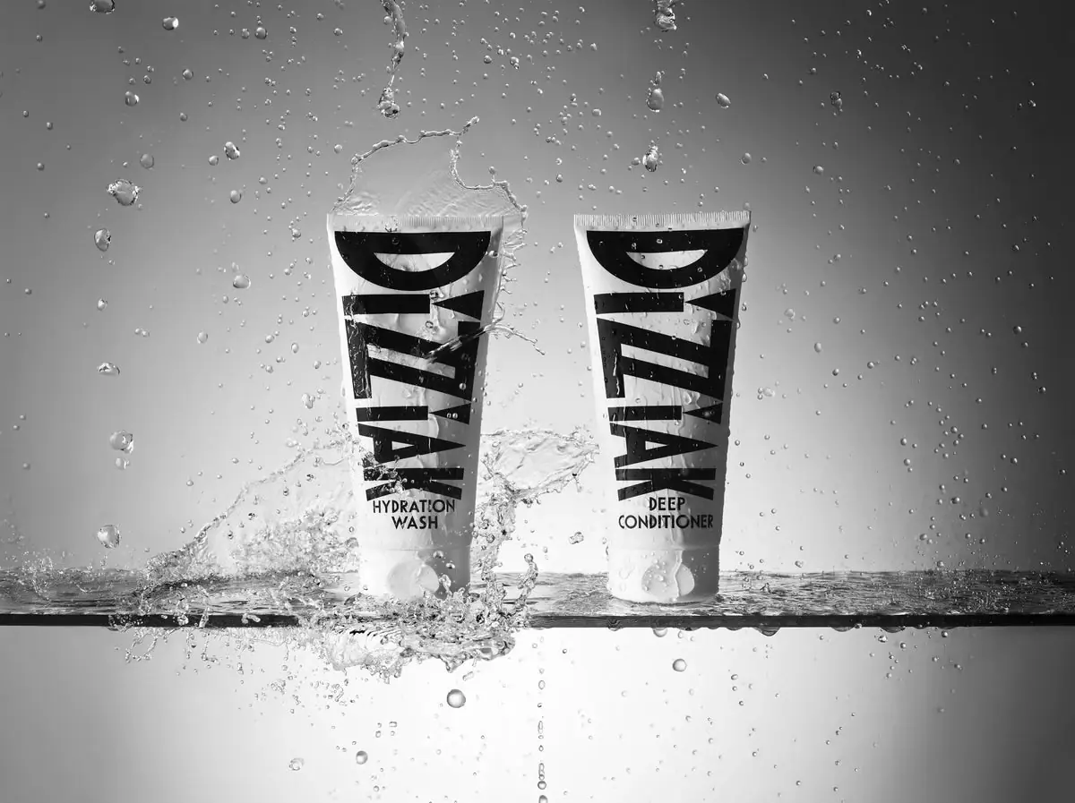
Oversized black lettering unites two pale haircare tubes

EADEM
Mirror-bright tube, oversized black identity, juicy campaign color
MAKE UP FOR EVER
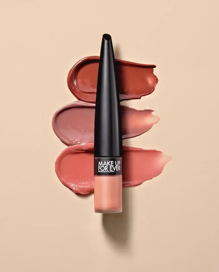
Long tapered black cap above a compact colour chamber
MUTHA
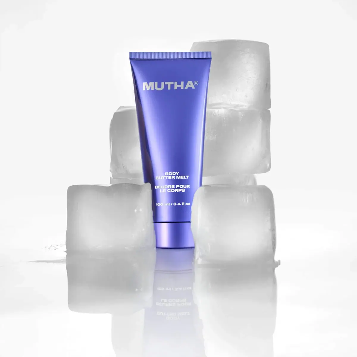
Reflective violet tube with bold maker and spacious middle
NARS
Clear elongated bottle with oversized interlocking mark and black cap
Pat McGrath Labs
Gold pigment kit with sparse labelling and sequin-filled pouch

Saie
giant lowercase wordmark over frosted shade