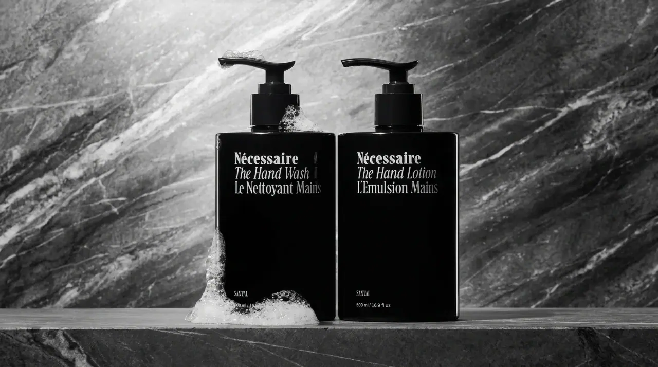
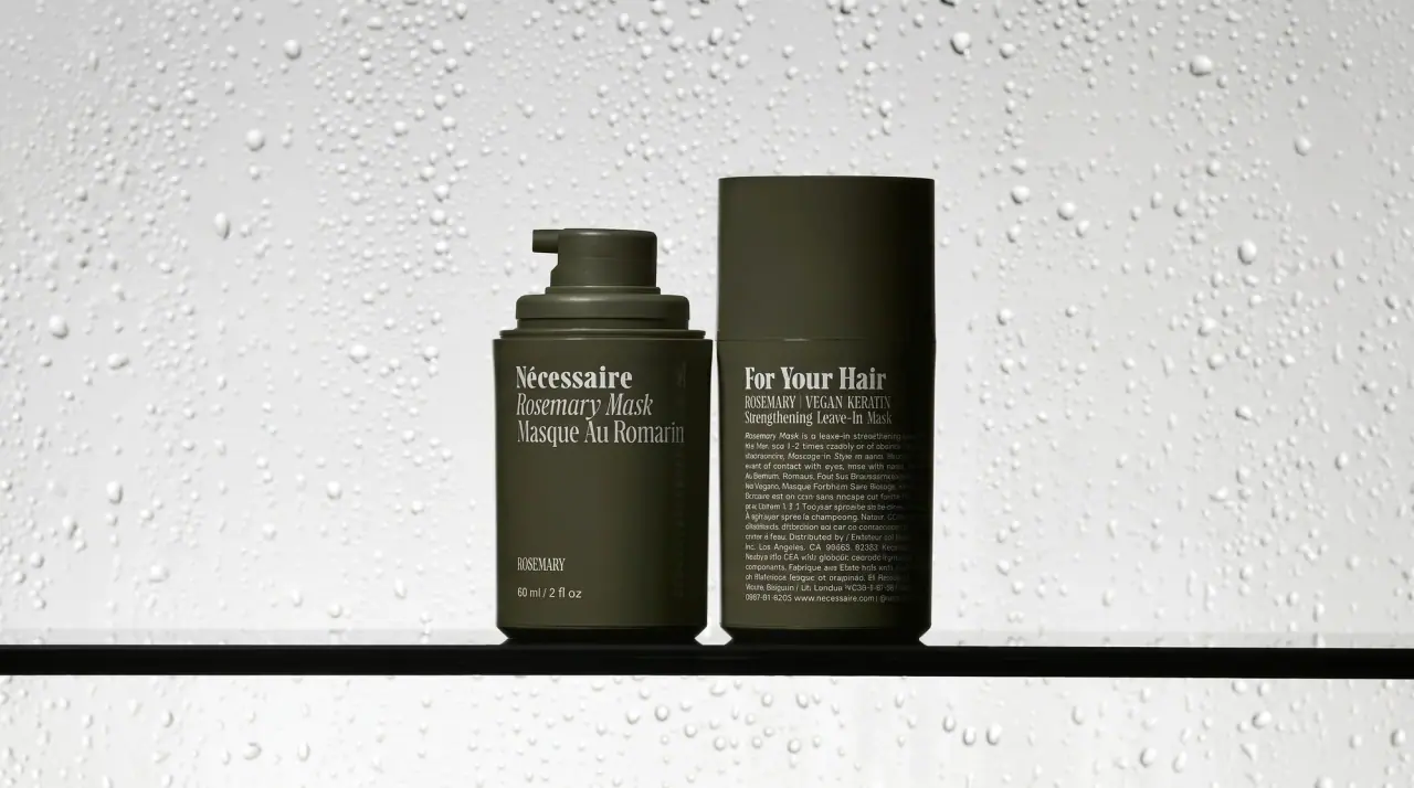
Campaign images © Nécessaire, from necessaire.com
Nécessaire

bilingual serif on muted bathroom neutrals
Nécessaire treats body care like a quiet pantry of essentials: every pump bottle, tube, can, stick and dropper is a plain soft-matte cylinder in one muted colour, with type printed straight onto it and no separate label. The same three-line stack sits top left on every pack: a bold serif wordmark with an accented capital, the English product name in serif italic ('The Body Wash'), then the French name in an upright condensed serif ('Le Nettoyant Corps'). A tiny uppercase scent or active line and the volume sit near the base, with empty colour in between. Range differences come from body colour alone (oat #e3d7bf for wash, sage for lotion and exfoliator, white for fragrance-free and peel, black for retinol, olive glass for serums, golden yellow for sunscreen), and pumps and caps match the body.
- Body & bath
- Light pack
- Clinical minimal
- Colour-coded range
Color Palette
Approximate colours interpreted from photography. These are screen references, not official brand colours or print specifications.
Pack body
Oat Milk
#e3d7bf
Body-wash bottle, a creamy oat tone
Eucalyptus Sage
#b4bdb1
Lotion bottle, exfoliator tube, deodorant, wipe sachet, water can and the pump on the wash
Bath Tile White
#ecebe7
Fragrance-free lotion, body-peel bottle and hand-cream jar
Night Black
#111111
Body and hand retinol bottles, the evening actives
Olive Glass
#3d4030
Tinted glass of the rosemary serum dropper with matching dark bulb
Ink
Print Black
#1b1b1b
Wordmark, product names and base text on every light pack
Reverse White
#f4f3f0
All type printed on the black retinol and olive serum packs
Fine Grey
#5c5c58
Volume line and small scent line where a softer tone is used on light packs
Range coding
Mineral Gold
#e6ac2c
Sunscreen tube, the one saturated colour in the range
Clay Rose
#9e6152
Deodorant stick in its terracotta colourway
Typography
Suggested visual alternatives, not confirmed brand typefaces. Any scale below is an illustrative estimate.
The wordmark leads in a bold serif, immediately followed by the English name in italic at the same size and the French name in a condensed upright serif, all left-aligned as a tight block in the upper third. At the base, a tiny uppercase line names the scent or active strength above the millilitre and fluid-ounce volume.
Type scale
Estimated cap size as a share of the panel · Front of the 250 ml body-wash pump bottle, shoulder to base, about 140 mm tall
wordmark
4.5% · Bold · Display
Essentiel
english-name
4.5% · Regular Italic · Headline
The Body Oil
french-name
4.5% · Regular · Body
L'Huile Corps
scent-line
1.5% · Regular · Label
VETIVER
active-line
1.5% · Regular · Label
0.2% PURE RETINOL
volume
1.3% · Regular · Label
250 ml / 8.4 fl oz
Fonts
Display
Source Serif 4
- Looks like
- Tiempos Headline Bold, Lyon Display Bold
- Type
- Bold transitional serif
- Weight
- Bold
- Case
- Title case with an accented capital
- Tracking
- Tight, about -1%
- Fallback
- Georgia Bold, Times New Roman Bold
The wordmark, always the first line of the stack, small and top left.
Headline
Newsreader
- Looks like
- Tiempos Text Italic
- Type
- Serif italic
- Weight
- Regular Italic
- Case
- Title case beginning with 'The'
- Tracking
- Tight, about -1%
- Fallback
- Times Italic, Georgia Italic
English product name directly under the wordmark, same size.
Body
Instrument Serif
- Looks like
- Times Condensed, Century Condensed
- Type
- Narrow upright serif
- Weight
- Regular
- Case
- Title case beginning with Le/La/L'
- Tracking
- Normal
- Fallback
- Times New Roman, serif
French translation under the italic line, and back-panel text.
Label
Instrument Serif
- Looks like
- Times Condensed capitals
- Type
- Narrow serif capitals at small size
- Weight
- Regular
- Case
- Uppercase
- Tracking
- Wide, about +6%
- Fallback
- Times New Roman, serif
Scent or active strength near the base, and the volume line.
Structure & Proportions
Proportions
| Purpose | Value | Preview |
|---|---|---|
| Text stack position | Upper third, starting about 15% below the shoulder | |
| Stack width | About 55% of front width, flush left | |
| Left margin | About 10% of front width | |
| Empty colour | About 70% of the front left as plain body colour | |
| Footer position | Lower 10% of the body | |
| Colours per pack | Two: body colour and one ink, closure matched | — |
| Density | Sparse: a five-line block and a two-line footer | — |
Shapes
| Element | Value | Preview |
|---|---|---|
| Pump bottle | Straight cylinder with rounded shoulder | |
| Pump | Colour-matched pump with long flat spout | |
| Serum | Tinted glass dropper with dark bulb | |
| Tube | Flat crimped tube with screw cap | |
| Label edge | None: type printed straight on the body |
Finishes
Soft matte plastic
Pump bottles, tubes, sticks and jars · matte
Satin black
Retinol bottles · soft-touch
Tinted glass
Serum dropper bottles · gloss
Matte aluminium
Eucalyptus water can · metallic
Formats and materials
| Formats | Pump bottle, Squeeze tube, Dropper bottle, Aerosol-style can, Deodorant stick, Jar, Wipe sachet |
| Materials | Plastic, Tinted glass, Aluminium, Paper-look sachet |
| Closures | Colour-matched pumps with a long flat spout, flat flip or screw caps on tubes, black actuator on the can, rubber-bulb dropper on serums |
| Decoration | Direct screen-printed type, No label edges, Single-colour pack bodies |
Front Panel
Schematic reading order. The diagram’s zone heights do not represent measured artwork proportions.
No applied label: type is printed directly on the pack, a left-aligned three-line block in the upper third and a two-line footer near the base, with empty colour in between.
| Zone | Content |
|---|---|
| Upper left | Wordmark, English italic product name, French upright name |
| Middle | Empty pack colour, nothing printed |
| Base left | Scent or active percentage in small caps, then volume |
Range System
Colour coding by pack body with a fixed typographic stack; the pump or cap matches the body, and the text block never moves or changes size.
- Body wash = oat bottle + sage pump
- Body lotion = sage or white bottle
- Retinol = black bottle with white type
- Serums = olive or clear glass dropper
- Sunscreen = golden yellow tube
- Deodorant = sage or terracotta stick
Back of Pack & Shelf
The back repeats the serif voice in one ink, flush left: a short paragraph on what the product is, directions, a full ingredient list and bilingual legal lines, then volume, batch and recycling marks at the base.
- Short serif paragraph describing the formula
- Directions for use
- Full INCI ingredient list
- English and French cautions
- Volume, batch code and period-after-opening
- Recycling marks and maker address
On shelf
On shelf the products read as one calm set of muted cylinders in oat, sage, white and black, with identical top-left type stacks lining up across the row.
Imagery
None on pack: no illustration, icon or photography; colour and type do all the work.
Guidelines
Do
- Make every pack a single soft matte colour from a muted set (oat, sage, white, black, olive).
- Print a three-line stack top left: bold serif wordmark, English italic name beginning 'The', French condensed name beginning 'Le/La'.
- Keep all three lines the same size, about 4.5% of body height.
- Put a tiny uppercase scent or active line and the volume at the base, flush left.
- Leave the middle of the front empty.
- Reverse the type to warm white (#f4f3f0) on black and olive packs.
Don't
- Don't add a paper label, frame or border.
- Don't use sans-serif type on the front.
- Don't centre the text stack.
- Don't use illustration, icons or photography.
- Don't use bright colours except the single sunscreen yellow (#e6ac2c).
Give your AI
packaging taste
Give your design or image tool a packaging study: palette, type, structure, front panel and principles for an original brief.
Export this styleFree with an email. PACK.md works in Claude, ChatGPT, Cursor and image tools.
More like this

Byoma
candy-coloured barrier science on a shelf
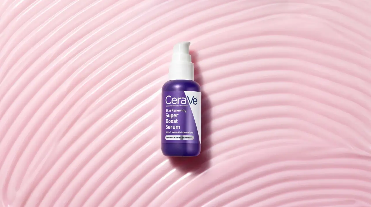
CeraVe
white pump bottles split by a coloured diagonal

Cocokind
sideways lowercase on spa-water pastels
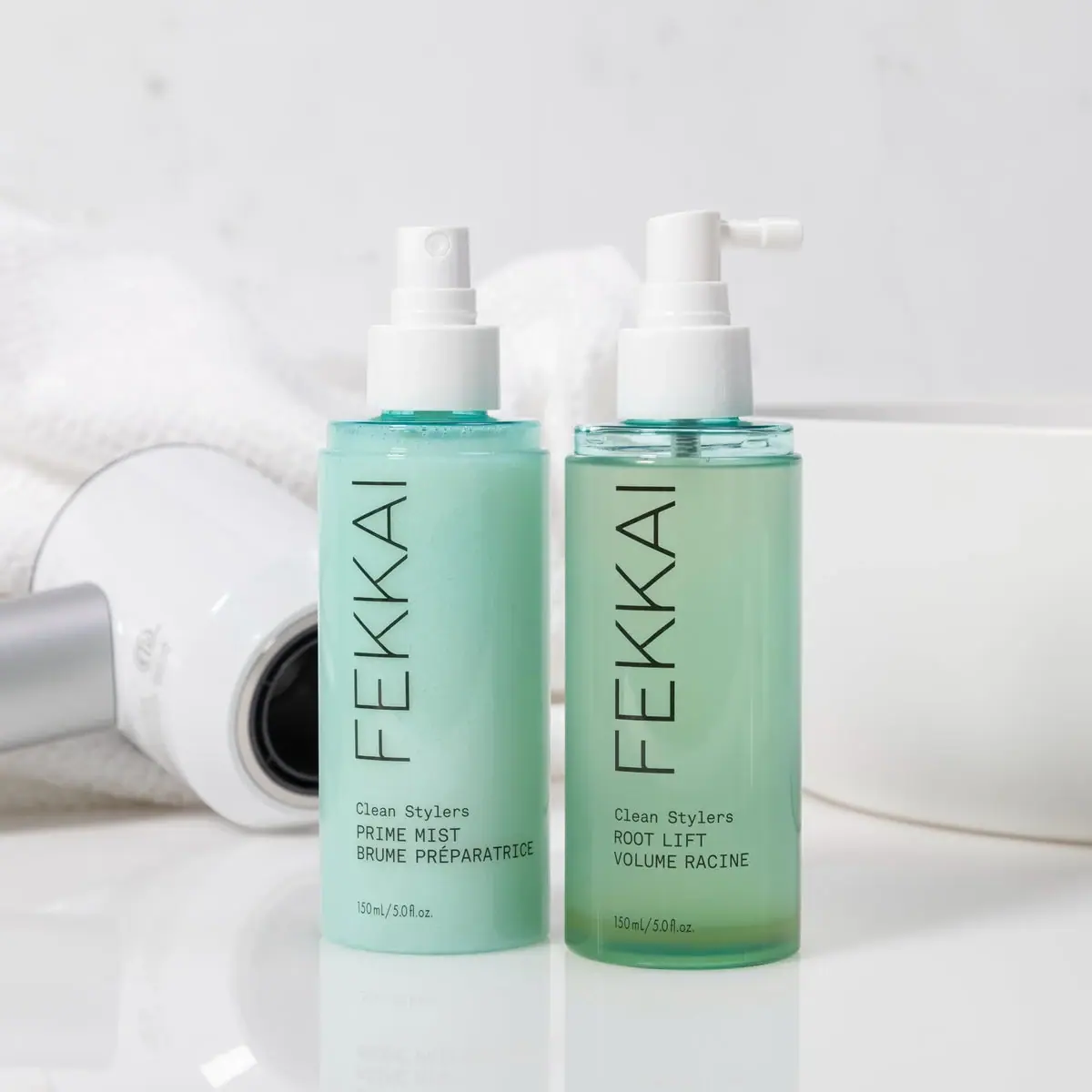
FEKKAI
Green styling duo with vertical hairline maker and white actuators
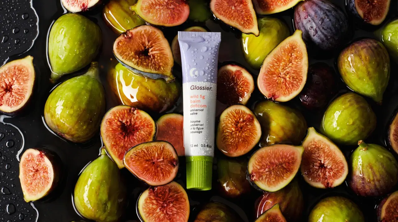
Glossier
clean white tubes with candy accents

Herbivore
pastel tinted vessels with a white tag
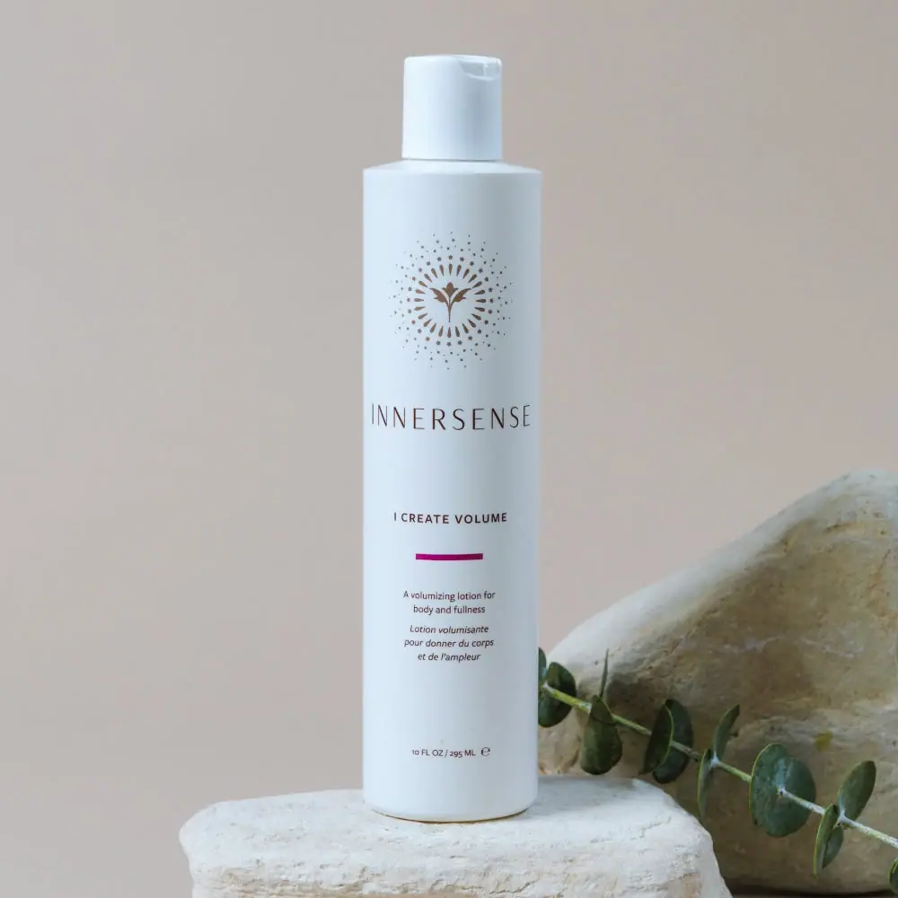
Innersense
Radiating bird emblem and magenta bar on a pale cylinder

Malin+Goetz
pharmacy label set in bracketed helvetica