Photography: Paddywax official photography. Images belong to their respective owners.
Paddywax

Painted koi, scalloped rim and striped pedestal
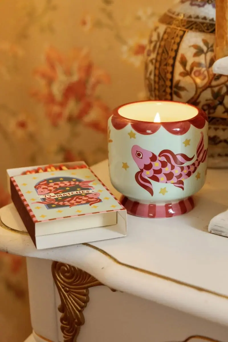
The selected Ocean Tide A Dopo candle uses its vessel as the main graphic surface. A pink and burgundy koi swims across pale mint ceramic, surrounded by small yellow stars. Burgundy scallops at the rim and vertical stripes at the short foot turn the container into a decorated object rather than a conventional labeled jar. The nearby illustrated matchbox reinforces the motif, but it is a separate accessory in the photograph. The study focuses on this 8 oz presentation, with its unlettered visible vessel face and display-oriented silhouette.
- Candles & home scent
- Light pack
- Maximalist pattern
- Playful colour
About this study
Ocean Tide A Dopo 8 oz koi vessel in the selected official lifestyle image; companion matchbox is separate context.
Sources & evidence · Reviewed 2026-10-19Color Palette
Approximate colours interpreted from photography. These are screen references, not official brand colours or print specifications.
Pack body
Pale mint ground
#CAD3B6
Quiet vessel ground allowing the fish and edge decoration to read clearly. Warm scene lighting shifts the apparent hue.
Accent
Burgundy red
#A33E36
Fish outlines and scale alternation, upper scallops and lower stripes; the principal linking color.
Rose pink
#D88D9F
Fish head and alternating scales, echoed at the pedestal.
Mustard star
#D9B54F
Small scattered stars and details within the koi, adding punctuation without competing with the larger fish.
Typography
Suggested visual alternatives, not confirmed brand typefaces. Any scale below is an illustrative estimate.
The vessel communicates through illustration first. A companion label or carton would need to supply producer, scent and amount without obscuring the koi. Keep accessory quantity copy distinct from candle weight: the photographed match count is not the candle size.
Fonts
Companion scent heading
Bree Serif
- Looks like
- Characterful moderate-contrast serif
- Type
- Serif
- Weight
- Regular 400
- Case
- Title case
- Tracking
- Neutral, with generous surrounding space.
- Fallback
- Georgia, serif
A proposed original scent title on a hangtag or carton, chosen for rounded character that can sit alongside hand-painted motifs. No such heading is claimed visible on this vessel.
Functional companion information
Archivo
- Looks like
- Sturdy readable sans
- Type
- Grotesque sans-serif
- Weight
- Regular 400 / Bold 700
- Case
- Uppercase short labels; sentence case instructions
- Tracking
- Slightly open for brief quantity labels.
- Fallback
- Arial, sans-serif
Weight, safety and accessory information on a separate practical surface. Use enough contrast and scale that the exuberant illustration does not force essential text into miniature type.
Structure & Proportions
Visual proportions and finish previews are illustrative. Confirmed construction details and uncertainties are distinguished in the study notes.
Proportions
| Purpose | Value | Preview |
|---|---|---|
| Illustration field | The rounded belly takes most of the visible height; the foot is substantially shorter and acts as a visual plinth. No dimensions are inferred. | — |
| Motif scale | One dominant fish spans much of the front curve, with smaller stars providing rhythm rather than a uniform all-over density. | — |
| Edge treatment | Broad rounded scallops are large enough to read as a continuous rim from a distance. The narrower base stripes create a different, faster rhythm. | — |
Shapes
| Element | Value | Preview |
|---|---|---|
| Vessel body | Soft rounded container above a compact supporting foot. | |
| Rim rhythm | Repeated painted semicircular scallops, not a physically scalloped cut edge. | |
| Star punctuation | Small yellow star motifs distributed around the fish. |
Finishes
Reflective decorated ceramic
Body, rim and pedestal; exact glaze unspecified · gloss
Formats and materials
| Formats | Rounded candle vessel with an open circular mouth, gently curving lower body and short flared pedestal., The official product is listed at 8 oz. The photograph shows a lit candle beside a separately illustrated matchbox; it does not establish an included gift set. |
| Materials | Paddywax explicitly describes a hand-painted ceramic vessel for this product. The visible glossy reflections are consistent with a finished ceramic surface, but glaze composition and firing process are unspecified., Wax composition, wick specification and any hidden vessel markings were not established from the consulted product details. The warm interior and flame do not identify those materials. |
| Closures | The candle is shown open and burning. No lid, protective cover or shipping closure is visible, so none is specified. The short pedestal is part of the visible vessel silhouette, not an attached cap. |
| Decoration | A large curved koi motif occupies the front-facing body while stars fill selected gaps., Scallops form a broad ornamental rim; alternating vertical color marks frame the short foot., The adjacent matchbox repeats fish, stars and a striped border on a flat rectangular format. |
Front Panel
Schematic reading order. The diagram’s zone heights do not represent measured artwork proportions.
There is no conventional front text label on the visible candle. Treat the koi as the hero, the scalloped rim as an upper frame and the striped foot as the lower frame. The composition remains coherent when the vessel is used as decor because it does not depend on a large front sales panel.
| Zone | Content |
|---|---|
| Upper rim | Burgundy painted scallops descend onto the mint body while the opening remains circular. |
| Central body | Pink and burgundy fish, scale pattern, flowing fins and scattered yellow stars. |
| Pedestal | Alternating rose and burgundy vertical marks tie the support back to the fish colors. |
| Separate accessory | Illustrated matchbox has a central quantity banner and border. It is visible context rather than a verified candle carton or included component. |
Range System
The official page presents multiple A Dopo scents with different illustrated vessels. For this study, the supported principle is a recurring decorated ceramic object with motif-led variants; precise universal color or shape rules are not established. Ocean Tide is the selected koi presentation.
- Keep one recognizable large creature motif rather than shrinking many competing illustrations into the same small vessel.
- Repeat selected colors at the rim and foot so an individual scent feels complete as an object.
- Translate a motif onto a companion accessory through a different composition instead of merely cropping the curved-vessel artwork.
Back of Pack & Shelf
The vessel base and opposite side are not shown, and the visible fish face carries no readable product information. The actual safety label and scent identification positions remain unknown.
- For an original candle, plan a clear safety and product-information surface after reviewing the vessel dimensions and applicable requirements.
- Keep candle weight distinct from the count printed on any matching accessory.
- Do not infer food-contact suitability or a refill program from a ceramic material description.
On shelf
The foot and scalloped band make a recognizable silhouette-plus-pattern combination even before the viewer reads a scent name. The image-rich body offers display value after burning; Paddywax explicitly suggests repurposing the vessel for storage or decoration. That source supports reuse intent, not verified refill compatibility or food-safe reuse. In a catalogue, show enough of the foot to distinguish this object from a standard cylindrical candle jar.
Imagery
The official photograph uses a warm domestic vignette: lit candle, open matchbox, patterned background vase and decorative furniture. It demonstrates how the candle sits among interior objects and makes the glossy paint catch small highlights. The golden wallpaper and furniture dominate the image histogram but should not become the package palette. Preserve the mint, burgundy and pink relationship when extracting a reference; a neutral-light companion photograph would improve color comparison.
Guidelines
Editorial principles for an original design brief, not official brand guidelines.
Do
- Use one dominant illustrated subject and smaller accents with deliberate open space.
- Tie the rim and foot to colors already present in the fish artwork.
- Keep accessory packaging visibly distinct from the candle vessel in catalogue descriptions.
- Design product-information placement that allows the decorated face to remain useful as a display object.
Don't
- Do not describe the painted scallops as a physically scalloped vessel edge.
- Do not sample golden wallpaper as the main ceramic color.
- Do not imply the matchbox is included or serves as the candle carton.
- Do not turn suggested storage reuse into food-safety, refill or sustainability certification.
Sources & evidence
How this study was built
structure · Sourced fact
Official page confirms hand-painted ceramic and 8 oz designation.Paddywax — Ocean Tide A Dopo 8 oz Candlepalette · Visual observation
Mint, burgundy, pink and small yellow stars are package colors; golden room excluded.label · Visual observation
Illustrated visible face has no readable producer or scent label.typography · Editorial interpretation
Two alternatives proposed for original companion copy, not existing vessel attribution.range · Sourced fact
Page lists other illustrated A Dopo scents; no universal detailed rules inferred.Paddywax — Ocean Tide A Dopo 8 oz Candleimagery · Visual observation
Lit candle beside matching separate matchbox; domestic setting not package construction.edition · Sourced fact
Brand suggests storage or decorative reuse, not a refill-system claim.Paddywax — Ocean Tide A Dopo 8 oz Candle
What remains unverified
- No underside or safety label visible.
- No lid or included accessory confirmed.
- Exact glaze, wax and wick specifications not established.
- Colors are approximate under warm lighting; typography suggestions are hypothetical companion alternatives.
Give your AI
packaging taste
Give your design or image tool a packaging study: palette, type, structure, front panel and principles for an original brief.
Export this styleFree with an email. PACK.md works in Claude, ChatGPT, Cursor and image tools.
More like this
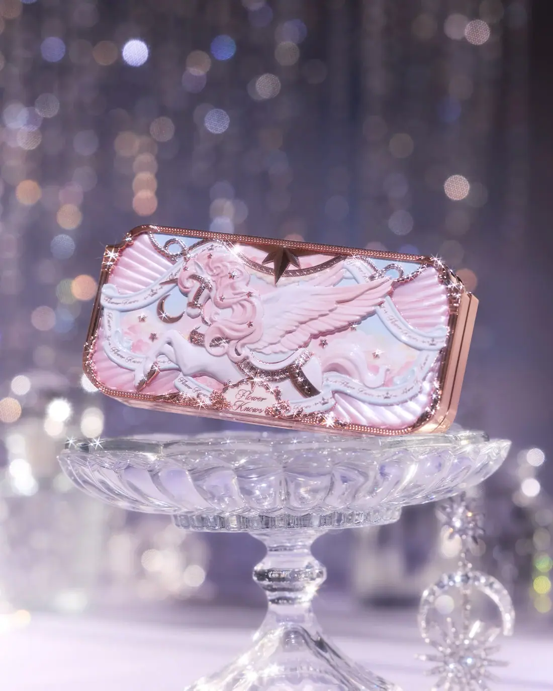
Flower Knows
Winged unicorn relief with pastel ribbons and reflective borders
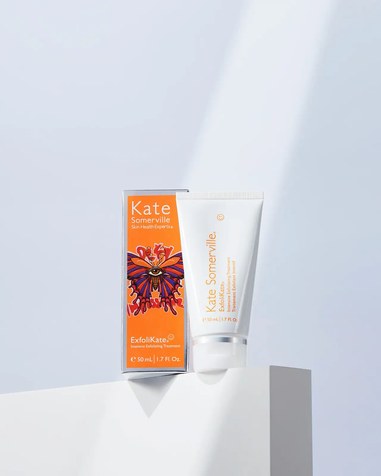
Kate Somerville
Orange artist carton beside a clean white vertical-text tube
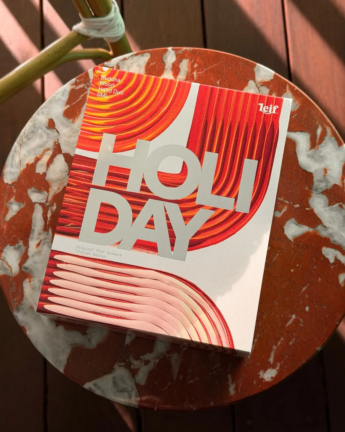
Leif
Huge silver holiday type over vivid plotted paint curves
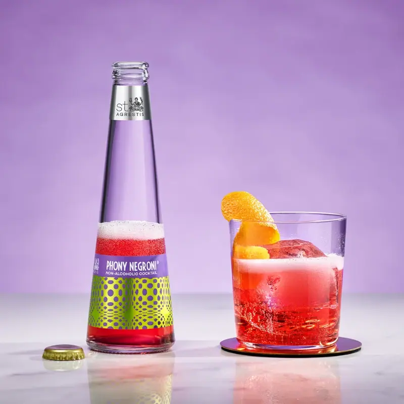
St. Agrestis
Optical lime-and-purple graphics below a long clear neck
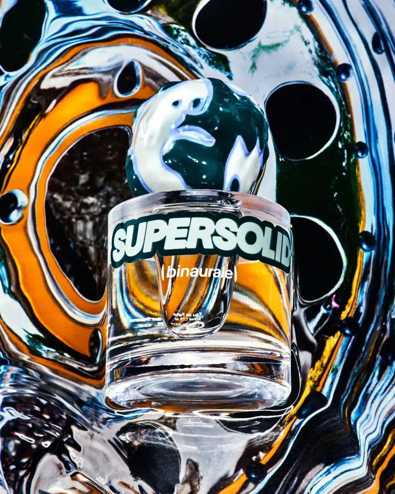
Binaurale
Globular teal cap above slanted pale fragrance lettering

Boy Smells
candy-shell flacons over blush pink glass
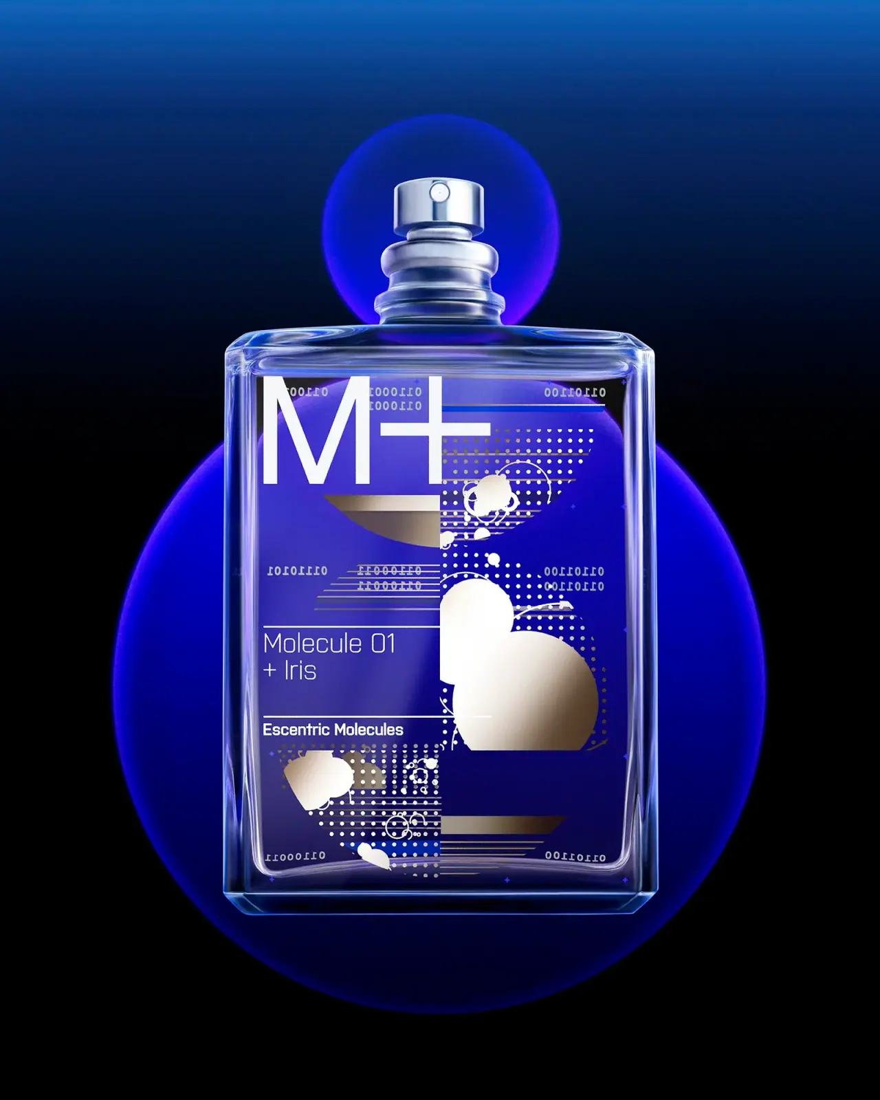
Escentric Molecules
Clear rectangular fragrance with giant symbol and layered coded graphics
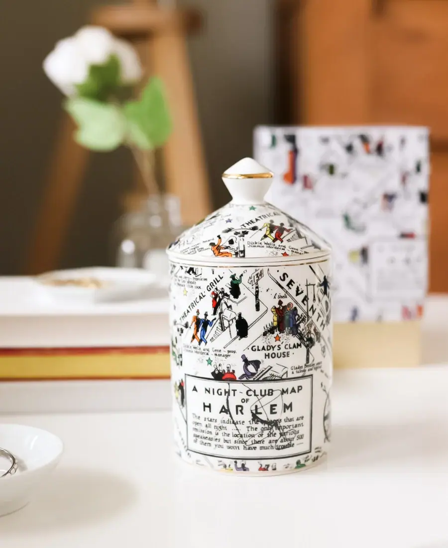
Harlem Candle Company
Illustrated ceramic map jar with coordinated lid and gold trim