Photography: Halves Studio — product photography. Images belong to their respective owners.
Peter Thomas Roth

Clinical orange with a broad branded lid
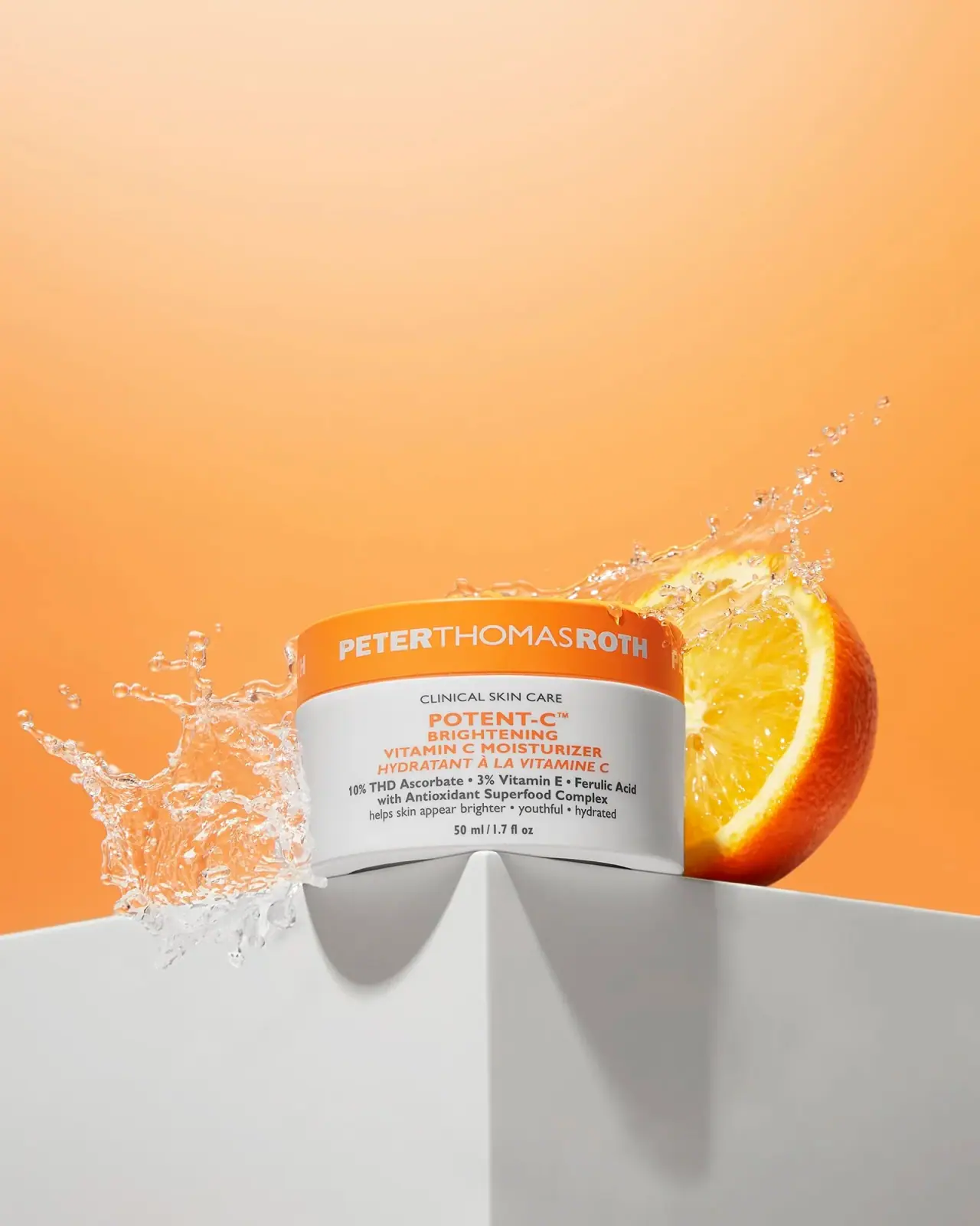
The selected Potent-C Brightening Vitamin C Moisturizer makes the lid a separate identity zone: white producer lettering spans an orange band above a white jar carrying a dense centered information stack. Orange returns in the product name, while charcoal supports the clinical descriptor, ingredient percentages and quantity. The design combines a strong distance signal with unusually explicit close-reading content. This study concerns the photographed 50 ml jar; it does not establish materials, production specifications or a universal Peter Thomas Roth packaging system.
- Skincare
- Light pack
- Clinical minimal
- Bold typographic
About this study
Photographed closed 50 ml Potent-C Brightening Vitamin C Moisturizer jar; not an audit of the wider brand range.
Sources & evidence · Reviewed 2026-10-19Color Palette
Approximate colours interpreted from photography. These are screen references, not official brand colours or print specifications.
Pack body
Cool jar white
#EEEFEA
Broad light body and reversed lid lettering; the photographed gray edges are shadows rather than a second printed stripe.
Ink
Clinical charcoal
#333432
Supporting descriptor, ingredient and benefit copy, and centered quantity; this keeps the informational layer distinct from the orange name.
Accent
Potent orange
#F58A22
Large closure band repeated in the product stack. Approximate screen color; exposure makes the illuminated lid brighter than the type.
Typography
Suggested visual alternatives, not confirmed brand typefaces. Any scale below is an illustrative estimate.
The wide producer name on the lid reads first. Potent-C leads the body, followed by a compact multiline category and French translation. Smaller clinical, ingredient and benefit lines then lead to the amount. Weight changes inside the producer lettering add emphasis without introducing another color.
Fonts
Lid identity and product heading
Montserrat
- Looks like
- Firm geometric capitals
- Type
- Geometric sans-serif
- Weight
- Medium 500 / Bold 700
- Case
- Uppercase
- Tracking
- Neutral to slightly open; never stretch characters to fill the lid.
- Fallback
- Arial, sans-serif
An original broad producer name and shorter formula family heading. Use two deliberate weights to create internal rhythm; the real producer lettering should not be recreated.
Clinical supporting text
Roboto Condensed
- Looks like
- Compact practical sans
- Type
- Condensed sans-serif
- Weight
- Regular 400 / Bold 700
- Case
- Sentence case with selected uppercase descriptors
- Tracking
- Mostly neutral; legibility matters more than fitting another claim.
- Fallback
- Arial, sans-serif
Small ingredient, category and quantity lines. Keep condensed supporting text subordinate to the orange headline and test it on a curved physical proof.
Structure & Proportions
Visual proportions and finish previews are illustrative. Confirmed construction details and uncertainties are distinguished in the study notes.
Proportions
| Purpose | Value | Preview |
|---|---|---|
| Closure identity band | The cap occupies roughly the upper quarter to third of the visible package height; a perspective-based impression, not a dieline measurement. | — |
| Body information density | The body holds several short centered lines, expanding for ingredients and contracting toward the amount. Side margins allow the curvature to remain readable. | — |
| Horizontal silhouette | The jar appears broader than tall. Its low center of gravity gives the lively orange color a stable visual base. | — |
Shapes
| Element | Value | Preview |
|---|---|---|
| Jar silhouette | A broad cylinder whose upper and lower ellipses compress into shallow curves in the photograph. | |
| Lid band | A continuous orange horizontal zone with no separate badge needed to carry producer recognition. | |
| Information block | Centered rectangular text grouping without a drawn rectangular border. |
Finishes
Smooth white body
Jar wall · matte
Restrained lid reflections
Orange closure; visual appearance only · gloss
Formats and materials
| Formats | Low, broad cylindrical moisturizer jar photographed closed, with the lid approximately matching the body diameter., Official product listing and visible front both identify 50 ml / 1.7 fl oz; these are contents, not container dimensions. |
| Materials | The body appears opaque white and the lid orange. The exact resin, glass content, wall construction and label substrate are not established by the consulted product page., No outer carton, inner seal or removable insert is visible. The white appearance alone cannot establish whether the body is decorated, molded or wrapped. |
| Closures | A deep orange lid covers the mouth and forms a continuous horizontal band. The image does not expose its underside or threads, so the opening mechanism and liner remain unverified. |
| Decoration | White producer lettering follows the curved lid wall., Orange and charcoal body text is arranged without a visible bordered cartouche. Direct printing versus an applied label cannot be resolved from this front view. |
Front Panel
Schematic reading order. The diagram’s zone heights do not represent measured artwork proportions.
Separate producer identity from formula explanation by placing them on different components. Within the white body, use one center axis, a short heading and progressively more functional text. The French category line is visibly slanted, providing a small change of texture within a largely upright typographic system.
| Zone | Content |
|---|---|
| Lid | White Peter Thomas Roth lettering spans the orange circumference and continues beyond the directly facing portion. |
| Top of body | Small dark Clinical Skin Care descriptor creates a restrained introduction above the colored name. |
| Product block | Potent-C, brightening category and vitamin C moisturizer wording form the orange focal group, followed by the French translation. |
| Supporting explanation | Dark lines name ingredient percentages and an antioxidant complex, then a smaller benefit statement. These are observed marketing statements, not independent efficacy findings. |
| Quantity baseline | 50 ml / 1.7 fl oz is centered at the lower front, matching the official product listing. |
Range System
Only this moisturizer is analyzed. As a transferable design principle, retain the producer band and clear category hierarchy while varying one verified formula identifier. The official Potent-C collection exists, but this study does not claim all related products share this exact lid, format or front layout.
- A fictional moisturizer family could repeat one closure color across different sizes while keeping amount labels plainly visible.
- A different active category could receive a new accent only after testing whether the category text remains recognizable without color.
- Bilingual category names should stay paired, rather than turning a language change into an unrelated visual variant.
Back of Pack & Shelf
The reverse and base are hidden. No reconstruction of actual ingredient order, barcode, batch location or disposal marks is possible from the selected photograph.
- For an original brief, reserve space for the complete ingredient declaration and directions separate from front-facing hero ingredients.
- Keep manufacturer, batch and applicable caution information legible on the chosen physical jar.
- Determine component disposal wording only after material and market verification; the white jar is not a recycling specification.
On shelf
At thumbnail size, orange lid over white body is the first useful distinction. Closer viewing reveals the repeated orange name and compact charcoal explanation. This is a design interpretation, not a measured retail-performance result. The broad band gives a short jar more identification area, but the lid must remain aligned enough for the producer name to face forward in photography and merchandising.
Imagery
The approved Halves Studio photograph places the jar on a white architectural corner with an orange slice and suspended splash. Low viewpoint, sharp edges and large empty orange space make the small jar feel monumental. The citrus and water are photographic props rather than package illustrations or proof of ingredient origin, waterproofing or clinical performance. For a useful catalogue crop, preserve both the lid lettering and entire quantity line; do not let the lively splash hide the product block.
Guidelines
Editorial principles for an original design brief, not official brand guidelines.
Do
- Give the closure enough uninterrupted area for the original producer identity to remain readable around the curve.
- Repeat the orange accent in one concise formula heading to connect cap and body.
- Separate ingredient statements from the product name through smaller size and darker neutral text.
- Proof both language lines and the amount at the actual jar size, particularly near the curved sides.
Don't
- Do not describe the white jar as glass or a specific polymer without component evidence.
- Do not replace the broad producer band with a tiny logo that leaves the lid visually disconnected.
- Do not treat the orange fruit or water splash as printed decoration or substantiation of performance.
- Do not transfer the photographed ingredient percentages or brand-specific wording to a fictional formula.
Sources & evidence
How this study was built
structure · Sourced fact
Official product page identifies 50 ml / 1.7 fl oz, also readable in the approved image.Peter Thomas Roth — Potent-C Brightening Vitamin C Moisturizerpalette · Visual observation
Orange lid and product text, light body and charcoal supporting copy; scenery excluded.typography · Visual observation
Sans-serif producer band, centered orange heading and condensed-looking support; proposed fonts are alternatives.label · Visual observation
Clinical descriptor, bilingual product block, ingredient lines and low quantity are visible.imagery · Visual observation
Citrus slice, water splash and architectural pedestal belong to the photo, not the pack.range · Editorial interpretation
Suggested adaptation is limited to principles from the selected jar.edition · Sourced fact
Current official page includes the white-and-orange 50 ml presentation; no component specification supplied.Peter Thomas Roth — Potent-C Brightening Vitamin C Moisturizer
What remains unverified
- Exact component materials and decoration method unverified.
- Original fonts and production color values unknown.
- Reverse, lid underside and inner seal not shown.
- Proportions are visual estimates; no dimensioned drawing reviewed.
Give your AI
packaging taste
Give your design or image tool a packaging study: palette, type, structure, front panel and principles for an original brief.
Export this styleFree with an email. PACK.md works in Claude, ChatGPT, Cursor and image tools.
More like this

AussieZinc
Sun-yellow numerals on a tall, information-rich white cylinder

BioSeivas
Vertical serif identity on a mauve treatment band
ELEVEN Australia
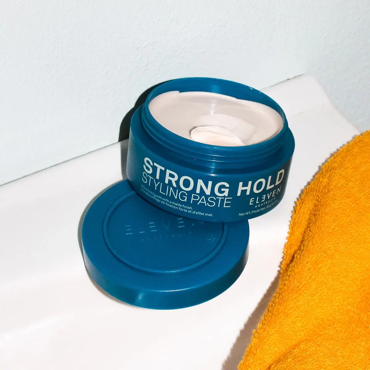
Deep blue open jar with emphatic hold-first typography
Gatineau
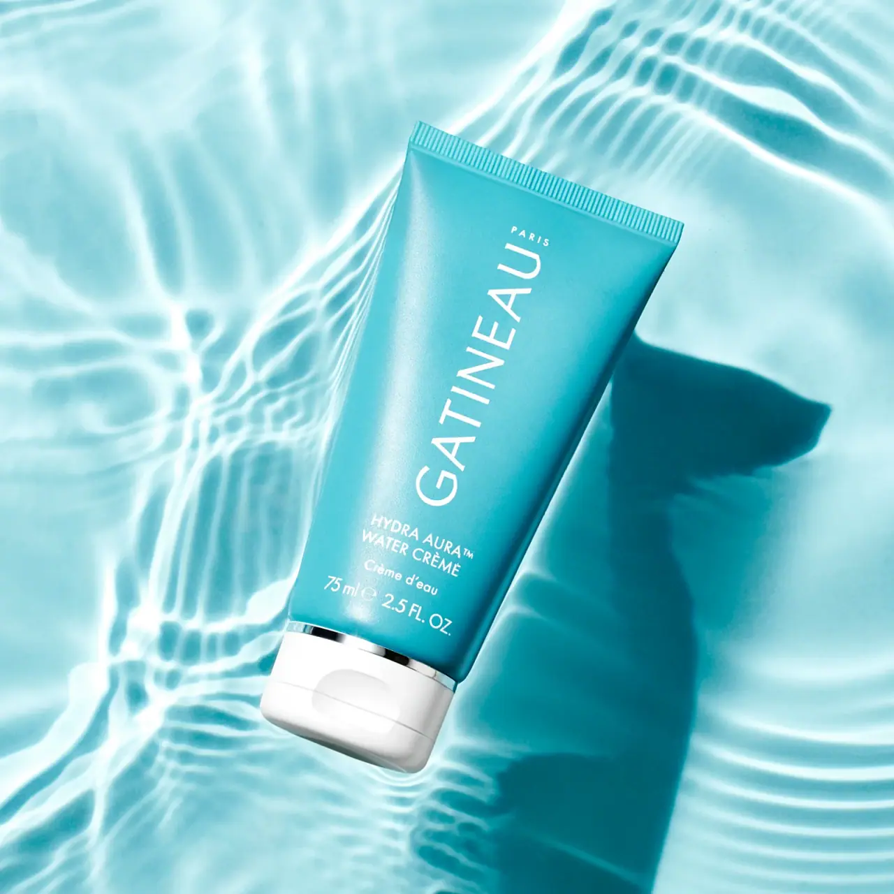
Turquoise tube with lengthwise white name and silver accent

Malin+Goetz
pharmacy label set in bracketed helvetica
Murad
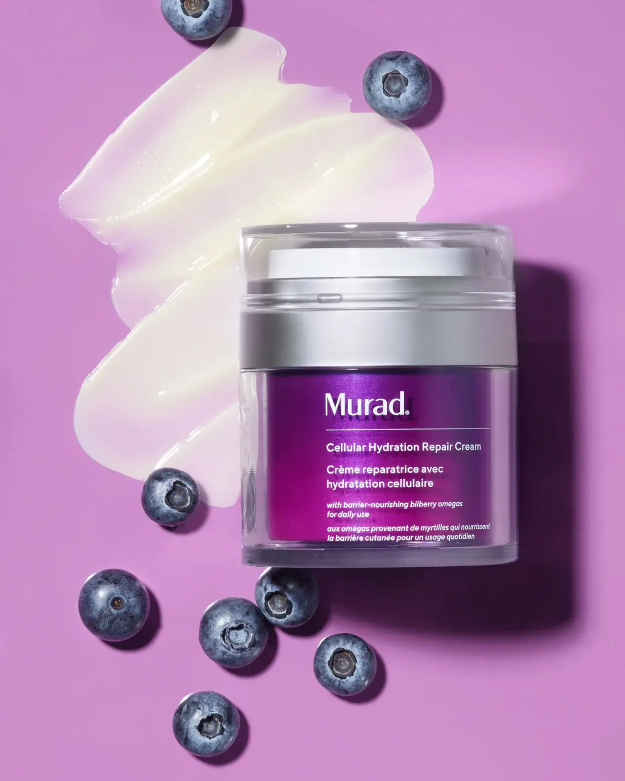
Purple inner field framed by clear walls and silver

Native
white drugstore bottles, scent-tinted vertical caps
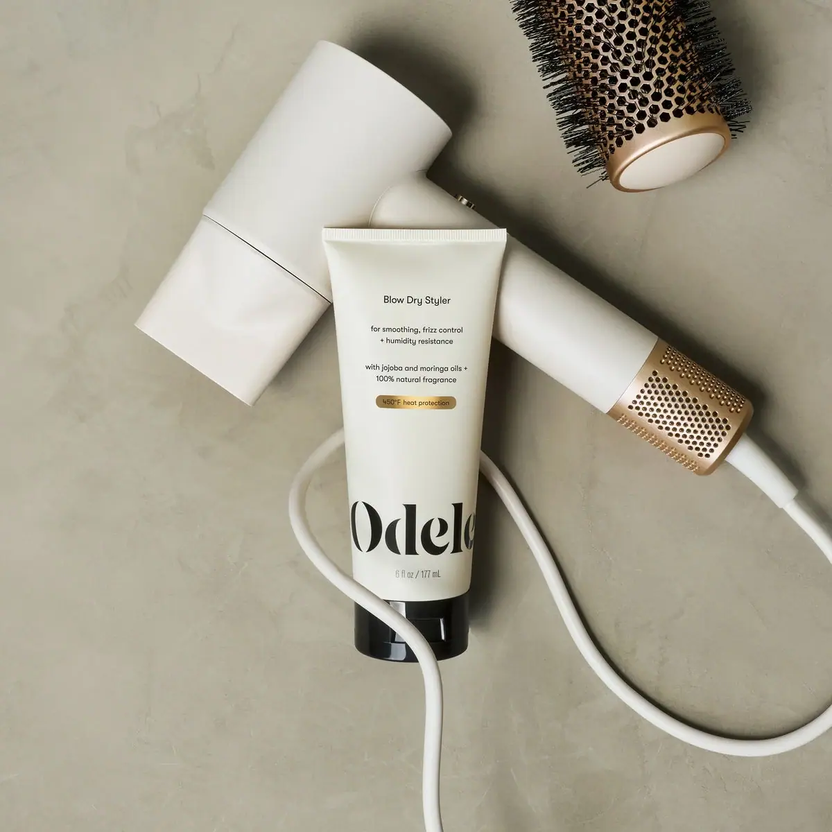
Odele
Cream tube with tiny utility copy and oversized lower serif