Photography: Raw Elements official photography. Images belong to their respective owners.
Raw Elements

Yellow fieldwork label with ruled sunscreen facts
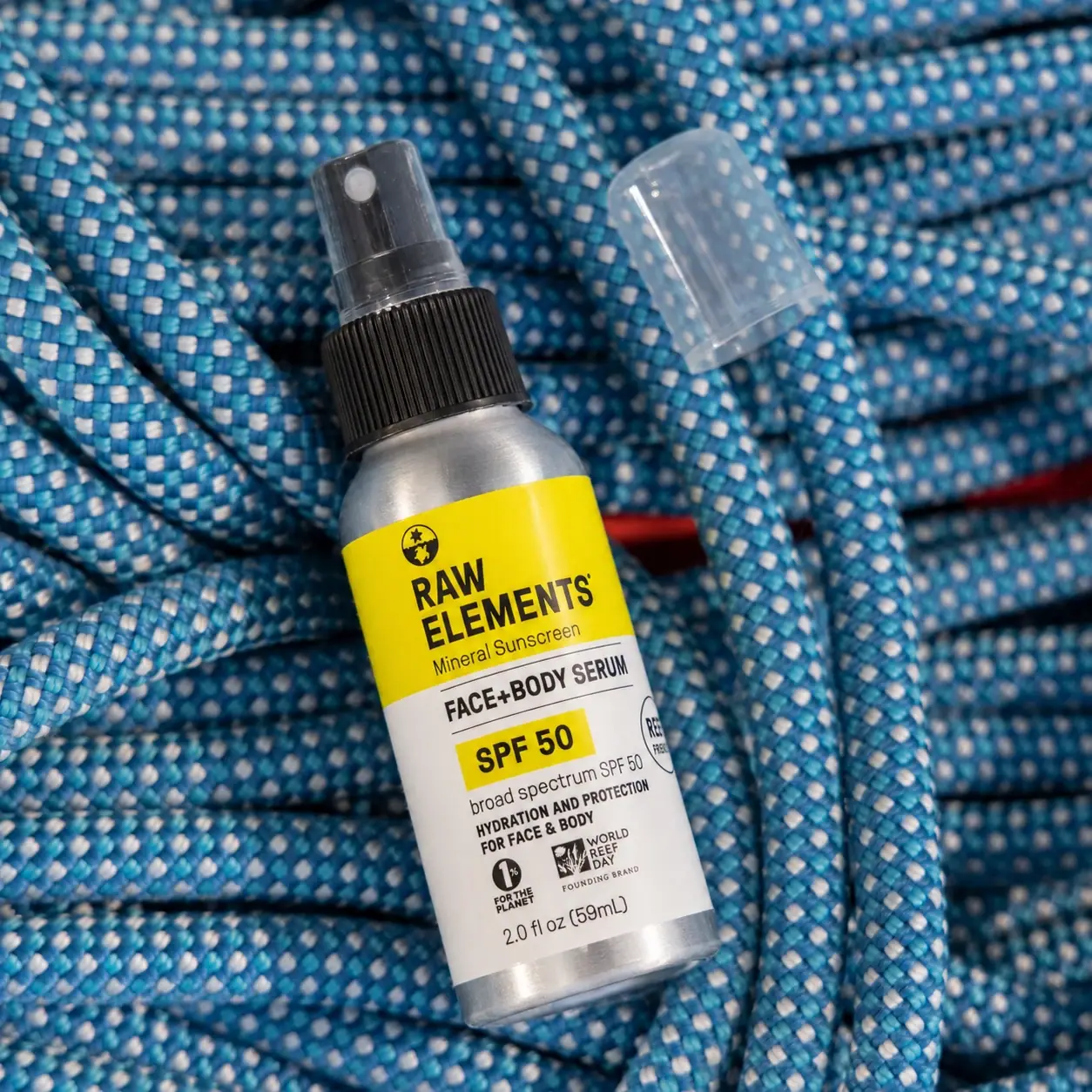
The selected Face + Body Serum SPF 50 places a bright yellow maker panel above a white information panel on a compact silver-looking spray bottle. A globe symbol and stacked RAW ELEMENTS identity establish the upper block; black rules, a yellow SPF highlight and tightly organised supporting text structure the lower one. The black ribbed collar and exposed actuator introduce a functional mechanical detail, while a translucent overcap sits separately. The brand identifies the serum as non-aerosol. The photographed front reads 2.0 fl oz / 59 mL, but the bottle substrate and decoration process remain unverified.
- Suncare
- Light pack
- Bold typographic
- Colour-coded range
About this study
Selected 59 mL-labelled serum spray in the approved rope photograph; current exact product page verifies non-aerosol function. Other formats and rear artwork are outside the inspected scope.
Sources & evidence · Reviewed 2026-10-19Color Palette
Approximate colours interpreted from photography. These are screen references, not official brand colours or print specifications.
Pack body
Silver bottle appearance
#B7B9B7
Approximate exposed shoulder and base appearance. This is not a verified aluminium or stainless-steel specification.
Label
Signal yellow
#F9D42E
Approximate upper maker field and lower SPF highlight. The repeated colour connects two separate reading zones without colouring the entire information panel.
Information white
#F5F3E8
Approximate lower label field under warm light, supporting dense black copy and small marks.
Ink
Utility black
#161714
Maker, globe, dividers, product information and visible collar. Similar appearance does not establish identical inks or materials.
Typography
Suggested visual alternatives, not confirmed brand typefaces. Any scale below is an illustrative estimate.
A compact globe sits above the large two-line maker name in the yellow upper zone. Below its smaller mineral-sunscreen descriptor, the white zone begins with the product role framed by black rules. SPF 50 receives a separate yellow highlight and heavier treatment, making the protection identifier easy to locate without forcing it to share a line with the maker. Smaller supporting copy, organisation marks and volume occupy the foot. The layout contains several strong uppercase elements, but their placement and backgrounds distinguish their jobs rather than relying on a single descending type scale.
Fonts
Original compact maker alternative
Archivo
- Looks like
- Dense bold sans capitals
- Type
- Grotesque sans serif
- Weight
- Bold, ExtraBold
- Case
- Uppercase
- Tracking
- Compact with open counters
- Fallback
- Arial, sans-serif
Build an independent two-line maker that remains legible against a saturated field. Avoid recreating the RAW ELEMENTS arrangement or globe; test the broadest line against the curved visible front.
Functional information alternative
Roboto Condensed
- Looks like
- Narrow practical sans
- Type
- Condensed sans serif
- Weight
- Regular, Bold
- Case
- Uppercase headings with readable supporting text
- Tracking
- Normal
- Fallback
- Arial, sans-serif
Keep product role, quantity and supporting statements distinguishable at small sizes. Condensation can fit a short factual heading, but should not be used to compress every mandatory line into an unreadably dense block.
Structure & Proportions
Visual proportions and finish previews are illustrative. Confirmed construction details and uncertainties are distinguished in the study notes.
Proportions
| Purpose | Value | Preview |
|---|---|---|
| Partitioned reading surface | The yellow upper field behaves as a compact identity block, while the longer white lower region accommodates product and supporting information. | — |
| Mechanical top margin | The exposed shoulder and collar create a clear transition above the printed wrap, preventing the label from visually competing with the actuator. | — |
| Curved-face constraints | Small symbols near the lateral edge begin to turn away from view. Central hierarchy is more reliably readable than the full width of the wrap in a frontal photograph. | — |
Shapes
| Element | Value | Preview |
|---|---|---|
| Body | Straight cylinder with rounded shoulder and a narrow exposed base. | |
| Spray actuator | Small upper dispensing head with a pale circular front outlet. | |
| Maker field | Broad yellow rectangular region wrapping around the upper body. | |
| SPF highlight | Small yellow rectangle embedded within the lower factual hierarchy. | |
| Globe mark | Circular graphic above the maker; proprietary artwork, not a generic certification symbol. |
Finishes
Silver-reflective body appearance
Exposed shoulder and lower edge; substrate unverified · metallic
Low-glare label appearance
Yellow and white wrap; exact stock and varnish unknown · matte
Translucent protective cap
Detached overcap; material unspecified · transparent
Formats and materials
| Formats | Compact cylindrical spray bottle with rounded shoulder, Black ribbed collar and exposed actuator, Separate translucent protective overcap, Selected front identifies 2.0 fl oz / 59 mL |
| Materials | Silver-looking exposed shoulder and base are visible, but the exact body substrate is unverified., The overcap appears translucent and the collar opaque black; polymer types and recycled content are not established., The brand explicitly describes the serum as non-aerosol. This distinguishes product function without proving the internal pump architecture or material. |
| Closures | The actuator projects above a ribbed black collar and has a small pale circular outlet on its front. The detached translucent overcap shows how the functional top can be covered between uses. Its attachment method, retention force and sealing performance cannot be assessed from the image. No aerosol pressure, refill arrangement or spray pattern is inferred. The ridges offer a visible grip texture, although their precise assembly purpose is not confirmed by a technical specification. |
| Decoration | Yellow upper field with globe and stacked maker, White lower field divided by black rules, Repeated yellow highlight around the SPF identifier, Small organisation marks concentrated near the bottom |
Front Panel
Schematic reading order. The diagram’s zone heights do not represent measured artwork proportions.
The wrap operates as two connected panels rather than one continuous block of copy. The maker owns the yellow header, while the product role and SPF anchor the white body. Horizontal rules frame the product name and help the reader distinguish one information level from the next. Repeating yellow only around the SPF value makes the technical identifier feel related to the brand field. Smaller supporting lines sit below, followed by organisation graphics and quantity. These graphics are visible marks, not evidence that every environmental or certification claim has been independently assessed.
| Zone | Content |
|---|---|
| Upper identity | Globe, stacked RAW ELEMENTS and a small mineral-sunscreen descriptor on yellow. |
| Product heading | FACE + BODY SERUM framed by black horizontal dividers. |
| Protection identifier | Prominent SPF 50 on a yellow rectangle with nearby broad-spectrum wording. |
| Supporting information | Hydration-and-protection wording followed by small organisation marks; some side details curve out of full view. |
| Quantity foot | 2.0 fl oz / 59 mL printed close to the lower label edge. |
Range System
The official SPF 50 collection separates this serum from a face stick. That establishes a functional relationship, but this study inspects only the selected serum bottle. Its combination of maker field, ruled role heading and highlighted SPF can be understood as a repeatable information architecture without assuming that all other products share identical colours, proportions or materials. The colour-coded-range tag describes this selected example's use of colour as an information cue; it does not establish a complete brand-wide coding table.
- Serum and stick are distinct formats listed within the SPF 50 collection; their packaging should be compared directly before asserting shared construction.
- On this bottle, product role and SPF remain separate identification tasks even though both appear in the lower field.
- For an original range, reserve consistent positions for role and protection information instead of varying every line with the variant colour.
Back of Pack & Shelf
The rear wrap, base markings and any carton are not shown. Only a portion of the side information is visible around the cylinder.
- Current online directions and ingredient information are not a transcription of the photographed reverse.
- No barcode position, batch coding, seam overlap or label-stock specification is established.
- The small organisation marks should be identified and verified individually before being described as certifications or reused in another design.
On shelf
The yellow header should remain a strong visual landmark when the finer white-panel text becomes too small to read. Within a closer view, the highlighted SPF gives the reader another clear destination. This is a visual inference rather than tested retail performance. The crowded lower details are more vulnerable to curvature and scale than the central maker. A practical review would inspect the bottle upright at real size, checking the smallest copy and marks independently of the dramatic rope photograph.
Imagery
The bottle lies diagonally among thick blue-and-white braided rope, with its translucent cap displaced near the top. The rope introduces outdoor equipment associations and a strong texture contrast to the smooth bottle. Its blue belongs to the set rather than the package palette. The angle exposes the actuator and keeps the two label zones visible, while the silver shoulder picks up the surrounding light. The photograph shows no spray plume and cannot demonstrate dispensing performance, waterproofing or environmental suitability. The useful compositional lesson is how a rugged prop can contextualise a practical pack without being printed on it.
Guidelines
Editorial principles for an original design brief, not official brand guidelines.
Do
- Give maker and product facts distinct but connected regions.
- Use rules to separate short information levels.
- Keep material claims separate from metallic appearance.
- Verify organisation marks before interpreting their meaning.
- Test the smallest copy around the real cylinder.
Don't
- Do not turn blue rope into a package colour.
- Do not describe the serum as aerosol when the brand identifies it as non-aerosol.
- Do not infer aluminium, refillability or recycled content from appearance.
- Do not copy environmental badges into a fictional concept.
- Do not treat a spray photograph as proof of spray performance.
Sources & evidence
How this study was built
structure · Sourced fact
Exact official product page explicitly identifies the serum as non-aerosol.SPF 50 Face + Body Serum — Raw Elementsrange · Sourced fact
SPF 50 collection lists serum and face stick as separate formats.SPF 50 Collection — Raw Elementslabel · Visual observation
Yellow maker header, white lower facts, ruled product title and yellow SPF rectangle form distinct reading zones.structure · Visual observation
Selected front reads 2.0 fl oz / 59 mL; exposed actuator and separate translucent overcap are visible.imagery · Visual observation
Blue-and-white braided rope belongs to the photographic set rather than printed package decoration.typography · Editorial interpretation
Repeated field colour and dividers organise several uppercase text levels without requiring a single simple size ladder.
What remains unverified
- Bottle substrate, label stock, decoration process and precise fonts are unverified.
- Rear information, internal pump construction and overcap attachment are not inspected.
- Visible organisation marks do not independently verify certification scope.
- HEX colours are approximate photograph observations rather than production specifications.
Give your AI
packaging taste
Give your design or image tool a packaging study: palette, type, structure, front panel and principles for an original brief.
Export this styleFree with an email. PACK.md works in Claude, ChatGPT, Cursor and image tools.
More like this

AKT
Lilac stage directions with a quiet metallic detail
Bouclème
warm colour blocks crossed by flowing white ribbons
Ceremonia
Warm colour labels bounded by upright and inverted wordmarks

Dr. Bronner’s
A bright soap wrapper with a densely ordered voice
Essie
Visible red colour, clear relief and a white cap
KraveBeauty
cropped wordmarks on minty skincare bottles
L'Oréal Paris
translucent amber shampoo under a gilded serif masthead

Malin+Goetz
pharmacy label set in bracketed helvetica