Photography: Sienna Naturals official photography. Images belong to their respective owners.
Sienna Naturals

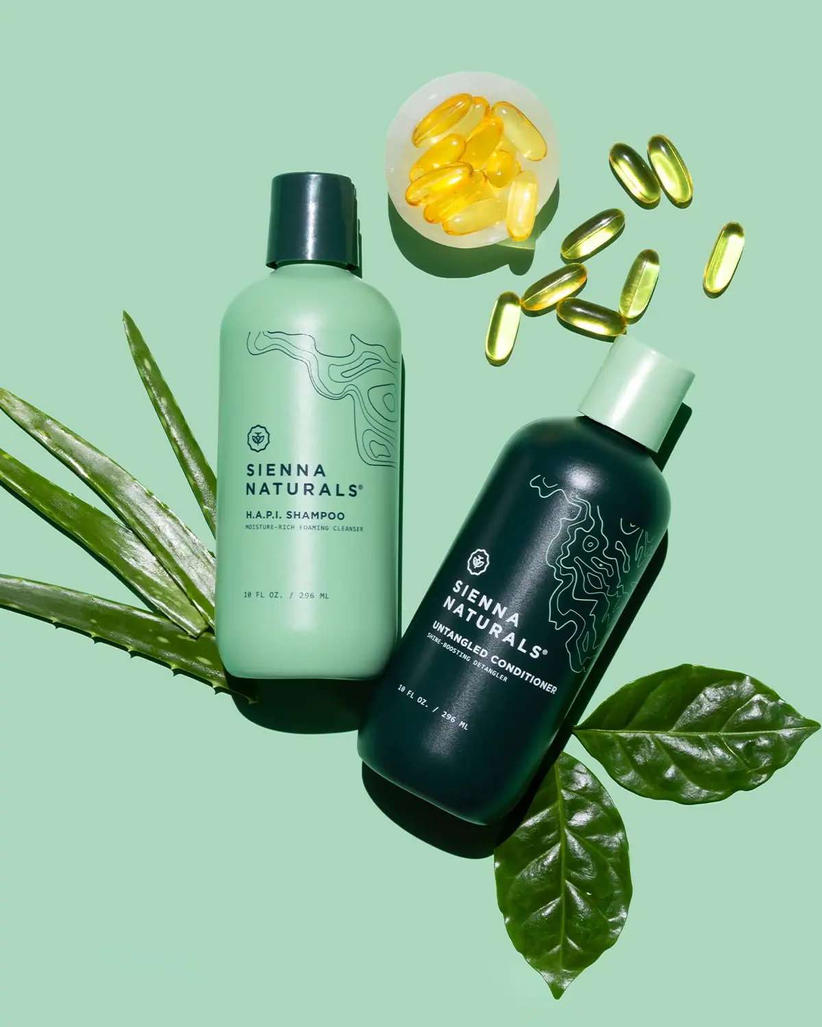
inverted green bottles with contour lines and left-aligned information
The photographed Wash Day Duo uses an inversion of pale and deep green to distinguish two related products. H.A.P.I. Shampoo has a pale body and dark cap; Untangled Conditioner has a dark body and pale cap. Fine contour-like drawings occupy the upper area, while a small emblem, stacked maker name and product information form a left-aligned block below. Both fronts visibly read 10 fl oz / 296 mL. This earlier presentation is kept separate from the brand's current 11 oz listing and documented packaging transition.
- Hair
- Light pack
- Colour-coded range
- Botanical
About this study
Earlier Wash Day Duo photograph with H.A.P.I. Shampoo and Untangled Conditioner, each visibly 10 fl oz / 296 mL. Current 11 oz and slimmer-bottle information is separate context.
Sources & evidence · Reviewed 2026-10-19Color Palette
Approximate colours interpreted from photography. These are screen references, not official brand colours or print specifications.
Pack body
Pale green body
#9FCBAD
Approximate shampoo body colour, repeated by the conditioner cap. Sunlight and the mint scene influence the apparent tone.
Deep green body
#123E34
Approximate conditioner body colour, echoed by the shampoo cap and dark text on the pale bottle.
Ink
Pale reversed information
#E6EEE5
Approximate light lettering on the dark conditioner. The contour drawing has a greener, lower-contrast appearance than the strongest white-looking copy.
Dark green information
#214E44
Approximate emblem, maker and smaller text on the shampoo. Exact ink recipes and official colour standards are unknown.
Typography
Suggested visual alternatives, not confirmed brand typefaces. Any scale below is an illustrative estimate.
The maker appears in two tracked uppercase lines with a shared left edge. A small emblem sits above that text block, while the product name and a much smaller functional descriptor follow below. Net quantity is separated near the lower front and has a more technical, monospaced-looking rhythm. The two bottles repeat the positions and type roles while reversing the dominant light/dark relationship. This is not a centred label stack: line starts provide the main alignment structure.
Fonts
Maker and category alternative
Montserrat
- Looks like
- Montserrat for tracked uppercase identity and compact category text
- Type
- Geometric sans serif
- Weight
- Bold 700 / Medium 500
- Case
- Uppercase
- Tracking
- Open maker spacing, closer category spacing
- Fallback
- Arial, sans-serif
Set a new two-line maker name on a clear left edge, then use a smaller and less tracked category line. Test the longer conditioner wording without forcing it into the shampoo's exact line length. This family is not an attribution of the original mark.
Quantity alternative
Roboto Mono
- Looks like
- Roboto Mono for a technical-looking numerical footer
- Type
- Monospaced sans serif
- Weight
- Regular 400
- Case
- Numerals and uppercase units
- Tracking
- Natural monospaced rhythm
- Fallback
- monospace
Give net quantity a quiet separated location and a consistent numeral rhythm. This is a practical alternative to the visible small footer, not proof of an original monospaced font. Keep enough size for curved surfaces and reverse printing.
Structure & Proportions
Visual proportions and finish previews are illustrative. Confirmed construction details and uncertainties are distinguished in the study notes.
Proportions
| Purpose | Value | Preview |
|---|---|---|
| Paired geometry | The two bodies and caps have closely related outlines in the selected view. Their different angles prevent an exact dimensional comparison. | — |
| Drawing above copy | Contour lines occupy the upper-right area while the main text begins below and towards the left. Ornament and information have distinct dominant zones. | — |
| Separated quantity | A broad open interval separates the short functional descriptor from the lower volume line, preserving a calm lower face. | — |
| Reversed component colours | Body and cap colours swap between the products, creating two complementary silhouettes from the same limited palette. | — |
Shapes
| Element | Value | Preview |
|---|---|---|
| Bottle body | Broad rounded shoulders above long near-straight sides and rounded base corners. | |
| Contour artwork | Nested irregular lines with looping enclosed areas, reminiscent of topographic contours without a verified mapped location. | |
| Emblem | Small scalloped or seal-like outline with a plant-like central symbol. | |
| Cap | Smooth short cylinder in the opposite light/dark colour to the body. |
Finishes
Softly reflective coloured body
Both opaque-looking bottles under hard light; no verified soft-touch or satin coating. · matte
Smooth cap highlights
Contrasting closures, particularly the dark shampoo cap; substrate unknown. · gloss
Formats and materials
| Formats | Selected pair of opaque-looking rounded-shoulder bottles with broad cylindrical-looking bodies, flat-looking bases and contrasting short cylindrical caps. |
| Materials | The selected earlier bottles' resin, cap composition and decoration process are unverified., The brand's later packaging update describes a new slimmer format and collection claims; those statements are not a component specification for the photographed 296 mL edition. |
| Closures | Each cap is a short smooth cylinder narrower than the bottle body. The pale shampoo's dark cap and dark conditioner's pale cap make the inversion visible even above the shoulder. Both are closed, so the exact opening, hinge, orifice and attachment are hidden. Matching external geometry is useful to describe, but it does not establish the same dispensing performance for shampoo and conditioner. |
| Decoration | Irregular contour-like linework near the upper body., Small outlined emblem above the left-aligned maker block., Two-line spaced uppercase maker identity., Smaller category and function lines with a separate quantity footer. |
Front Panel
Schematic reading order. The diagram’s zone heights do not represent measured artwork proportions.
The front artwork uses a clear left-hand text alignment beneath more fluid upper linework. The small emblem introduces the maker block, product name and compact descriptor. Quantity sits much lower, maintaining the same general reading edge. On the conditioner, lighter information reverses out of the deep-green field; on the shampoo, dark information sits on pale green. No separate applied label boundary is clearly established, so the analysis describes artwork positions rather than a verified label cutting shape.
| Zone | Content |
|---|---|
| Upper contour field | Fine irregular lines near the shoulder and upper-right body. |
| Small emblem | Outlined plant-like symbol above the maker block. |
| Maker block | SIENNA NATURALS on two spaced uppercase left-aligned lines. |
| Product and function | H.A.P.I. Shampoo or Untangled Conditioner followed by a smaller functional descriptor. |
| Lower quantity | Separated 10 FL OZ. / 296 ML footer on each bottle. |
Range System
This image provides direct evidence for a two-product light/dark inversion: body, cap and information contrast coordinate the shampoo and conditioner. The official current bundle still pairs the named products but lists 11 oz, while a separate brand update explains a rollout of slimmer, taller bottles alongside remaining older stock. The older photograph therefore supports its own visual system, not every current component or recycling claim.
- Photographed H.A.P.I. Shampoo: pale body, dark cap and dark information, 296 mL.
- Photographed Untangled Conditioner: dark body, pale cap and light information, 296 mL.
- Later source context: updated bottle format and current 11 oz listing, kept distinct from this earlier pair.
Back of Pack & Shelf
The reverse, underside and open caps are unseen. Front descriptors identify product roles, but no complete directions or ingredient placement can be reconstructed. The packaging-transition article does not establish the exact material composition of the older bottles shown here.
- Inspect each reverse before documenting the full information system.
- Check open closures before assigning a dispensing gesture or internal mechanism.
- For a new pair, test reversed small copy separately from dark-on-light copy rather than assuming equal readability.
On shelf
Interpretation: the light/dark body inversion can make the two steps easier to distinguish than two nearly identical pale packs, while matching text positions maintain family recognition. The contour artwork is finer and lower contrast than the maker block, so it may recede at distance. A new system should retain readable category names as well as colour differences, and test the small reversed descriptor on the dark version at actual size and under glare.
Imagery
The duo lies on a mint background with aloe-like leaves, other green foliage and translucent golden capsule props. Hard light creates deep bottle shadows and small highlights on the caps and capsules. The backdrop relates to the pale package without becoming identical to its colour under all lighting. The botanical and capsule forms are external story cues; they do not prove an exact ingredient source, a supplied accessory or an environmental property of the bottle material.
Guidelines
Editorial principles for an original design brief, not official brand guidelines.
Do
- Coordinate a pair through shared positions while using clear light/dark differentiation.
- Keep category words readable even when colour is the fastest cue.
- Test fine reversed artwork and small text independently on dark and pale versions.
- Record the photographed edition before applying newer packaging statements.
Don't
- Do not describe the main text as centred when its lines share a left edge.
- Do not identify contour artwork as a particular map without evidence.
- Do not transfer later bottle materials or collection claims to the older 296 mL pair.
- Do not copy the Sienna Naturals emblem or exact contour arrangement.
Sources & evidence
- Sienna Naturals — Wash Day Duo, current product contextproduct
- Sienna Naturals — Packaging Update, edition transitionbrand
How this study was built
context · Sourced fact
Current bundle pairs H.A.P.I. Shampoo and Untangled, listed at 11 oz.Sienna Naturals — Wash Day Duo, current product contextedition · Sourced fact
Brand update describes slimmer taller packaging and mixed older/newer inventory during rollout.Sienna Naturals — Packaging Update, edition transitionedition · Visual observation
Both selected fronts visibly read 10 fl oz / 296 mL.Sienna Naturals — Wash Day Duo, current product contextpalette · Visual observation
Pale and deep green body/cap colours invert between shampoo and conditioner.Sienna Naturals — Wash Day Duo, current product contextlabel · Visual observation
Main information shares a left edge below contour-like artwork; it is not a centred text stack.Sienna Naturals — Wash Day Duo, current product contextshelf · Editorial interpretation
Reversed small text needs separate testing even when the two layouts share positions.
What remains unverified
- Selected 296 mL edition differs from current 11 oz listing and later format guidance.
- Bottle/cap resin, coating and graphic application process are unverified.
- Original fonts, physical dimensions and contour artwork origin are unknown.
- Reverse, underside and open closures are unseen; props and scene colours are separate from packaging.
Give your AI
packaging taste
Give your design or image tool a packaging study: palette, type, structure, front panel and principles for an original brief.
Export this styleFree with an email. PACK.md works in Claude, ChatGPT, Cursor and image tools.
More like this
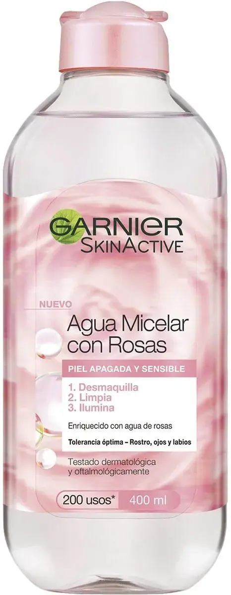
Garnier
green-leaf mark over fruit-bright sub-brand bottles
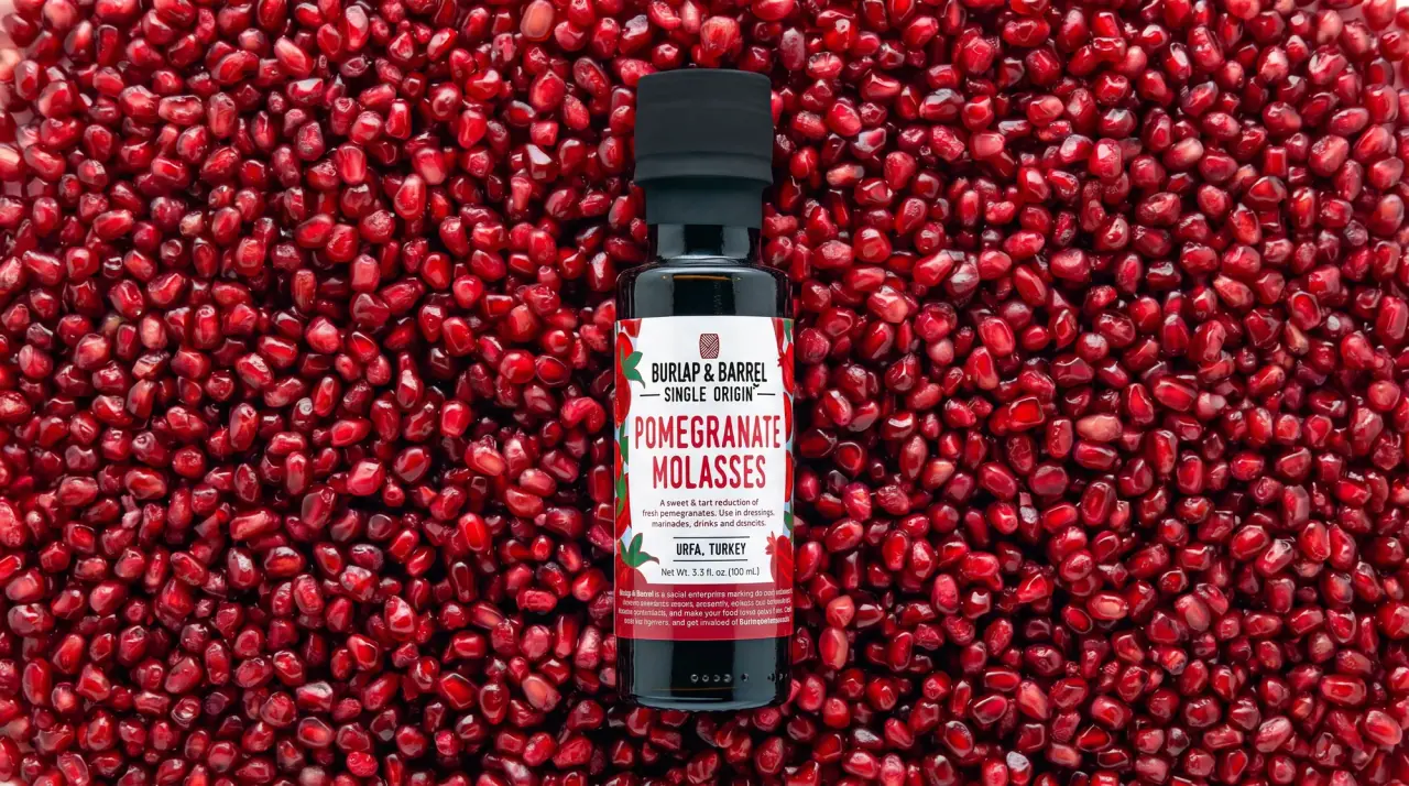
Burlap & Barrel
field-guide labels on clear spice jars

Yerba Madre
golden cans woven with andean textile geometry

AKT
Lilac stage directions with a quiet metallic detail

al.ive body
warm architectural calm, built as a paired vanity object

Benamôr
Ornamental lilac medallion suspended above golden botanical oil

Bomba Curls
tropical foliage gathered around a bold yellow nameplate
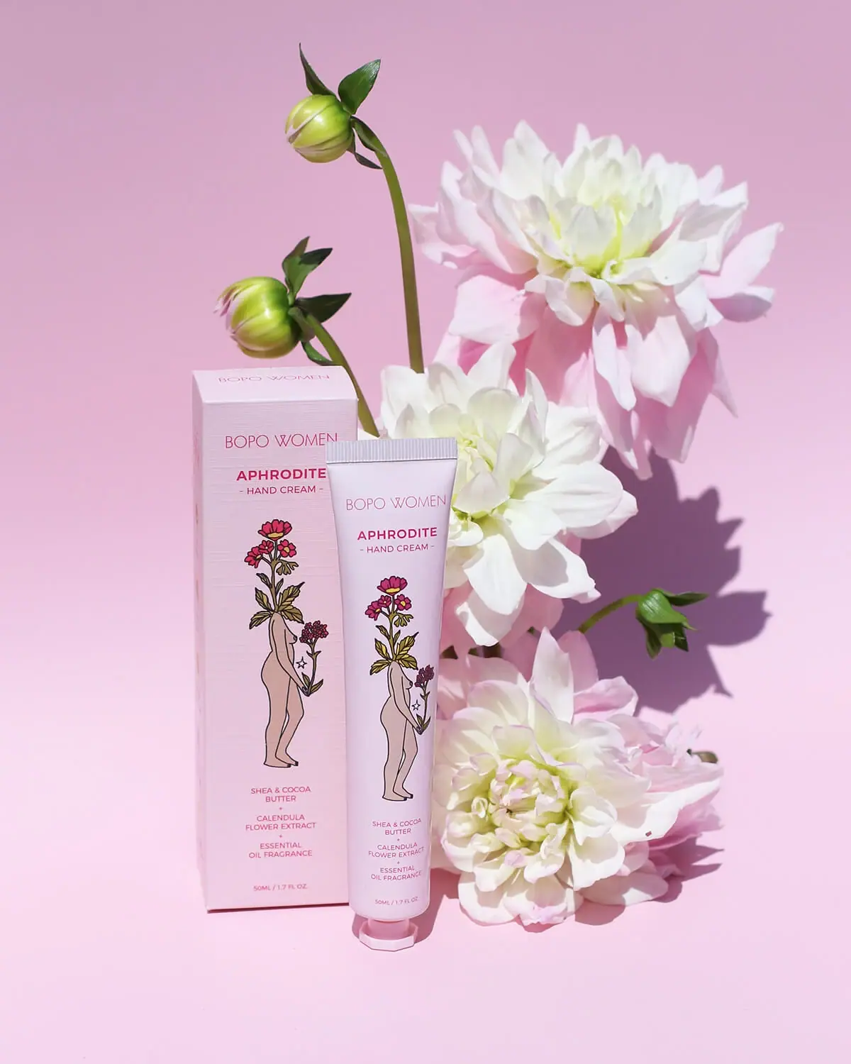
Bopo Women
a botanical figure on a coordinated blush-pink pair