Photography: RED Productions and Joe Lingeman; art direction Claudia Leung. Images belong to their respective owners.
Skinfix

pale blue tiered jar with dark maker and white subline
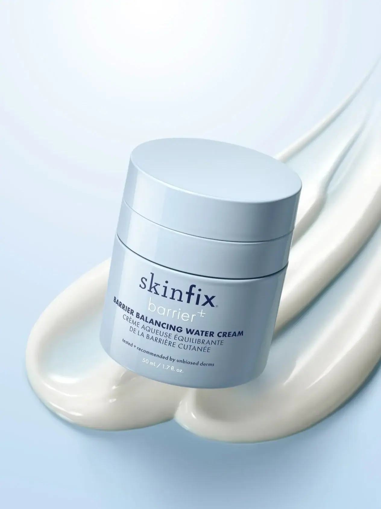
The selected pale-blue 50 mL Water Cream jar uses a compact centred front beneath a broad closed top. A dark maker name combines visibly different letter voices, followed by the thinner white barrier+ line. Heavy uppercase English naming sits above lighter French wording, with a small endorsement and white quantity below. Two horizontal seams divide the upper silhouette into stacked bands. Cream swatches and a matching blue backdrop make the photograph cohesive while remaining separate from the jar itself.
- Skincare
- Light pack
- Clinical minimal
About this study
Selected pale-blue 50 mL Water Cream jar from Claudia Leung's campaign project. Current material and refill guidance is attributed to the brand and scoped to its stated size.
Sources & evidence · Reviewed 2026-10-19Color Palette
Approximate colours interpreted from photography. These are screen references, not official brand colours or print specifications.
Pack body
Powder-blue shell
#AFC8D8
Approximate jar and lid colour under the selected cool lighting. Highlights approach white and shadows become grey-blue; those are not separate specified component colours.
Ink
Deep blue information
#25354F
Approximate maker, English name, French wording and small endorsement. Weight changes contribute to the perceived darkness of each line.
White subline and quantity
#F3F7F8
Approximate barrier+ and volume lettering. The thin subline has less contrast against the pale body than the darker information around it.
Typography
Suggested visual alternatives, not confirmed brand typefaces. Any scale below is an illustrative estimate.
The maker is the largest text element and contains a contrast between the serif-like skin portion and more solid sans-like fix. Immediately below, barrier+ changes to a thin rounded-looking white lowercase voice. The English product name is smaller but heavy and uppercase; French translation uses lighter uppercase lines. A short sentence-case endorsement precedes the pale quantity footer. The hierarchy therefore depends on weight and colour as well as size, with the English descriptor remaining visually stronger than the thin subline.
Fonts
Serif identity alternative
IBM Plex Serif
- Looks like
- IBM Plex Serif for an independent compact lowercase maker
- Type
- Serif
- Weight
- Regular 400
- Case
- Lowercase
- Tracking
- Natural optical spacing
- Fallback
- Georgia, serif
Use a new complete maker name and assess its small-size counters and stroke contrast. The photographed mixed lettering is a proprietary identity; the alternative should not be used to reconstruct the skin/fix split or imitate its exact proportions.
Product and supporting alternative
Inter
- Looks like
- Inter for clear bilingual information with distinct weights
- Type
- Sans serif
- Weight
- Light 300 / Regular 400 / Bold 700
- Case
- Uppercase product, lowercase supporting line
- Tracking
- Natural to gently open
- Fallback
- Arial, sans-serif
Give the primary product descriptor a bold weight and the translated lines a lighter weight, while keeping both comfortably readable. A thin secondary subline can supply contrast, but its colour must be checked on the actual pale surface rather than judged only on a bright screen.
Structure & Proportions
Visual proportions and finish previews are illustrative. Confirmed construction details and uncertainties are distinguished in the study notes.
Proportions
| Purpose | Value | Preview |
|---|---|---|
| Broad upper assembly | The lid and intermediate-looking band occupy a noticeable part of the total height, leaving the main information grouped on the lower body. | — |
| Compact front stack | Maker, subline and bilingual product information are closely related vertically, while the quantity remains a small final line near the rounded lower edge. | — |
| Weight over size | The smaller bold English name can compete with the larger thin white subline because it has stronger stroke and colour contrast. | — |
| Consistent outer width | The upper sections and body keep a near-continuous cylindrical outline, with seams rather than broad projecting edges marking their separation. | — |
Shapes
| Element | Value | Preview |
|---|---|---|
| Jar body | Broad cylindrical-looking volume with a gently rounded lower edge. | |
| Top disc | Wide flat-looking circular lid shown as an ellipse in perspective. | |
| Upper seams | Two narrow horizontal divisions following the curved sidewall. | |
| Plus sign | Small cross at the end of the thin white subline, part of the printed identity system. |
Finishes
Smooth softly reflective shell
Blue lid, upper band and body. Broad highlights describe curvature without verifying a specific coating. · gloss
Quiet printed field
Main front beneath the upper seams; no separate label substrate or tactile finish is established. · matte
Formats and materials
| Formats | Selected closed cylindrical-looking jar visibly marked 50 mL / 1.7 fl oz, with a broad flat-looking top and two fine horizontal upper seams. |
| Materials | Current official 1.7 oz guidance lists a 70% PCR PP outer jar and an inner pod with 44% PCR PP by weight., The same guidance describes the pump as 26% PCR mixed material. These source statements are separate from what can be seen in the closed photograph; exact internal construction and decoration process remain unverified. |
| Closures | The broad upper disc and band beneath it have closely matching diameters and colour, producing a tiered silhouette. Fine dark seams separate those sections from each other and the main body. The source describes a pump retained for use with a refill, but the selected closed view does not reveal the dispensing surface, outlet or inner cartridge. It would be misleading to derive an operating mechanism solely from the two visible horizontal lines. |
| Decoration | Mixed-voice dark maker at the top of the front information area., Thin white barrier+ subline., Heavy English descriptor above lighter bilingual supporting lines., Small dark endorsement and white quantity footer. |
Front Panel
Schematic reading order. The diagram’s zone heights do not represent measured artwork proportions.
The front information is centred within the lower cylindrical body. The dark maker establishes the widest identity group, the white subline adds a softer intervening voice, and the bold English category provides a dense horizontal anchor. French wording follows on two lighter lines. Small endorsement and quantity text close the sequence. This arrangement is observed as front artwork; no visible boundary confirms an applied label. Curvature and camera tilt alter apparent line lengths, so the photograph is not a flat production template.
| Zone | Content |
|---|---|
| Maker | Dark skinfix identity with contrasting letter voices. |
| Subline | Thin white barrier+ directly beneath the maker. |
| Primary name | Heavy uppercase Barrier Balancing Water Cream. |
| Translation | Lighter uppercase French product wording on two lines. |
| Supporting footer | Small dark endorsement followed by white 50 mL / 1.7 fl oz quantity. |
Range System
The official gallery distinguishes a white earlier presentation from a pale-blue new one and separately shows a refill. This study remains focused on the selected blue 50 mL jar. A photographed outer silhouette alone does not demonstrate that every size shares compatible internals, so mini and larger variants require their own checks before adopting a common refill specification.
- Selected front: pale-blue closed 50 mL jar with dark maker and white subline.
- Source context: the product gallery presents a distinct refill format and a packaging colour transition.
Back of Pack & Shelf
The reverse, underside, open dispenser and refill interior are absent from the selected image. The official component guidance supplies useful current context but does not show where every instruction is printed on this photographed jar. No barcode, full ingredients panel or opening sequence is reconstructed.
- Inspect the opened jar and compatible refill before illustrating replacement steps.
- Verify exact edition and size before assigning component percentages.
- Keep local collection requirements separate from the visual style analysis.
On shelf
Interpretation: the pale-blue silhouette and dark maker offer recognition at a distance, while the thin white subline may recede sooner. The long English descriptor bends around the cylindrical face, making angled viewing an important check. A new bilingual system should preserve translation readability rather than assuming lighter weight is always sufficient. The broad top may also dominate from above, so a complete physical study would inspect whether the lid or underside supplies any additional identification.
Imagery
The jar appears above two broad cream swatches on a light blue surface. Their smooth ridges repeat the package's rounded geometry while their irregular tails introduce movement beyond the compact cylinder. Claudia Leung's project page includes this exact image and credits product photography to RED Productions and Joe Lingeman. Its campaign art-direction context does not establish who designed the physical package. The cream is external styling; it is not a permanent pedestal or an indication of the jar's material.
Guidelines
Editorial principles for an original design brief, not official brand guidelines.
Do
- Build bilingual hierarchy with weight, spacing and readable line lengths.
- Test thin pale lettering separately from bold dark copy.
- Distinguish current component specifications from visual observations of a closed pack.
- Credit campaign photography and art direction without inventing a packaging-design attribution.
Don't
- Do not infer pump construction from horizontal seams alone.
- Do not transfer one size's refill compatibility to every jar.
- Do not mistake cream swatches for package material or a supplied accessory.
- Do not reproduce the Skinfix mixed wordmark or barrier+ identity.
Sources & evidence
- Skinfix — Barrier Balancing Water Cream and current packaging guidanceproduct
- Claudia Leung — Water Cream campaign, image and creditsdesigner
How this study was built
range · Sourced fact
Official gallery distinguishes blue and white presentations and shows a separate refill.Skinfix — Barrier Balancing Water Cream and current packaging guidancestructure · Sourced fact
Current product guidance identifies PP jar components and mixed-material pump with component-specific recycled-content figures.Skinfix — Barrier Balancing Water Cream and current packaging guidanceimagery · Sourced fact
Claudia Leung's project includes the exact selected texture image and product-photography credits.Claudia Leung — Water Cream campaign, image and creditstypography · Visual observation
Dark mixed-voice maker, thin white subline and weighted bilingual product block create distinct levels.Claudia Leung — Water Cream campaign, image and creditsstructure · Visual observation
Two upper seams divide a near-continuous pale-blue cylindrical silhouette.Claudia Leung — Water Cream campaign, image and creditsshelf · Editorial interpretation
Thin pale text and long curved descriptor lines require separate contrast and angle checks.
What remains unverified
- Component statements are current size-specific guidance, not a physical inspection of the photographed jar.
- Exact fonts, dimensions, printing method and finish specifications are unknown.
- Reverse, underside and open dispenser/refill are unseen.
- Campaign credits do not establish physical packaging authorship.
Give your AI
packaging taste
Give your design or image tool a packaging study: palette, type, structure, front panel and principles for an original brief.
Export this styleFree with an email. PACK.md works in Claude, ChatGPT, Cursor and image tools.
More like this

African Botanics
Technical black label with a low serif signature

AussieZinc
Sun-yellow numerals on a tall, information-rich white cylinder

bareMinerals
a restrained black compact framing the powder itself

BeautyPWR
Clear square shell, white cream cup, black serif identity

BioSeivas
Vertical serif identity on a mauve treatment band

Byoma
candy-coloured barrier science on a shelf
CeraVe
white pump bottles split by a coloured diagonal

Cocokind
sideways lowercase on spa-water pastels