Photography: SunsolveMD official photography. Images belong to their respective owners.
SunsolveMD

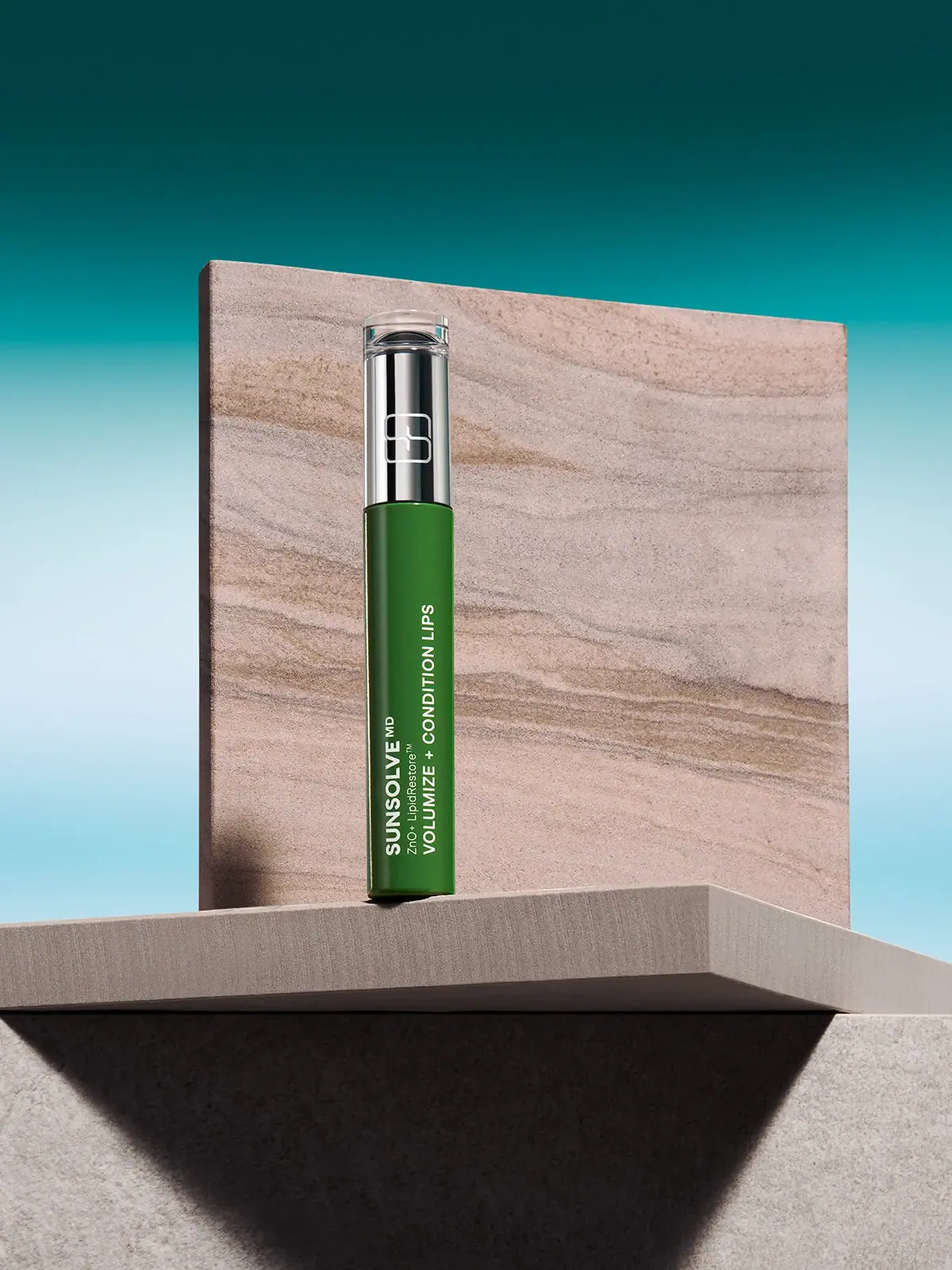
Green lip-care cylinder with mirrored crown and longitudinal white copy
SunsolveMD's selected LipidRestore lip-care package divides a narrow cylinder into a long green information field, a substantial reflective silver upper section and a short transparent-looking top. White lettering runs lengthwise along the green body, while an outlined symbol occupies the reflective section. The official product page identifies a lip oil with SPF40; the photographed face does not clearly display that rating or reveal its applicator. Its character comes from compact clinical information, a saturated green field and a polished component, rather than a conventional sunscreen tube silhouette.
- Suncare
- Light pack
- Clinical minimal
- Bold typographic
About this study
Selected closed LipidRestore container; official lip-oil identity is distinguished from visible copy and unobserved mechanism.
Sources & evidence · Reviewed 2026-10-19Color Palette
Approximate colours interpreted from photography. These are screen references, not official brand colours or print specifications.
Pack body
Deep leaf green
#286322
Approximate green lower cylinder; illumination produces lighter central areas and darker edges. The teal scene is not the body colour.
Reflective silver appearance
#BABDB9
Representative neutral highlight from the upper section, not a uniform metallic ink specification or verified metal substrate.
Ink
White information and symbol
#F0F4E7
Approximate pale lettering on green and outline symbol above; exact print colour and process unverified.
Typography
Suggested visual alternatives, not confirmed brand typefaces. Any scale below is an illustrative estimate.
The lower field contains three adjacent lengthwise lines. The maker SUNSOLVE MD is bold, the ZnO+ LipidRestore line is smaller and lighter, and the product function is a long uppercase line extending further toward the upper section. Read after rotating the object or image, these lines form a compact conventional hierarchy rather than stacked individual letters. Their lower ends cluster near the base, leaving substantial green above the shorter maker line. A separate outline symbol on the reflective section provides recognition without requiring the same reading orientation. No readable SPF value should be added to this face by inference from the product title.
Fonts
Original maker and function alternative
Inter
- Looks like
- Compact neutral uppercase sans serif
- Type
- Sans serif
- Weight
- Medium, Bold
- Case
- Uppercase
- Tracking
- Normal
- Fallback
- Arial, sans-serif
Create distinct weights for maker and function while keeping their lengthwise lines aligned at one end. Test the longest function phrase on a curved prototype before fixing the container diameter.
Technical companion alternative
Source Sans 3
- Looks like
- Small clear mixed-case sans serif
- Type
- Sans serif
- Weight
- Regular, SemiBold
- Case
- Mixed case
- Tracking
- Normal
- Fallback
- Arial, sans-serif
Provide smaller technical and product-family information without imitating proprietary terminology. Retain sufficient stroke weight for pale lettering on a glossy coloured surface.
Structure & Proportions
Visual proportions and finish previews are illustrative. Confirmed construction details and uncertainties are distinguished in the study notes.
Proportions
| Purpose | Value | Preview |
|---|---|---|
| Elongated silhouette | The closed object is much taller than wide, so lengthwise copy occupies more usable line length than a horizontal front label would. | — |
| Reflective crown | The silver section is a substantial upper zone rather than a thin trim ring, making it a second visual anchor. | — |
| Unequal text lengths | The function line travels furthest up the green body; shorter maker and technical lines preserve a stepped text silhouette. | — |
| Short clear terminal | The transparent-looking top adds a small edge and depth cue without introducing another opaque colour block. | — |
Shapes
| Element | Value | Preview |
|---|---|---|
| Closed body | Straight slender cylinder with a subtly rounded lower edge. | |
| Reflective upper section | Smooth cylindrical component with a distinct boundary against green. | |
| Outline signifier | Overlapping rounded geometric outline, independent of the longitudinal copy. | |
| Text field | Three neighbouring longitudinal lines rather than stacked characters. |
Finishes
Smooth green highlight
Lower cylinder; exact coating unverified · gloss
Mirror-like silver appearance
Upper cylinder; substrate unverified · metallic
Clear terminal appearance
Short top component; material unverified · transparent
Formats and materials
| Formats | Slender closed cylindrical lip-care container, Long green lower body with a taller reflective upper component than a simple narrow collar, Short clear-looking terminal component above the reflective section |
| Materials | The green body is opaque in this image; exact polymer, glass or coated substrate is unverified., Mirror-like silver appearance does not establish solid metal, metallised plastic or a particular coating., The transparent-looking top has visible edges and refracted highlights, but its resin and construction are not specified. |
| Closures | The image shows a closed assembly and distinct component boundaries, not an exposed applicator. A short clear-looking section tops the substantial silver region. Its exact relationship to a removable cap or internal dispenser cannot be resolved from this view. The official source calls the product a lip oil, so the slender silhouette should not be treated as proof of a solid twist-up stick. No wand, rollerball, pump, screw thread or refill mechanism is established. Those details require an open product photograph or an explicit component specification. |
| Decoration | Lengthwise maker, family and function lines on the lower body, Single outlined rounded geometric symbol above, No opaque paper label border visible, No visible illustration or decorative botanical motif |
Front Panel
Schematic reading order. The diagram’s zone heights do not represent measured artwork proportions.
Information is applied-looking directly to the green field, with no distinct paper label edge visible. Rotating the reading axis gives the long function phrase room without reducing it to several short wrapped lines. The maker, technical line and function remain parallel, while the symbol above is independent. This creates two routes into recognition: form and symbol at a distance, then the longitudinal text when handled or viewed at larger scale. The small technical line remains the most vulnerable to curved-surface distortion and thumbnail reduction.
| Zone | Content |
|---|---|
| Lower maker line | SUNSOLVE MD in bold pale sans serif along the length of the body. |
| Technical companion | Smaller ZnO+ LipidRestore line alongside the maker. |
| Function line | VOLUMIZE + CONDITION LIPS extending further along the green field. |
| Upper symbol | White rounded geometric outline on the reflective silver region. |
Range System
The official product identity connects this package to the LipidRestore family and an SPF40 lip oil. This does not establish an inspected colour-coding rule across every SunsolveMD product. The selected image supports a specific green-and-silver composition, not a full range map. For an original system, longitudinal function lines could vary while a common structural boundary and symbol remain consistent, but each variation would need a readable product name and independently verified protection information.
- The official SPF40 designation is recorded as a source fact rather than invented visible front copy.
- The photographed green container does not by itself prove that every green brand product has the same function.
- An original family can preserve the longitudinal reading principle while changing colour, symbol and wording substantially.
Back of Pack & Shelf
The reverse circumference, underside, open applicator and retail carton are outside the approved view.
- No quantity, ingredient panel or disposal instruction is legible on this photographed face.
- No mechanical opening direction or refill access is demonstrated.
- The presence of a clear top does not prove how the dispensing system operates.
On shelf
The large green area and bright upper cylinder should remain distinguishable when the photograph is reduced, while the smallest technical line is likely to disappear first. This is an interpretation, not measured shelf performance. The lengthwise layout rewards rotation or close inspection, so the product may need an accompanying upright digital title in a catalogue. The mark on the reflective section can be affected by glare, making controlled product lighting particularly important. A closed beauty-shot silhouette cannot replace an open applicator view when explaining use.
Imagery
The official image places the narrow cylinder on an architectural ledge in front of a large veined, sandstone-looking slab. A teal gradient surrounds these warm neutral planes, and hard directional light casts deep geometric shadows. The broad slab makes the small cylinder feel monumental while leaving its white information visible against green. The stone appearance is a staging choice, not proof of a mineral package material. Likewise the turquoise background is not a second pack colour. Reflective bands on the upper component belong to the lighting environment rather than a striped printed decoration.
Guidelines
Editorial principles for an original design brief, not official brand guidelines.
Do
- Use container length deliberately for long copy.
- Distinguish visible lettering from source-only product facts.
- Treat reflective highlights separately from printed decoration.
- Inspect an open applicator before describing the mechanism.
- Test pale technical copy at actual cylindrical scale.
Don't
- Do not call the product a solid stick from silhouette alone.
- Do not add an SPF value to the photographed face.
- Do not infer solid metal from a mirrored finish.
- Do not include the teal sky in the pack palette.
- Do not describe the substantial upper section as only a thin band.
Sources & evidence
How this study was built
edition · Sourced fact
Official listing identifies LipidRestore lip oil and SPF40.Volumize + Condition Lips SPF40 — SunsolveMDstructure · Visual observation
Green lower cylinder, substantial silver-looking upper zone and short clear-looking terminal are visible; no applicator is exposed.typography · Visual observation
Three neighbouring longitudinal lines have different weights and lengths, rather than stacked individual letters.label · Visual observation
Maker, technical family and function are readable; no SPF value is clearly readable on this face.palette · Visual observation
Green, pale lettering and silver appearance belong to the pack; teal and stone tones belong to the setting.imagery · Editorial interpretation
Architectural planes enlarge the perceived presence of a narrow object without supplying a material specification.
What remains unverified
- Applicator and opening mechanism unseen.
- Exact materials, print processes, fonts and dimensions unverified.
- SPF and quantity not legible on the approved face.
- Non-www source failed; www product page accessible.
Give your AI
packaging taste
Give your design or image tool a packaging study: palette, type, structure, front panel and principles for an original brief.
Export this styleFree with an email. PACK.md works in Claude, ChatGPT, Cursor and image tools.
More like this

AussieZinc
Sun-yellow numerals on a tall, information-rich white cylinder

BioSeivas
Vertical serif identity on a mauve treatment band
ELEVEN Australia
Deep blue open jar with emphatic hold-first typography
Gatineau
Turquoise tube with lengthwise white name and silver accent

Malin+Goetz
pharmacy label set in bracketed helvetica
Murad
Purple inner field framed by clear walls and silver

Native
white drugstore bottles, scent-tinted vertical caps
Odele
Cream tube with tiny utility copy and oversized lower serif