Photography: Superegg official photography. Images belong to their respective owners.
Superegg

glossy white egg form with three spaced text groups
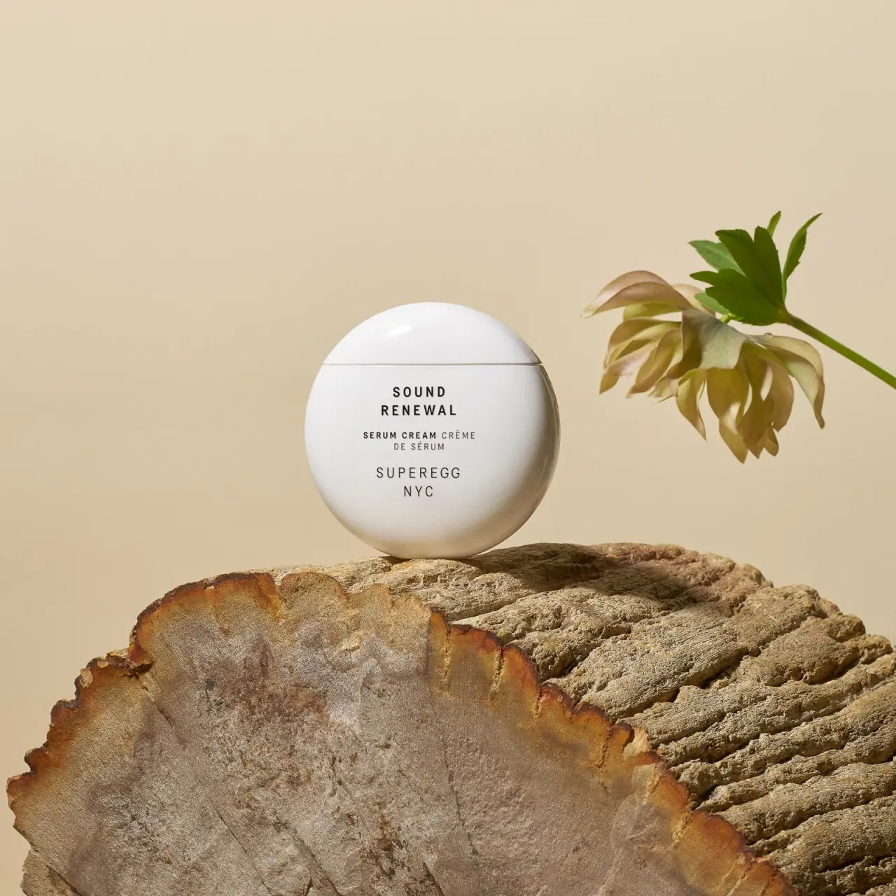
Sound Renewal Serum Cream is shown as a smooth white egg-like container with a shallow domed upper section and a broad rounded lower body. A horizontal seam crosses above the typography. The front has three centred groups: a bold two-line product name, a smaller bilingual descriptor and a lighter spaced maker signature. Its recognition comes chiefly from the curved silhouette and bright surface rather than a colour block or illustration.
- Skincare
- Light pack
- Clinical minimal
About this study
Selected closed Sound Renewal Serum Cream egg-like container. The study distinguishes formulation terminology from the brand’s packaging patent statement.
Sources & evidence · Reviewed 2026-10-19Color Palette
Approximate colours interpreted from photography. These are screen references, not official brand colours or print specifications.
Pack body
Warm-lit white shell
#F1EEE7
Approximate white container appearance in a warm setting; shadows and reflected wood colour are not separate package inks.
Ink
Black front text
#242321
Approximate product name, bilingual descriptor and maker lettering.
Typography
Suggested visual alternatives, not confirmed brand typefaces. Any scale below is an illustrative estimate.
SOUND and RENEWAL form a compact bold uppercase title immediately below the seam. The next group pairs the heavier English SERUM CREAM with lighter French wording, wrapping the French continuation onto another line. SUPEREGG and NYC sit lower in a lighter, more widely spaced voice. The maker is physically broad but not as heavy as the product title. All three groups share a central axis, with enough vertical space to remain distinct on the strongly curved front.
Fonts
Product-title alternative
Barlow Condensed
- Looks like
- Barlow Condensed as an independent visual alternative
- Type
- Sans serif
- Weight
- SemiBold 600
- Case
- Uppercase
- Tracking
- Open
- Fallback
- Arial, sans-serif
Use a compact uppercase face for a short two-line product title, checking that the narrow counters remain open on the curved print area. Keep each line short enough to avoid strong edge distortion. This is a functional alternative, not an identification of the original type.
Maker and descriptor alternative
Inter
- Looks like
- Inter as an independent visual alternative
- Type
- Sans serif
- Weight
- Light 300 / Regular 400 / Medium 500
- Case
- Uppercase
- Tracking
- Generous for the maker, moderate for functional copy
- Fallback
- Arial, sans-serif
Separate maker identity from product function through weight and spacing. In an original bilingual system, establish a consistent language hierarchy without making one translation too faint or small. Do not copy the exact SUPEREGG NYC arrangement.
Structure & Proportions
Visual proportions and finish previews are illustrative. Confirmed construction details and uncertainties are distinguished in the study notes.
Proportions
| Purpose | Value | Preview |
|---|---|---|
| Shallow upper dome | The seam sits above the body’s widest area, leaving a smaller upper section and a larger text-bearing lower section. | — |
| Narrow text column | The typography occupies only the central portion of the rounded face, leaving generous white side margins. | — |
| Three information islands | Product name, bilingual function and maker remain separated by visible open intervals. | — |
Shapes
| Element | Value | Preview |
|---|---|---|
| Container | Egg-like rounded volume, wider around the middle and narrowing toward its resting point. | |
| Upper section | Shallow continuous dome above a near-horizontal seam. | |
| Text groups | Three short centred rectangular blocks on the curved surface. |
Finishes
Glossy white exterior
Continuous rounded surface and small dome highlight; substrate unverified. · gloss
Dark typography
Compact black-looking letters against the light curved body; application process unknown. · matte
Formats and materials
| Formats | Selected closed egg-like cream container. Official product capacity is 60 mL / 2 fl oz; no quantity is readable on this selected front. |
| Materials | The brand states that the primary packaging is patented in several markets, but that statement does not identify its substrate or component construction., Yolk Duplex is the brand’s proprietary ingredient complex, not a packaging material or the name of the container. White gloss does not establish porcelain, glass or a specific polymer. |
| Closures | A fine nearly horizontal seam divides the shallow upper dome from the larger rounded body. Both parts share the same white-looking finish, so the junction is more visible through its narrow shadow than through a colour change. The container is closed; the opening motion, threads, internal cup, liner and any dispensing part cannot be determined. Its resting position on a rough log does not establish the exact geometry or stability of the base on a flat surface. The patent statement is attributed to the brand without inferring the scope of the patent claims. |
| Decoration | Three centred text groups below the closure seam., No illustrated egg, pattern or colour-coded band on the selected front., Large uninterrupted white margins around the narrow reading column. |
Front Panel
Schematic reading order. The diagram’s zone heights do not represent measured artwork proportions.
The visible information sits below the seam rather than crossing it. Product name leads, function follows, and maker closes the composition. There is no separately coloured rectangular label visible, so the text appears to belong directly to the white object, although the image cannot verify the printing or transfer method. The upper dome remains clear. The narrow central alignment avoids forcing letters far around the sides, where curvature would compress their apparent width. The two language treatments share a group but differ in weight, making this more specific than a simple three-line minimalist label.
| Zone | Content |
|---|---|
| Upper dome | Unprinted-looking white surface above the seam. |
| Product | Bold SOUND / RENEWAL in two lines. |
| Function | English serum-cream descriptor and lighter French translation. |
| Maker | Spaced SUPEREGG / NYC below the functional group. |
Range System
This study concerns the selected Sound Renewal container only. The official page confirms 60 mL and describes the ingredient complex separately from its packaging patent statement. Neither fact establishes a shared container specification for all Superegg products. The egg-like silhouette can be analysed as a recognition device, but other sizes or products need their own approved views before assuming the same seam position, print area or opening system.
- Selected white Sound Renewal container with dark centred typography.
- Official 60 mL capacity is source context; it is not transcribed from this front image.
Back of Pack & Shelf
The reverse, underside and open interior are unseen. The selected front does not locate quantity, ingredient declaration or batch information. A patent statement does not substitute for a drawing of the closure or an inspection of its sealing parts.
- Inspect the base to understand flat-surface stability.
- Review open and reverse views before describing internals or information placement.
- Keep Yolk Duplex ingredient terminology separate from packaging specifications.
On shelf
Interpretation: the rounded white volume should be recognised before the small typography. Its short product name is easy to locate centrally, but the lighter maker and translated descriptor may disappear in a distant view. Curvature can distort text when the object rotates, making front orientation important. A new design using a similar form principle should check readable angles, grip, stable resting position and the visibility of the opening seam rather than relying on a single styled photograph.
Imagery
The bright rounded container balances on a rough-cut log beside a pale green flower against a warm beige background. The smooth manufactured object contrasts with bark, growth rings and soft petals. This visual opposition makes the silhouette prominent without adding decoration to the pack. Wood and flower colours are environmental elements, not label accents. The scene’s warm reflections also affect the lower body, so a beige-looking shadow should not be treated as a second moulded colour or a gradient coating.
Guidelines
Editorial principles for an original design brief, not official brand guidelines.
Do
- Keep short text within the least-distorted front area.
- Distinguish formulation names from packaging claims.
- Test the opening seam and resting stability on a physical mockup.
- Use weight differences to organise bilingual information.
Don't
- Do not call Yolk Duplex the package name.
- Do not infer ceramic from a glossy white appearance.
- Do not infer patent scope from a marketing statement.
- Do not copy the exact egg silhouette and maker arrangement.
Sources & evidence
How this study was built
context · Sourced fact
Official page lists 60 mL and identifies Yolk Duplex as a proprietary ingredient complex.Superegg — Sound Renewal Serum Creamstructure · Sourced fact
Brand separately states that the primary packaging is patented; no patent claims are analysed.Superegg — Sound Renewal Serum Creamstructure · Visual observation
High seam divides a shallow dome from a broad rounded lower body.Superegg — Sound Renewal Serum Creamtypography · Visual observation
Bold title, bilingual descriptor and lighter maker form three centred groups.Superegg — Sound Renewal Serum Creamimagery · Visual observation
Log and flower provide texture outside the smooth white package.Superegg — Sound Renewal Serum Creamshelf · Editorial interpretation
Curved print area and resting geometry need physical mockup checks.
What remains unverified
- Container substrate, closure internals, exact patent scope and physical dimensions unverified.
- Original fonts and decoration process unknown.
- Quantity is sourced, not visible on the selected front; reverse and base unseen.
Give your AI
packaging taste
Give your design or image tool a packaging study: palette, type, structure, front panel and principles for an original brief.
Export this styleFree with an email. PACK.md works in Claude, ChatGPT, Cursor and image tools.
More like this

African Botanics
Technical black label with a low serif signature

AussieZinc
Sun-yellow numerals on a tall, information-rich white cylinder

bareMinerals
a restrained black compact framing the powder itself

BeautyPWR
Clear square shell, white cream cup, black serif identity

BioSeivas
Vertical serif identity on a mauve treatment band

Byoma
candy-coloured barrier science on a shelf
CeraVe
white pump bottles split by a coloured diagonal

Cocokind
sideways lowercase on spa-water pastels