Photography: TCHO official photography. Images belong to their respective owners.
TCHO

Giant cream flavour lettering on a hot orange-red square
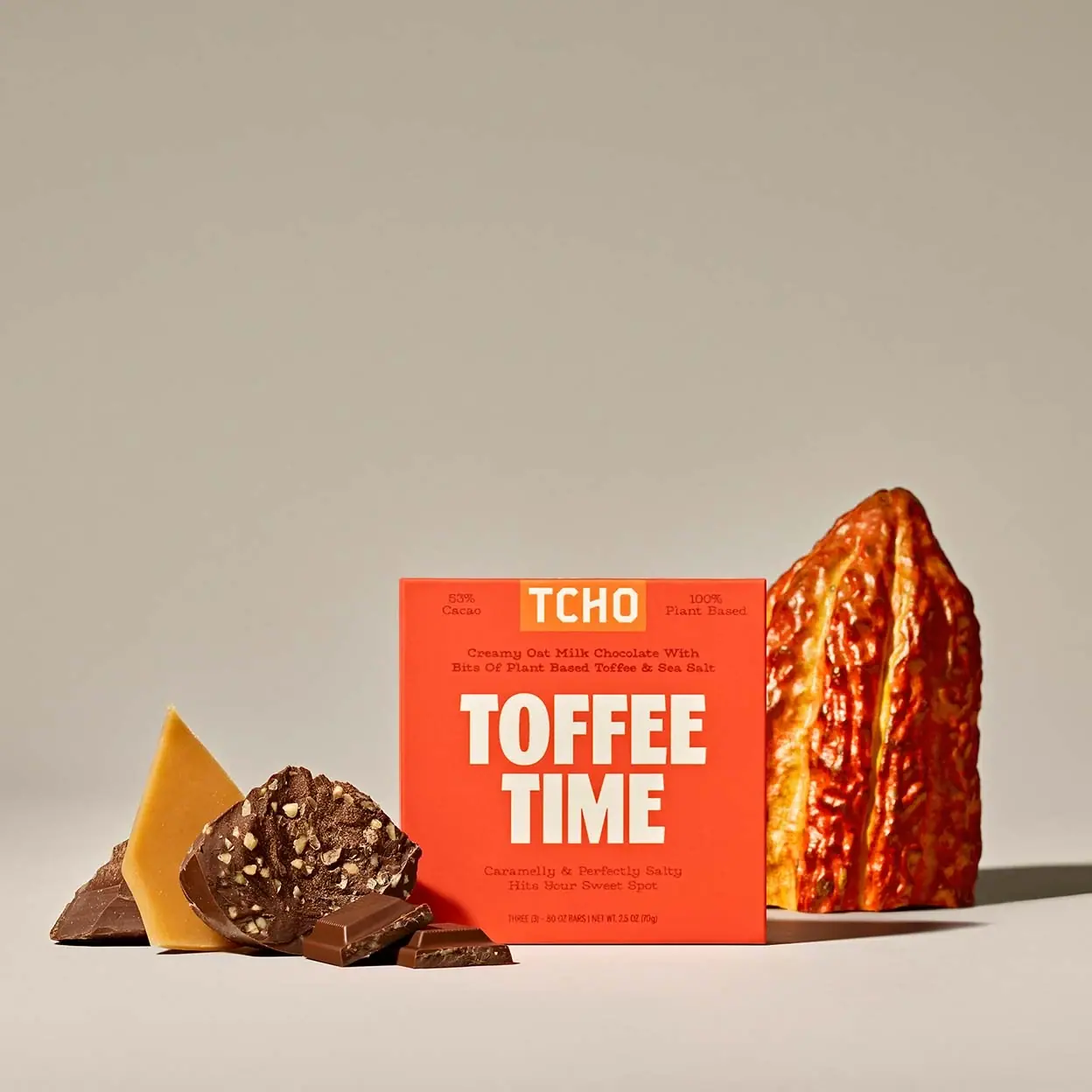
The selected Toffee Time carton makes the flavour name the dominant visual event: two lines of heavy cream capitals occupy the middle of an almost square orange-red face. TCHO sits in a smaller orange block at the top, flanked by compact factual statements. Dark descriptive lines provide a quieter second voice above and below the headline. The result is emphatic without relying on a large product photograph on the front. This study follows the photographed 2.5 oz (70 g) edition; the current official listing describes a smaller pack, so its quantity must not silently replace the visible one.
- Chocolate & sweets
- Light pack
- Bold typographic
- Playful colour
About this study
Photographed Toffee Time 2.5 oz (70 g) carton, not the current listing's 2.1 oz (60 g) edition. Analysis covers its visible front and official still-life image, not unseen inner packaging or all TCHO variants.
Sources & evidence · Reviewed 2026-10-19Color Palette
Approximate colours interpreted from photography. These are screen references, not official brand colours or print specifications.
Pack body
Hot orange-red
#F94D2B
Approximate dominant carton field. It carries the strongest area of saturated colour and separates the pack from the neutral photographic ground.
Ink
Warm cream
#FFF0D1
Approximate large flavour letters and brand mark. Its warm tone echoes the food setting without turning the headline into literal ingredient imagery.
Dark cocoa-red
#793221
Approximate small descriptive lettering. It sits quietly on the vivid field, so practical legibility deserves separate checking at actual pack size.
Accent
Brand-block orange
#F98B31
Approximate lighter orange rectangle behind TCHO, creating a brand marker through a neighbouring hue rather than a dark badge.
Typography
Suggested visual alternatives, not confirmed brand typefaces. Any scale below is an illustrative estimate.
The two-line flavour name is much larger than everything around it. Tall, heavy sans-serif capitals and tight line spacing make the short phrase behave like a single graphic block. The smaller TCHO mark has its own rectangular ground. Descriptive copy uses a lighter, typewriter-like serif voice, while the tiny quantity line is narrow and economical. This contrast lets the carton sound playful in its headline and conversational in its supporting text.
Fonts
Flavour display alternative
Anton
- Looks like
- Heavy condensed poster grotesque
- Type
- Condensed display sans serif
- Weight
- Regular, visually heavy
- Case
- Uppercase
- Tracking
- Tight but with distinct counters
- Fallback
- Impact, Arial Narrow, sans-serif
A short fictional flavour name set in two balanced lines. Rework line breaks for each phrase rather than forcing identical widths by extreme stretching.
Descriptive alternative
Roboto Slab
- Looks like
- Light typewriter-like slab serif
- Type
- Slab serif
- Weight
- Regular
- Case
- Title or sentence case
- Tracking
- Normal to slightly open
- Fallback
- Georgia, serif
One or two brief lines that explain the flavour and texture. Its smaller scale should remain readable against the saturated ground in a printed proof.
Alternative detail voice
IBM Plex Mono
- Looks like
- Typewriter rhythm, not an exact match
- Type
- Monospaced sans serif
- Weight
- Regular
- Case
- Sentence case or short capitals
- Tracking
- Natural monospace spacing
- Fallback
- Courier New, monospace
An alternative to the slab face for factual corner statements or short supporting text. Choose one small-copy direction rather than adding unrelated voices everywhere.
Structure & Proportions
Visual proportions and finish previews are illustrative. Confirmed construction details and uncertainties are distinguished in the study notes.
Proportions
| Purpose | Value | Preview |
|---|---|---|
| Headline mass | The flavour block takes the centre and much of the available width. Its very large letters are balanced by compact lines of information above and below, not by equal-weight secondary graphics. | — |
| Top strip | A short central brand block is framed by small statements near the upper corners. This spreads minor information across the square instead of stacking every item into one long column. | — |
| Negative space | Margins remain visible around the headline, especially between its bottom and the quantity footer. These are qualitative observations; the photograph is not a dimensional artwork specification. | — |
Shapes
| Element | Value | Preview |
|---|---|---|
| Carton face | Nearly square frontal panel with straight edges and a shallow visible depth. | |
| Brand field | Small horizontal rectangle attached visually to the top of the panel. |
Finishes
Low-glare printed appearance
Orange-red front face; apparent flatness is a photographic observation, not confirmation of uncoated stock or matte varnish · matte
Formats and materials
| Formats | Shallow, nearly square retail carton shown upright |
| Materials | Paperboard-like outer carton visible; exact stock, coating and construction not established by the inspected primary sources., Current product listing describes individually wrapped portions, but their wrapper material and the interior of this photographed edition are outside the visual evidence. |
| Closures | The front-on photograph does not reveal an opening flap, locking feature or tear strip clearly. The shallow square silhouette should not be mistaken for proof of a particular folding-carton dieline. |
| Decoration | Large cream typographic headline, Small orange rectangular brand field at the upper edge, Dark supporting type rather than a printed hero ingredient photograph |
Front Panel
Schematic reading order. The diagram’s zone heights do not represent measured artwork proportions.
The front uses a centred main axis but distributes secondary information into clearly separated zones. Its hierarchy rewards two distances: flavour at a glance, explanation on closer inspection. The headline is not surrounded by an illustrated frame, so the saturated ground and letterforms do the structural work.
| Zone | Content |
|---|---|
| Top centre | TCHO mark in cream on a lighter orange rectangular block, visually separate from the flavour headline. |
| Top corners | Cacao percentage at left and a plant-based statement at right on the photographed edition. These are observed pack claims, not independently verified product claims. |
| Upper support | A compact two-line description identifies the chocolate style and additions before the large name. |
| Centre | TOFFEE TIME in very large cream capitals, with the shorter second word centred under the first. |
| Lower support and foot | Short taste-oriented copy sits below the headline; quantity and net-weight information form a separate tiny line near the bottom. |
Range System
The primary collaborator describes a broader identity built around bright colour, direct language and custom type. This study verifies those principles on Toffee Time only; it does not claim fixed type sizes or colour assignments for every TCHO bar. For new work, a repeatable brand position can support changing short names while each flavour receives a distinct field colour.
- Observed selected edition: cream two-line flavour name on orange-red, with a lighter orange brand block.
- Interpretation for a new range: reserve a stable top brand zone while checking each new flavour name for balanced line lengths.
- Do not treat current pack weight as a range rule: the reviewed photograph and current listing differ.
Back of Pack & Shelf
No reverse or open carton is shown in the approved cover. Ingredients, sourcing information, certifications and inner photography must not be reconstructed from this front. No location is asserted for a barcode or QR code.
- Obtain reverse and open-carton views before documenting the full information architecture.
- For original production work, create a separate verified information plan rather than copying current website text onto an older pack mockup.
On shelf
Interpretation: a vivid square with oversized lettering should stay legible as a flavour signal before its small origin or ingredient statements become readable. The compact brand block can give a recurring anchor without making every pack visually identical. Because secondary text has lower contrast than the cream headline, a design adaptation should test it at actual viewing distance rather than assuming that a strong hero photograph proves retail readability.
Imagery
The visible carton front is typographic. The photograph supplies physical ingredient storytelling: broken chocolate and a translucent golden shard sit low at left, while a large ridged cacao pod rises at right. Hard directional light makes the props tactile and keeps the carton face readable. The creator's case study describes an ingredient-focused photographic direction; this still life illustrates that division of labour between a concise pack and a richer campaign scene. The warm beige backdrop is not part of the carton palette.
Guidelines
Editorial principles for an original design brief, not official brand guidelines.
Do
- Make a short flavour name carry the first reading level.
- Use a compact recurring brand position and intentional line breaks.
- Separate descriptive text from net quantity so each has a clear task.
- Keep photographed ingredient props from obstructing the main title.
- State edition differences whenever current product specifications conflict with the visible pack.
Don't
- Do not import the current 60 g weight into analysis of the photographed 70 g carton.
- Do not present substitute Google fonts as the brand's custom type.
- Do not infer an interior, wrapper material or print finish from the closed front.
- Do not enlarge every supporting claim until it competes with the flavour name.
- Do not copy TCHO's logo or distinctive wording into an original concept.
Sources & evidence
- Toffee Time — TCHO official product listingproduct
- TCHO — Nate Totten, primary project collaborator case studydesigner
How this study was built
edition · Sourced fact
The current official listing gives 2.1 oz (60 g); the inspected photograph visibly carries the earlier 2.5 oz (70 g) quantity.Toffee Time — TCHO official product listingtypography · Sourced fact
The primary project collaborator describes custom-crafted type, supporting a custom-identity context without identifying the proposed substitute families as originals.TCHO — Nate Totten, primary project collaborator case studylabel · Visual observation
The local approved cover shows a dominant cream flavour headline, a smaller top brand block and separated dark supporting copy.Toffee Time — TCHO official product listingpalette · Visual observation
Orange-red belongs to the pack, lighter orange to the brand block and beige primarily to the photographic ground.Toffee Time — TCHO official product listingimagery · Sourced fact
The collaborator describes the photographic direction as ingredient-led; the local image shows the actual props while keeping the carton typography exposed.TCHO — Nate Totten, primary project collaborator case studyrange · Editorial interpretation
A repeatable brand zone is a transferable principle; one reviewed edition does not establish identical measurements across the range.
What remains unverified
- Exact artwork revision date, carton stock, dieline and print process were not established.
- The custom-type context is documented, but proposed font alternatives are not actual brand fonts.
- The selected image does not show the reverse, opening mechanism or inner wrappers.
- Approximate colours and qualitative proportions are not production specifications.
Give your AI
packaging taste
Give your design or image tool a packaging study: palette, type, structure, front panel and principles for an original brief.
Export this styleFree with an email. PACK.md works in Claude, ChatGPT, Cursor and image tools.
More like this

Behave
struck-through wordmark on sour neon pouches
Magic Spoon
saturday cartoon cereal for grown-ups
Oat Haus
Birthday-party color blocks with oversized grocery typography

Partake
one saturated carton per cookie flavour
Seed + Mill
Cream serif lettering inside a flowing red tahini field

Tony's Chocolonely
circus-poster slab letters on a yellow wrapper

ACURE
Iridescent spectacle with practical, tightly ordered type

Bask
sunny yellow with a playful turquoise signature