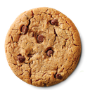
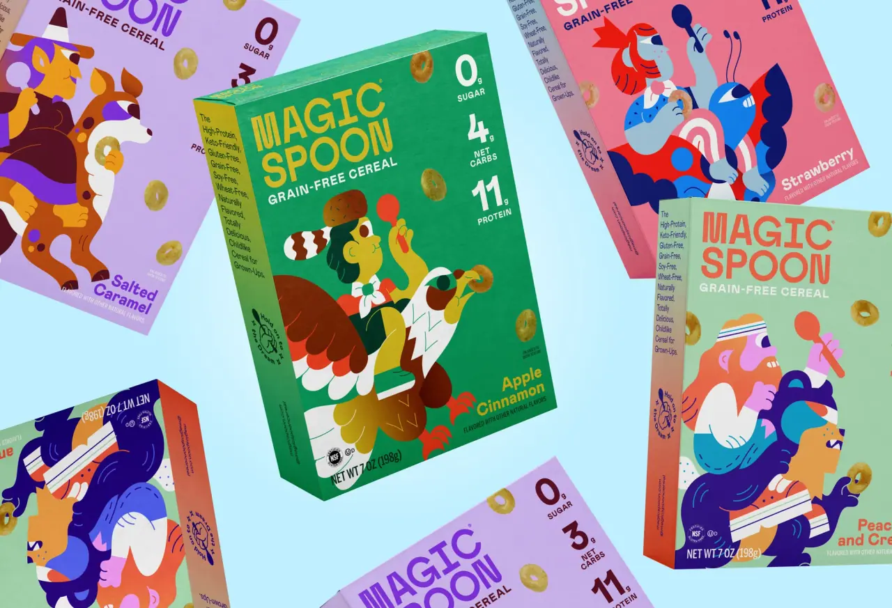
Partake gives every cookie a carton printed in one saturated flat colour (Graham Raspberry #b51f4a, Ginger Tangerine, Confetti Magenta, Chip Cobalt #1e5aa6, Soft Sky), with the same chunky white geometric capital wordmark and ® centred in the upper half. The flavour name follows in a bold rounded sans, often in a pale tint rather than white, over a tiny tracked descriptor, and cut-out cookie photography stacks and tumbles down the front, spilling crumbs along the base. Short stacked claims ('thoughtfully delicious', 'wholesome ingredients', 'nut free') sit in small white capitals at the sides, a row of certification icons sits above the net weight, and multipacks add a pale tint band at the top with the pack count and show the individual snack bags with a checkmark allergy seal. Teeny-tiny cookies move to a stand-up pouch with a tilted outlined name.
Approximate colours interpreted from photography. These are screen references, not official brand colours or print specifications.
Label
Count Band Tint
#f3d6e0
Pale tint band across the top of multipack cartons holding the pack count in the carton colour
Ink
Wordmark White
#ffffff
Wordmark, descriptor, claims and legal reversed out of the flat colour
Flavour Tint
#bfe6f2
Pale tinted flavour name on multipacks, set lighter than the white wordmark
Accent
Cookie Gold
#d9a35e
The photographed cookies themselves, the main warm accent on every carton
Range coding
Graham Raspberry
#b51f4a
Carton colour for classic grahams and the grahams multipack
Ginger Tangerine
#e08a2c
Carton colour for crunchy ginger snap
Confetti Magenta
#b2288f
Carton colour for confetti cookies and the confetti snack bag
Chip Cobalt
#1e5aa6
Carton, pouch and snack-bag colour for crunchy chocolate chip
Soft Sky
#9fd6ea
Light blue carton for teeny-tiny chocolate chip multipacks, printed in cobalt
Variety Violet
#5a3aa8
Carton colour for the chocolate chip and confetti mixed multipack
Typography
Suggested visual alternatives, not confirmed brand typefaces. Any scale below is an illustrative estimate.
The white capital wordmark is the biggest type and sits in the upper middle, with the flavour name directly under it in a bold rounded sans and a tiny capital descriptor below that. Multipacks put the pack count in a top band first. Claims, net weight and certification icons are small and pushed to the edges and base.
Type scale
Estimated cap size as a share of the panel · Front of the single-flavour cookie carton, about 190 mm tall
wordmark
9% · Black · Display
CRUMBLE
teeny-name
6% · Regular · Script
ITTY-BITTY BITES
flavour-name
4.5% · ExtraBold · Headline
Maple Oat
pack-count
4% · ExtraBold · Display
12 SNACK PACKS
net-weight
2.2% · Bold · Label
NET WT. 5.5 OZ (156G)
descriptor
1.8% · SemiBold · Label
CRUNCHY COOKIES
Fonts
Display
Montserrat
Looks like
Gilroy Black, Galano Grotesque Heavy
Type
Heavy geometric grotesk, wide
Weight
ExtraBold, Black
Case
Uppercase
Tracking
Slightly tight, about -1%
Fallback
Futura Extra Bold, Arial Black
Wordmark with a small ®, same size and position on every single-flavour carton; also the pack-count band.
Headline
Nunito
Looks like
Recoleta Sans Bold, Nunito ExtraBold
Type
Bold rounded sans
Weight
Bold, ExtraBold
Case
Title case
Tracking
Normal
Fallback
Arial Rounded MT Bold, Helvetica
Flavour names under the wordmark, white on single cartons and pale tint on multipacks.
Schematic reading order. The diagram’s zone heights do not represent measured artwork proportions.
Top (multipacks)
Upper middle
Lower middle
Base
Full-bleed single colour carton with a centred type stack in the upper half and cookies stacked and tumbling through the lower half, crumbs along the base.
Zone
Content
Top (multipacks)
Pale tint band with the snack pack count in capitals
Upper middle
Wordmark, flavour name, small descriptor
Lower middle
Cut-out cookies or snack bags, with stacked claims tucked at the sides and a checkmark seal
Base
Certification icons, net weight and pack sizes
Range System
Strict colour coding: one flat saturated carton colour per flavour, while wordmark size, type stack, photo style and claim placement are fixed; multipacks reuse the flavour colour and show the matching small bags, and mixed packs take a neutral violet.
Classic grahams = raspberry
Ginger snap = tangerine
Confetti = magenta
Crunchy chocolate chip = cobalt
Teeny-tiny chocolate chip = light sky blue with cobalt type
Chocolate chip + confetti multipack = violet
Back of Pack & Shelf
The back stays in the flavour colour with white type: a short brand line, then a white box holding nutrition facts, ingredients and an allergen statement listing what the cookies are free from, plus barcode and certification icons.
Short friendly brand paragraph in white
Nutrition facts panel on a white box
Ingredients list and a 'free from' allergen statement
Row of certification icons (gluten-free, vegan, non-GMO)
UPC barcode and manufacturer address
Recycling note for the carton and inner bags
On shelf
On shelf the cartons form solid blocks of raspberry, tangerine, magenta and cobalt with a white wordmark at the same height on each, so the flavour is read by colour first and the brand by the repeating white band of capitals.
Imagery
Bright, cleanly cut-out cookie photography: cookies stacked two or three high, one tilted mid-fall, crumbs scattered at the base; multipacks show the snack bags themselves. No illustration apart from simple seal and icon graphics.
Guidelines
Do
Print each flavour's carton in one flat saturated colour such as Graham Raspberry (#b51f4a), edge to edge.
Set the Display wordmark in white capitals at about 80% of carton width, same size and position on every flavour.
Put the flavour name in the rounded Headline sans directly under the wordmark, with a tiny tracked Label descriptor below.
Stack and tumble cut-out cookies through the lower 45% of the face with crumbs along the bottom edge.
Place short claims as stacked white Label capitals at the sides of the cookies.
On multipacks, add a pale tint band about 8% tall at the top with the pack count.
Don't
Don't use gradients, textures or patterned backgrounds on the carton.
Don't put two flavour colours on a single-flavour carton.
Don't illustrate the cookies; use cut-out photography.
Don't use kraft board or muted earth tones.
Don't move or resize the wordmark between flavours.
Don't set the wordmark in anything but white.
Give your AI packaging taste
Give your design or image tool a packaging study: palette, type, structure, front panel and principles for an original brief.