


Tony's Chocolonely
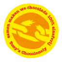
circus-poster slab letters on a yellow wrapper
Tony's Chocolonely wraps its bar in a single flat-colour paper wrapper, here bright yellow (#f2cf14), dominated by a huge red name in a flared circus-poster slab with a thin white outline, and two secondary words stacked beside it in white wide slab capitals. The brand name repeats in small white slab capitals along the top and bottom fold bands, the flavour is printed lowercase in white on a contrasting green strip at one end, and a small orange roundel overlaps the corner of the logo. Across the range the wrapper colour and strip change per flavour (red for milk, dark blue for dark, and so on) while the logo and layout stay fixed. Inside, the bar is moulded into deliberately unequal pieces.
- Chocolate & sweets
- Light pack
- Bold typographic
- Playful colour
Color Palette
Approximate colours interpreted from photography. These are screen references, not official brand colours or print specifications.
Pack body
Wrapper Yellow
#f2cf14
Flat full-coverage ground of the milk almond honey nougat wrapper
Ink
Tony Red
#e1252f
Giant main name lettering and text inside the roundel
Lettering White
#ffffff
Secondary stacked words, repeated edge bands, letter outlines and flavour text
Accent
Roundel Orange
#f39a1c
Small circular badge overlapping the top-left of the logo
Milk Bar Brown
#a5684a
The moulded bar itself, with unequal pieces and a debossed name
Range coding
Flavour Green
#23963a
End strip carrying the lowercase flavour name on this wrapper
Classic Milk Red
#d7262e
Wrapper ground of the plain milk bar, with the name in white
Dark Navy
#1f3a6e
Wrapper ground of the dark chocolate bar
Typography
Suggested visual alternatives, not confirmed brand typefaces. Any scale below is an illustrative estimate.
The red main name fills almost the full height of the front; the two secondary words sit to its right in two white lines at roughly half that size. Repeated brand names in white run along the folds, and the flavour is the smallest text, turned sideways on the end strip.
Type scale
Estimated cap size as a share of the panel · Front face of the 180 g bar wrapper, about 75 mm tall
main-name
40% · Regular · Display
MARLO'S
secondary-words
18% · Regular · Headline
COCOA
edge-band
7% · Regular · Headline
MARLO'S COCOA CLUB
flavour-strip
6% · Bold · Body
hazelnut sea salt
roundel-text
3% · Bold · Body
Open here
back-copy
2.5% · Regular · Body
Unequally divided, on purpose.
Fonts
Display
Rye
- Looks like
- Rosewood, P22 Barnum, Playbill
- Type
- Flared western circus slab serif, condensed and heavy
- Weight
- Regular (heavy)
- Case
- Uppercase
- Tracking
- Tight, letters touching
- Fallback
- Playbill, Rockwell Extra Bold
Main name only, red with a thin white outline, letters sitting slightly unevenly like wood type.
Headline
Holtwood One SC
- Looks like
- Clarendon Black, Egyptienne Bold
- Type
- Wide heavy slab serif
- Weight
- Regular (heavy)
- Case
- Uppercase
- Tracking
- Normal
- Fallback
- Clarendon, Rockwell Bold
Two secondary words stacked in white beside the main name, and the small repeated name along the edge bands.
Body
Arvo
- Looks like
- Clarendon Bold, Century
- Type
- Bold slab serif
- Weight
- Bold, Regular
- Case
- Lowercase
- Tracking
- Normal
- Fallback
- Rockwell, Georgia
Flavour name on the end strip, text circling the roundel, and back-of-wrapper copy.
Structure & Proportions
Proportions
| Purpose | Value | Preview |
|---|---|---|
| Main name height | About 70% of front height | |
| Main name width | About 55% of front length | |
| Secondary words width | About 35% of front length, right of the name | |
| Edge bands | About 12% of front height each, top and bottom | |
| End strip | About 4% of wrapper length | |
| Colours per wrapper | Four: ground, red, white, strip colour, plus a small orange roundel | — |
| Density | Logo fills the face edge to edge; almost no empty ground | — |
Shapes
| Element | Value | Preview |
|---|---|---|
| Wrapper | Long flat rectangle | |
| Roundel | Small orange circle overlapping the logo | |
| End strip | Narrow vertical band at one end | |
| Bar pieces | Unequal angular segments in the mould |
Finishes
Matte uncoated paper
Outer wrapper · uncoated
Inner foil
Wrap around the bar · foil
Formats and materials
| Formats | Bar wrapper, Mini bar wrapper, Gift box |
| Materials | Paper, Inner foil |
| Closures | Folded paper wrapper with a tear-open end; foil inner wrap |
| Decoration | Oversized logotype, Repeated name bands, Contrasting end strip, Roundel badge, Unequally divided moulded bar with debossed name |
Front Panel
Schematic reading order. The diagram’s zone heights do not represent measured artwork proportions.
The whole wrapper is the label: one flat colour field, a giant two-part logo across the front, brand-name bands along both long edges and a coloured strip at one end.
| Zone | Content |
|---|---|
| Front centre | Red main name plus stacked white secondary words |
| Top-left of logo | Small orange roundel |
| Long edges | Repeated brand name in white slab capitals |
| End strip | Lowercase flavour name in white on green, set vertically |
Range System
Only one pack is in the library, so this rests partly on general knowledge: the logo and layout stay fixed while the wrapper colour, strip colour and flavour text identify each bar.
- Milk almond honey nougat = yellow wrapper + green flavour strip
- Milk = red wrapper
- Dark = navy wrapper
Back of Pack & Shelf
The back of the wrapper continues the flat colour with a long paragraph of mission copy in white, a smaller ingredient and nutrition block and a small certification and barcode area.
- Long conversational mission story in white slab type
- Ingredients with allergens highlighted
- Nutrition table in a small white box
- Fairtrade-style certification mark
- Barcode, weight and recycling marks
On shelf
On shelf the bars stack into thick stripes of flat colour, each carrying the same giant red-and-white logo, so the range billboards as a block of loud colour bars.
Imagery
No illustration or photography on the wrapper; the logotype is the image. Product shots show the bar itself, moulded in irregular pieces.
Guidelines
Do
- Cover the whole wrapper in one bright flat colour, such as yellow #f2cf14.
- Make the main name fill about 70% of the front height in a red flared circus slab (Display) with a thin white outline.
- Stack the secondary words in white wide slab capitals beside it at about half its size.
- Repeat the brand name in small white slab capitals along both long edges.
- Put the flavour in lowercase white type on a contrasting coloured end strip.
- Mould the bar into unequal pieces and deboss the name on one end.
Don't
- Don't use sans-serif or refined serif type.
- Don't add foil, gradients or premium finishes to the outer wrapper.
- Don't add illustrations or photography to the wrapper.
- Don't shrink the logo to make room for copy.
- Don't use more than about four flat colours on one wrapper.
Give your AI
packaging taste
Give your design or image tool a packaging study: palette, type, structure, front panel and principles for an original brief.
Export this styleFree with an email. PACK.md works in Claude, ChatGPT, Cursor and image tools.
More like this

Behave
struck-through wordmark on sour neon pouches
Magic Spoon
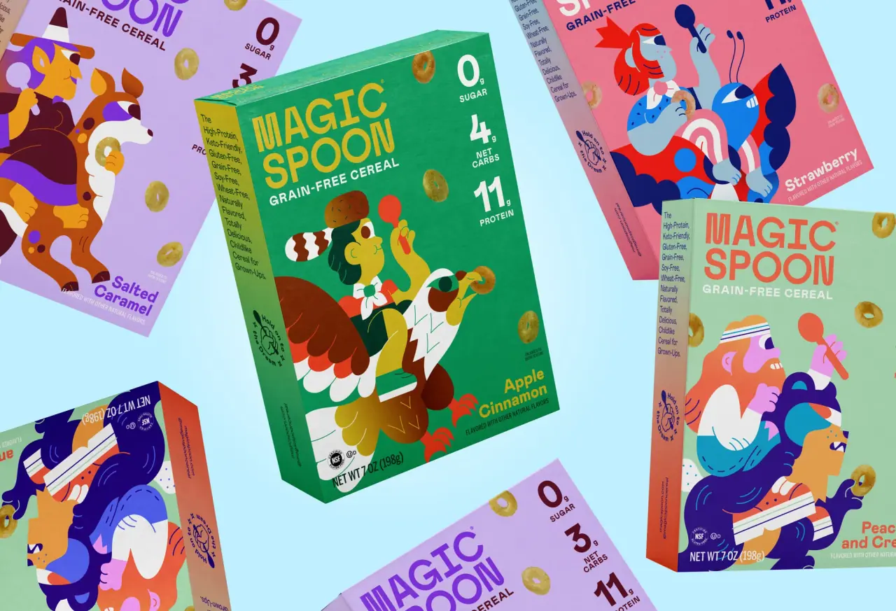
saturday cartoon cereal for grown-ups
Oat Haus
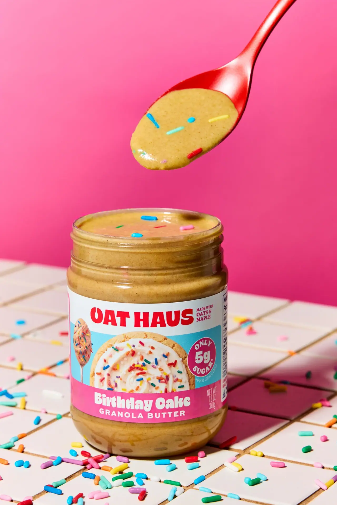
Birthday-party color blocks with oversized grocery typography

Partake
one saturated carton per cookie flavour
Seed + Mill
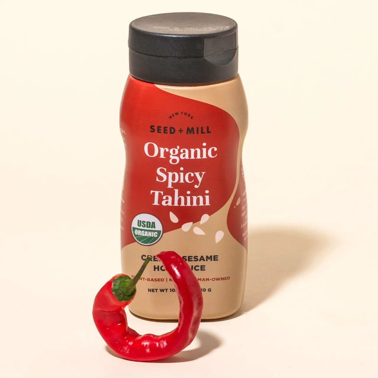
Cream serif lettering inside a flowing red tahini field
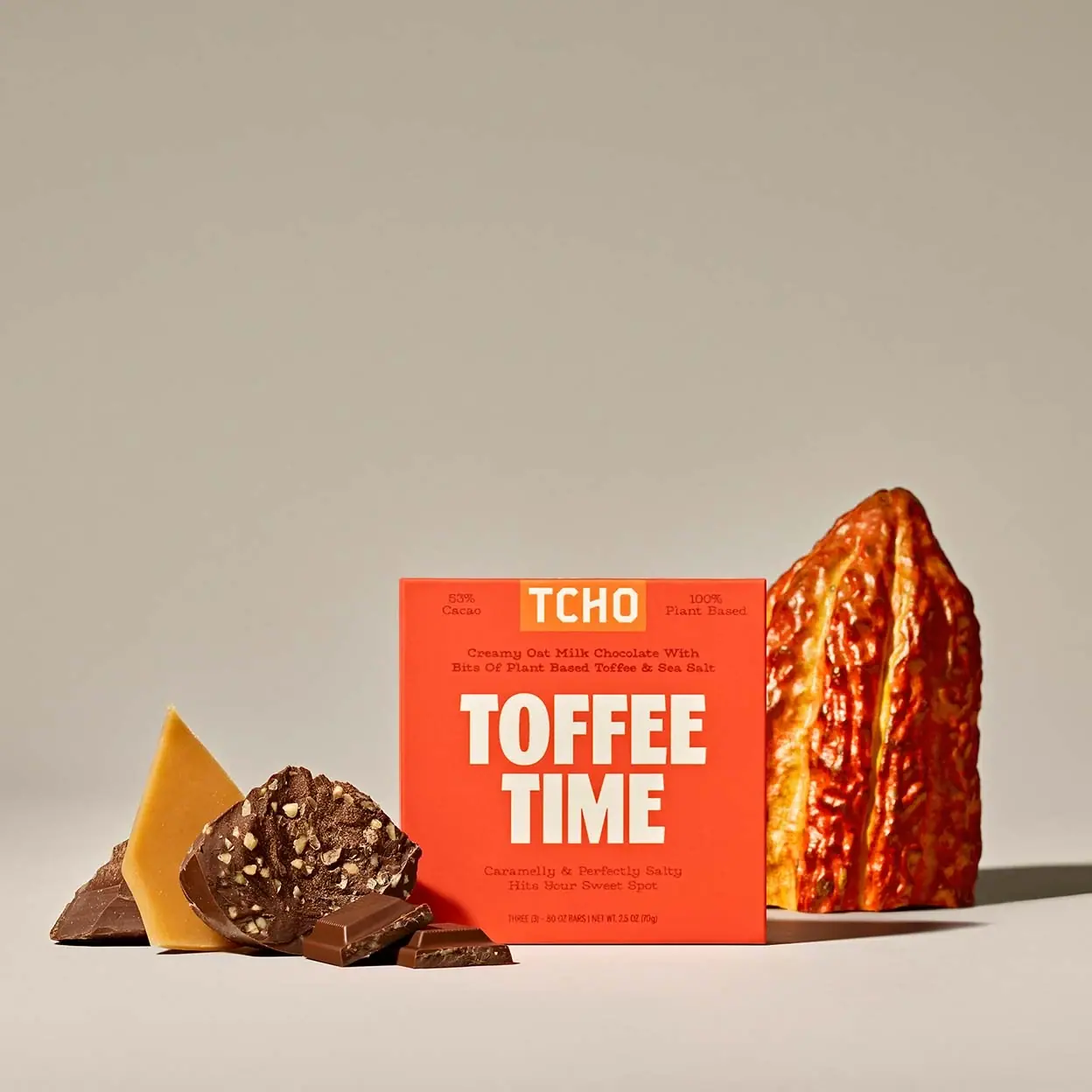
TCHO
Giant cream flavour lettering on a hot orange-red square

ACURE
Iridescent spectacle with practical, tightly ordered type

Bask
sunny yellow with a playful turquoise signature