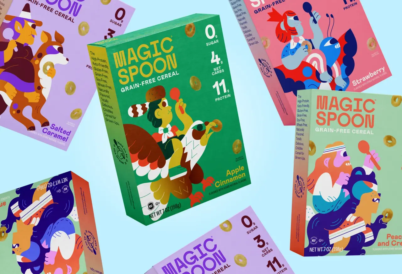
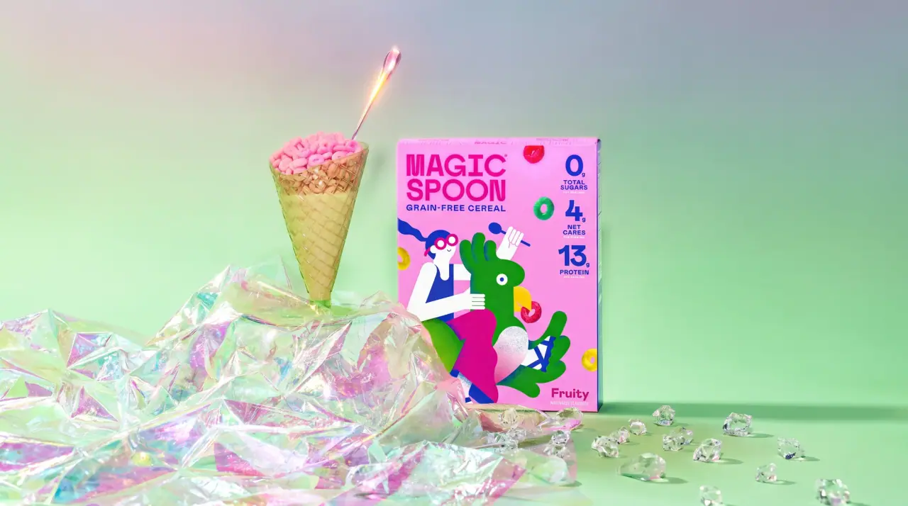
Magic Spoon packages high-protein cereal, pastries, treats, oatmeal and granola like a kids' cereal aisle, with a fixed front grid that every flavour fills in its own saturated colour. The heavy squared two-line wordmark always sits top left, a column of oversized nutrition numerals (grams of protein, sugar, net carbs) runs down the top right, and the product line in condensed caps sits under the wordmark. The lower front shows flat cartoon characters on the cereal or glossy close-up food photography on newer lines, the flavour name sits in a rounded sans in the bottom corner, and the box sides fade through bright two-colour gradients carrying a run-on line of playful copy. Packs are sold fanned in multipacks of four to eight.
Approximate colours interpreted from photography. These are screen references, not official brand colours or print specifications.
Pack body
Frosting Cream
#f1e8cf
Front panel ground of the birthday cake cereal box
Ink
Stat Navy
#1e2470
Oversized nutrition numerals, their labels and the product line on light cartons
Carton White
#ffffff
Wordmark and product line reversed out on saturated cartons
Accent
Party Pink
#e8417f
Wordmark and flavour name on the cereal, character clothing
Side Turquoise
#2bbcb3
End of the pink-to-turquoise gradient on carton side panels
Badge Maroon
#6b1e2e
Small corner panel behind the nutrition column on treats cartons
Range coding
Oat Lavender
#b9a6ea
Carton colour of the protein oatmeal line and the salted caramel treats
Grape Purple
#a443c9
Double chocolate cereal treats carton and wrapper
Strawberry Red
#f22b3e
Frosted strawberry pastries carton
Cinnamon Orange
#f27a1a
Cinnamon brown sugar pastries carton
Mallow Yellow
#efe35b
Marshmallow treats carton and the yellow end of the granola pouch gradient
Typography
Suggested visual alternatives, not confirmed brand typefaces. Any scale below is an illustrative estimate.
The wordmark is biggest, stacked on two lines top left; nutrition numerals are almost as tall and stacked top right; the product line sits under the wordmark in condensed caps, and the flavour name sits in a rounded sans near the food image in the bottom corner.
Type scale
Estimated cap size as a share of the panel · Front panel of the 7 oz cereal box, about 230 mm tall
wordmark
11% · Black · Display
STAR BOWL
stat-numeral
8% · Black · Numeral
14g
product-line
3.5% · Bold · Headline
PROTEIN PASTRIES
flavour-name
3.2% · ExtraBold · Body
Maple Waffle
side-copy
2% · Regular · Body
Crunchy-Sweet-Keto-Friendly-Totally-Breakfast
stat-label
1.6% · Bold · Numeral
NET CARBS
Fonts
Display
Archivo Black
Looks like
Obviously Narrow Black, Haas Grotesk Display Black
Type
Heavy squared grotesque, slightly condensed
Weight
Black
Case
Uppercase
Tracking
Tight, about -2%
Fallback
Helvetica Neue Black, Arial Black
Wordmark only, two stacked words, flavour colour on cream or white on saturated cartons.
Headline
Oswald
Looks like
Bebas Neue, Oswald Bold
Type
Condensed bold grotesque
Weight
Bold
Case
Uppercase
Tracking
Slightly open, about +2%
Fallback
Impact, Arial Narrow Bold
Product line (protein pastries, treats, oatmeal, grain-free cereal) directly under the wordmark.
Numeral
Jost
Looks like
Futura Bold, Avenir Black
Type
Bold geometric sans numerals
Weight
Bold, Black
Case
Numerals with small uppercase labels
Tracking
Tight
Fallback
Futura, Avenir Black
Grams of protein, sugar and net carbs stacked in a column at the top right, with tiny g and labels.
Body
Nunito
Looks like
Nunito ExtraBold, Gilroy Bold
Type
Rounded bold sans
Weight
ExtraBold, Regular
Case
Title case
Tracking
Normal
Fallback
Arial Rounded, Helvetica
Flavour name in the bottom corner, run-on side-panel copy and back-panel text.
Structure & Proportions
Proportions
Purpose
Value
Preview
Wordmark block
About 55% of front width, top left
Nutrition column
About 15% of front width, top right
Image area
About 60% of front height, lower panel
Top margin
About 5% of front height
Colour coverage
Full bleed, 100% of the carton in the flavour colour
Colours per front
Flavour colour, white or navy, plus the image
—
Density
Busy and loud: type top, image bottom, no empty zones
—
Shapes
Element
Value
Preview
Carton
Upright rectangle carton, flat colour
Nutrition panel
Tall rounded rectangle behind the stat column
Flavour tag
Small rounded banner holding the flavour
Spoon badge
Small round seal on the side panel
Finishes
Matte printed board
Cartons · matte
Glossy printed film
Bar wrappers and granola pouches · gloss
Metallised film
Inner wrappers of pastries and treats · metallic
Formats and materials
Formats
Cereal carton, Snack carton, Individually wrapped bar, Stand-up pouch, Multipack of four to eight cartons
Materials
Paperboard, Flexible film
Closures
Tuck-end cartons; flow-wrapped bars; zip-top stand-up pouches for granola
Decoration
Full-bleed flat colour, Colour gradients on sides and pouches, Flat cartoon illustration, Food photography, Navy nutrition panel
Front Panel
Schematic reading order. The diagram’s zone heights do not represent measured artwork proportions.
Top left
Top right
Lower front
Bottom corner
Side panel
A fixed front grid repeated on every flavour: wordmark block top left, nutrition column top right, image in the lower two thirds, flavour name bottom corner.
Zone
Content
Top left
Stacked wordmark and product line
Top right
Column of big nutrition numerals, sometimes in a navy or maroon panel
Lower front
Cartoon characters or close-up food photography
Bottom corner
Flavour name and net weight
Side panel
Gradient ground with run-on benefits copy and a small spoon badge
Range System
Colour coding by flavour within a fixed grid: each flavour owns one saturated carton colour, and each product line keeps its own descriptor and image type, while the wordmark and nutrition column never move.
Oatmeal = lavender carton, green or yellow flavour panel
Granola = blue-to-yellow gradient pouch
Back of Pack & Shelf
The back continues the flavour colour with a large white nutrition facts box, a short brand story in rounded type and a net-carb equation strip; sides run gradient grounds.
Nutrition facts box in black on white
Ingredient list and allergen statement under it
Net carbs equation strip (carbs minus fibre minus allulose)
Short playful brand story paragraph
Barcode, best-by area and recycling marks
On shelf
Fanned multipacks make a row of identical grids, and adjacent flavours stack into a rainbow of flat cartons; the giant numerals read from across the aisle.
Imagery
Flat, bold-coloured cartoon characters with simple shapes on the cereal, and glossy close-up food photography (stacked pastries, bars, oatmeal bowls) on newer lines, cut out and overlapping the carton base.
Guidelines
Do
Give every flavour one saturated full-bleed carton colour (for example #f22b3e).
Stack the heavy squared wordmark on two lines at about 55% of front width, top left.
Run oversized nutrition numerals (Numeral) in a column down the top right.
Fill the lower 60% of the front with flat cartoon characters or cut-out food photography.
Fade side panels through a bright two-colour gradient with playful run-on copy.
Sell multipacks by fanning four or more identical cartons in a row.
Don't
Don't use muted, earthy or kraft colours.
Don't move the wordmark or nutrition column between flavours.
Don't use serif type anywhere.
Don't make the nutrition numbers small; they are a headline.
Don't use realistic illustration; characters stay flat and graphic.
Give your AI packaging taste
Give your design or image tool a packaging study: palette, type, structure, front panel and principles for an original brief.