Photography: Aurélie Graillot portfolio photography. Images belong to their respective owners.
TRESemmé

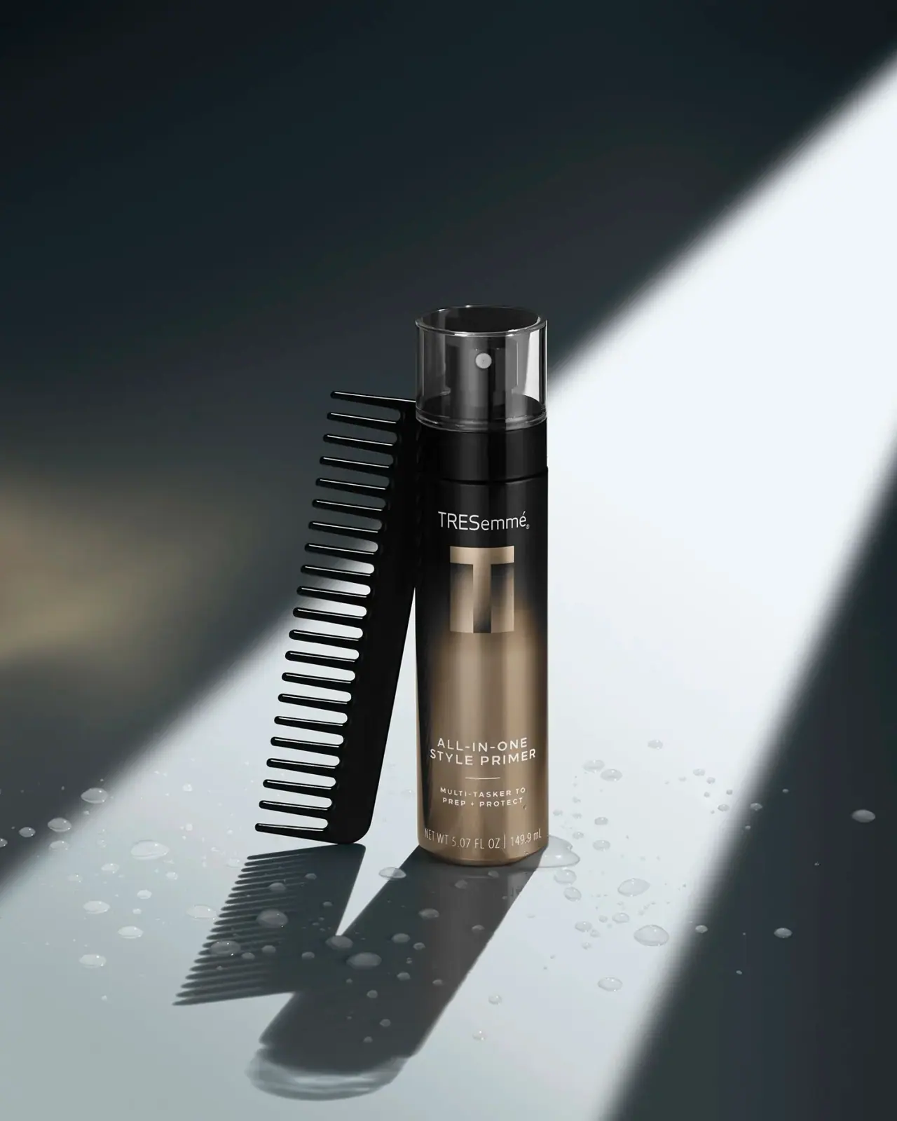
bronze geometric initial over a dark slender spray cylinder
The selected A-List All-in-One Style Primer uses a small pale TRESemmé name above a much larger geometric T. Its dark upper body transitions visually into a warm bronze-looking lower field, with the product descriptor placed well below the emblem. A clear cylindrical overcap reveals the black spray actuator and pale outlet. Aurélie Graillot's photograph frames this restrained front with a black comb, water droplets and a diagonal shaft of light, reinforcing the styling context without adding permanent package graphics.
- Hair
- Dark pack
- Luxe monochrome
- Bold typographic
About this study
A-List All-in-One Style Primer, selected 5.07 fl oz / 149.9 mL front photographed in Aurélie Graillot's portfolio. No whole-range material or layout specification inferred.
Sources & evidence · Reviewed 2026-10-19Color Palette
Approximate colours interpreted from photography. These are screen references, not official brand colours or print specifications.
Pack body
Near-black upper field
#191A1B
Approximate upper body and closure tone. Reflections create brighter vertical edges; the photograph does not establish a uniform production colour across components.
Ink
Pale information
#E8E4DC
Approximate maker, product description and quantity lettering. Small text contrast varies across the warm reflective-looking field.
Accent
Bronze-looking field
#9A8365
Approximate warm lower-body and large initial appearance. Metallic-looking highlights are not proof of foil, aluminium or any particular coating.
Typography
Suggested visual alternatives, not confirmed brand typefaces. Any scale below is an illustrative estimate.
A relatively small mixed-case maker name sits near the upper front. Beneath it, a large geometric T supplies the dominant recognition shape without being a full product title. A long quiet interval separates that emblem from the lower two-line uppercase descriptor. A short horizontal rule then divides the name from a smaller tracked benefit statement. Net quantity forms a narrow footer. The visible front does not show a large A-List word stack; A-List is the official collection context rather than the dominant photographed lettering.
Fonts
Product and benefit alternative
Raleway
- Looks like
- Raleway for light geometric uppercase information
- Type
- Geometric sans serif
- Weight
- Medium 500 / SemiBold 600
- Case
- Uppercase
- Tracking
- Open, with shorter benefit lines
- Fallback
- Arial, sans-serif
Use two short descriptor lines with enough space around them to remain distinct from a large emblem. Increase weight where pale text crosses a bright metallic-looking area. Raleway is a working alternative; the photographed maker name and geometric T should not be reconstructed from this recommendation.
Technical footer alternative
Roboto Condensed
- Looks like
- Roboto Condensed for a narrow volume line
- Type
- Condensed sans serif
- Weight
- Regular 400
- Case
- Numerals and units
- Tracking
- Natural to slightly open
- Fallback
- Arial Narrow, sans-serif
Keep quantity in a separate lower interval and test it on the real curved surface. A condensed family can fit units without forcing the primary descriptor into the same narrow voice. Avoid shrinking legal information simply to preserve an unusually large empty middle area.
Structure & Proportions
Visual proportions and finish previews are illustrative. Confirmed construction details and uncertainties are distinguished in the study notes.
Proportions
| Purpose | Value | Preview |
|---|---|---|
| Emblem versus maker | The single T is much larger than the full maker name above it, turning an initial into the strongest graphic shape. | — |
| Open middle interval | A substantial unlettered field separates the large initial from the lower descriptor, giving the relatively small product name its own reading zone. | — |
| Continuous upper silhouette | The transparent cover closely follows the bottle width, so the actuator reads as an internal shape within a simple outer cylinder. | — |
| Layered lower information | Product name, short rule, benefit statement and quantity form progressively smaller or narrower units near the base. | — |
Shapes
| Element | Value | Preview |
|---|---|---|
| Main cylinder | Long near-parallel sides and a softly rounded base edge. | |
| Transparent cover | Straight-sided clear cylinder enclosing the smaller black actuator. | |
| Geometric initial | Broad horizontal top bar over a heavy vertical stem, with tonal changes across the interior. | |
| Divider | Short fine horizontal rule centred below the product descriptor. |
Finishes
Warm metallic-looking appearance
Large T and lower body in the selected illumination; material and decoration process are not verified. · metallic
Transparent enclosure
The cylindrical overcap reveals actuator shape and pale outlet while retaining a simple outer silhouette. · transparent
Formats and materials
| Formats | Tall, near-straight cylindrical-looking spray bottle, shown with a transparent cylindrical overcap and visible 5.07 fl oz / 149.9 mL marking. |
| Materials | Bottle, actuator and overcap materials are unverified; dark and transparent appearances do not identify their polymers or other substrates., The bronze-looking front may involve decoration and reflections, but no foil, metallisation, label stock or direct-print process is established. |
| Closures | The clear cover encloses a dark upright actuator with a small pale circular outlet. A black lower collar connects this upper assembly to the body, and the cover is approximately continuous with the bottle's overall width in this view. The official directions describe misting, which supports the spray context. Neither the attachment method, internal pump construction nor a particular spray pattern can be inferred from the closed package photograph. |
| Decoration | Small pale upper maker name., Large geometric bronze-looking T beneath the maker., Separated lower product descriptor, short rule and compact benefit lines., Narrow quantity footer close to the base. |
Front Panel
Schematic reading order. The diagram’s zone heights do not represent measured artwork proportions.
The front is centred around a large initial and generous vertical spacing. Small maker text introduces the upper graphic, while the actual product role is deferred to a lower block. That block uses two tracked uppercase lines, a fine divider and a compact two-line benefit statement. Quantity follows near the base. The bronze-to-dark appearance creates a tonal field rather than a sharply bounded coloured label panel; the photograph does not reveal a complete label edge or verify whether the tonal change is entirely printed.
| Zone | Content |
|---|---|
| Upper maker | Small pale TRESemmé name above the dominant initial. |
| Large initial | Geometric bronze-looking T, the front's strongest isolated mark. |
| Open interval | Broad largely unlettered warm-toned field between emblem and product information. |
| Lower product role | Two-line All-in-One Style Primer descriptor, short divider and smaller preparation/protection statement. |
| Quantity footer | Visible 5.07 fl oz / 149.9 mL marking near the curved base. |
Range System
The official page places this primer in the A-List Collection and describes its preparation role. This study covers one selected front, so the large initial, bronze appearance and low descriptor position are not asserted as universal rules across all collection formats. They offer a possible starting point for comparing related packs, but another product would need its own image review before claiming consistent colour coding or shared dimensions.
- Selected primer: dark-to-bronze-looking cylinder, transparent overcap, large T and low product descriptor.
- Official source: 5.07 oz primer used by misting damp hair and combing through; usage context does not specify package materials.
Back of Pack & Shelf
The reverse and underside are hidden. Online directions and ingredients provide product context but cannot establish the printed back's layout, exact copy, barcode position or recycling instructions. The cover remains fitted, so a physical inspection is also needed to document attachment and dispensing behaviour.
- Inspect the reverse before mapping technical information or claiming a continuous wrap layout.
- Check small pale text against highlights across the full cylinder, not only in a flat artwork proof.
- Confirm materials and component separation directly before adding recycling guidance.
On shelf
Interpretation: the large T may remain identifiable when the smaller maker and descriptor are too distant to read. The long empty interval produces a restrained front, but it also places the product role relatively low, where a shelf edge or neighbouring pack could hide it. A new layout should test that tradeoff rather than copying the spacing automatically. Pale small lettering over a reflective warm field also needs angled-light checks because the brightest area may reduce contrast.
Imagery
The selected photograph uses a dark setting crossed by a broad diagonal beam. A black wide-tooth comb leans beside the bottle, leaving the front unobstructed, while droplets and long shadows occupy the supporting surface. The comb and damp setting correspond to the official application sequence, but they are photographic props rather than demonstrated contents of the sale. The large initial receives its own highlight, and the transparent cap stays visible through rim reflections against the darker background.
Guidelines
Editorial principles for an original design brief, not official brand guidelines.
Do
- Separate recognition, product role and technical quantity through clear spacing.
- Use a large original symbol only when the actual product name remains easy to find.
- Check low descriptor placement against realistic shelf obstructions.
- Keep photographer, packaging designer and manufacturer specifications distinct.
Don't
- Do not treat a bronze-looking photograph as proof of metal or foil.
- Do not call the front a large A-List word stack when that wording is not visible.
- Do not assume the comb is included with the product.
- Do not copy the TRESemmé name or geometric T as a new brand identity.
Sources & evidence
- TRESemmé — A-List All-in-One Style Primerproduct
- Aurélie Graillot — beauty photography portfoliophotographer
How this study was built
context · Sourced fact
Official page identifies the 5.07 oz primer and describes misting damp hair followed by combing through.TRESemmé — A-List All-in-One Style Primerimagery · Sourced fact
Retained curation provenance points to Aurélie Graillot's beauty portfolio, accessed for this study.Aurélie Graillot — beauty photography portfoliotypography · Visual observation
Small maker sits above a large geometric T; product descriptor occupies a separate lower zone.Aurélie Graillot — beauty photography portfoliostructure · Visual observation
Transparent cylindrical cap reveals a dark actuator with pale circular outlet.Aurélie Graillot — beauty photography portfoliopalette · Visual observation
Dark upper field and warm bronze-looking lower field are appearances under directional light, not verified substrates.Aurélie Graillot — beauty photography portfolioshelf · Editorial interpretation
Low descriptor placement and small pale copy need shelf-obstruction and glare testing.
What remains unverified
- Materials, coating, foil or label application are unverified.
- Fonts, physical dimensions and tonal-field construction are unknown.
- Reverse, underside, cap attachment and internal spray mechanism are unseen.
- Comb, droplets and diagonal lighting are scene elements rather than supplied package components.
Give your AI
packaging taste
Give your design or image tool a packaging study: palette, type, structure, front panel and principles for an original brief.
Export this styleFree with an email. PACK.md works in Claude, ChatGPT, Cursor and image tools.
More like this

Color Wow
Tall condensed naming on a broad reflective silver jar
DIZZIAK
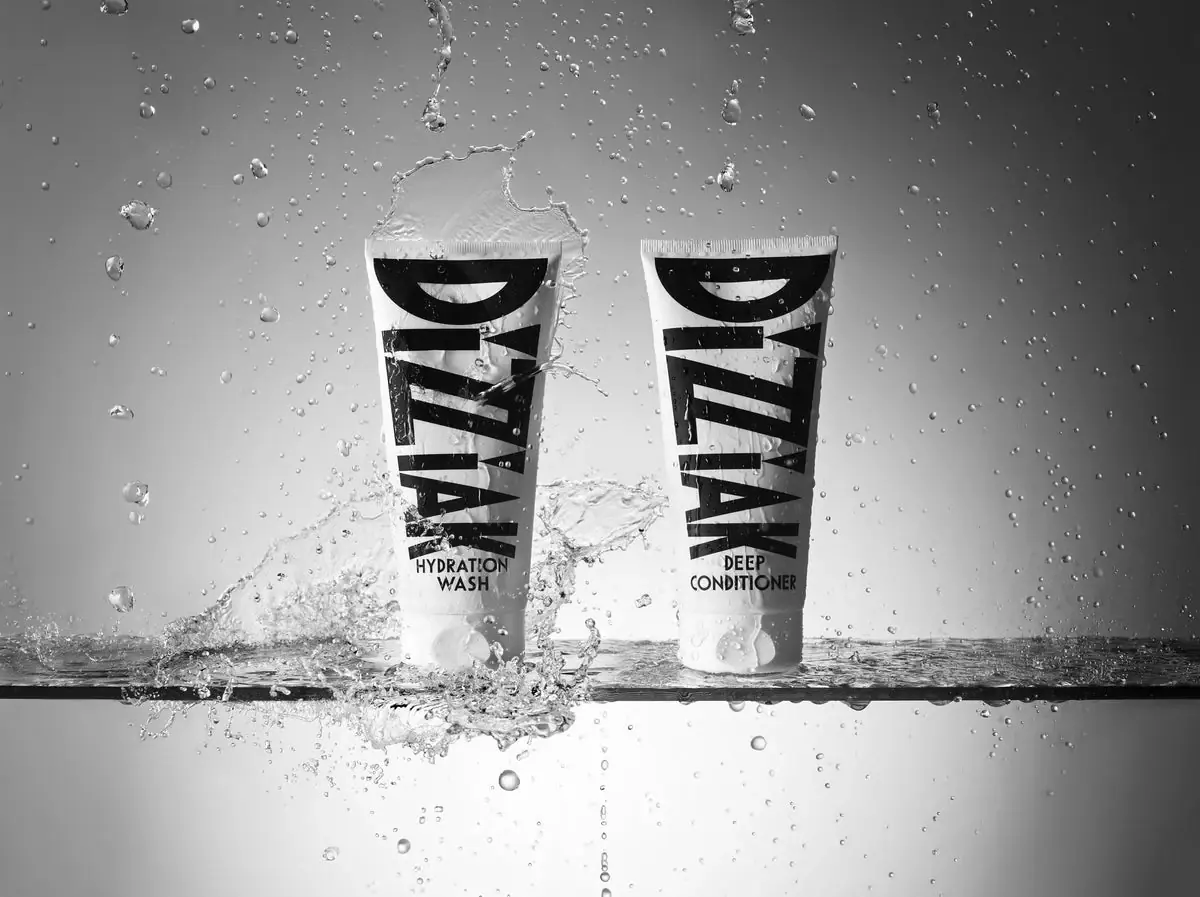
Oversized black lettering unites two pale haircare tubes

EADEM
Mirror-bright tube, oversized black identity, juicy campaign color
MAKE UP FOR EVER
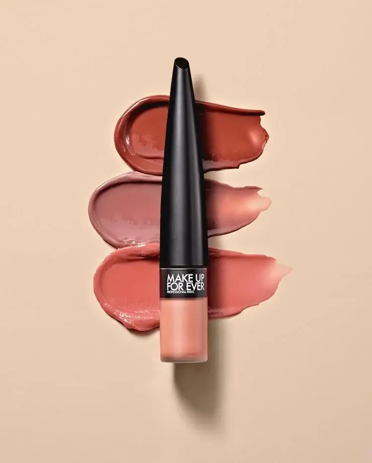
Long tapered black cap above a compact colour chamber
MUTHA
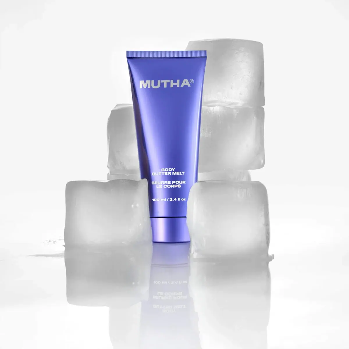
Reflective violet tube with bold maker and spacious middle
NARS
Clear elongated bottle with oversized interlocking mark and black cap

Pat McGrath Labs
Gold pigment kit with sparse labelling and sequin-filled pouch
Rodial
Reflective silver with parallel vertical foundation lettering