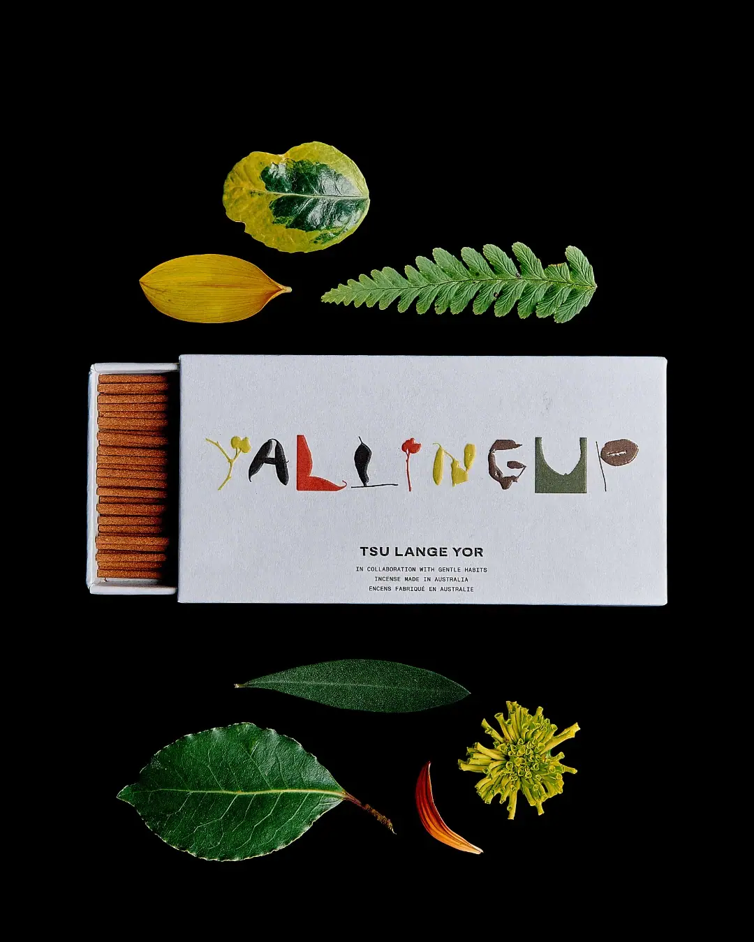
Photography: Gentle Habits — TSU LANGE YOR collaboration photography. Images belong to their respective owners.
TSU LANGE YOR

botanical collage letters across a white sliding incense box
Yallingup Incense uses a wide pale sleeve with a partly withdrawn tray exposing neatly aligned brown sticks. Across the front, the scent name becomes a sequence of irregular collage-like letterforms in green, yellow, red, brown and black. A much smaller orderly identity block sits below. The contrast is between expressive naming and restrained practical information, with the sliding construction making the contents visible without obscuring the artwork.
- Candles & home scent
- Light pack
- Botanical
- Playful colour
About this study
Selected Yallingup incense collaboration sleeve and partially exposed tray. Exact official product sources establish contents; holder and other brand products are excluded.
Sources & evidence · Reviewed 2026-10-19Color Palette
Approximate colours interpreted from photography. These are screen references, not official brand colours or print specifications.
Pack body
Pale carton
#DCDDE0
Approximate sleeve and tray appearance under cool light; not a calibrated paper-white specification.
Ink
Black identity
#171A15
Approximate maker, collaboration and origin text, plus dark parts of the collage lettering.
Accent
Muted botanical green
#69745C
Approximate green letterform area on the sleeve; surrounding real leaves are not sampled as packaging colours.
Yellow collage accent
#B5AD39
Approximate yellow letterform fragments.
Rust red fragment
#AC3B2D
Approximate red letterform accent within the scent name.
Typography
Suggested visual alternatives, not confirmed brand typefaces. Any scale below is an illustrative estimate.
YALLINGUP is the dominant element, but its letters behave as individual images rather than a repeated font. Their shapes, textures, colour and baseline relationships vary, with some looking botanical and others like cut fragments. Below, TSU LANGE YOR is a compact bold uppercase line. Smaller technical-looking uppercase text credits the collaboration and gives incense origin in English and French. The lower block provides a stable reading anchor after the viewer deciphers the expressive name.
Fonts
Maker alternative
Archivo
- Looks like
- Archivo as an independent visual alternative
- Type
- Sans serif
- Weight
- Bold 700
- Case
- Uppercase
- Tracking
- Slightly open
- Fallback
- Arial, sans-serif
Use a compact, confident sans-serif for the maker beneath an independently drawn title. Keep it readable enough to anchor the composition, but smaller than the expressive name. Do not trace the selected TSU LANGE YOR lettering.
Technical information alternative
IBM Plex Mono
- Looks like
- IBM Plex Mono as an independent visual alternative
- Type
- Monospace
- Weight
- Regular 400
- Case
- Uppercase
- Tracking
- Natural monospaced rhythm
- Fallback
- Arial, sans-serif
A small monospaced voice can organise collaboration, product type and origin. Test its size in print and avoid treating practical information as decorative texture. The proposed face is not an identification of the original lower copy.
Structure & Proportions
Visual proportions and finish previews are illustrative. Confirmed construction details and uncertainties are distinguished in the study notes.
Proportions
| Purpose | Value | Preview |
|---|---|---|
| Wide title field | The sleeve front is horizontally oriented, giving the irregular name room to spread across one line. | — |
| Small opening reveal | Only a narrow section of tray is exposed, keeping the front artwork fully visible. | — |
| Source-listed stick size | The brand lists sticks at 112 × 1.8 mm; these are content dimensions, not measured carton dimensions. | — |
Shapes
| Element | Value | Preview |
|---|---|---|
| Sleeve | Wide shallow rectangular outer box with open short end. | |
| Tray | Shallow rectangular drawer with pale rim. | |
| Letter artwork | Irregular cut, curved and botanical-looking fragments forming the scent name. |
Finishes
Diffuse carton
Pale sleeve and tray surfaces; exact paper finish unverified. · matte
Printed-looking collage
Multicolour title appears integrated on the sleeve, without confirmed applied physical fragments. · matte
Formats and materials
| Formats | Selected pale rectangular sleeve with a sliding inner tray, photographed partly open from the left. Official Yallingup listing specifies 60 bamboo incense sticks. |
| Materials | The official product page identifies bamboo sticks and Australian manufacture. It does not specify sleeve board grade, coatings, adhesive or tray construction., The pale box has a paperboard-like appearance, but recycled content, certification and complete recyclability are unverified. Botanical-looking title fragments are printed-looking artwork, not confirmed real leaves attached to the carton. |
| Closures | The tray extends from one short end of the sleeve, exposing a shallow section of aligned sticks. The sleeve remains in place over most of the contents and carries the entire visible front identity. There is no visible hinge, magnet or tear strip. Friction, internal stops and any original seal are not established by the photograph. The open edge shows a light tray rim around the sticks, but the complete internal arrangement and number of layers cannot be counted from the partial reveal. |
| Decoration | Large irregular scent-name artwork across the front., Small centred maker and collaboration block beneath., Broad unprinted-looking margins around the two graphic groups. |
Front Panel
Schematic reading order. The diagram’s zone heights do not represent measured artwork proportions.
The expressive title spans the upper-middle front in one broad line. Its differing letter shapes are balanced by the lower centred block, where maker, collaboration and bilingual origin are stacked in a disciplined sequence. The maker is much heavier than the tiny supporting lines. No separate adhesive-label boundary is visible, so the front is documented as sleeve artwork rather than a confirmed pasted label. The title’s irregularity should not be mistaken for poor alignment; it is the main expressive device, while the lower copy carries reliable orientation.
| Zone | Content |
|---|---|
| Scent artwork | Large collage-like YALLINGUP across the horizontal face. |
| Maker | Bold TSU LANGE YOR centred below. |
| Collaboration | Small credit naming Gentle Habits. |
| Product and origin | Incense made in Australia wording in English and French. |
Range System
Both partners’ official pages confirm the Yallingup collaboration, and the exact TSU LANGE YOR product page identifies 60 bamboo sticks. The partial photo reveal is not a count of the full contents. The separately listed incense holder is a different item and is not included in this package analysis. This study does not extend the collage typography to the brand’s perfumes or other objects, nor attribute the artwork to a collaborator without a specific design credit.
- Selected Yallingup collaboration sleeve and partially opened tray.
- Official 60-stick product; a separately listed holder is outside the package scope.
Back of Pack & Shelf
The reverse, underside, closed end and complete tray interior are unseen. Directions, caution information, ingredients and quantity marking cannot be located from this front. The decorative arrangement does not show how the carton is sealed for sale or whether additional protective wrapping is used.
- Inspect the reverse before mapping practical incense instructions.
- Check the closed pack for its original sealing method.
- Verify board and tray construction from supplier documentation.
On shelf
Interpretation: the pale wide rectangle and colourful title should attract attention first, while the small lower maker requires closer viewing. The irregular title may take longer to decipher than ordinary type, making the clear product descriptor important. The drawer reveal works well in a photograph but will not be available on a closed retail shelf. An original design should therefore test recognition with the tray fully shut and ensure the package still communicates incense without visible sticks.
Imagery
Real leaves, a fern-like frond and small flower or petal fragments are arranged above and below the box on black. Their varied shapes echo the collage-like title while leaving the white sleeve unobstructed. The black ground is entirely photographic and should not become a package colour. The botanical objects are not proven to be exact formula ingredients or included contents. The carefully spaced arrangement also makes the modest drawer opening legible as a construction detail rather than a messy unboxing.
Guidelines
Editorial principles for an original design brief, not official brand guidelines.
Do
- Pair expressive lettering with plainly readable product information.
- Make the closed sleeve understandable without visible contents.
- Separate content dimensions from carton dimensions.
- Count contents from source specifications rather than a partial photo.
Don't
- Do not assume real leaves are attached to the sleeve.
- Do not claim recycled board from a matte appearance.
- Do not include the separately sold holder in this pack.
- Do not reproduce the Yallingup collage lettering.
Sources & evidence
- TSU LANGE YOR — Yallingup Incense 60 packproduct
- Gentle Habits — TSU LANGE YOR x Gentle Habits Yallingupproduct
How this study was built
context · Sourced fact
Both partners identify the Yallingup incense collaboration.TSU LANGE YOR — Yallingup Incense 60 pack · Gentle Habits — TSU LANGE YOR x Gentle Habits Yallingupstructure · Sourced fact
Exact brand page lists 60 bamboo sticks and 112 × 1.8 mm stick dimensions.TSU LANGE YOR — Yallingup Incense 60 packtypography · Visual observation
Irregular multicolour title contrasts with small orderly maker and origin text.TSU LANGE YOR — Yallingup Incense 60 packstructure · Visual observation
Tray slides partly from the left short end, exposing aligned sticks.TSU LANGE YOR — Yallingup Incense 60 packimagery · Visual observation
Botanical specimens surround the box on a black photographic ground.TSU LANGE YOR — Yallingup Incense 60 packshelf · Editorial interpretation
Closed-pack recognition should not depend on the staged open drawer.
What remains unverified
- Board specification, coatings, sealing method and complete tray construction unverified.
- Collage artwork authorship and original supporting fonts unknown.
- Reverse and full contents unseen; surrounding leaves are scene props.
Give your AI
packaging taste
Give your design or image tool a packaging study: palette, type, structure, front panel and principles for an original brief.
Export this styleFree with an email. PACK.md works in Claude, ChatGPT, Cursor and image tools.
More like this
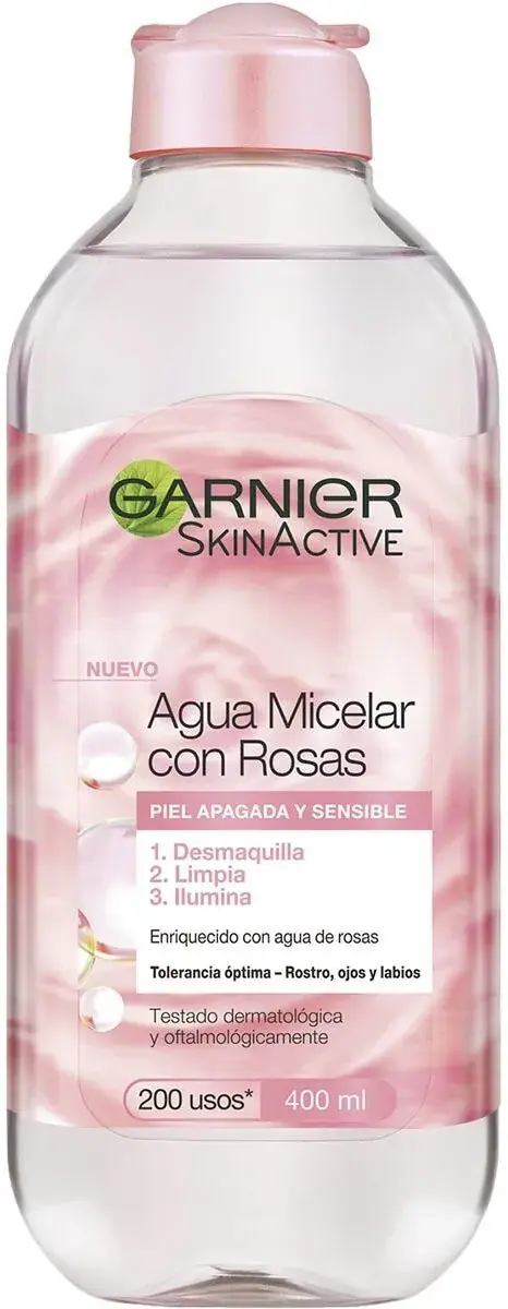
Garnier
green-leaf mark over fruit-bright sub-brand bottles
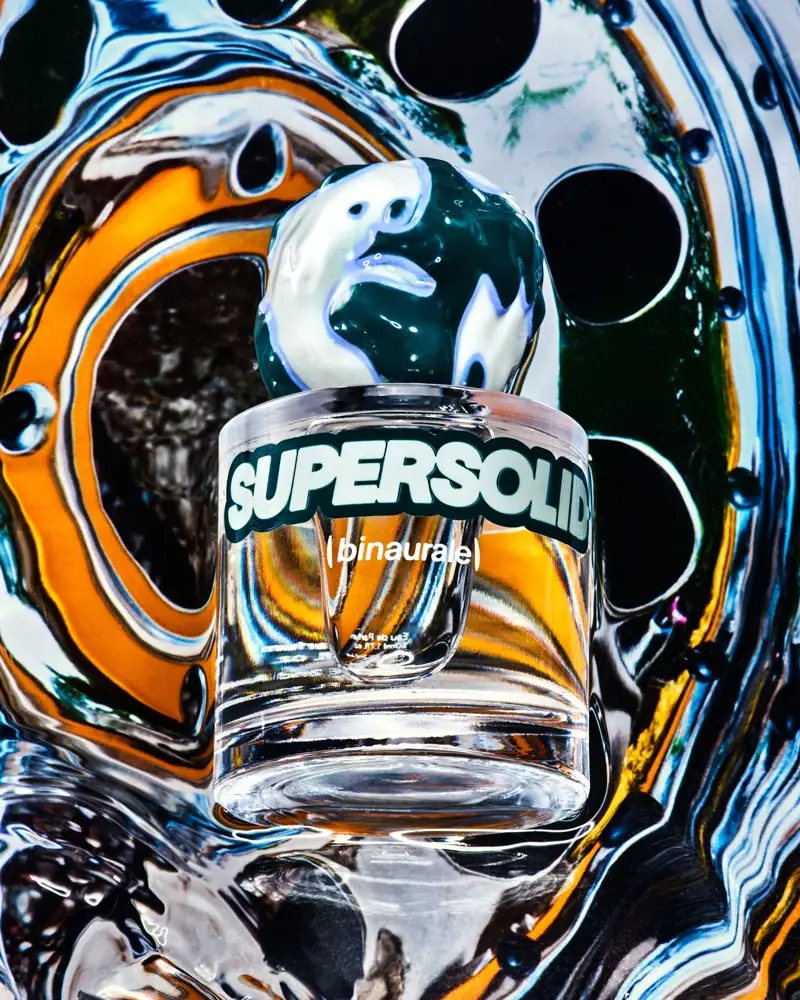
Binaurale
Globular teal cap above slanted pale fragrance lettering

Boy Smells
candy-shell flacons over blush pink glass
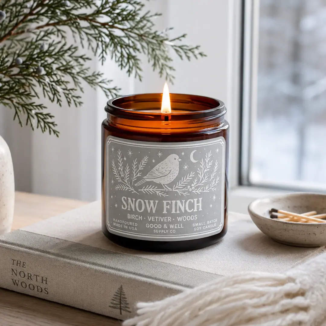
Good & Well Supply Co.
Pale winter bird illustration on a grey amber-jar label
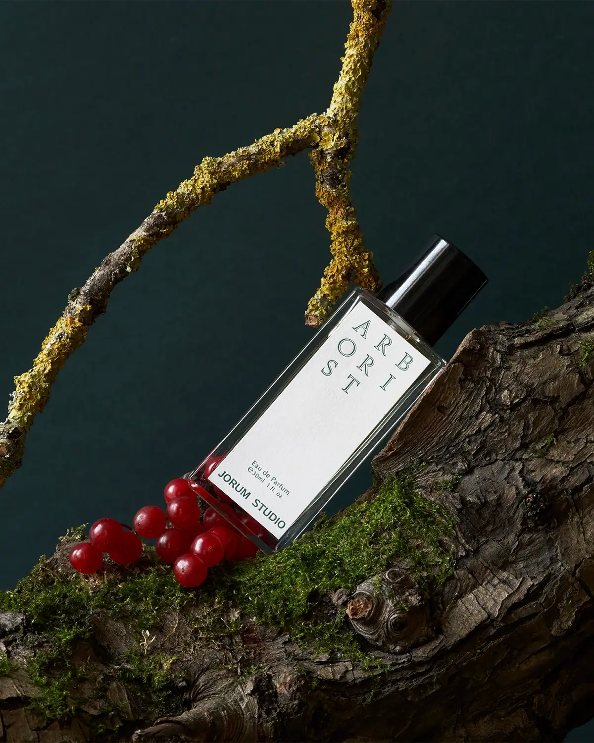
Jorum Studio
Outlined woodland lettering with a quiet label center
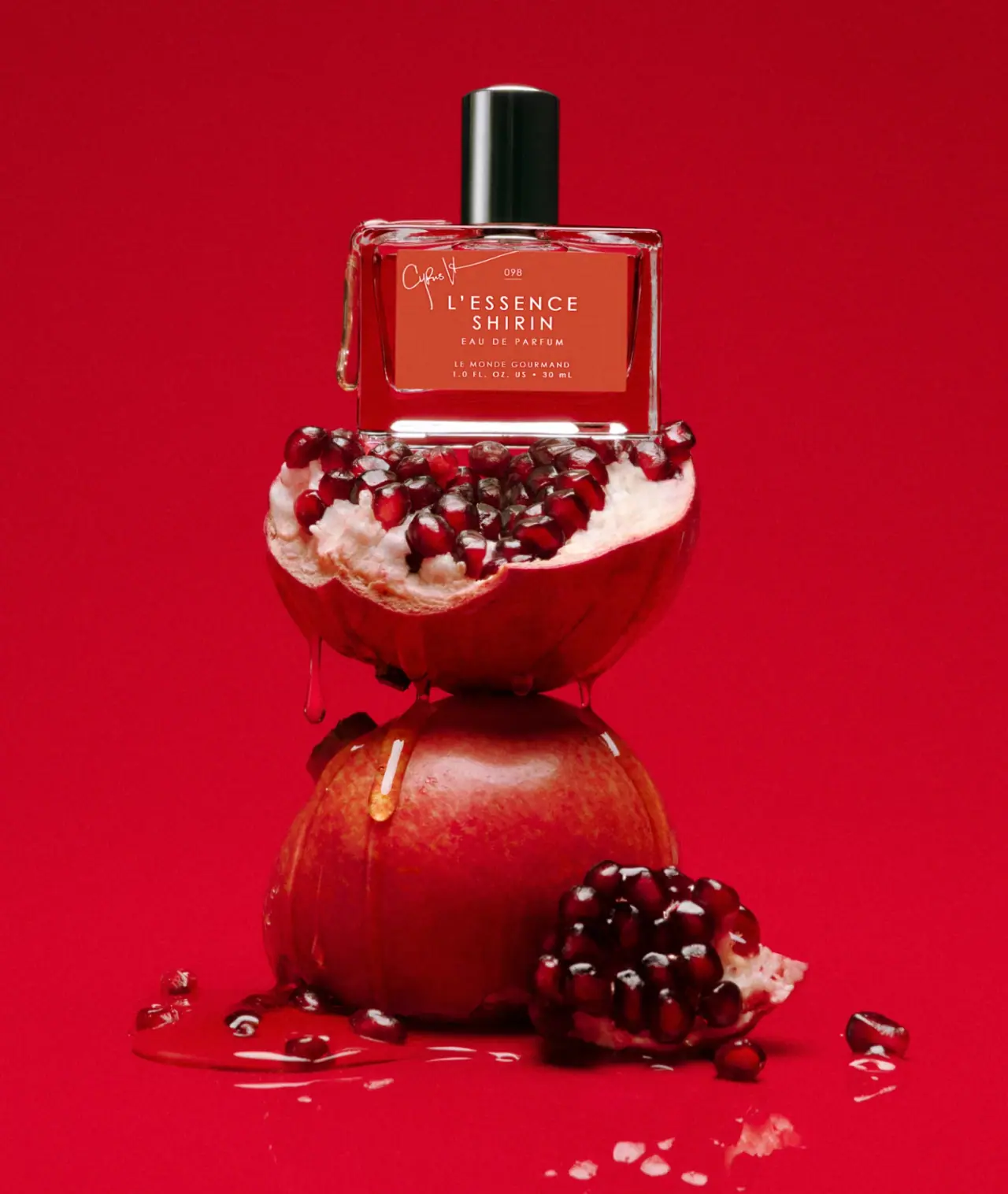
Le Monde Gourmand
white spaced scent naming on red beneath a black cap
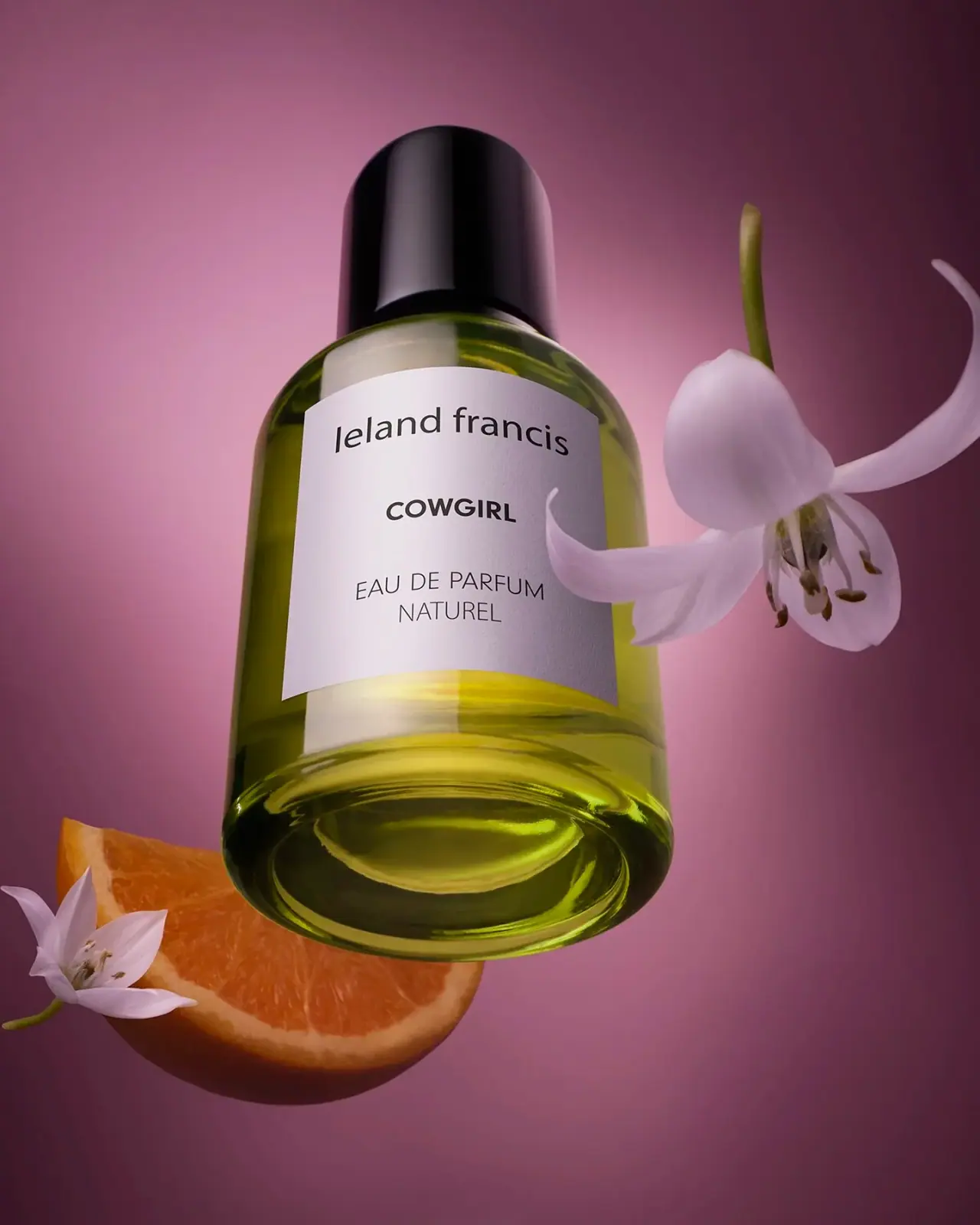
Leland Francis
quiet cream label against luminous botanical perfume
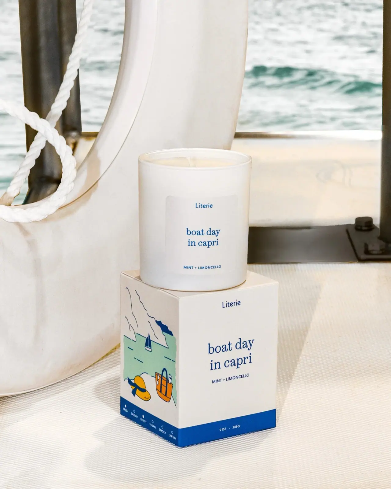
Literie
Quiet blue destination type with a playful coastal side panel