
Photography: Uni official photography. Images belong to their respective owners.
Uni

blue column, clear rounded body and low relief identity
Rain places most of its visible colour in a tall blue cap above a low transparent-looking vessel. The body widens toward its rounded base, where a substantial clear uni. signature catches light without a contrasting label. In the selected wet-tile photograph, the bottle takes on the surrounding blue-green reflections while the cap remains a distinct colour block. This study concerns the selected 50 ml perfume presentation; it does not transfer the brand’s broader bodycare packaging specifications to this object.
- Perfume
- Light pack
- Clinical minimal
- Bold typographic
About this study
Rain Water-Based Perfume 50 ml in the approved wet-tile campaign photograph. Analysis concerns this closed front presentation, not all Uni bodycare or fragrance packaging.
Sources & evidence · Reviewed 2026-10-19Color Palette
Approximate colours interpreted from photography. These are screen references, not official brand colours or print specifications.
Pack body
Clear optical highlight
#D9E4E6
Illustrative pale reflection through the transparent-looking body and relief identity. It represents an optical appearance, not white pigment or a verified tinted substrate.
Accent
Blue cap midtone
#155F87
Approximate blue sampled by visual judgement from the cylindrical cap. Droplets and directional light produce much brighter and darker areas; this is not a supplier colour specification.
Typography
Suggested visual alternatives, not confirmed brand typefaces. Any scale below is an illustrative estimate.
The visible front has one principal identity: rounded lowercase uni. lettering near the base. Its substantial width makes it part of the vessel’s silhouette rather than a small information label. The shallow relief reads through highlights, internal edges and shadows, not a second ink colour. No fragrance name, capacity line or ingredient text is legible on this face. Their absence here does not prove that the complete package omits them.
Fonts
Rounded identity alternative
M PLUS Rounded 1c
- Looks like
- M PLUS Rounded 1c for soft, substantial lowercase forms
- Type
- Rounded sans serif
- Weight
- Bold 700
- Case
- Lowercase
- Tracking
- Compact but with distinct open counters
- Fallback
- Arial, sans-serif
Explore an original short name with rounded strokes. Its counters, spacing and baseline should be developed independently; this is not a reconstruction of the uni. signature or its distinctive joined-looking curves.
Supporting information proposal
Archivo
- Looks like
- Archivo for a clear secondary information voice
- Type
- Plain sans serif
- Weight
- Regular 400 / Medium 500
- Case
- Sentence case with selective uppercase
- Tracking
- Normal for short descriptions
- Fallback
- Arial, sans-serif
Use for hypothetical volume, product identity and handling information in a new design. Such text is not inspected on this front, so this role is a practical proposal rather than a claimed Uni typography rule.
Structure & Proportions
Visual proportions and finish previews are illustrative. Confirmed construction details and uncertainties are distinguished in the study notes.
Proportions
| Purpose | Value | Preview |
|---|---|---|
| Broad base versus narrow top | The body spreads outward below the neck, while the cap reads as a narrower vertical column. Their contrast makes the two components distinct without a separate label field. | — |
| Low identity placement | The rounded signature follows the lower frontal area, leaving the shoulder and most of the curved body visually open. Its apparent width is substantial, not an incidental tiny stamp. | — |
| Height balance | The cap contributes a large share of the visible overall height. Perspective affects the exact relationship, so no manufacturing ratio is assigned. | — |
| Standing edge | A continuous bright-looking base perimeter visually anchors the flared body. Apparent edge depth in a transparent object does not establish wall thickness or mass. | — |
Shapes
| Element | Value | Preview |
|---|---|---|
| Vessel silhouette | Low rounded body, narrower at the shoulder and broader near its standing base; exact plan geometry is not measured. | |
| Closure column | Tall straight-sided cylindrical cap with a flat-looking top and softened perimeter. | |
| Relief identity | Rounded lowercase strokes and a terminal dot appearing in clear relief across the lower front. |
Finishes
Transparent reflective body
Vessel and clear signature; visibility depends strongly on the surrounding scene. · transparent
Opaque blue cap appearance
Vertical closure surface. Matte-like dry appearance is tentative because the photographed surface is wet. · matte
Formats and materials
| Formats | Selected 50 ml perfume vessel, broad and low below a tall cylindrical cap. |
| Materials | The body is transparent-looking and rigid in the photograph; exact substrate, composition and tint are not established by a product-specific packaging declaration., Cap material, colouring method, liner and concealed dispenser components remain unverified. Generic brand impact statements do not identify this particular perfume’s components. |
| Closures | A straight-sided blue cap sits over a narrower neck area. Its top is visible from the elevated camera angle and carries a shallow wave-like feature, partly interrupted by water. The cap is closed, so the spray mechanism, attachment and removability for refilling cannot be analysed. A tall appearance does not establish weight, magnetic retention or grip performance. |
| Decoration | Large clear lowercase identity on the lower front, with no contrasting rectangular label visible., Subtle wave-like mark visible on the cap top, without a verified engraving or moulding process., Single blue closure supplies the primary stable colour contrast against the transparent body. |
Front Panel
Schematic reading order. The diagram’s zone heights do not represent measured artwork proportions.
The object has no visible broad paper label on the inspected front. A single relief signature sits low against the curved body, while the cap supplies colour above it. The hierarchy is therefore structural: blue column, transparent volume, clear wordmark. A front-panel diagram is only a conceptual reading of these regions; it is not a flat label dieline.
| Zone | Content |
|---|---|
| Upper colour block | Blue cylindrical cap provides the main saturated accent and a separate vertical silhouette. |
| Open shoulder and body | Transparent-looking space reveals reflections and curved contours, with no inspected printed copy in this region. |
| Lower identity | Substantial clear uni. lettering becomes readable through edge light and the darker scene behind it. |
| Standing perimeter | Bright curved base edge separates the object from its dark reflection on wet tiles. |
Range System
This is a study of the selected Rain 50 ml object. The official site also lists a Sunset fragrance and a discovery format, but their packaging is not visually compared here. No rule assigning one cap colour to every fragrance or preserving this shape across every size is asserted. For an original family, a shared low body with independently tested closure colours could be explored as a design hypothesis.
- Observed Rain presentation: blue cap above a transparent-looking body with low relief identity.
- Unverified extension: whether other fragrances retain the same cap, relief treatment and vessel geometry requires separate image review.
- Original-design exercise: test whether short and long names remain recognisable when expressed through relief rather than contrasting ink.
Back of Pack & Shelf
The reverse, underside and any retail carton are not shown. The location of ingredient information, capacity, fragrance name and batch coding cannot be recovered from this front scene. A clean frontal appearance should not become a claim that the entire package has no printed information.
- Inspect the underside and reverse before documenting the complete information architecture.
- Obtain an exposed-dispenser view before describing the spray mechanism or a refill procedure.
- For a new concept, plan a readable information area separate from the decorative relief identity.
On shelf
Interpretation: the broad base and tall coloured column could be recognised before the clear brand lettering is read. The trade-off is that relief on a transparent object depends on background contrast and light direction. The dramatic wet scene supplies both; an evenly lit retail shelf may not. An original design using this principle should be tested against pale and dark backgrounds, at small thumbnail size and with the cap temporarily removed.
Imagery
Wet dark tiles, pooled water and droplets give the scene an immediate after-rain character. The brand’s product narrative explicitly invokes a break in a storm, supporting this thematic connection. Water on the bottle interrupts both the clear signature and the cap surface with bright edges. Reflections below echo the silhouette, while the tiles introduce a contrasting rectilinear background. These elements belong to the campaign: they do not prove waterproof construction, a textured coating, blue-tinted glass or the colour of the fragrance itself.
Guidelines
Editorial principles for an original design brief, not official brand guidelines.
Do
- Make the relationship between body and cap intentional before adding more graphic content.
- Evaluate transparent relief against several backgrounds and at the final physical scale.
- Separate the palette of the object from blue-green reflections contributed by wet scenery.
- Check product-specific component evidence before transferring brand-wide material or refill statements.
Don't
- Do not claim a confirmed moulding, engraving or embossing process from relief appearance alone.
- Do not turn the campaign’s water droplets into a permanent texture specification.
- Do not recreate the uni. letterforms or wave-like cap feature in an original concept.
- Do not assume that an uncluttered front establishes the complete reverse, carton or regulatory layout.
Sources & evidence
How this study was built
edition · Sourced fact
Exact official listing identifies Rain Water-Based Perfume and 50 ml capacity; broader impact copy is not a component specification.Uni — Rain Water-Based Perfume, 50 ml, official product and imagerystructure · Visual observation
A low widening transparent-looking body supports a tall straight blue cap; the dispenser is concealed.Uni — Rain Water-Based Perfume, 50 ml, official product and imagerytypography · Visual observation
Substantial rounded lowercase identity appears in clear relief near the front base, without an inspected printed product-name line.Uni — Rain Water-Based Perfume, 50 ml, official product and imagerypalette · Visual observation
Blue closure and transparent optical highlights belong to the object; dark tiles and water reflections are not separate specified package colours.Uni — Rain Water-Based Perfume, 50 ml, official product and imageryimagery · Sourced fact
The official storm narrative supports the thematic connection between Rain and the wet campaign scene.Uni — Rain Water-Based Perfume, 50 ml, official product and imageryshelf · Editorial interpretation
Relief legibility depends on illumination and background; the campaign image is not a controlled retail visibility test.range · Editorial interpretation
A shared body with varying closures is a possible original-design exercise, not a verified rule for every Uni scent.
What remains unverified
- Exact bottle and cap materials, forming processes, tint and dry surface finish are unverified.
- Original typography, physical dimensions and numerical proportions are not identified.
- Reverse, underside, carton, dispenser and cap attachment are unseen; no refill mechanism is established.
- Clear-body colour is affected by the wet blue-green scene; HEX values are illustrative screen appearances.
Give your AI
packaging taste
Give your design or image tool a packaging study: palette, type, structure, front panel and principles for an original brief.
Export this styleFree with an email. PACK.md works in Claude, ChatGPT, Cursor and image tools.
More like this

AussieZinc
Sun-yellow numerals on a tall, information-rich white cylinder

BioSeivas
Vertical serif identity on a mauve treatment band
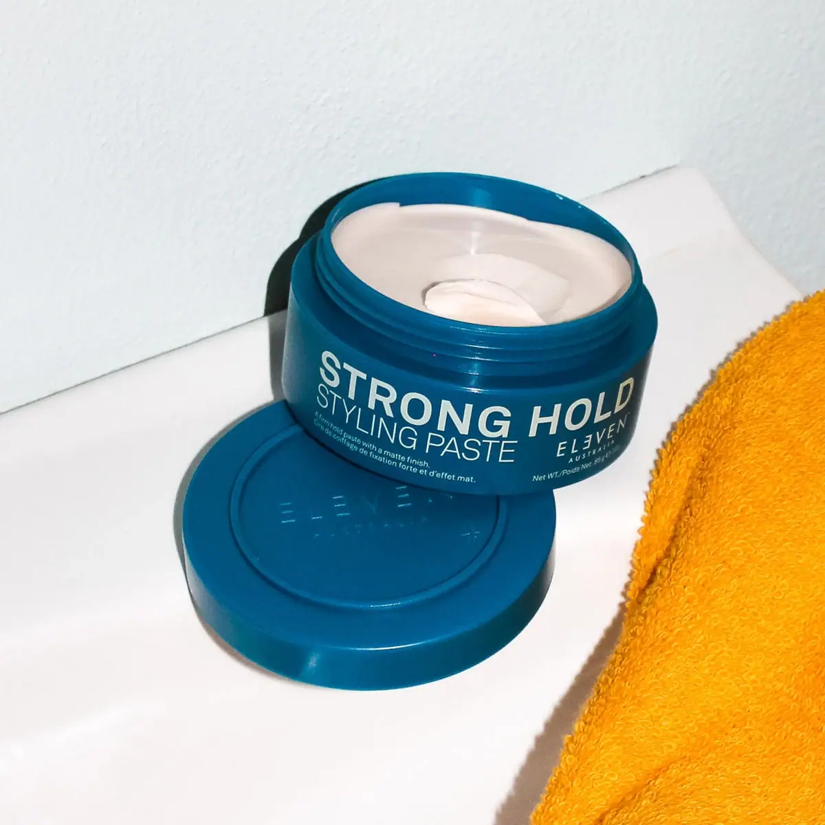
ELEVEN Australia
Deep blue open jar with emphatic hold-first typography
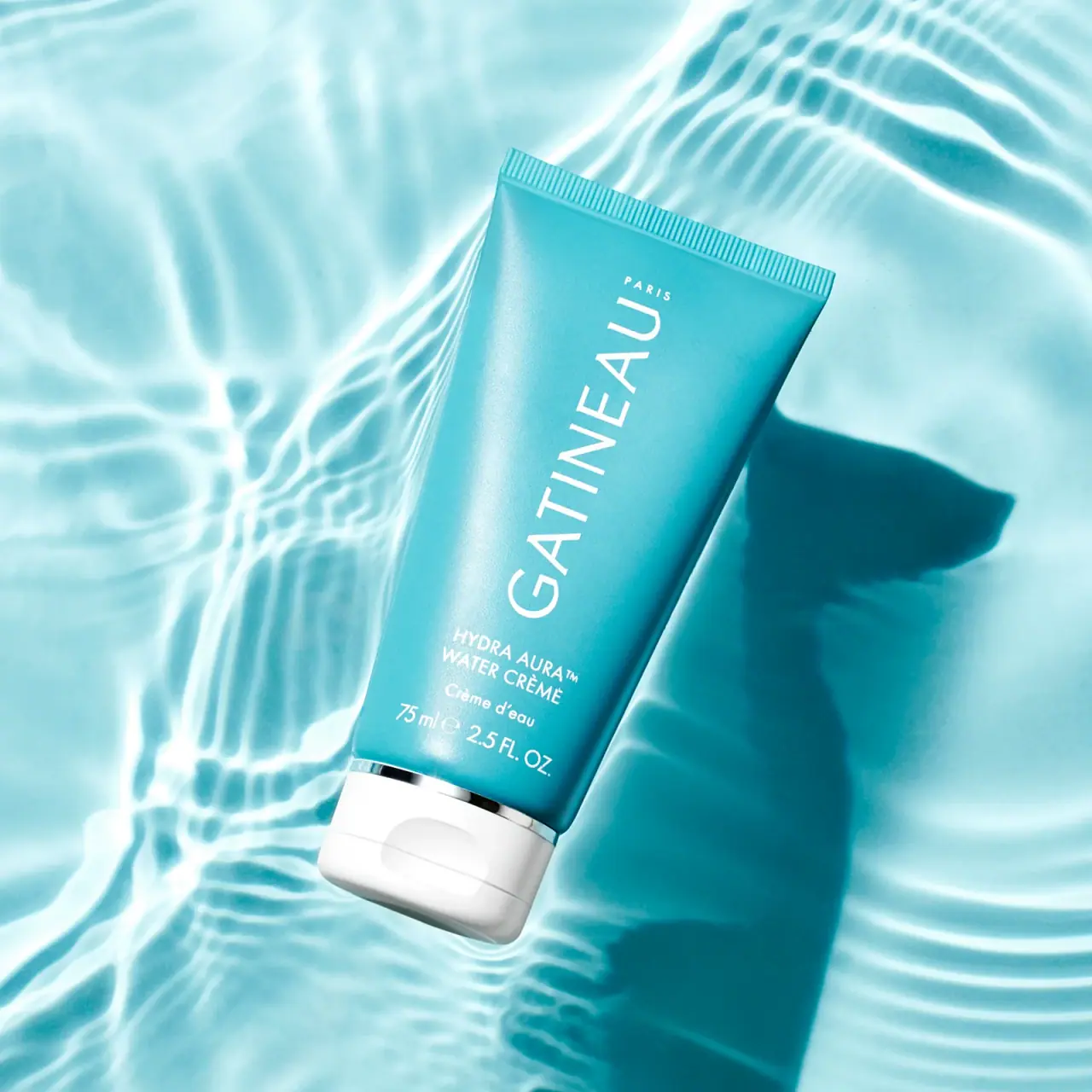
Gatineau
Turquoise tube with lengthwise white name and silver accent

Malin+Goetz
pharmacy label set in bracketed helvetica
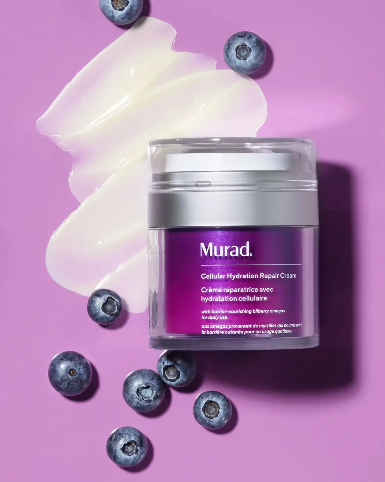
Murad
Purple inner field framed by clear walls and silver

Native
white drugstore bottles, scent-tinted vertical caps
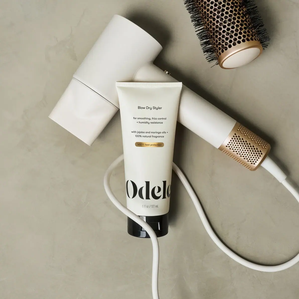
Odele
Cream tube with tiny utility copy and oversized lower serif