Photography: Jurada — Peace Out Skincare campaign photography. Images belong to their respective owners.
Peace Out Skincare

Patterned peace hand over forceful black pouch typography
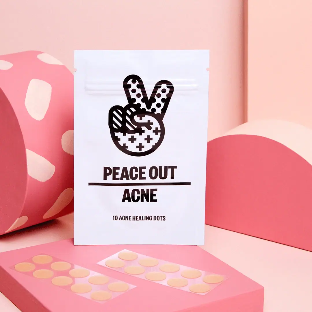
The selected archival pouch reads through three strong devices: a large patterned peace-sign hand, condensed uppercase naming and a horizontal rule separating the maker phrase from ACNE. Its white face is almost entirely monochrome despite the pink campaign scene. The small ten-dot descriptor identifies this photographed edition precisely. Contemporary retail quantities and packaging are different, so this study treats the pictured pouch as a specific design reference rather than a current universal brand system.
- Skincare
- Light pack
- Bold typographic
- Maximalist pattern
About this study
Archival ten-dot white pouch from Jurada campaign, distinct from current larger retail options. Staged foreground sheets are not an exact contents inventory.
Sources & evidence · Reviewed 2026-10-19Color Palette
Approximate colours interpreted from photography. These are screen references, not official brand colours or print specifications.
Pack body
Cool white pouch
#F0EFF6
Approximate white flexible face under the photographed lighting. The slight cool cast is not a verified substrate tint.
Ink
Deep black graphics
#201719
Hand outline, internal patterns, maker, rule, category and count form a single strong contrast system.
Accent
Peach product dots
#EEC18F
Approximate appearance of exposed dots on clear carrier strips in the foreground; this belongs to staged contents, not a printed pouch accent.
Typography
Suggested visual alternatives, not confirmed brand typefaces. Any scale below is an illustrative estimate.
The peace hand is the largest recognition device. Below it, PEACE OUT appears in a heavy condensed uppercase sans, then a thick horizontal line extends beyond the word block. ACNE is centered underneath at similarly assertive weight but narrower overall width. The bottom count uses smaller condensed capitals. There is almost no stylistic change between verbal levels; size, line width and vertical gaps do the organizing. The category remains unusually direct, while the hand adds a less clinical personality.
Fonts
Condensed title system
Barlow Condensed
- Looks like
- Heavy compact display sans
- Type
- Condensed sans-serif
- Weight
- Bold, ExtraBold
- Case
- Uppercase
- Tracking
- Tight but clearly separated words
- Fallback
- Arial Narrow, sans-serif
Create an original two-level naming block with a strong category word. Do not reproduce the exact phrase, hand emblem and rule arrangement together.
Small count and instructions
Roboto Condensed
- Looks like
- Clear compact utility sans
- Type
- Condensed sans-serif
- Weight
- Regular, Bold
- Case
- Uppercase label; mixed-case longer copy
- Tracking
- Natural readable spacing
- Fallback
- Arial, sans-serif
Keep the quantity readable and allow more open spacing for longer information. A small count should be subordinate without becoming illegible on a real flexible surface.
Structure & Proportions
Visual proportions and finish previews are illustrative. Confirmed construction details and uncertainties are distinguished in the study notes.
Proportions
| Purpose | Value | Preview |
|---|---|---|
| Large upper emblem | The hand takes much of the upper half, creating recognition before the text is read. | — |
| Wide divider | The horizontal rule reaches beyond the maker's width and forms a clear threshold between maker and category. | — |
| Compact lower count | A small quantity line sits well below ACNE, with enough separation to act as a distinct purchasing detail. | — |
| Front-face margin | Generous white margins around the dense black graphics prevent the pouch from looking fully patterned. | — |
Shapes
| Element | Value | Preview |
|---|---|---|
| Pouch face | Tall flat rectangle with near-square corners and shallow surface bends. | |
| Patterned hand | Two raised fingers and folded lower fingers contain dots, diagonal stripes and crosses within a thick outline. | |
| Divider | One strong horizontal dark bar between maker phrase and category. | |
| Exposed product | Small peach circles on clear rectangular carrier strips, photographed separately from the pouch. |
Finishes
Lightly reflective pouch
Soft highlights and creases appear on the white front; exact laminate and coating are unknown. · gloss
Formats and materials
| Formats | Flat white pouch; photographed front explicitly identifies ten acne dots |
| Materials | The pouch appears flexible and opaque, with slight surface undulations and straight sealed-looking edges. Film layers, barrier construction, recyclability and exact substrate are not established by the current product page., Clear rectangular carrier strips with peach-toned circular dots are arranged outside the pouch. Their visible transparency does not identify carrier resin or establish how many strips were originally supplied in this ten-dot edition. |
| Closures | Small opposing notches are visible near the top side edges. A raised horizontal band runs below the top margin and across the upper fingers of the printed hand. These are useful structural observations, but the photograph does not demonstrate the opening sequence, resealing performance or construction of an internal closure. The pouch is shown upright for the campaign; a self-standing bottom gusset is not established. |
| Decoration | Oversized peace-sign hand with three contrasting patterns, Heavy condensed maker phrase, Strong horizontal divider, Direct category name, Small explicit count line |
Front Panel
Schematic reading order. The diagram’s zone heights do not represent measured artwork proportions.
The front is centered and sharply edited. Image, maker, divider, category and count are almost the entire visible system. The hand's internal detail is concentrated inside a familiar outline, leaving the surrounding white area calm. The divider separates two short verbal ideas without adding a box around either. This produces a strong front hierarchy, but says little about rear information or the internal organization of the pouch.
| Zone | Content |
|---|---|
| Top margin and band | A plain upper strip, side notches and raised horizontal band sit above and partly across the hand graphic. |
| Emblem | A bold black-outlined peace hand contains dotted raised fingers, striped folded fingers and a cross-patterned palm. |
| Maker phrase | PEACE OUT appears in one dense uppercase line. |
| Divider and category | A substantial horizontal rule separates the maker from the centered word ACNE. |
| Edition count | The smaller bottom line identifies ten acne healing dots, which must not be replaced with the current site's larger quantities. |
Range System
The primary product page currently offers twenty-, forty- and sixty-dot options and shows contemporary boxed presentations. Those establish a changed retail context, not a material specification or replacement count for this archival pouch. An original family could preserve a bold emblem and plain category naming, while updating count and format visibly for each SKU. The selected photograph does not show a full historic range or establish a formal pattern-to-concern code.
- Keep the product count separate from the dominant graphic so editions can be distinguished clearly.
- Treat a new outer format as a new layout problem rather than assume pouch and carton share identical proportions.
- Use a consistent category position while allowing original symbols to vary only when their meaning is documented.
Back of Pack & Shelf
No reverse, opened pouch or internal seal is visible. The front cannot establish the full ingredient, direction or warning presentation.
- Inspect the rear before describing complete information hierarchy.
- Verify the historical edition separately before assigning current formulation or clinical claims.
- Check actual pouch construction before claiming resealability, barrier properties or recycling routes.
On shelf
Interpretively, the large hand is readable before the quantity line, and the condensed type gives the category a strong presence in a small front area. Monochrome packaging can remain distinct within a colorful product photograph because its white field and dark graphic form a clear boundary. At thumbnail scale, the count is the first useful detail to disappear. A detailed product page therefore needs a close front view and an explicit edition label alongside the campaign image.
Imagery
A pink plinth holds two clear strips of peach-colored dots in front of the white pouch. A spotted curved block sits to the left and a solid pink semicircular form to the right, against a pale pink wall. The props repeat the graphic language of circles and patterns without being part of the package. The staged dot total exceeds the printed ten-dot count, so the image should not be used as an exact contents inventory. Its purpose is to show the small circular product alongside a highly visible identity.
Guidelines
Editorial principles for an original design brief, not official brand guidelines.
Do
- Keep the exact photographed count visible in editorial content.
- Contain pattern inside a recognizable original silhouette.
- Use spacing and a strong divider to organize short naming.
- Separate staged contents from a verified pack inventory.
- Distinguish current cartons from archival pouches.
Don't
- Do not make the pouch pink because the set is pink.
- Do not infer flexible-film composition from a highlight.
- Do not treat cross motifs as medical certification.
- Do not transfer contemporary claims to the ten-dot edition.
- Do not copy the peace hand or maker phrase.
Sources & evidence
- Peace Out — Acne Treatment Dotsproduct
- Jurada — Peace Out Skincare campaignphotographer
How this study was built
edition · Sourced fact
Current product page offers larger counts, requiring a distinction from the photographed ten-dot edition.Peace Out — Acne Treatment Dotsstructure · Visual observation
White flat pouch has top notches and a raised horizontal band; mechanism is not demonstrated.Jurada — Peace Out Skincare campaigntypography · Visual observation
Condensed heavy uppercase maker and category are separated by a strong horizontal rule.Jurada — Peace Out Skincare campaignlabel · Visual observation
Large hand contains dot, stripe and cross patterns; small bottom descriptor states ten dots.Jurada — Peace Out Skincare campaignpalette · Visual observation
Pouch is white and dark-printed; pink belongs to the set and peach to exposed contents.Jurada — Peace Out Skincare campaignimagery · Visual observation
Two carrier strips and geometric props are staged around the single pouch.Jurada — Peace Out Skincare campaignrange · Editorial interpretation
Count must remain independent of identity when adapting an original family across formats.
What remains unverified
- Pouch laminate, opening mechanism and resealability unverified.
- Historical formula and current availability not established.
- Reverse and interior unseen; exact fonts and dimensions unknown.
- Scene contains more visible dots than printed pouch count, so staged quantity is not inventory.
Give your AI
packaging taste
Give your design or image tool a packaging study: palette, type, structure, front panel and principles for an original brief.
Export this styleFree with an email. PACK.md works in Claude, ChatGPT, Cursor and image tools.
More like this

Bomba Curls
tropical foliage gathered around a bold yellow nameplate
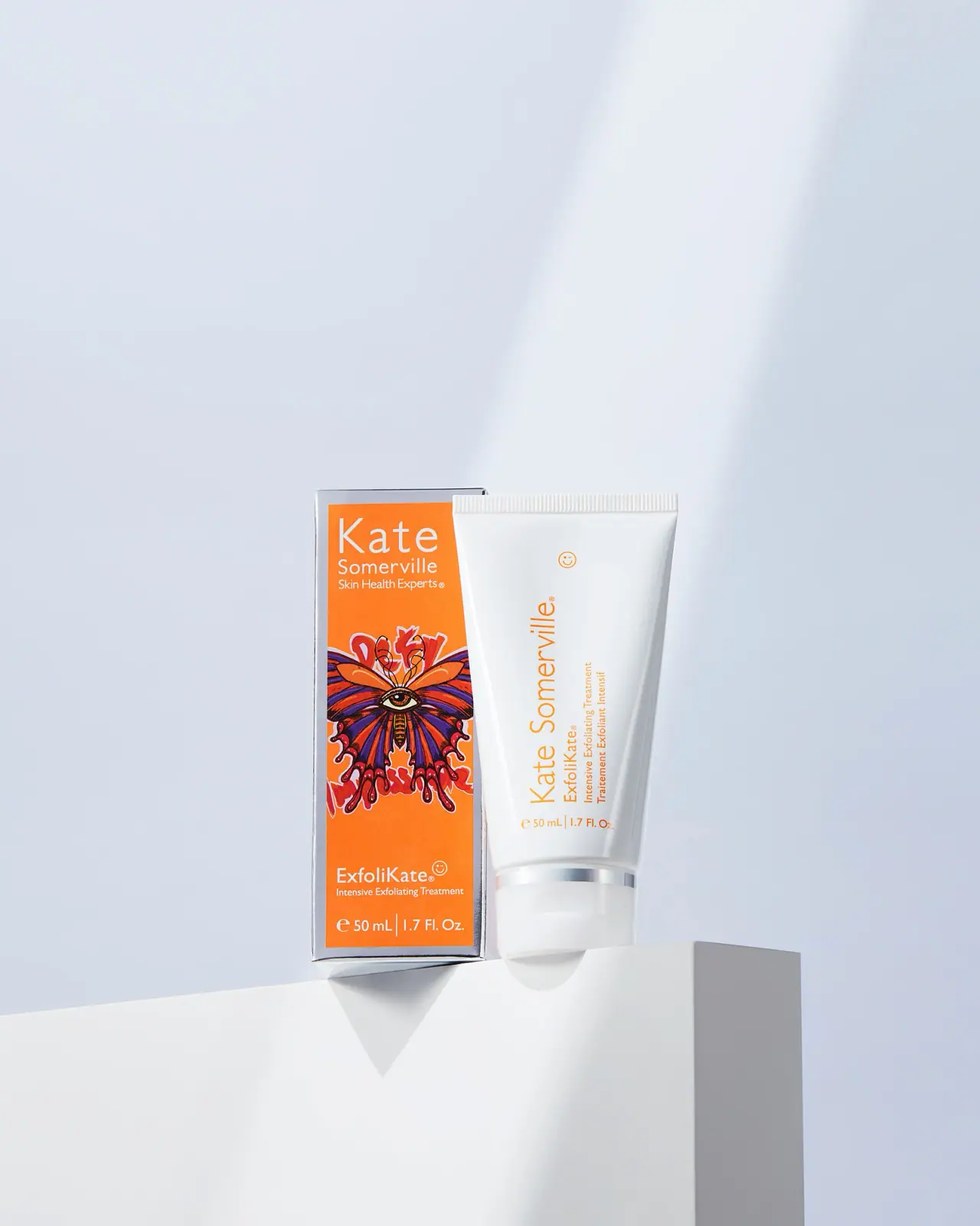
Kate Somerville
Orange artist carton beside a clean white vertical-text tube
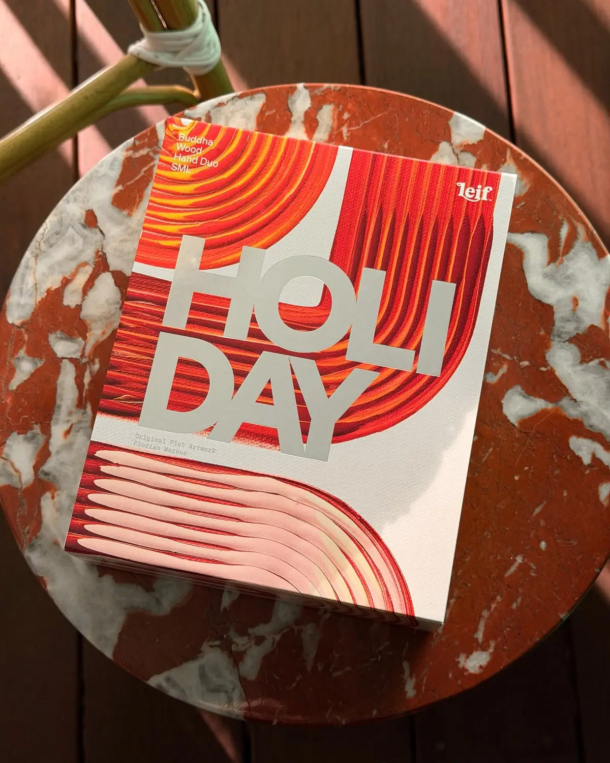
Leif
Huge silver holiday type over vivid plotted paint curves
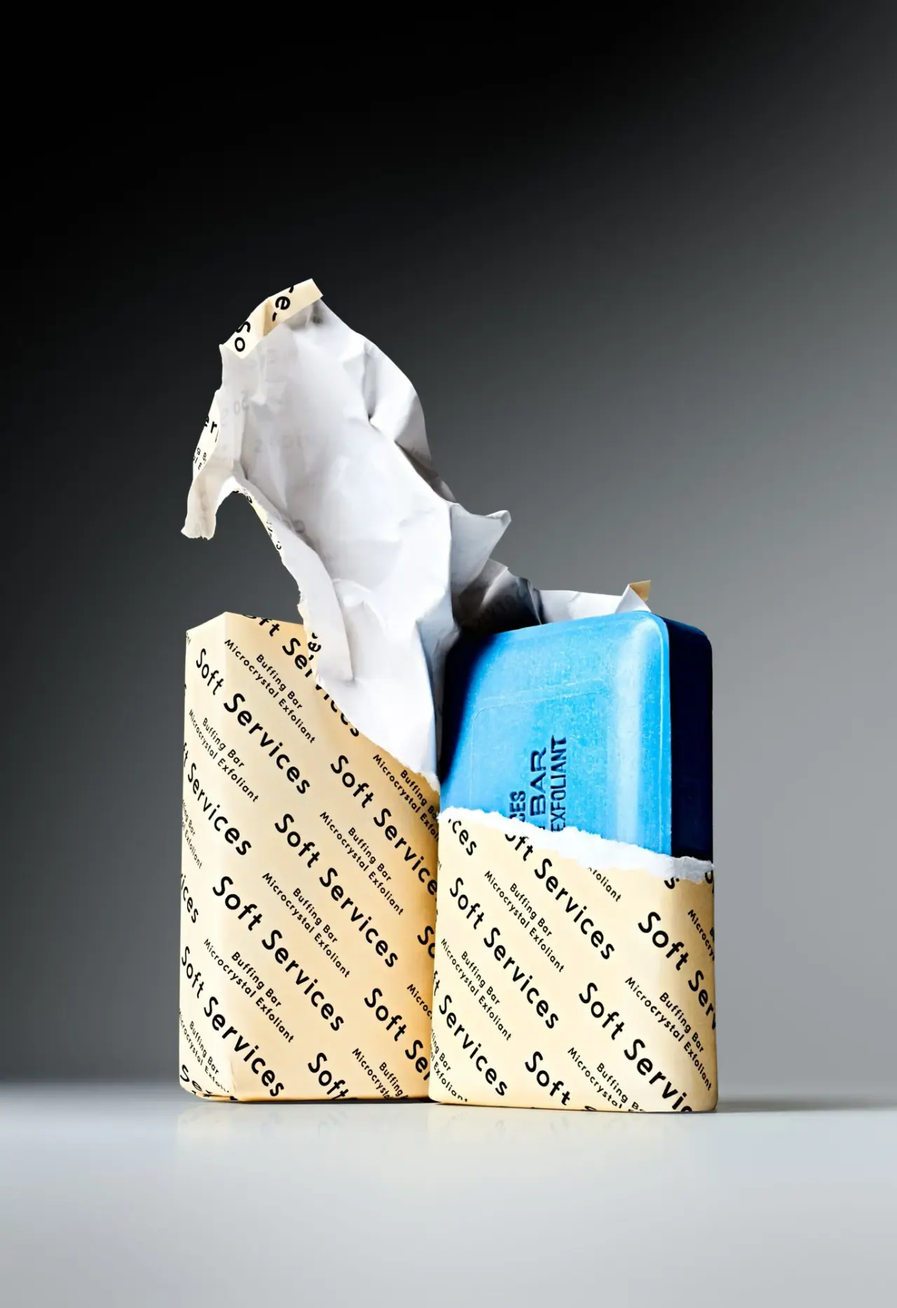
Soft Services
Diagonal cream paper type revealing a vivid blue bar

Escentric Molecules
Clear rectangular fragrance with giant symbol and layered coded graphics
Fly By Jing
sichuan street poster, turned up loud

ACURE
Iridescent spectacle with practical, tightly ordered type

AKT
Lilac stage directions with a quiet metallic detail