Photography: Soft Services official photography. Images belong to their respective owners.
Soft Services

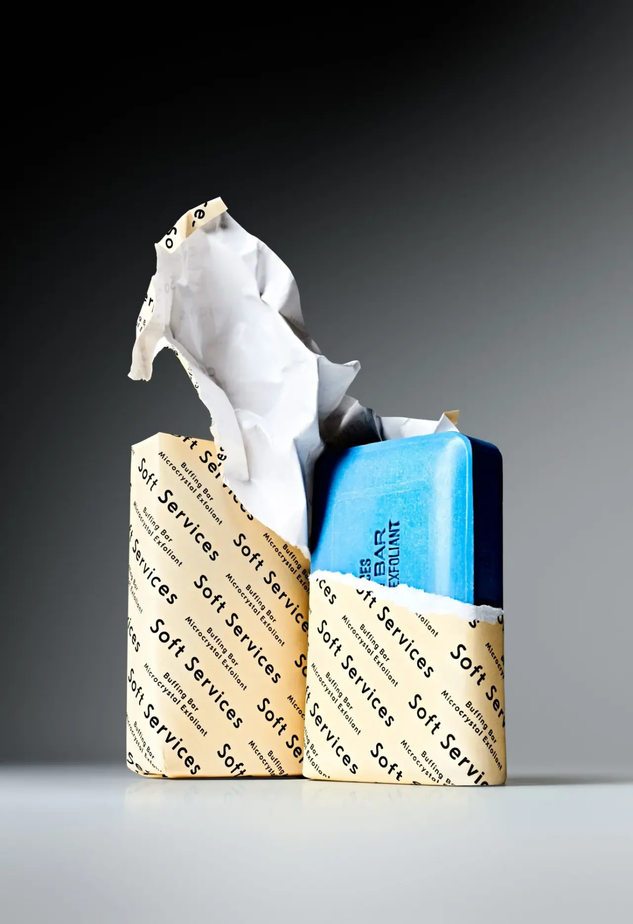
Diagonal cream paper type revealing a vivid blue bar
Buffing Bar makes the transition from paper to product the central design event. Repeated black maker and product text run diagonally across pale cream packaging, while a torn white-backed section lifts away to expose a saturated blue solid. The bar has its own inset border and recessed-looking lettering, so identity continues after the wrap is removed. The official product is a two-bar set, but only one blue bar is clearly exposed in the selected photograph.
- Body & bath
- Light pack
- Bold typographic
- Maximalist pattern
About this study
Selected blue Buffing Bar reveal with cream patterned paper. Source set count is two; only one blue bar is clearly exposed in this image.
Sources & evidence · Reviewed 2026-10-19Color Palette
Approximate colours interpreted from photography. These are screen references, not official brand colours or print specifications.
Pack body
Cream paper exterior
#F3DFA5
Approximate warm outward paper color; highlights and folds vary from pale cream to ochre shadow.
White paper reverse
#ECEDEA
Visible interior of the peeled paper creates a light sculptural area distinct from the cream printed exterior.
Ink
Black repeated text
#161817
Maker and smaller product/function blocks form a diagonal typographic pattern.
Accent
Bright blue solid
#38B9EF
Color of the exposed product itself, not blue ink on the wrapper; deep side shadow should not be treated as a separate variant.
Typography
Suggested visual alternatives, not confirmed brand typefaces. Any scale below is an illustrative estimate.
Soft Services repeats in a larger open-spaced sans, alternating with smaller two-line Buffing Bar and Microcrystal Exfoliant blocks. Both scales share the same diagonal direction, but the smaller block is dense enough to read as a compact unit between larger names. The pattern crosses folds and edges without relying on a single centered front. The bar's inset lettering is heavier and compact, providing a separate product mark that remains after the surrounding paper is removed.
Fonts
Large repeated maker
DM Sans
- Looks like
- Open-spaced neutral sans
- Type
- Grotesque sans-serif
- Weight
- Regular, Medium
- Case
- Title case
- Tracking
- Noticeably open
- Fallback
- Arial, sans-serif
Use an original maker in repeated diagonal rows with enough space to avoid merging across folds. The repetition should survive partial removal rather than depend on one perfect front alignment.
Small product block
Archivo
- Looks like
- Compact functional sans
- Type
- Grotesque sans-serif
- Weight
- Regular, Bold
- Case
- Title case for wrapper; uppercase for solid mark
- Tracking
- Compact but readable
- Fallback
- Arial, sans-serif
Keep the product/function pair shorter and denser than the repeated maker. For a mark on the solid, simplify letterforms and confirm tooling constraints separately instead of assuming a print font works unchanged in relief.
Structure & Proportions
Visual proportions and finish previews are illustrative. Confirmed construction details and uncertainties are distinguished in the study notes.
Proportions
| Purpose | Value | Preview |
|---|---|---|
| Repeat unit | A large maker phrase alternates with a much smaller two-line descriptive block, creating two rhythms within the same diagonal direction. | — |
| Partial reveal | The front wrapper remains around the lower part of the blue bar, so both paper identity and product marking are visible together. | — |
| Raised paper flap | The torn white-backed section extends far above the bar, giving a small solid product a taller, more dynamic photographic silhouette. | — |
| Rounded solid | The blue bar has softened rectangular corners and a clearly visible side thickness, unlike the sharper printed paper edges. | — |
Shapes
| Element | Value | Preview |
|---|---|---|
| Exposed bar | Thick rounded rectangle with an inset border and compact recessed-looking text. | |
| Printed paper form | Upright rectangular wrapped form beside the exposed product; folds and edges carry the continuous pattern. | |
| Torn reveal | Irregular white-backed flap rises from the printed paper, with visible folds and a rough edge. | |
| Diagonal repeat | Alternating large maker and small product blocks travel obliquely across the cream surface. |
Finishes
Paper appearance
Cream exterior and white reverse show diffuse light; source confirms paper but not exact coating. · uncoated
Product relief appearance
Blue bar lettering looks recessed; preview represents relief rather than a verified emboss process. · emboss
Formats and materials
| Formats | Paper-wrapped solid body exfoliant with separate carton; official set contains two bars of 3.75 oz each |
| Materials | The official page specifies a wrapper made entirely from paper and a carton made from responsibly sourced FSC-certified paper. These are separate component claims; the certification is explicitly attached to the carton rather than automatically extended to every layer., The blue solid is the product, not a rigid colored container. The image shows the texture of its face and a dark side plane, but does not independently establish manufacturing details of the product mark or a full paper coating specification. |
| Closures | Paper folds around the rectangular solid and is shown torn back across the upper front. A large irregular flap rises above the left printed form, revealing a pale reverse. The image demonstrates an opened state, not a resealable mechanism. Exact carton flap construction, seals and adhesive locations are not sufficiently exposed to reconstruct a dieline or opening sequence. |
| Decoration | Diagonal repeated maker rows, Smaller paired product/function text, Pattern continues across folds, Inset border on exposed solid, Compact lettering within the bar face |
Front Panel
Schematic reading order. The diagram’s zone heights do not represent measured artwork proportions.
There is no single dominant framed label on the visible paper. Instead, the whole surface carries repeated identity at two text scales. Cropped words at the edges are acceptable because another complete instance appears nearby. The angled orientation produces movement even on a rectangular form. Once the paper is peeled away, the solid's compact mark provides a second identity layer, with color making the transition immediately clear.
| Zone | Content |
|---|---|
| Large repeat | Soft Services appears repeatedly in open-spaced black title case across the cream outward surface. |
| Small repeat | Buffing Bar and Microcrystal Exfoliant form a two-line supporting unit between maker phrases. |
| Opened reverse | The white-backed paper flap exposes folds, shadows and faint show-through; it is not an additional white carton panel. |
| Product face | Blue rounded solid carries an inset border and partly visible compact relief lettering; not every obscured character is reconstructed. |
| Unseen utility information | The selected decorative face does not show the complete quantity, ingredients or directions panel. |
Range System
The official page identifies the standard blue Buffing Bar and lists other named versions, but their packaging is not visually audited here. This study therefore does not assign a color code to all variants. An original solid-product family could carry identity through both repeated paper graphics and a physical mark on the product. Any variation should preserve legibility through folds while clearly distinguishing product color from wrapper color and confirmed set count from staged objects.
- Repeat a concise maker/product unit so opening does not remove every identifier at once.
- Use a product-face mark to retain identity after disposal of the wrapper.
- Specify wrapper and carton materials separately rather than summarize all layers with one broad sustainability claim.
Back of Pack & Shelf
No complete reverse information panel or flattened carton is visible. The torn paper shows its inner surface but not a full technical layout.
- Inspect unopened units to locate ingredients, directions and set quantity.
- Confirm paper coatings and local disposal guidance before making end-of-life claims.
- Do not infer a second visible bar merely because the source sells a pair.
On shelf
Interpretively, the repeated pattern can identify a folded or partially obscured pack from several angles, but dense repetition may compete with utility information if it covers every panel. The blue product creates the strongest color contrast only after opening. A good product presentation should therefore show both the wrapped state and the solid so users understand which color belongs to which layer. The design lesson is continuity of identity across a reveal, rather than decoration alone.
Imagery
A dark-to-gray background isolates two upright printed forms and the exposed blue bar. The paper flap catches a large pale highlight, while the bar's right side becomes deep blue in shadow. A slight floor reflection grounds the objects without a bathroom scene or wet-use demonstration. The photograph turns opening into a sculptural gesture: cream print, white reverse and blue solid are revealed in sequence. The torn appearance is campaign styling, not evidence that every customer opening produces the same shape.
Guidelines
Editorial principles for an original design brief, not official brand guidelines.
Do
- Design repetition to survive folds.
- Differentiate wrapper and carton specifications.
- Make product color distinct from package ink.
- Show the opened state honestly.
- Retain a clear utility panel outside decorative repetition.
Don't
- Do not label the blue bar a plastic case.
- Do not claim every paper component carries the same certification.
- Do not infer a second exposed bar from a shadow.
- Do not call recessed-looking letters a verified emboss process.
- Do not imply all variants use the same color.
Sources & evidence
How this study was built
structure · Sourced fact
Official page specifies paper wrapper and FSC-certified paper carton separately, with two 3.75 oz bars in the set.Soft Services — Buffing Bar Microcrystal Exfolianttypography · Visual observation
Open-spaced maker and smaller paired product/function text repeat diagonally.label · Visual observation
Continuous pattern crosses folds while a compact mark appears on the blue solid.palette · Visual observation
Cream exterior, white reverse, black text and blue contents are distinct color layers.imagery · Visual observation
One exposed bar and a large torn flap form the selected reveal composition.edition · Sourced fact
Standard Buffing Bar product page supports identity; other listed variants are not visually generalized.Soft Services — Buffing Bar Microcrystal Exfoliantrange · Editorial interpretation
Identity can continue from repeated wrapper to product mark without assuming a full brand color system.
What remains unverified
- Exact paper coating, print method and closure layout unverified.
- Complete reverse utility panel unseen.
- Product relief manufacturing method and original fonts unknown.
- Set count does not establish a second visibly exposed solid.
Give your AI
packaging taste
Give your design or image tool a packaging study: palette, type, structure, front panel and principles for an original brief.
Export this styleFree with an email. PACK.md works in Claude, ChatGPT, Cursor and image tools.
More like this

Bomba Curls
tropical foliage gathered around a bold yellow nameplate
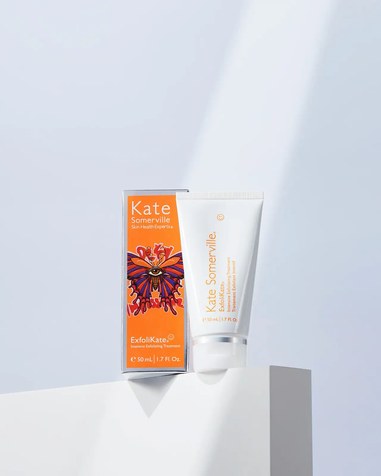
Kate Somerville
Orange artist carton beside a clean white vertical-text tube
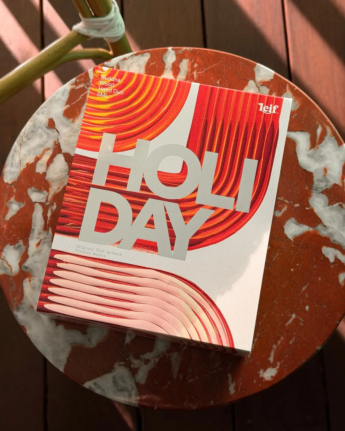
Leif
Huge silver holiday type over vivid plotted paint curves
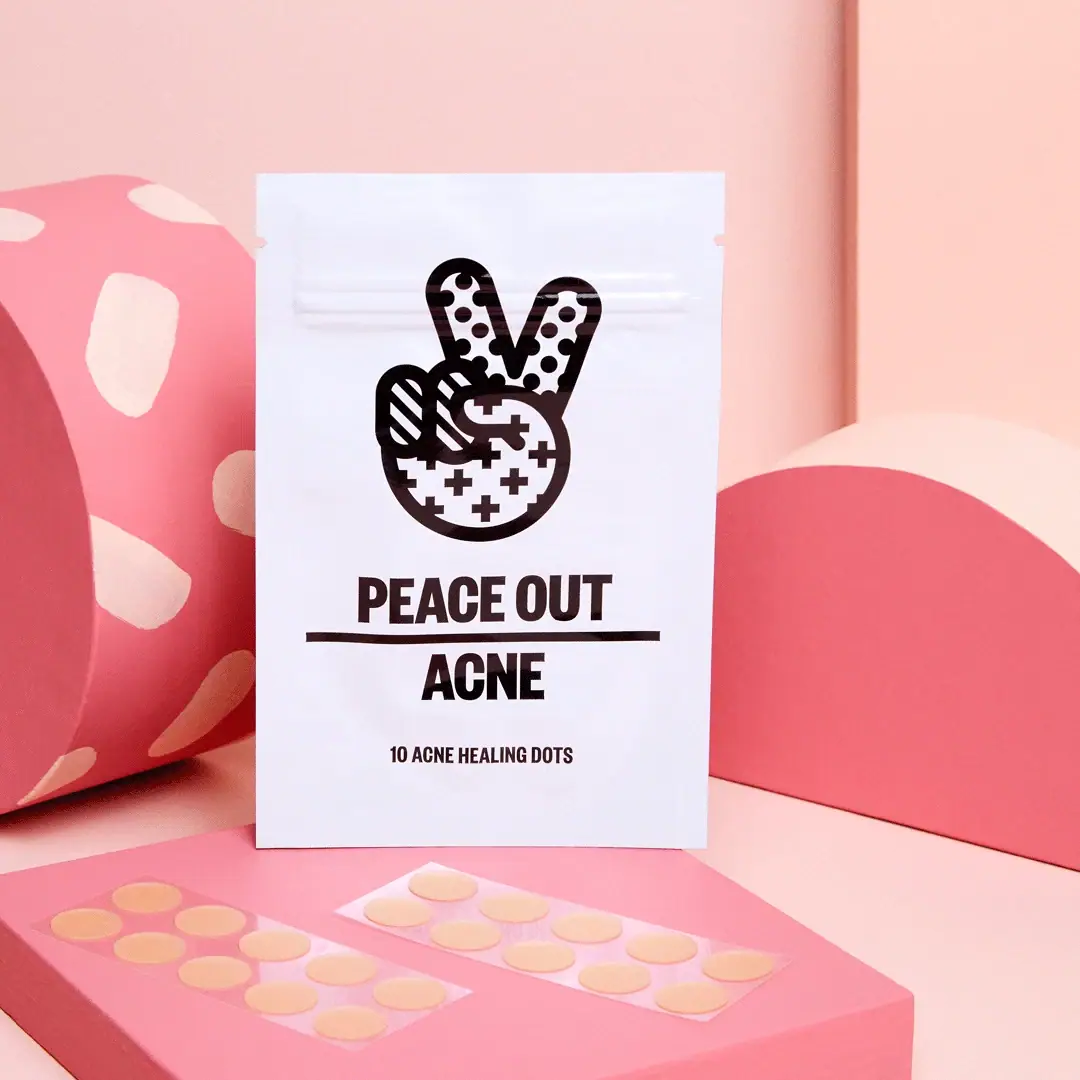
Peace Out Skincare
Patterned peace hand over forceful black pouch typography
Escentric Molecules
Clear rectangular fragrance with giant symbol and layered coded graphics
Fly By Jing
sichuan street poster, turned up loud

ACURE
Iridescent spectacle with practical, tightly ordered type

AKT
Lilac stage directions with a quiet metallic detail