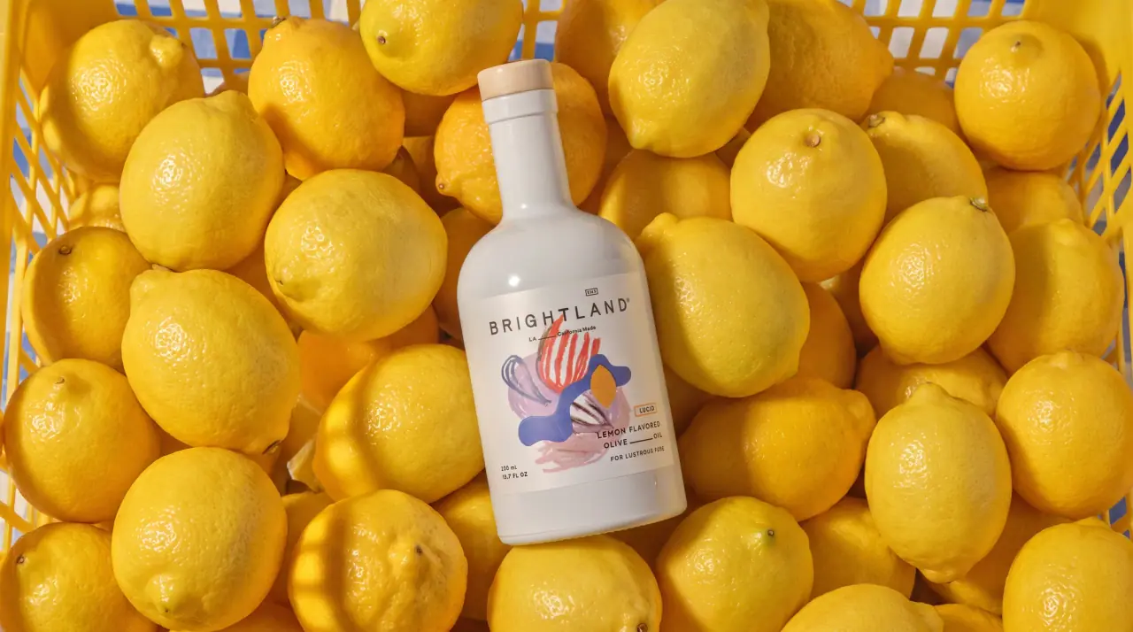
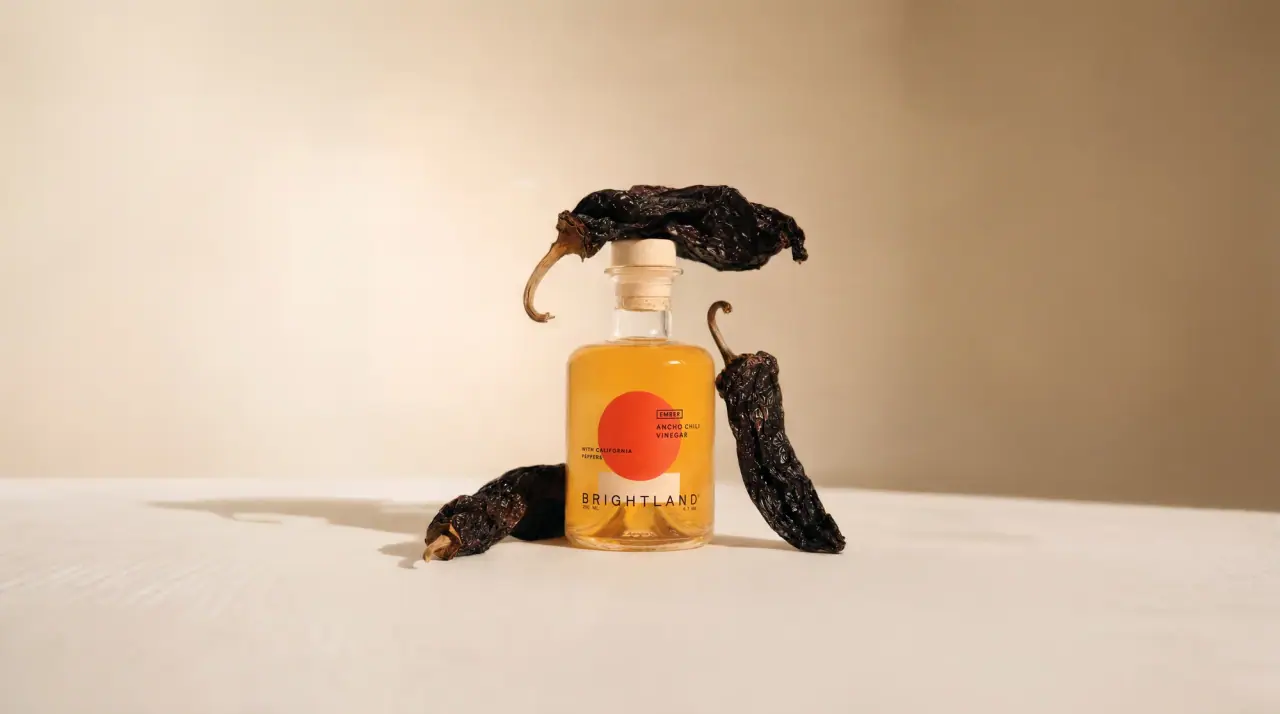
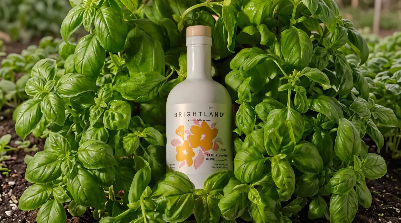
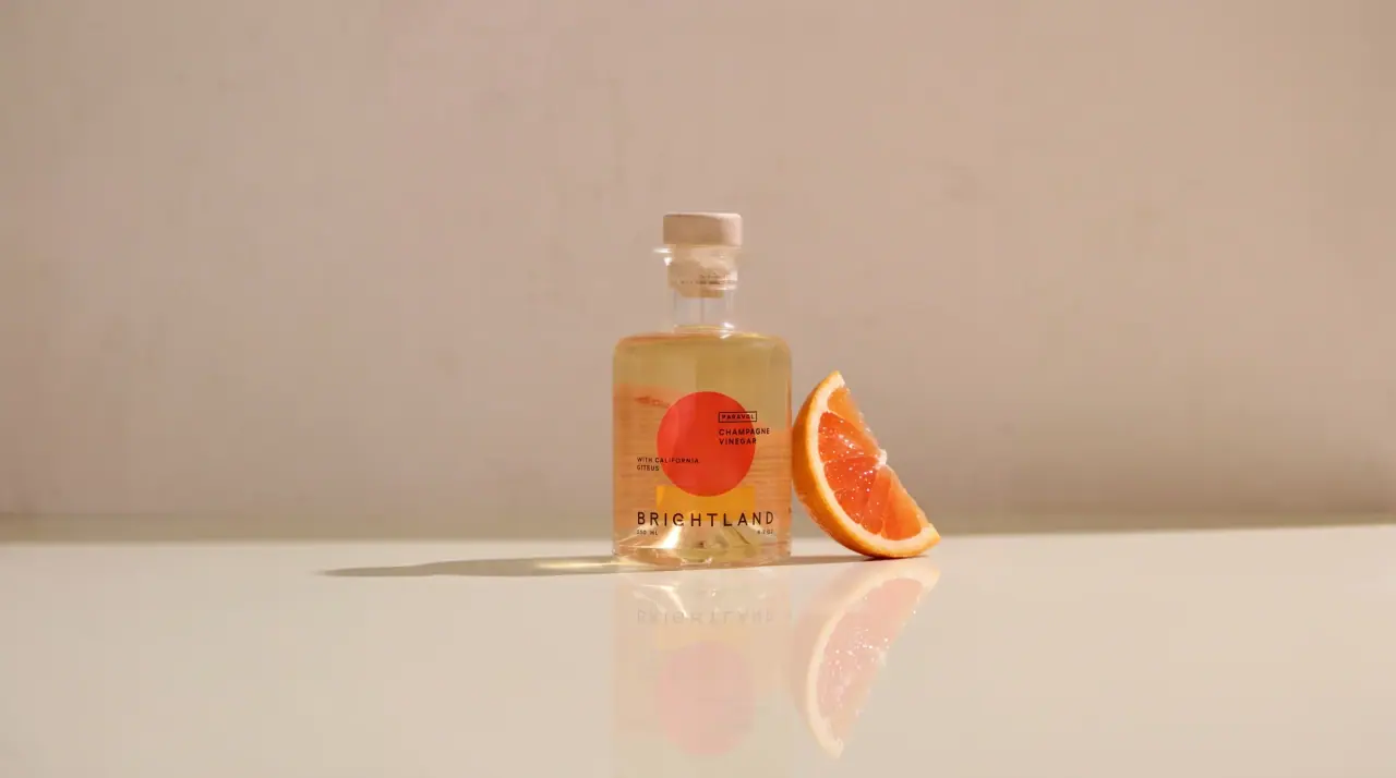
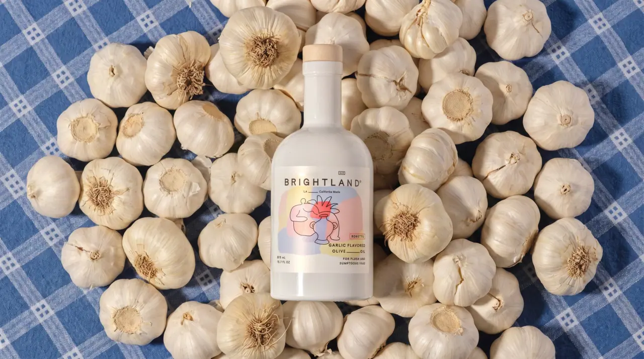
Brightland bottles its oils in opaque white-coated glass (#f6f6f4) with a pale wood-look stopper, so each bottle reads as a blank canvas on the counter. A near-square white label on the lower body carries a widely tracked light geometric wordmark, a fine-ruled line of small capitals and one artwork per product: a painterly colour swatch, gouache flowers, flat geometric shapes or a small landscape vignette. The artwork and a tiny outlined product name ('Ardor', 'Alive') do all the range coding, while the type and layout never move. Vinegars move to squat clear glass so their amber liquid becomes the colour, with a single flat disc as the artwork.
Approximate colours interpreted from photography. These are screen references, not official brand colours or print specifications.
Pack body
Milk Glass
#f6f6f4
Opaque white-coated glass bottle used for all the olive oils; also the label ground, which melts into it
Birch Stopper
#e3c79e
Pale wood-look stopper top on every bottle
Ink
Ash Ink
#3b3634
Wordmark, ruled lines, product descriptor, volume and tagline
Range coding
Alive Cobalt
#2f7fc2
Blue geometric arc artwork and boxed name on the Alive extra virgin label
Ardor Vermilion
#f2552c
Painterly red-orange swash on the chili oil label; also the disc on the chili vinegar
Arise Marigold
#f2b345
Golden gouache flowers on the basil oil label
Aurora Fuchsia
#d9479a
Pink and violet floral burst on the rosemary oil label
Kalamata Sea
#7fb1d6
Sky-and-sea landscape vignette on the Kalamata label
Swash Blush
#efc3c6
Dusty pink under-wash behind the main brush stroke on chili and rosemary labels
Vinegar Amber
#e98b2e
Liquid colour seen through the clear glass vinegar bottles
Typography
Suggested visual alternatives, not confirmed brand typefaces. Any scale below is an illustrative estimate.
The tracked wordmark heads the label but is small; the artwork in the centre is the real first read. All product information is set very small in capitals to the lower right, starting with the poetic product name in a tiny outlined box, then the descriptor with fine ruled gaps, then a tagline; volume sits lower left.
Type scale
Estimated cap size as a share of the panel · Front label of the 375 ml oil bottle, about 75 mm tall
wordmark
6% · Light · Display
HILLSIDE
descriptor
4% · Medium · Label
OLIVE — OIL
boxed-name
3% · Medium · Label
AWAKEN
origin-line
2.4% · Regular · Body
Coastal Farms — Made in California
tagline
2.2% · Regular · Body
FOR WARMTH AND COLOUR
volume
2% · Regular · Body
375 ML · 12.7 FL OZ
Fonts
Display
Jost
Looks like
Futura Book, Avenir Book
Type
Geometric sans, light to book weight, very widely tracked
Weight
Light, Regular
Case
Uppercase with ®
Tracking
Very wide, about +30%
Fallback
Futura, Century Gothic, sans-serif
The wordmark, centred across the top of the label in Ash Ink, with a small numbered box above it.
Label
Jost
Looks like
Futura Medium, Brandon Grotesque Medium
Type
Geometric sans, medium
Weight
Medium
Case
Uppercase
Tracking
Wide, about +8%
Fallback
Futura, Arial, sans-serif
Boxed product name in the artwork colour, and the descriptor 'CHILI FLAVORED / OLIVE ___ OIL' with fine rules between words.
Body
Josefin Sans
Looks like
Avenir, Futura Book
Type
Small geometric sans
Weight
Regular
Case
Uppercase, mixed case for the origin line
Tracking
Wide, about +6%
Fallback
Avenir, Helvetica, sans-serif
Origin line under the wordmark, tagline ('FOR FLARE AND FERVOR'), volume and all back-label copy.
Structure & Proportions
Proportions
Purpose
Value
Preview
Label height
About 35% of bottle height, on the lower body
Label width
About 85% of the visible bottle width; near-square
Artwork area
About 45% of label area, centre-left
Wordmark width
About 60% of label width, tracked out
White space
About 40% of the label left as bare white
Colours per label
Two to three: Ash Ink plus one or two artwork colours
—
Density
Very airy; the bottle above the label is entirely blank
Pale wood-look stopper caps on oils and vinegars; cork-topped stopper on the vinegars
Decoration
Front paper label, Painterly and gouache artwork, Fine-rule typographic details, Small landscape vignettes
Front Panel
Schematic reading order. The diagram’s zone heights do not represent measured artwork proportions.
Top
Centre
Lower right
Lower left
A near-square white label on the lower body with the wordmark across the top and artwork filling the centre-left; text blocks align to the lower right.
Zone
Content
Top
Small numbered box, tracked wordmark, origin line with a ruled gap
Centre
One artwork per product: brush swash, gouache florals, geometric shapes or landscape
A small matching white back label in the same Ash Ink and tracked capitals: a short paragraph about the farm and harvest, serving ideas, then nutrition, barcode and recycling marks in a lower block.
Short paragraph on the farm, olive varieties and harvest
Harvest date and best-by line
Nutrition facts in the same thin ink
Storage note (keep away from light and heat)
Barcode and glass recycling mark
On shelf
On a shelf the bottles form a row of identical white silhouettes with a small burst of different colour on each, so the brand reads by bottle shape first and the artwork tells the products apart.
Imagery
Hand-made artwork: loose gouache brush marks, cut-paper floral shapes, flat geometric forms and small soft-focus landscape vignettes, always contained within the white label.
Guidelines
Do
Use an opaque white glass bottle (#f6f6f4) with a pale wood-look stopper (#e3c79e) for every oil.
Put one near-square white label on the lower body, about 35% of bottle height, the same size on every product.
Give each product its own hand-made artwork and colour, contained within the label.
Set the wordmark in Display light geometric capitals tracked about +30%, across the top of the label.
Join descriptor words with fine horizontal rules ('OLIVE ___ OIL').
Name each product with one evocative word in a small outlined box in the artwork colour.
Leave the bottle above the label completely blank.
Don't
Don't let artwork run off the label onto the glass.
Don't use dark or green glass for the oils.
Don't set the product name large; the artwork carries the shelf impact.
Don't use serif or script type.
Don't add foil, embossing or heavy claims badges.
Don't put more than two artwork colours on one label.
Give your AI packaging taste
Give your design or image tool a packaging study: palette, type, structure, front panel and principles for an original brief.