


Fenty Beauty

faceted caps and wide-spaced lilac capitals
Fenty runs two families under one typographic signature: a geometric sans wordmark set in very wide-tracked capitals with an open, stencil-like E, printed small on tinted bodies with lots of empty space and often turned vertical down the side of a pack. Skincare and body bottles are soft tinted plastics (lilac #b48fd0, milky white, blush pink, cocoa brown) with angular lilac or periwinkle pumps and spray caps, and a lowercase sub-line ('body', a scent name) sits under the wordmark. Colour cosmetics use faceted hexagonal components in rose-gold metallic, translucent burgundy and tinted plastic so the shade shows through. Loud moments come only from limited editions, where a hand-painted bubble wordmark is splashed across a mint carton or a component.
- Make-up
- Light pack
- Pastel soft-touch
- Bold typographic
Color Palette
Approximate colours interpreted from photography. These are screen references, not official brand colours or print specifications.
Pack body
Lilac Mist
#b48fd0
Frosted translucent body-mist bottle and the purple pumps and spray caps of the body line
Milk White
#f1f0ee
Opaque white body-milk bottle under a lilac pump
Blush Clay
#e9b9a7
Pink cleanser bottle and nude lip-oil and gloss components
Cocoa Jar
#4a2219
Glossy dark brown jar and lid of the whipped body cream
Ink
Wordmark White
#f6f4f2
Spaced capitals on lilac, cocoa and burgundy packs
Body Purple
#8a5bb5
Wordmark and sub-line printed on the white body-milk bottle
Accent
Periwinkle Pump
#a8a6d2
Pastel blue-lilac pump on the cleanser, and the vertical wordmark printed on the pink bottle
Rose Gold Facet
#d9b7a6
Metallic faceted hexagonal cap on gloss wands
Graffiti Mint
#a9ddd3
Limited-edition carton ground under a purple bubble-letter wordmark
Bubble Magenta
#b23aa8
Hand-painted bubble wordmark on edition cartons and components
Range coding
Black Cherry
#3a1418
Translucent faceted burgundy component on gloss sticks and lipstick cases
Typography
Suggested visual alternatives, not confirmed brand typefaces. Any scale below is an illustrative estimate.
The wordmark is small but unmistakable because of its extreme letter-spacing, set horizontally near the shoulder or vertically along the body. A lowercase sub-brand or scent name sits under it in the same family at about two-thirds of its size, and the product type in English and French plus the volume appear low on the pack in tiny tracked type. Edition packs override all of this with a huge hand-painted bubble wordmark that fills the front.
Type scale
Estimated cap size as a share of the panel · Front of the 175 ml body-mist bottle, shoulder to base, about 150 mm tall
edition-wordmark
30% · Regular · Script
GLOW
wordmark
3.2% · Medium · Display
LUMA SKIN
vertical-wordmark
3% · Medium · Display
LUMA BEAUTY
sub-line
2.4% · Regular · Headline
body
scent-name
1.8% · Regular · Headline
sweet little thing
product-type
1.4% · Regular · Body
allover body mist
Fonts
Display
Jost
- Looks like
- Custom geometric sans close to Futura Medium with an open E
- Type
- Geometric sans, very wide tracking
- Weight
- Medium
- Case
- Uppercase
- Tracking
- Very wide, about +40%
- Fallback
- Futura, Avenir, Century Gothic
The wordmark and sub-brand name, horizontal near the shoulder or rotated 90 degrees down the side.
Headline
Jost
- Looks like
- Futura Book
- Type
- Geometric sans
- Weight
- Regular
- Case
- Lowercase
- Tracking
- Wide, about +10%
- Fallback
- Futura, Avenir
Lowercase sub-line under the wordmark ('body', the scent name), centred.
Body
Jost
- Looks like
- Avenir Next Regular
- Type
- Small geometric sans
- Weight
- Regular
- Case
- Lowercase
- Tracking
- Wide, about +6%
- Fallback
- Avenir, Arial
Bilingual product type and volume in the lower third, and all back-panel text.
Script
Rubik Bubbles
- Looks like
- Hand-painted graffiti bubble letters
- Type
- Inflated bubble display lettering
- Weight
- Regular
- Case
- Uppercase
- Tracking
- Tight, overlapping
- Fallback
- Bubblegum Sans, Impact
Edition-only wordmark painted large across cartons or wrapped around a component.
Structure & Proportions
Proportions
| Purpose | Value | Preview |
|---|---|---|
| Wordmark width | About 50% of pack width despite small letters, because of tracking | |
| Wordmark position | Upper third, about 25% down from the shoulder | |
| Empty body | About 80% of the front left as plain tinted surface | |
| Info block | Lower 15% of the body, centred | |
| Edition wordmark | About 90% of carton front height on editions | |
| Colours per pack | Two: body tint plus one ink, closure tinted to match or contrast | — |
| Density | Very sparse on core packs; maximal only on editions | — |
Shapes
| Element | Value | Preview |
|---|---|---|
| Colour component | Faceted hexagonal cap and case | |
| Body bottle | Tall rounded cylinder with soft shoulder | |
| Pump | Angular tinted pump with long spout | |
| Body cream jar | Low wide round jar | |
| Edition wordmark | Inflated wavy bubble letters |
Finishes
Frosted translucent plastic
Body-mist bottle and lilac pumps · frosted
Soft matte opaque
Body milk and cleanser bottles · matte
High-gloss tinted plastic
Burgundy gloss sticks and cocoa jar · gloss
Rose-gold metallic
Faceted caps on gloss wands · metallic
Clear tube
Gloss wands showing the shade · transparent
Formats and materials
| Formats | Spray bottle, Pump bottle, Low wide jar, Lip gloss wand, Gloss stick, Foundation bottle, Folding carton |
| Materials | Tinted translucent plastic, Opaque plastic, Metallised plastic |
| Closures | Faceted hexagonal caps on colour products, angular lilac pumps and spray overcaps on body care, low screw lid on the jar |
| Decoration | Tracked wordmark print, Vertical wordmark, Faceted geometry, Graffiti lettering on editions |
Front Panel
Schematic reading order. The diagram’s zone heights do not represent measured artwork proportions.
Printed directly on the component with no applied label; the wordmark floats in the upper third or runs vertically, and small product information sits near the base.
| Zone | Content |
|---|---|
| Shoulder or side | Wide-spaced wordmark, horizontal or rotated |
| Under wordmark | Lowercase sub-brand or scent name |
| Base | Product type in English and French, volume |
Range System
Pack colour follows the product's family or scent (lilac for one body scent, brown for another, pink for cleanser), and colour products show the shade through tinted or translucent faceted components; the wordmark treatment is constant.
- Sweet body scent = lilac mist + white milk with lilac pump
- Amber body scent = cocoa-brown jar
- Cleanser = blush bottle + periwinkle pump
- Lip luminizers = shade visible through a clear tube under a rose-gold or burgundy facet cap
- Edition gloss = mint carton + magenta bubble wordmark
Back of Pack & Shelf
Back and carton sides use the same tracked geometric sans in one ink: a short use line, directions, a full ingredient list, bilingual product type, then barcode, recycling and legal lines, centred and spaced out.
- Product type and one-line description in English and French
- Directions for use
- Full INCI ingredient list in small type
- Warnings and period-after-opening symbol
- Barcode, batch code and recycling marks
- Distributor address and country of manufacture
On shelf
On shelf the core range reads as a soft row of tinted pastel and cocoa objects with tiny spaced capitals, while the faceted hexagonal caps give colour products a jewel-like silhouette that is recognisable without reading the name.
Imagery
No illustration on core packs; editions use hand-painted graffiti bubble lettering and scribbled strokes as the only image.
Guidelines
Do
- Track the geometric capitals wordmark about +40% so it spans half the pack while staying small.
- Leave about 80% of the front as plain tinted surface.
- Rotate the wordmark 90 degrees on tall narrow components.
- Use faceted hexagonal caps and cases for colour products, in rose gold or translucent burgundy (#3a1418).
- Set the sub-line in lowercase under the wordmark and keep bilingual product data tiny at the base.
- Reserve the bubble-letter wordmark for limited editions only.
Don't
- Don't set the wordmark large or tightly spaced on core packs.
- Don't use a paper label or frame.
- Don't add photography or illustration to core packs.
- Don't use serif type anywhere.
- Don't mix more than two colours on one component outside editions.
Give your AI
packaging taste
Give your design or image tool a packaging study: palette, type, structure, front panel and principles for an original brief.
Export this styleFree with an email. PACK.md works in Claude, ChatGPT, Cursor and image tools.
More like this

Bread Beauty Supply
bubblegum pumps and a fat black wordmark
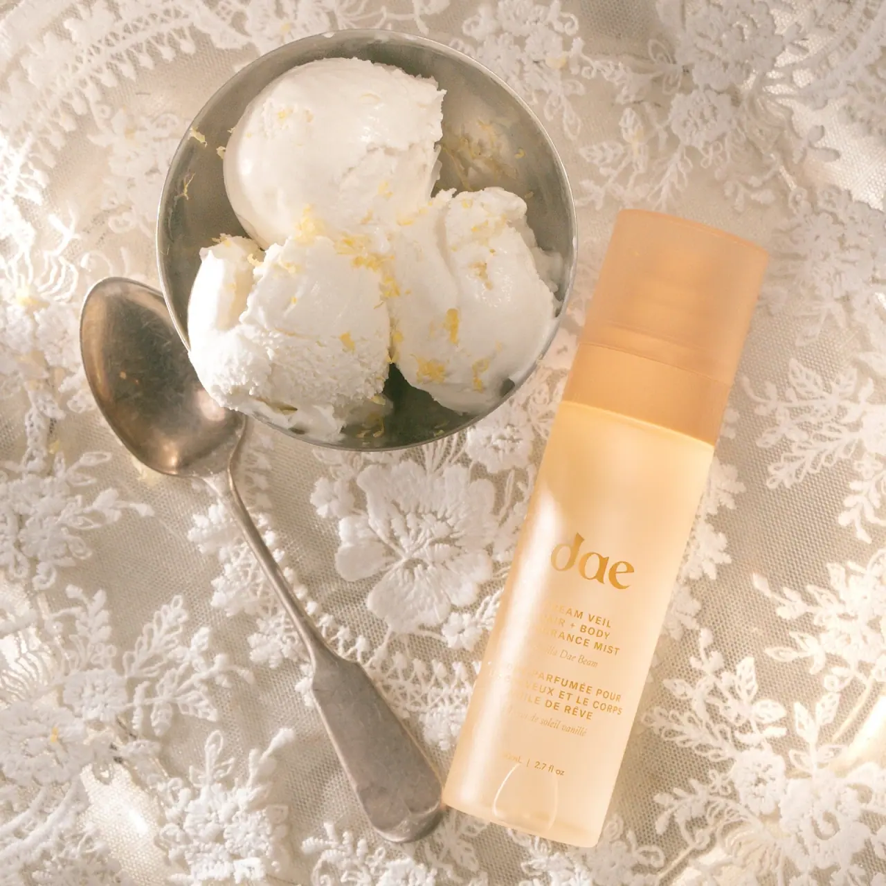
Dae
Warm translucent mist with tonal lettering and bilingual rhythm
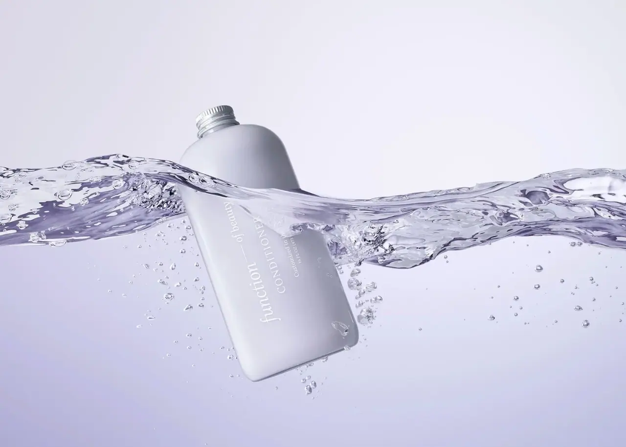
Function of Beauty
Lavender bottle with longitudinal white serif lettering
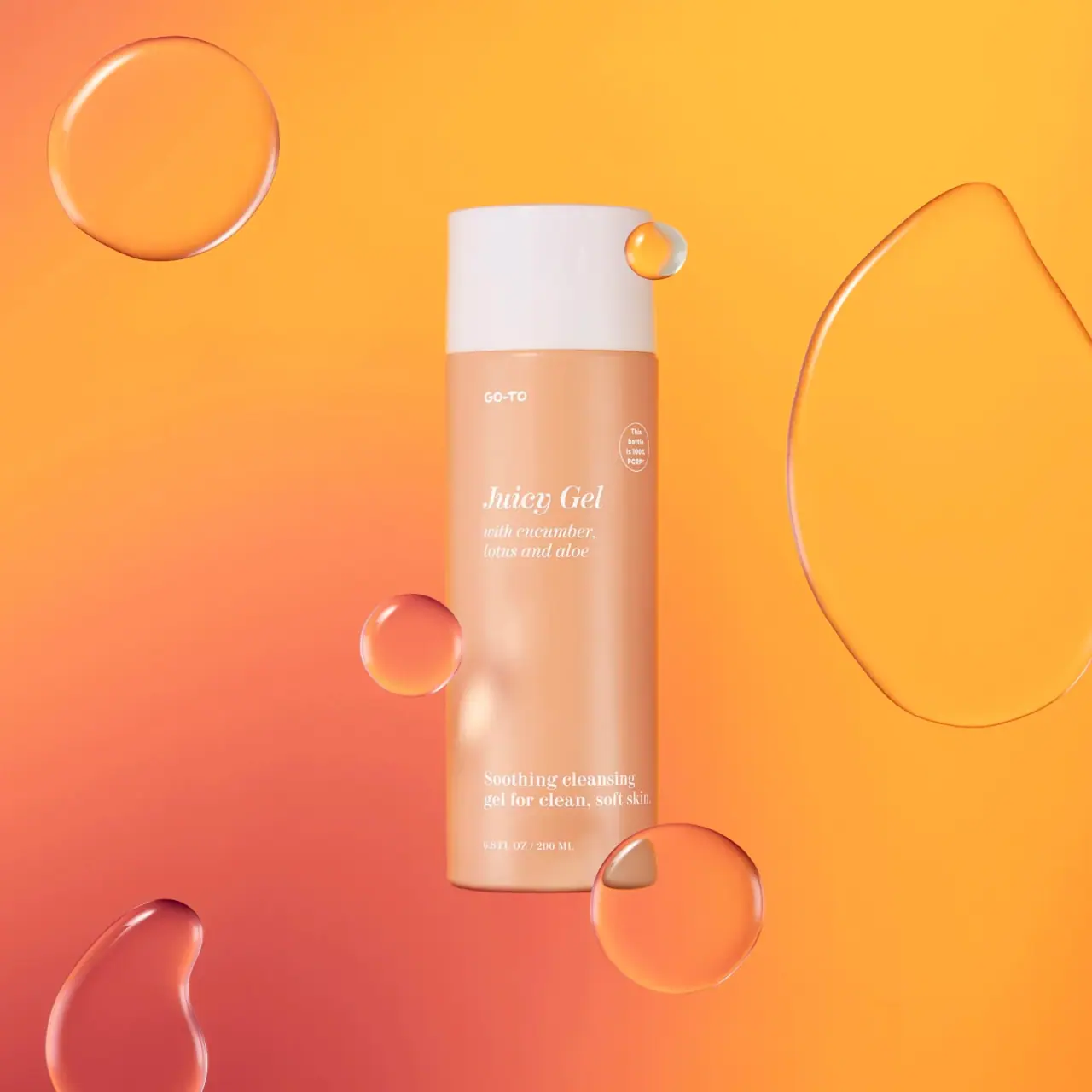
Go-To
Peach cylinder, white cap and airy italic serif copy

Kosas
lavender chrome and candy-pink acrylic
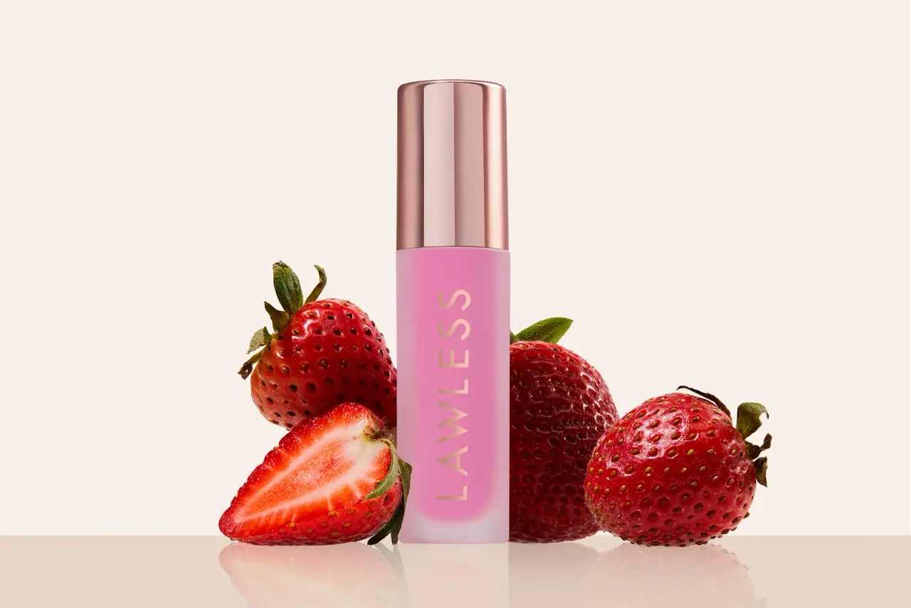
LAWLESS
Pink diffused gloss vial with a reflective rose-toned cap
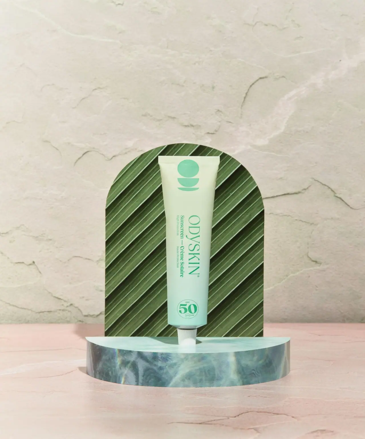
Odyskin
Mint tube with rotated serif lettering and circular protection badge
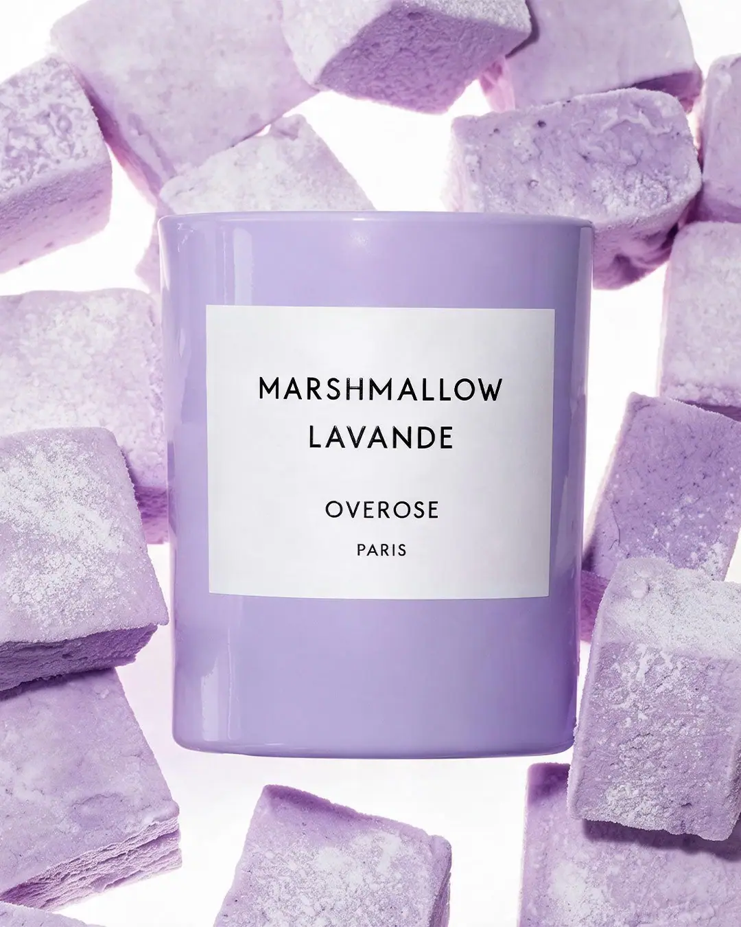
Overose
Lavender glossy cylinder with a spare black-and-white scent label