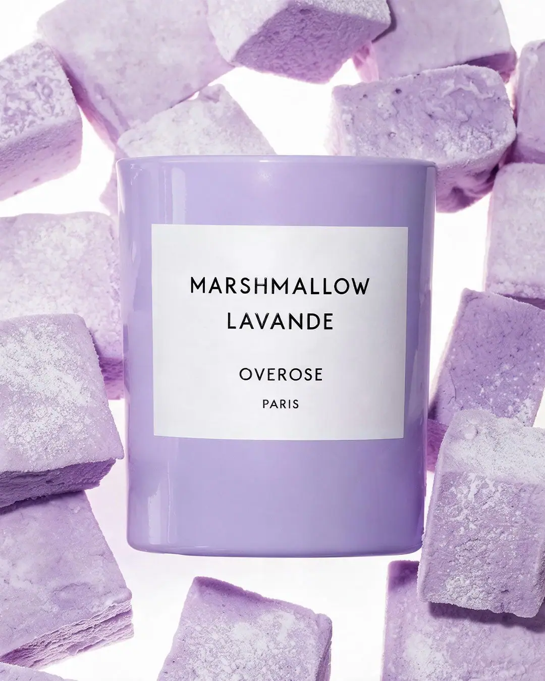
Photography: Overose official photography. Images belong to their respective owners.
Overose

Lavender glossy cylinder with a spare black-and-white scent label
Marshmallow Lavande presents a glossy lavender cylinder with one large white rectangular label. Black uppercase scent wording occupies two centred lines above a smaller OVEROSE signature and PARIS line. The package's colour and geometric simplicity do most of the visual work; there is no printed confectionery illustration. Lavender marshmallow-like blocks surround the object in the approved official photograph, creating a tonal scene with a contrasting powdery texture. The exact official product page confirms a reusable glass jar; the glossy lavender colour application remains unspecified.
- Candles & home scent
- Light pack
- Pastel soft-touch
- Bold typographic
About this study
Selected official lavender Marshmallow Lavande image; exact official product page accessed through the collection route confirms glass and candle specifications, while finish process and unseen components remain unknown.
Sources & evidence · Reviewed 2026-10-19Color Palette
Approximate colours interpreted from photography. These are screen references, not official brand colours or print specifications.
Pack body
Soft lavender vessel
#B5A0CC
Approximate broad body colour, with lighter reflected stripes and darker curved edges. The pastel tag describes colour; no tactile soft-touch finish is established.
Label
Clean white label
#F5F3F5
Large neutral rectangle separating all typography from the coloured vessel.
Ink
Black naming
#171319
Scent name, maker and place line use a single dark appearance. No foil, raised print or special ink specification is confirmed.
Typography
Suggested visual alternatives, not confirmed brand typefaces. Any scale below is an illustrative estimate.
MARSHMALLOW is the longest and widest line, with LAVANDE centred below it. Both use the same plain uppercase sans-serif character and similar visual weight. A larger vertical pause separates the scent from OVEROSE, which is smaller, and PARIS is reduced again beneath. The hierarchy is scent-first rather than maker-first. Because every line is centred, differences in word length create a stepped shape without a border or illustration. The typography is restrained enough that the lavender surface remains a major part of the identity rather than merely a background behind a logo.
Fonts
Original scent-title alternative
Montserrat
- Looks like
- Open geometric sans capitals
- Type
- Geometric sans serif
- Weight
- Regular, Medium
- Case
- Uppercase
- Tracking
- Slightly open
- Fallback
- Arial, sans-serif
Create a clear two-line title with enough side margin for the longest word. Keep optical line spacing deliberate so the two lines read as one scent name rather than separate products.
Secondary maker alternative
DM Sans
- Looks like
- Restrained neutral sans
- Type
- Sans serif
- Weight
- Regular, Medium
- Case
- Uppercase
- Tracking
- Normal to slightly open
- Fallback
- Arial, sans-serif
Set a smaller original maker and optional origin statement only when accurate. The secondary block should remain readable while clearly subordinate to the scent title.
Structure & Proportions
Visual proportions and finish previews are illustrative. Confirmed construction details and uncertainties are distinguished in the study notes.
Proportions
| Purpose | Value | Preview |
|---|---|---|
| Large label field | The white rectangle occupies much of the front width but leaves a visible lavender margin on all sides, especially below it. | — |
| Title before maker | The scent block sits in the upper half of the label, while a larger gap separates it from the smaller house signature. | — |
| Colour frame | The lavender perimeter remains wide enough to read as a coloured object rather than a white-labelled container with only a thin edge of colour. | — |
| Simple silhouette | The straight wall and unbroken cylindrical profile give the front label a stable surface without shoulder, neck or cap interruptions. | — |
Shapes
| Element | Value | Preview |
|---|---|---|
| Vessel | Straight lavender cylinder with a gently softened base and narrow visible top rim. | |
| Label | White rectangular panel with plain corners, curving slightly with the vessel. | |
| Scent block | Two centred uppercase lines with a wider first line. | |
| House signature | Smaller centred maker and place lines below a pronounced pause. |
Finishes
Glossy lavender exterior
Main glass vessel; lavender colour application and coating process unknown · gloss
Low-glare white label
Front rectangle; paper type or varnish unverified · matte
Formats and materials
| Formats | Straight-sided cylindrical candle vessel, Smooth lavender exterior with a softly rounded lower edge, Single white rectangular front label, No separate lid, carton or opened interior in the selected view, Official product listing: 240 g candle |
| Materials | The exact official product page identifies a reusable glass jar. Its lavender colour application and glass treatment are not specified., The brand describes a natural wax blend, without identifying its exact composition in the accessible details., The white label's stock, adhesive and surface treatment are unknown; a paper-like appearance is not a substrate specification. |
| Closures | No lid or closure is shown. The upper edge is visible as a narrow curved rim, but the camera angle does not reveal enough interior to identify wax, wick or a separate insert. A lid, dust cover or carton may exist outside the image; none is inferred. The photograph therefore supports analysis of the exterior vessel and label rather than candle assembly, closure fit, refillability or burn behaviour. |
| Decoration | One broad white rectangular panel centred on the front, Two-line uppercase scent title, Smaller centred maker and place line, No printed lavender stems, marshmallows or ornamental border |
Front Panel
Schematic reading order. The diagram’s zone heights do not represent measured artwork proportions.
The label is deliberately limited to the scent, maker and place line. It has no visible rule, pictogram, scent-note list, net weight or decorative frame. The white panel creates a consistent reading ground independent of the lavender surface, and the black text keeps contrast strong. The longest scent word governs the label's usable width, while the shorter second line and maker form a centred stack. Large internal margins prevent the minimal content from appearing crowded. PARIS is documented as printed wording, not used as evidence of the vessel's manufacturing location or candle production site.
| Zone | Content |
|---|---|
| Scent title | MARSHMALLOW above LAVANDE in two black uppercase lines. |
| House signature | OVEROSE in a smaller centred line after a clear vertical gap. |
| Place line | PARIS in the smallest visible line beneath the maker. |
| Label perimeter | Unprinted white margins without a border or graphic badge. |
Range System
The exact Marshmallow Lavande page is accessible through the official collection route and lists the lavender candle as a current product. It confirms a 240 g candle, a natural wax blend, a stated 60-hour burn duration and a reusable glass jar. These are brand product specifications, not quantities or claims legible on the selected front label. The fragrance description connects lavender with marshmallow, supporting the thematic relationship of the name and surrounding props without proving that those props are ingredients. A neutral naming panel on a coloured vessel is the transferable principle; a complete colour-to-scent map would require inspection of other products.
- The selected lavender body and Marshmallow Lavande wording are verified by the approved official image.
- The selected lavender colour is distinct from the broader collection’s signature pink language; the exact product source confirms glass for this edition.
- An original range can keep the label architecture stable while changing vessel colour, but explicit scent names remain necessary when colours are similar.
Back of Pack & Shelf
The reverse, underside, interior and any carton are absent. The sparse front does not establish the location or absence of safety and practical information.
- The source identifies weight and a general wax blend, but neither is legible on this front; wick construction, barcode and batch-code placement remain unobserved.
- The stated burn duration and reusable-jar description are source information, not inferred from the exterior; no refill insert is established.
- The printed PARIS line is not treated as a manufacturing-origin claim.
On shelf
The broad lavender body supplies the first colour impression; the high-contrast white label then provides a clear place to read the scent. This is visual interpretation rather than tested sales or recognition. The scent-first hierarchy may help selection among several Overose candles, but the smaller maker becomes less prominent at distance. A useful comparison would remove the surrounding lavender props and inspect the vessel among other pastel products, testing whether colour plus label proportions still create enough distinction without the campaign's repeated texture.
Imagery
Large lavender marshmallow-like blocks surround the vessel against a bright white ground. Their irregular, powdery surfaces contrast with the smooth glossy candle exterior, while their shared hue makes the composition feel almost monochromatic. The white label and background create bright interruptions between the lavender forms. The framing gives the vessel a suspended or tightly surrounded appearance, but it does not establish the physical rig or whether the props are edible. The objects visually echo the scent name without proving a formula ingredient, fragrance source or particular confectionery manufacturing process.
Guidelines
Editorial principles for an original design brief, not official brand guidelines.
Do
- Let a coloured vessel surround a neutral readable panel.
- Give the longest scent word enough side margin.
- Separate a selected colour edition from generic collection descriptions.
- Use exact product sources before transferring generic collection specifications.
- Test recognition without matching campaign props.
Don't
- Do not infer a glass colour or coating process from a glossy surface.
- Do not confuse an access failure on one URL with product discontinuation.
- Do not treat powdery props as a tactile vessel finish.
- Do not turn PARIS into a verified production location.
- Do not infer exact wax composition or wick construction from general product details.
Sources & evidence
How this study was built
range · Sourced fact
Accessible collection describes signature pink glass and minimalist monochrome labels generally.Candle Collection — Overosepalette · Visual observation
Approved selected image shows a glossy lavender vessel, distinct from generic pink collection wording.label · Visual observation
White rectangle carries MARSHMALLOW LAVANDE above smaller OVEROSE and PARIS.structure · Visual observation
No interior, flame, wick, lid or carton is visible.imagery · Visual observation
Lavender powdery marshmallow-like blocks surround the smooth vessel on a white ground.structure · Sourced fact
Exact product details confirm a reusable glass jar, 240 g, natural wax blend and stated 60-hour burn duration. The source does not specify the colour application.Marshmallow Lavande — Overose
What remains unverified
- Direct product URLs initially failed; the collection-qualified product URL was subsequently accessible.
- Glass is source-confirmed; colour application, label stock, exact wax blend and wick construction remain unverified.
- No reverse, underside, interior, lid or carton view.
- Pastel tag describes colour, not a verified soft-touch finish.
Give your AI
packaging taste
Give your design or image tool a packaging study: palette, type, structure, front panel and principles for an original brief.
Export this styleFree with an email. PACK.md works in Claude, ChatGPT, Cursor and image tools.
More like this

Bread Beauty Supply
bubblegum pumps and a fat black wordmark
Dae
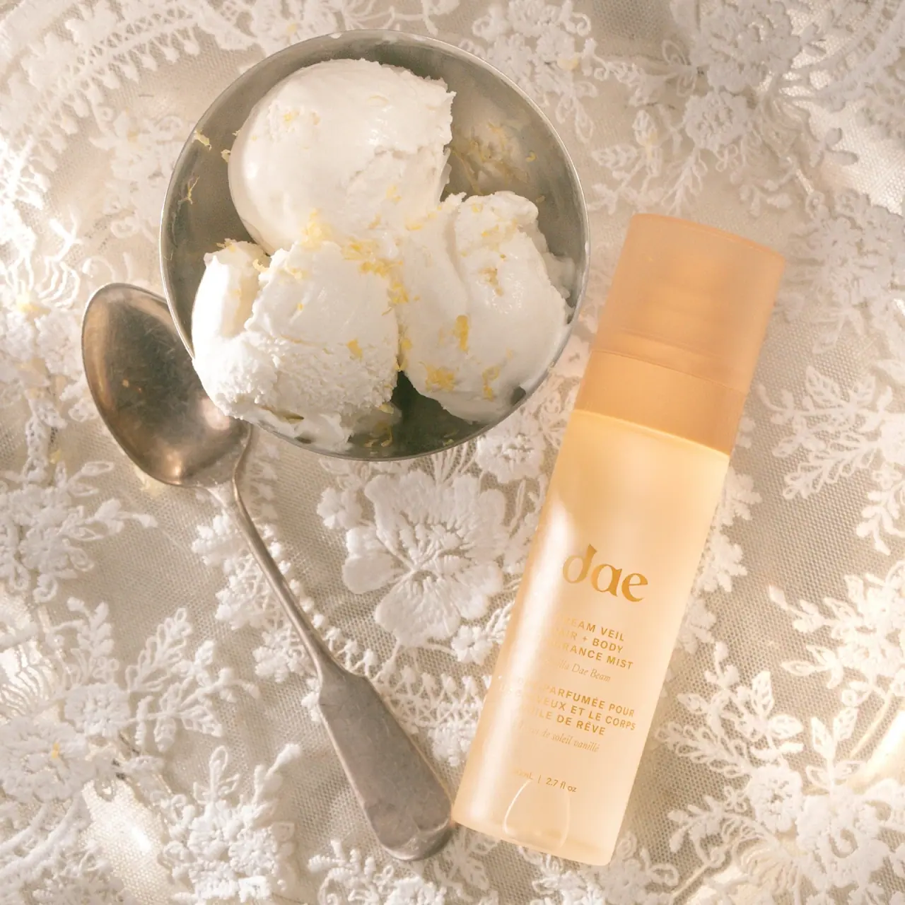
Warm translucent mist with tonal lettering and bilingual rhythm

Fenty Beauty
faceted caps and wide-spaced lilac capitals
Function of Beauty
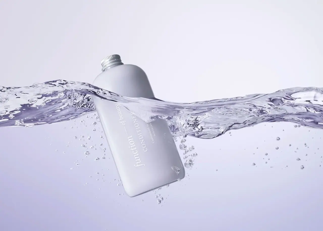
Lavender bottle with longitudinal white serif lettering
Go-To
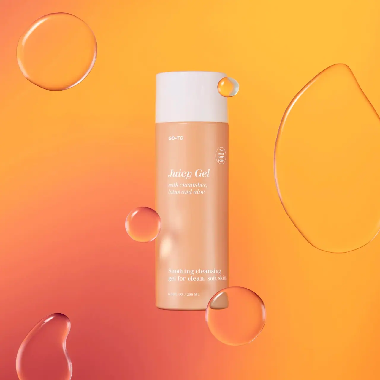
Peach cylinder, white cap and airy italic serif copy

Kosas
lavender chrome and candy-pink acrylic
LAWLESS
Pink diffused gloss vial with a reflective rose-toned cap
Odyskin
Mint tube with rotated serif lettering and circular protection badge