Photography: Ricardo Lozano — product photography. Images belong to their respective owners.
LAWLESS

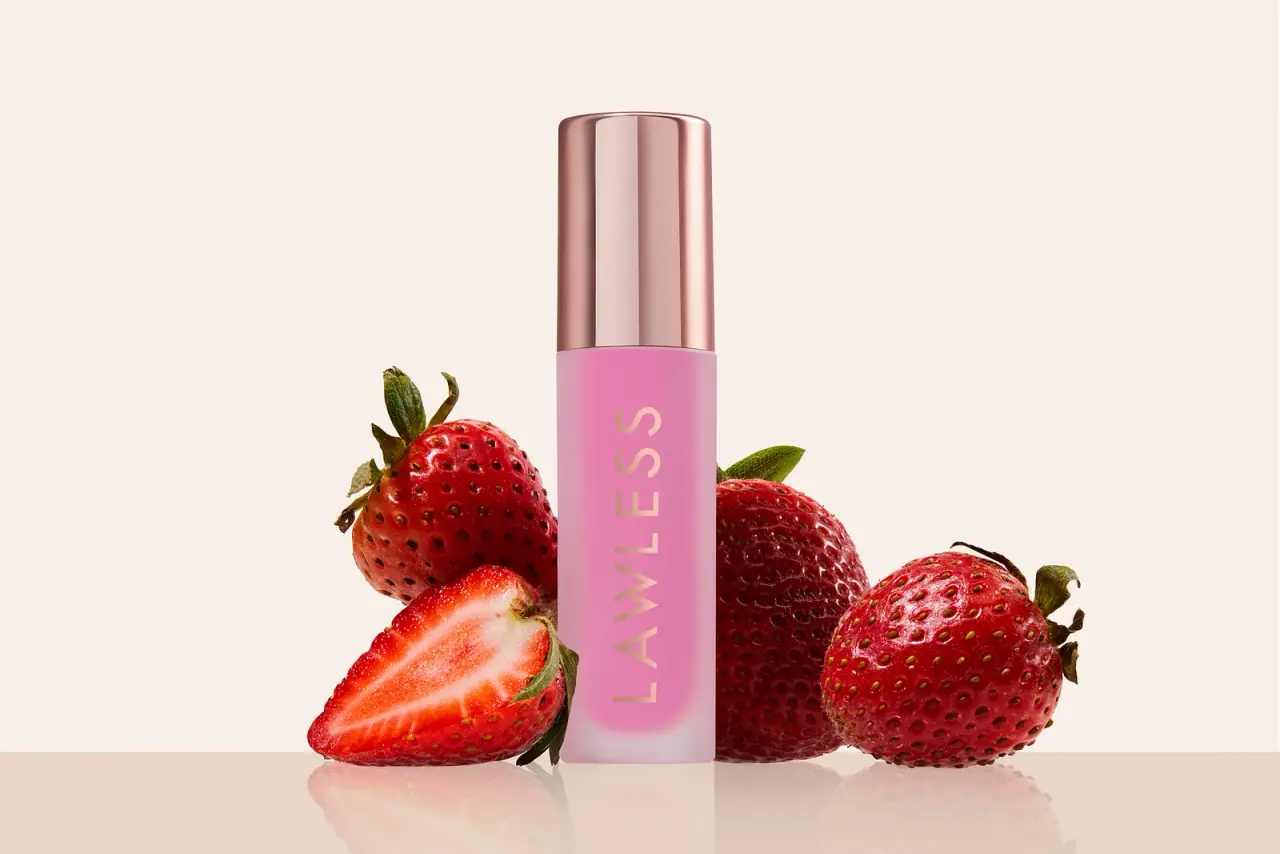
Pink diffused gloss vial with a reflective rose-toned cap
Forget The Filler gloss is shown as a slender closed vial with a strong pink interior, a softly diffused pale outer edge and a tall reflective rose-toned cap. A single pale LAWLESS wordmark runs along the body, leaving colour and finish to define most of the object. The cap and body meet at a nearly flush horizontal seam rather than exposing a separate neck. Strawberries and a warm cream setting frame the selected photograph. The official listing confirms a 3.3 mL gloss with a large plush applicator, while the exact photographed shade remains unassigned.
- Make-up
- Light pack
- Bold typographic
- Pastel soft-touch
About this study
Selected closed Forget The Filler gloss in Ricardo Lozano's strawberry still life. Product-family size and applicator context are sourced; exact photographed shade and hidden components remain unverified.
Sources & evidence · Reviewed 2026-10-19Color Palette
Approximate colours interpreted from photography. These are screen references, not official brand colours or print specifications.
Pack body
Diffused pale pink shell
#D9BDCC
Approximate pale outer body and base appearance. This is not a verified polymer tint, frosted coating specification or tactile soft-touch finish.
Reflective rose cap
#B9827A
Approximate rose-metallic appearance, excluding the pale and dark reflected stripes. Exact metal or coating is unknown.
Ink
Pale warm maker lettering
#DBB7A1
Approximate vertical wordmark colour, visually related to the cap but not verified as the same material or print process.
Accent
Visible bright pink interior
#DE79AE
Approximate pink seen within the vial. It does not establish an exact named shade or the colour it produces on lips.
Typography
Suggested visual alternatives, not confirmed brand typefaces. Any scale below is an illustrative estimate.
The visible front carries one dominant identity: LAWLESS in widely spaced uppercase sans-serif letters rotated along the long body. The word begins toward the lower portion and reads up the vial, exploiting length rather than wrapping a large horizontal name around its narrow circumference. No competing product title or shade name is readable in this selected view. The light warm lettering contrasts through hue and surface appearance with the saturated pink interior, although it is less stark than black-on-white text. The treatment is brand-led rather than a complete front information hierarchy.
Fonts
Original maker alternative
Montserrat
- Looks like
- Open geometric sans capitals
- Type
- Geometric sans serif
- Weight
- Regular, Medium
- Case
- Uppercase
- Tracking
- Wide but optically balanced
- Fallback
- Arial, sans-serif
Create a new identity that reads clearly along a narrow body without copying LAWLESS. Check spacing around diagonals and wide letters so the word does not become a series of disconnected shapes.
Secondary-information alternative
Inter
- Looks like
- Compact neutral sans
- Type
- Sans serif
- Weight
- Regular, Medium
- Case
- Sentence case or compact uppercase
- Tracking
- Normal
- Fallback
- Arial, sans-serif
A proposed practical companion for original shade and role information on another surface. Such a panel is not visible in this reference, so its exact layout must be designed independently rather than presented as a brand observation.
Structure & Proportions
Visual proportions and finish previews are illustrative. Confirmed construction details and uncertainties are distinguished in the study notes.
Proportions
| Purpose | Value | Preview |
|---|---|---|
| Two clear surface zones | The tall cap forms a substantial upper portion, while the longer lower body carries the pink colour and wordmark. Their widths appear closely aligned in this frontal view. | — |
| Length used for identity | The rotated maker spans most of the visible body height, leaving the narrow front free of a stacked paragraph. | — |
| Pale lower margin | The bright pink interior appears rounded above a pale diffused base, creating a gentle visual ending. This optical boundary does not establish a measured wall thickness or separate insert. | — |
Shapes
| Element | Value | Preview |
|---|---|---|
| Closed vial silhouette | Slender straight-sided body with softly rounded edges and an aligned upper cap. | |
| Cap face | Tall reflective curved surface with a slightly rounded upper edge. | |
| Maker field | One long rotated word occupying a narrow vertical strip. | |
| Visible pink interior | Long colour field ending in a softer rounded area above the pale base. |
Finishes
Rose-metallic cap appearance
Fitted upper closure; substrate unverified · metallic
Diffused frosted-looking body
Outer edges and pale base; process unverified · frosted
Formats and materials
| Formats | Slim straight-sided closed lip-gloss vial, Tall reflective cap meeting the body at a horizontal seam, Pink interior with pale diffused edges and base, Official product listing identifies 3.3 mL / 0.11 oz |
| Materials | The semi-opaque body appearance does not establish glass, acrylic or another particular polymer, nor a confirmed double-wall construction., The rose-metallic-looking cap is not evidence of solid metal or a specific metallisation method., The brand describes a large plush applicator and explains that the vial accommodates its size. This is source-backed functional context, not a view of the hidden wand, wiper or internal components. |
| Closures | The cap is fitted and occupies a substantial upper section of the silhouette. Its edge aligns closely with the body below, creating two distinct surface zones with little visible change in width. The neck and shoulders are concealed rather than exposed, so their shape should not be described from this closed view. Attachment threads, wiper, wand stem and tip are not inspected. No refill system or closure material specification is established. |
| Decoration | Single large spaced maker wordmark along the vial height, No visible enclosing label rectangle, Broad pink field with softly lighter edges, No strawberry illustration printed on the selected front |
Front Panel
Schematic reading order. The diagram’s zone heights do not represent measured artwork proportions.
The visible package front is largely a wordmark on a coloured transparent-to-diffused field. There is no separate opaque paper panel, border or multi-line product story. The longitudinal word sits away from the upper cap seam and runs through the pink area. Its pale warm colour connects visually with the cap, while its comparatively flat appearance separates it from the cap's bright reflections. The actual decoration technique is unknown. Product-family name, capacity and shade identification are sourced or withheld rather than placed into invented front zones.
| Zone | Content |
|---|---|
| Upper closure | Plain reflective rose-toned cap without additional readable copy in the selected view. |
| Main body identity | LAWLESS in pale spaced uppercase lettering along the vial's long axis. |
| Colour field | Bright pink interior bordered by a softer pale outer appearance. |
| Base | Diffused pale lower region with no clearly readable shade or quantity label from this angle. |
Range System
The official page lists many shade names, including several strawberry-related variants. The photographer asset's filename references a popsicle and strawberry, but a filename plus fruit props is not enough to identify the exact retail shade. This study therefore records the visible pink presentation without selecting Strawberry Popsicle, Strawberry Shortcake or Strawberry Milkshake. The source confirms the product family's 3.3 mL format and applicator context. A hypothetical range could use visible formula colour as a cue, but it still needs durable readable shade identification because lighting and opacity can make close pinks difficult to distinguish.
- The same product listing includes multiple pink and strawberry-themed shades, demonstrating why props alone are insufficient identification.
- The selected front prioritises maker and visible colour rather than a readable variant title.
- For original work, place shade information where it remains useful when the cap is removed or several similar colours stand together.
Back of Pack & Shelf
The reverse, underside, opened applicator and carton are absent. The selected front does not show a complete label system.
- No printed shade-name location, barcode, batch code or ingredient panel is established.
- The official capacity is a source fact rather than a readable front quantity mark in this image.
- The brand's explanation of applicator volume should not be converted into a claim about the pictured unit's fill level or manufacturing quality.
On shelf
As a visual interpretation, the tall reflective cap is likely to draw attention before the subtler pale lettering becomes legible. The bright pink interior and diffused pale base make the lower section feel softer, creating a contrast within a restrained silhouette. The rotated wordmark fits the body well but may require a turn in the hand to read naturally. A useful evaluation would test the pack under diffuse retail light and compare neighbouring pink shades, because the studio reflection and fruit setting may make this single example more distinct than it appears in a crowded display.
Imagery
Ricardo Lozano's cosmetics photograph places the upright gloss among whole strawberries and one sliced berry on a warm cream reflective surface. The fruit remains low enough to leave the maker and cap exposed. Red fruit, pink contents and rose cap share a warm visual family, while the pale background gives the slim object a clean outline. The reflection adds depth beneath the bottle without a second printed panel. Strawberries are styling elements, not proof of a specific shade, flavour or ingredient, and the campaign date is not established from the asset filename.
Guidelines
Editorial principles for an original design brief, not official brand guidelines.
Do
- Use longitudinal naming deliberately on narrow bodies.
- Separate reflective cap and diffused body appearances.
- Verify exact shade identity before naming a photographed colour.
- Keep hidden applicator claims tied to the product source.
- Test pale lettering against several nearby formula colours.
Don't
- Do not infer a strawberry flavour or shade from fruit props alone.
- Do not describe exposed shoulders when the fitted cap conceals the neck.
- Do not identify glass, acrylic, metal or foil without evidence.
- Do not treat the bright cap reflection as a separate material insert.
- Do not copy the maker wordmark or claim a refillable construction.
Sources & evidence
- Forget The Filler Lip-Plumping Line-Smoothing Gloss — LAWLESSproduct
- Cosmetic Photography — Ricardo Lozanophotographer
How this study was built
edition · Sourced fact
Official product page identifies 3.3 mL / 0.11 oz for the gloss family.Forget The Filler Lip-Plumping Line-Smoothing Gloss — LAWLESSstructure · Sourced fact
The brand describes a large plush doe applicator and explains the vial's accommodation of it; the selected wand is not opened or inspected.Forget The Filler Lip-Plumping Line-Smoothing Gloss — LAWLESStypography · Visual observation
Pale uppercase LAWLESS runs along the pink body, with no readable product title or shade name in the selected view.Cosmetic Photography — Ricardo Lozanostructure · Visual observation
The cap and body meet nearly flush, concealing the neck rather than exposing rounded bottle shoulders.Cosmetic Photography — Ricardo Lozanoimagery · Visual observation
Whole and cut strawberries frame the gloss on a cream reflective surface without forming printed package graphics.Cosmetic Photography — Ricardo Lozanorange · Editorial interpretation
Multiple strawberry-related variants and an ambiguous asset filename do not justify assigning an exact shade to this photograph.Forget The Filler Lip-Plumping Line-Smoothing Gloss — LAWLESS · Cosmetic Photography — Ricardo Lozano
What remains unverified
- Photographed shade is not confirmed by a readable mark or exact primary caption.
- Case material, reflective finishing and diffused-body process are unknown.
- Closed cap conceals shoulders, neck, wand and wiper; reverse and carton are absent.
- Exact fonts, dimensions, production colours and campaign date are unverified.
Give your AI
packaging taste
Give your design or image tool a packaging study: palette, type, structure, front panel and principles for an original brief.
Export this styleFree with an email. PACK.md works in Claude, ChatGPT, Cursor and image tools.
More like this

Bread Beauty Supply
bubblegum pumps and a fat black wordmark
Dae
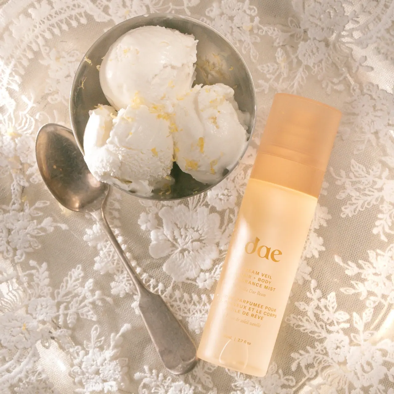
Warm translucent mist with tonal lettering and bilingual rhythm

Fenty Beauty
faceted caps and wide-spaced lilac capitals
Function of Beauty
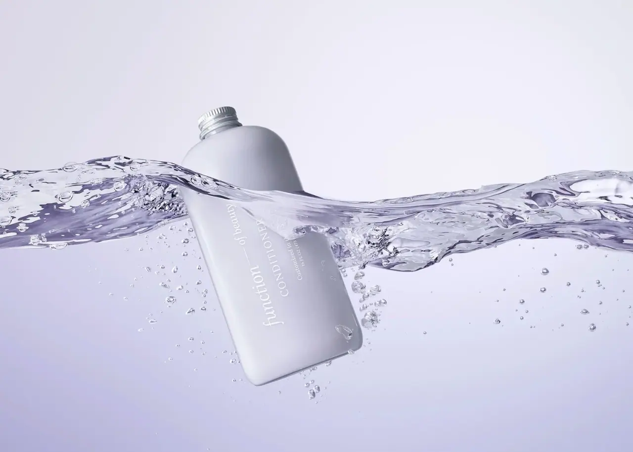
Lavender bottle with longitudinal white serif lettering
Go-To
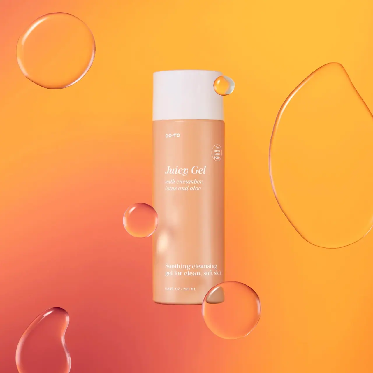
Peach cylinder, white cap and airy italic serif copy

Kosas
lavender chrome and candy-pink acrylic
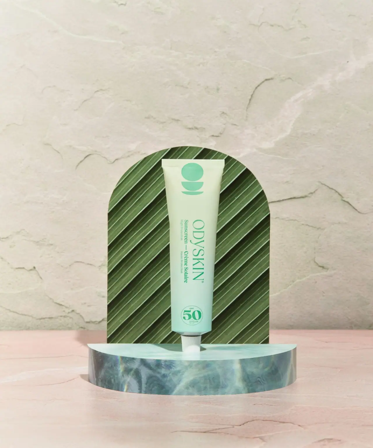
Odyskin
Mint tube with rotated serif lettering and circular protection badge
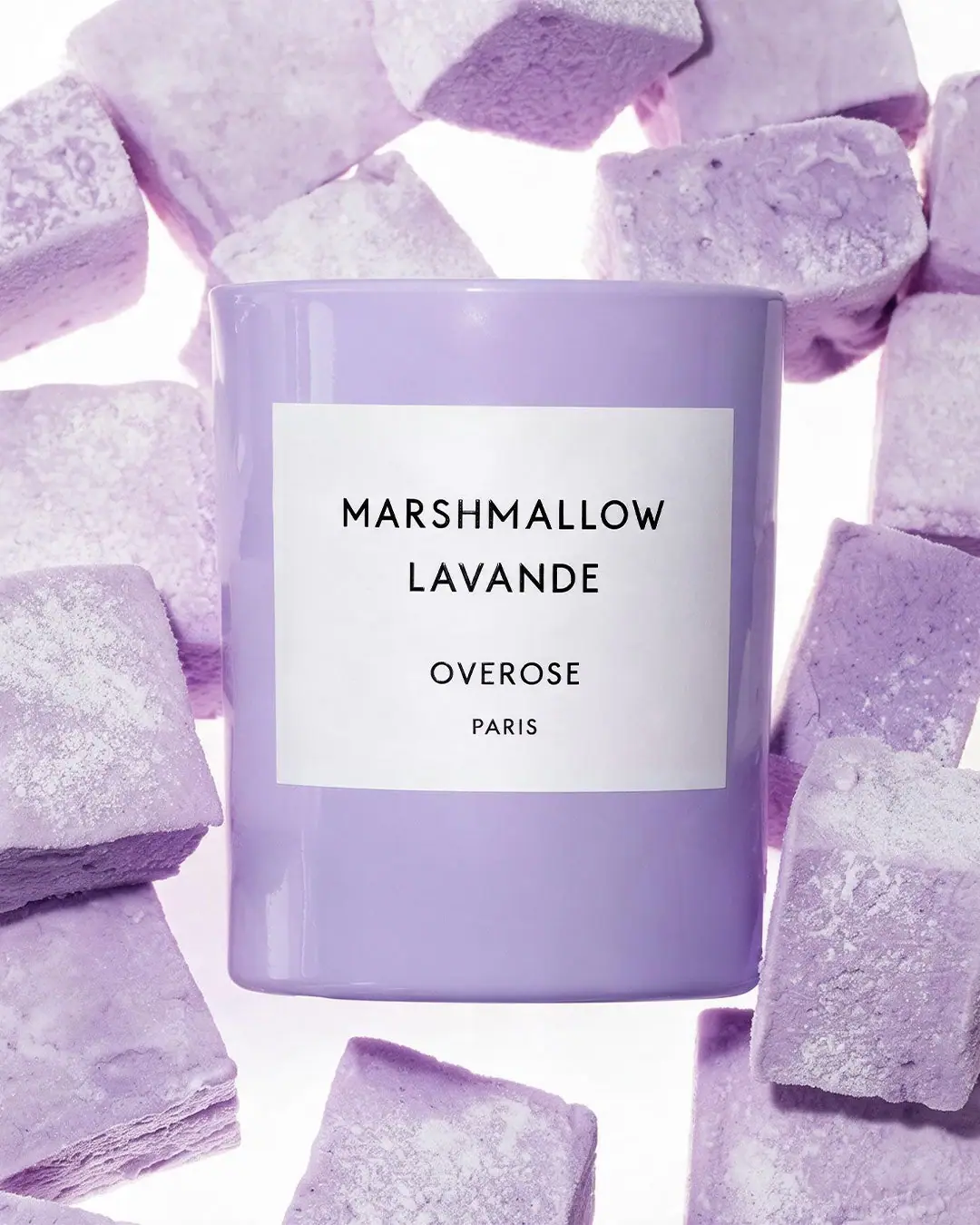
Overose
Lavender glossy cylinder with a spare black-and-white scent label