Photography: Odyskin official photography. Images belong to their respective owners.
Odyskin

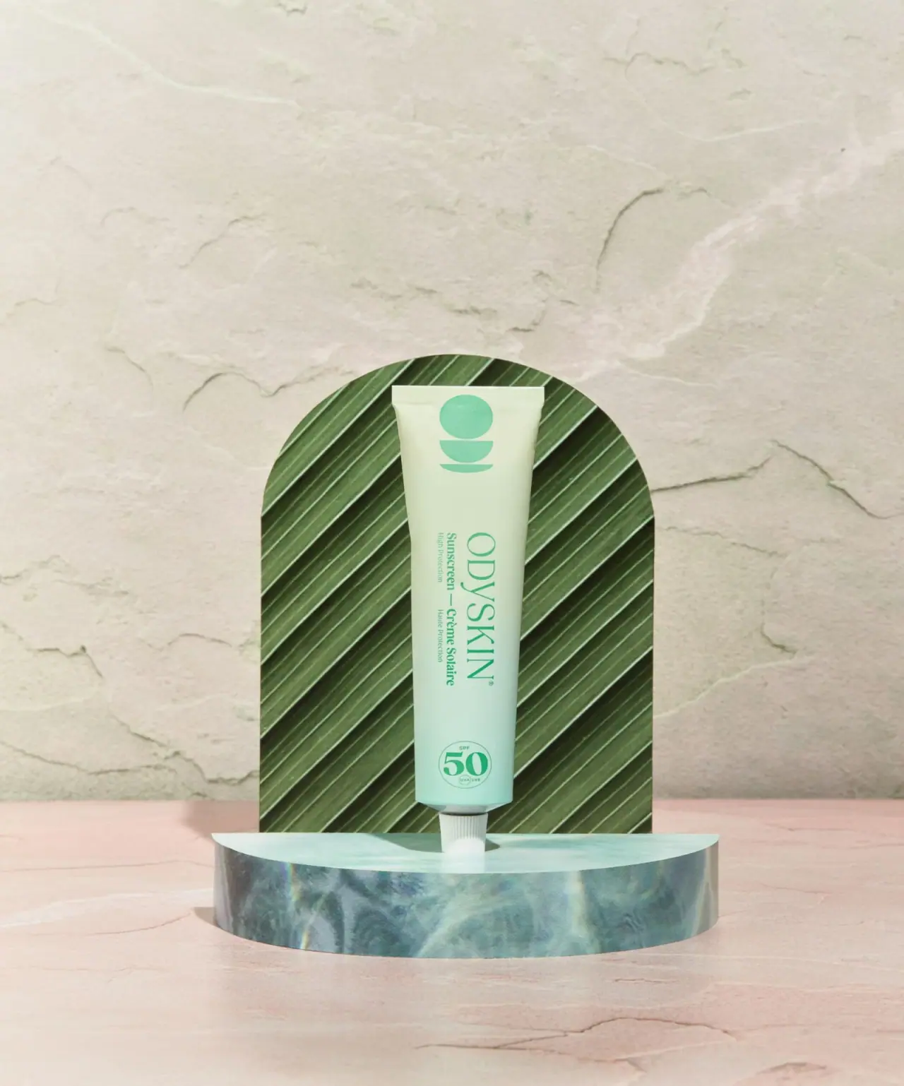
Mint tube with rotated serif lettering and circular protection badge
The selected SPF50 tube combines a pale green body, a large rotated serif maker name and an upright circular protection badge near the cap. A simple stacked geometric symbol occupies the opposite end. The long bilingual wording turns with the maker, while the badge stays readable with the tube standing upright. This change of reading direction gives the narrow surface an unusually clear rhythm. The leaf-textured arch and reflective watery platform belong to the photographic scene, not the pack.
- Suncare
- Light pack
- Pastel soft-touch
- Bold typographic
About this study
Selected pale-green SPF50 tube in the official botanical still life. Source confirms component materials and 75 ml; unseen carton and reverse are not reconstructed.
Sources & evidence · Reviewed 2026-10-19Color Palette
Approximate colours interpreted from photography. These are screen references, not official brand colours or print specifications.
Pack body
Pale yellow mint
#D7E5C4
Approximate upper body color in the selected lighting, softer and warmer than the lower mint area.
Cool mint
#B7DDCF
Approximate lower body appearance; a printed gradient cannot be distinguished conclusively from lighting and surrounding reflections.
Ink
Fresh medium green
#52AE88
Maker, bilingual description, top emblem and protection badge share a green appearance, distinctly lighter than the dark leaf prop behind them.
Accent
Cap white
#E9EEE3
Small ribbed cap separates the green body from the scene's blue platform.
Typography
Suggested visual alternatives, not confirmed brand typefaces. Any scale below is an illustrative estimate.
The large ODYSKIN word uses slim, contrasting serif forms and rotates clockwise as one word. Beneath it in the same rotated orientation, a bolder bilingual sunscreen description provides function, with smaller protection wording alongside. Near the lower end, a large 50 sits inside a thin circle with much smaller SPF and UVA/UVB details. The badge therefore offers an immediate upright number while the maker invites a second, sideways read. This is not a composition of individually stacked letters.
Fonts
Independent serif maker
Bodoni Moda
- Looks like
- Fine contrasting display serif
- Type
- Modern serif
- Weight
- Regular, Medium
- Case
- Uppercase
- Tracking
- Moderate optical spacing
- Fallback
- Georgia, serif
An alternative for a new maker name rotated as a single line. Keep fine strokes robust enough for the curved surface rather than copying the precise source lettering.
Product and numerical information
Source Serif 4
- Looks like
- Readable text serif with strong bold figures
- Type
- Text serif
- Weight
- Regular, Bold
- Case
- Mixed case for category; large figures for protection
- Tracking
- Natural compact spacing
- Fallback
- Georgia, serif
Use a bold role for the main category and protection number, with smaller regular supporting lines. The source's exact mixture of small serif and sans details is not fully resolved at this image scale.
Structure & Proportions
Visual proportions and finish previews are illustrative. Confirmed construction details and uncertainties are distinguished in the study notes.
Proportions
| Purpose | Value | Preview |
|---|---|---|
| Long information axis | The narrow body makes a rotated maker word more spacious than an equally large horizontal line would be. | — |
| Separate end anchors | The abstract symbol sits near the wide sealed end, while the circular protection badge occupies the narrower area above the cap. | — |
| Compact closure | The white cap is considerably narrower than the body and reads as a small supporting foot rather than a broad pedestal. | — |
| Air around identity | Visible gaps between symbol, rotated text and badge prevent the three orientations and shapes from merging into one dense column. | — |
Shapes
| Element | Value | Preview |
|---|---|---|
| Tube body | Slender tapered container with a broad straight sealed top. | |
| Upper abstract symbol | A circle sits above two separated bowl-like curved segments; the mark is not a botanical arch illustration. | |
| Protection badge | Thin circular boundary around a large upright 50 and small supporting details. | |
| Ribbed cap | Short white narrow closure visible below the tube neck. |
Finishes
Low-glare body appearance
Broad pale front shows soft shading, not a verified soft-touch coating despite the visual style tag. · matte
Formats and materials
| Formats | Narrow upright sunscreen tube with a flattened top and short white lower cap; official product size 75 ml |
| Materials | The official product page specifies an aluminium tube and compostable box. The box is not present in the approved cover, so its shape, graphic system and material texture are not analyzed here., The brand explicitly calls the cap plastic and suggests keeping it for a subsequent tube. Exact polymer, aluminium lining, recycled content and compostability conditions are not stated in the accessed product description. |
| Closures | A short ribbed white cap closes the lower neck. Its visible grooves provide grip and contrast with the broad smooth body. The cover is closed, so the opening and any seal are unseen; a screw-cap appearance should not be expanded into unverified thread or liner specifications. The straight upper edge visibly flattens the tube into a wide seam. |
| Decoration | Circle and separated curved segments near the sealed end, Long rotated maker and bilingual category block, Thin upright circular SPF50 badge near the lower end, Large intervals of open pale color between these anchors |
Front Panel
Schematic reading order. The diagram’s zone heights do not represent measured artwork proportions.
There is no visible separate rectangular label. The design uses the full tube surface as one pale field, with three independently spaced anchors. The maker and product wording rotate together, so their internal relationship remains coherent even though it differs from the upright SPF badge. The abstract upper symbol does not compete with text through detail. Its broad shapes can remain recognizable at a scale where the smallest protection wording is no longer readable.
| Zone | Content |
|---|---|
| Upper emblem | Green circle with two curved segments beneath, positioned below the flattened seal. |
| Rotated maker | Large serif ODYSKIN occupies the middle portion, reading along the length of the tube. |
| Bilingual function | Sunscreen and Crème Solaire sit alongside in the same turned orientation, with smaller high-protection wording. |
| Protection number | An upright 50 dominates a small circular badge close to the cap; fine supporting marks remain subordinate. |
Range System
This study examines only the selected SPF50 front. It does not establish how other Odyskin factors, formats or editions change color. The useful transferable principle is to keep function and a primary numerical identifier distinct even when the maker is rotated. A new family would need its own tested labels and truthful protection data; color alone should not carry a safety-relevant distinction.
- Retain a stable location for the key product identifier across an independently designed family.
- Let bilingual category lines rotate with the maker rather than creating unrelated reading directions.
- Document each component separately when the range includes different caps, tubes or cartons.
Back of Pack & Shelf
The reverse and outer carton are not shown. The source's component and disposal statements do not reveal where they are printed on the actual package.
- Check the reverse before describing ingredient, instruction or certification layout.
- Treat carton compostability as a brand statement with unspecified conditions, not a visual conclusion.
- Keep the plastic-cap statement visible in material documentation instead of simplifying the entire pack to plastic-free.
On shelf
Interpretively, the upright SPF number can be read before the turned maker, creating a useful division between identification and brand character. The mint field and medium-green graphics are gentler in contrast than black on white; fine text therefore needs particular care at reduced size. A physical proof should be evaluated on the curved tube under neutral lighting, where the dramatic leaf backdrop will no longer strengthen its silhouette.
Imagery
The tube stands against a leaf-textured arched panel on a shallow semicircular platform whose blue surface resembles rippling water. Pink ground and a textured pale wall add warmth around the green object. The dark diagonal leaf lines amplify the tube's clean vertical outline but are not printed on it. The watery platform also changes the lower body's perceived color. An image-led study must separate these reflections and staging materials from the actual package palette and construction.
Guidelines
Editorial principles for an original design brief, not official brand guidelines.
Do
- Coordinate the orientation of related text.
- Give a key numerical identifier its own space.
- Separate the scene's botanical texture from package graphics.
- Record aluminium body and plastic cap individually.
- Test delicate type on a curved physical proof.
Don't
- Do not call the leaf arch a tube motif.
- Do not infer a soft-touch coating from low-glare photography.
- Do not describe the whole assembly as plastic-free.
- Do not turn reflected color into a confirmed printed gradient.
- Do not invent disposal conditions or protection claims.
Sources & evidence
How this study was built
structure · Sourced fact
Official page specifies 75 ml, aluminium tube, compostable box and plastic cap; broad plastic-free language elsewhere is not generalized to every component.Odyskin — Natural Sunscreen SPF50typography · Visual observation
Serif maker and bilingual function rotate as a group; the protection number remains upright.Odyskin — Natural Sunscreen SPF50label · Visual observation
Upper circle-and-segments symbol, central rotated text and lower circular badge form three separated anchors.Odyskin — Natural Sunscreen SPF50palette · Visual observation
Medium-green graphics contrast with pale green body and white cap, not dark forest-green ink.Odyskin — Natural Sunscreen SPF50imagery · Visual observation
Leaf arch and watery semicircular platform are external set elements.Odyskin — Natural Sunscreen SPF50edition · Visual observation
Only the selected front is analyzed; current source material statements do not reveal unseen carton artwork.Odyskin — Natural Sunscreen SPF50range · Editorial interpretation
Stable numeric location and coordinated rotated text are transferable principles, not a documented universal brand system.
What remains unverified
- Original fonts, exact dimensions, printing and coating processes unknown.
- Cap resin, tube lining and compostability conditions unspecified.
- Reverse, carton and open closure unseen.
- Upper-to-lower hue variation may include lighting and reflections.
Give your AI
packaging taste
Give your design or image tool a packaging study: palette, type, structure, front panel and principles for an original brief.
Export this styleFree with an email. PACK.md works in Claude, ChatGPT, Cursor and image tools.
More like this

Bread Beauty Supply
bubblegum pumps and a fat black wordmark
Dae
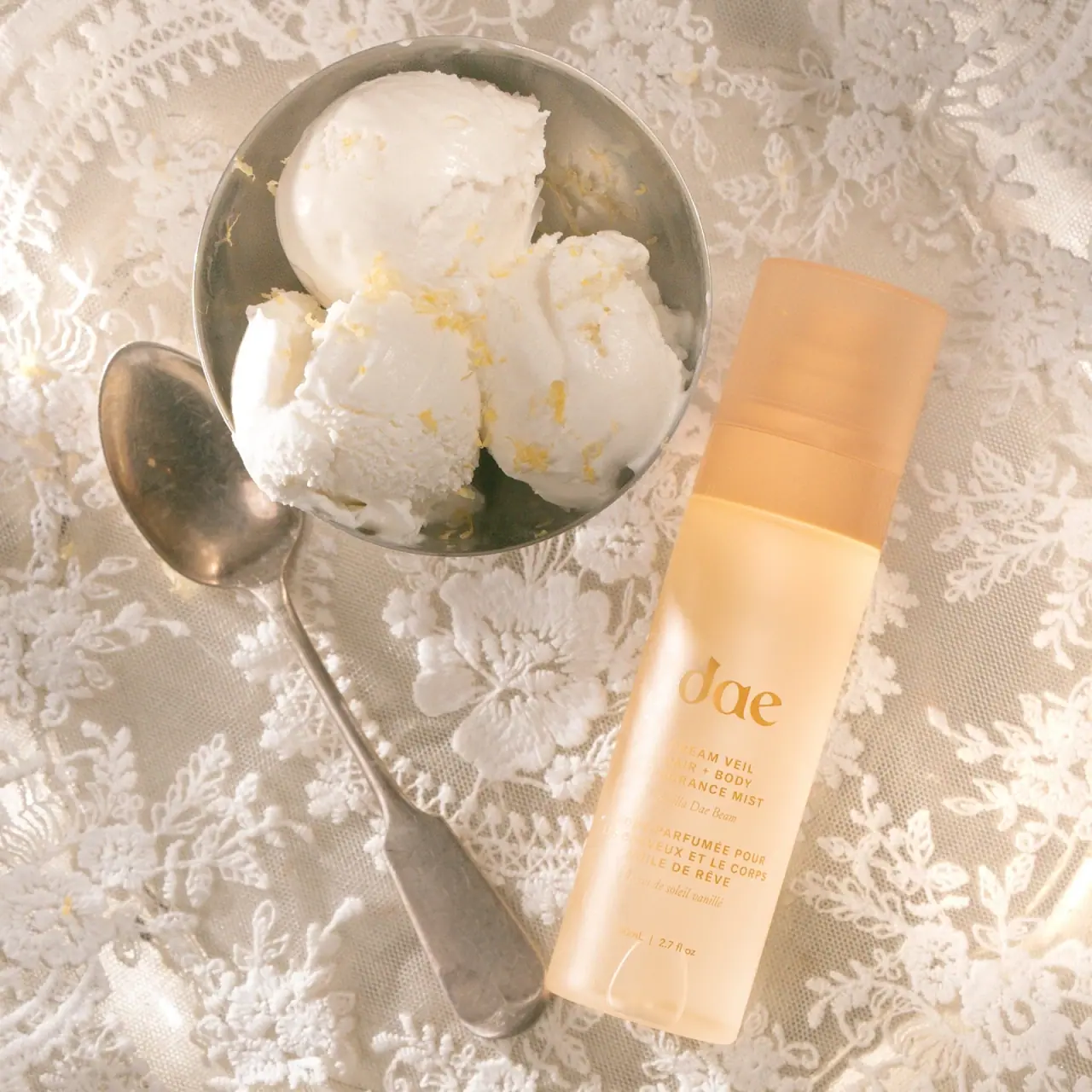
Warm translucent mist with tonal lettering and bilingual rhythm

Fenty Beauty
faceted caps and wide-spaced lilac capitals
Function of Beauty
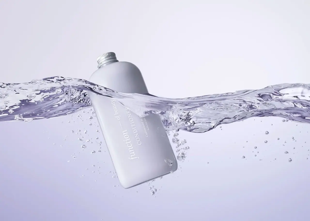
Lavender bottle with longitudinal white serif lettering
Go-To
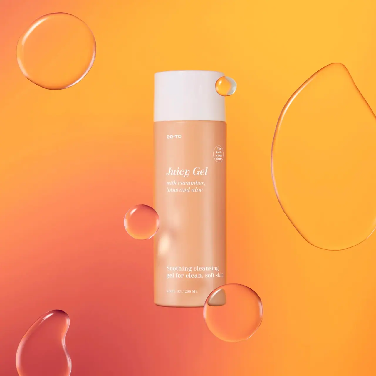
Peach cylinder, white cap and airy italic serif copy

Kosas
lavender chrome and candy-pink acrylic
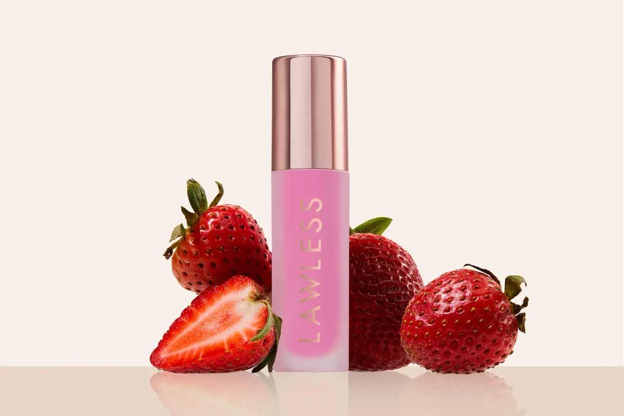
LAWLESS
Pink diffused gloss vial with a reflective rose-toned cap
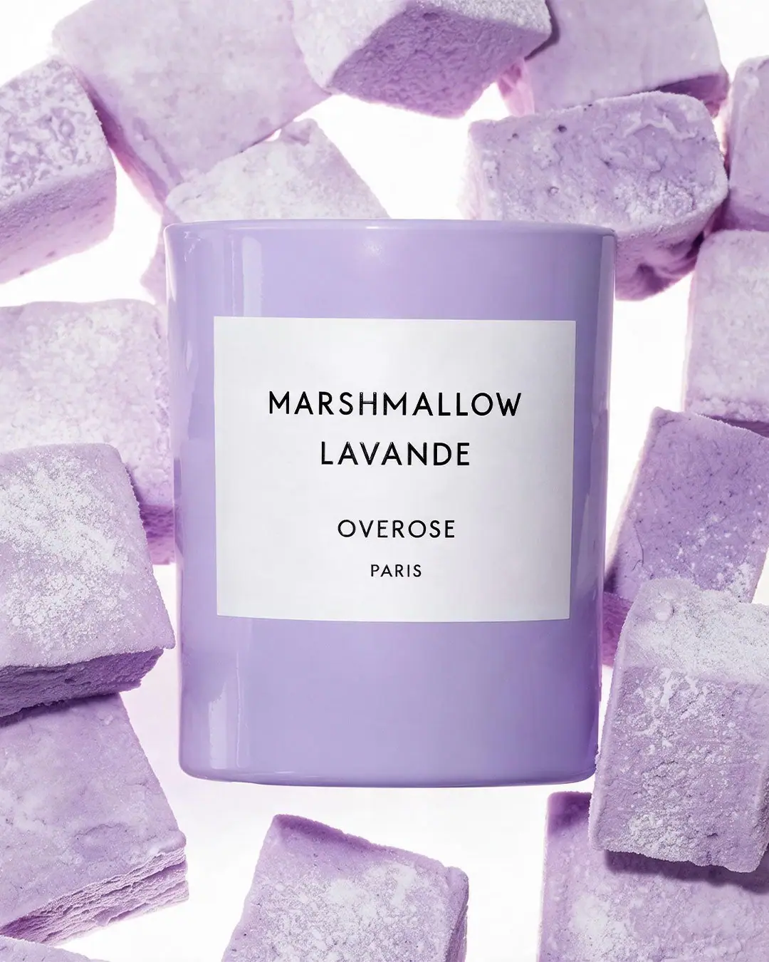
Overose
Lavender glossy cylinder with a spare black-and-white scent label