Photography: Oway official photography. Images belong to their respective owners.
Oway

mustard wrap with split lower anchors on amber spray bottle
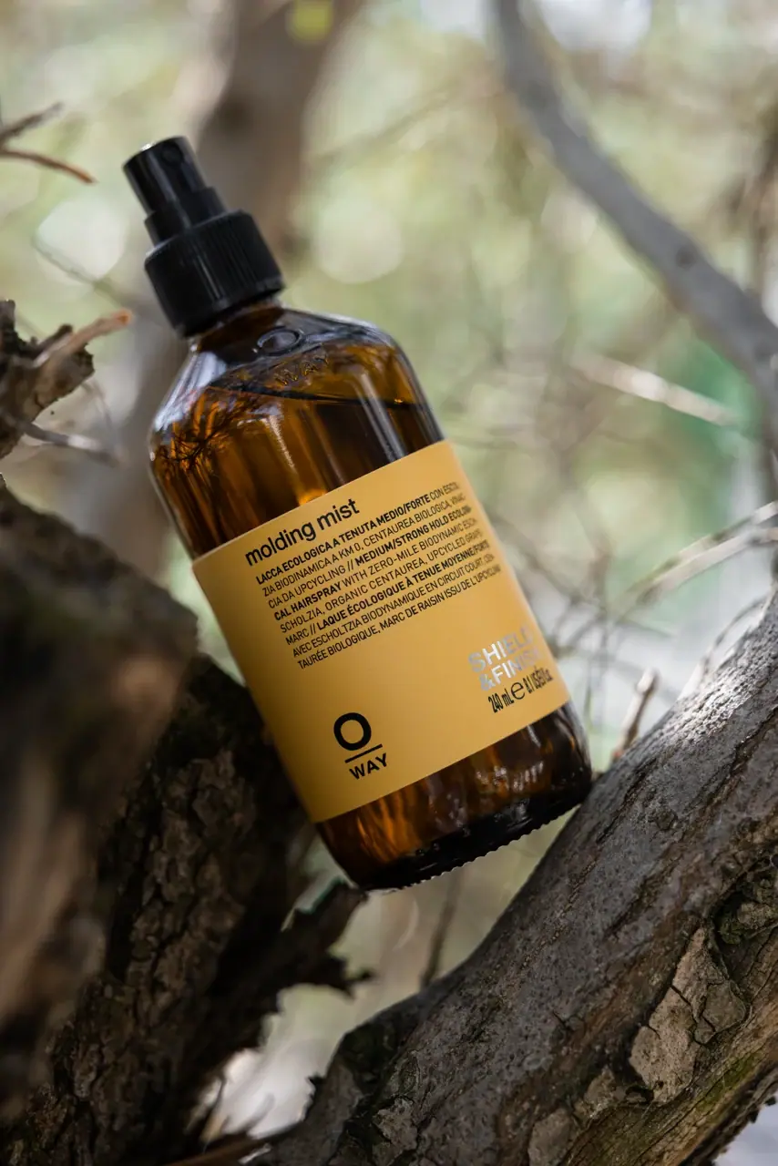
Molding Mist combines an amber bottle with a mustard-yellow rectangular information panel. The upper label is dense: a lowercase product name leads compact multilingual copy. Below that text, a broad open area separates two different anchors: a black stacked Oway mark at lower left, and pale Shield & Finish wording with quantity at lower right. The black ribbed spray collar extends the upright silhouette. The selected official photograph places the pack between tree branches; the natural setting is separate from the package's material evidence.
- Hair
- Light pack
- Apothecary
- Bold typographic
About this study
Selected yellow-label Molding Mist photograph and current official 240 mL product context. Analysis does not extend to the entire Oway styling range.
Sources & evidence · Reviewed 2026-10-19Color Palette
Approximate colours interpreted from photography. These are screen references, not official brand colours or print specifications.
Pack body
Amber appearance
#704312
Approximate transmitted brown-gold body appearance. Liquid, bottle tint, branches and reflections all affect the photographic value.
Label
Mustard-yellow panel
#D5A845
Approximate label field under filtered outdoor light. This is a visual screen reference, not a verified stock colour or ink recipe.
Ink
Black information
#171613
Approximate upper copy and lower maker mark, echoed by the dark spray assembly. Shared appearance does not mean shared material.
Pale family wording
#DDD9CA
Approximate lower-right Shield & Finish lettering, visibly lighter than the black quantity immediately beneath it.
Typography
Suggested visual alternatives, not confirmed brand typefaces. Any scale below is an illustrative estimate.
The lowercase product name starts a left-aligned upper block. Closely spaced uppercase lines beneath use a much narrower register to fit multilingual information. The lower-left identity changes scale and construction: a large O sits above a horizontal line and smaller WAY. On the opposite side, pale uppercase family wording forms a separate two-line block with quantity below. The label therefore does not end in one centred maker stack; it distributes identity and functional classification across two lower anchors.
Fonts
Product-name alternative
Inter
- Looks like
- Inter for a direct lowercase heading
- Type
- Sans serif
- Weight
- SemiBold 600
- Case
- Lowercase
- Tracking
- Natural, compact spacing
- Fallback
- Arial, sans-serif
Give the name enough weight to introduce a dense multilingual block without making it as large as a display headline. Use an original maker name elsewhere, and avoid rebuilding the O-line-WAY arrangement. The product title and maker need different positions as well as different sizes.
Compact information alternative
Barlow Condensed
- Looks like
- Barlow Condensed for narrow multilingual copy and family wording
- Type
- Condensed sans serif
- Weight
- Medium 500 / SemiBold 600
- Case
- Uppercase
- Tracking
- Close but optically checked
- Fallback
- Arial Narrow, sans-serif
Set short language units with enough leading to distinguish them on a curved bottle. Condensation can reduce line length, but should not become an excuse for unreadably small type. Use a stronger weight for a short family label and test pale-on-yellow contrast independently from black-on-yellow copy.
Structure & Proportions
Visual proportions and finish previews are illustrative. Confirmed construction details and uncertainties are distinguished in the study notes.
Proportions
| Purpose | Value | Preview |
|---|---|---|
| Label within bottle | Amber areas remain visible above and below the yellow panel, keeping the vessel part of the front composition rather than covering its entire height. | — |
| Dense top and open middle | The information block occupies the upper label; a noticeably quieter interval separates it from the lower identities. | — |
| Split lower anchors | Maker mark sits towards the left while family wording and quantity group towards the right, avoiding a single central axis. | — |
| Narrow upper assembly | The collar and actuator remain narrower than the body, extending its vertical direction without a broad projecting pump head. | — |
Shapes
| Element | Value | Preview |
|---|---|---|
| Rounded shoulder bottle | Long cylindrical-looking body, curved shoulders and short narrow neck. | |
| Label panel | Straight-edged rectangular field wrapping around the visible front and sides. | |
| Maker construction | Open circular O above a short rule and smaller word fragment. | |
| Spray assembly | Ribbed collar supporting a smaller cylindrical actuator with a compact outlet. |
Finishes
Amber glass appearance
Bottle body; glass is separately stated by the current official product page, while exact tint and surface treatment remain unspecified. · transparent
Even yellow label field
Main information panel, which appears less reflective than the surrounding body under the selected lighting. · matte
Formats and materials
| Formats | Amber cylindrical-looking bottle with rounded shoulders, narrow neck and a black spray assembly; the current official listing specifies 240 mL. |
| Materials | The accessed current official Molding Mist page explicitly identifies a glass bottle., The spray assembly, label stock, adhesive and decoration processes are not specified by the accessed product text; no complete component material schedule is inferred. |
| Closures | A broad black ribbed collar connects the narrow neck to a smaller cylindrical actuator. Fine vertical grooves create a visible grip texture around the collar, while the actuator has a smoother side and small frontal opening. It is photographed exposed, without a visible overcap. The internal mechanism, thread, transport lock and any normally supplied protection cannot be reconstructed from this view. The source identifies a hairspray product, but that does not establish a measured mist pattern or dose. |
| Decoration | Lowercase product heading over a compact multilingual text block., Asymmetrical lower maker and family/quantity anchors., Raised-looking circular and lettering detail on the shoulder, whose full manufacturing specification is unknown. |
Front Panel
Schematic reading order. The diagram’s zone heights do not represent measured artwork proportions.
The label's strongest organisational feature is its change in density. Product and descriptive copy make a compact upper rectangle. The lower area is much more open, with a black maker mark near one corner and a pale classification block near the other. Quantity belongs to the right-hand group and returns to black. This means the pale family line should not be treated as the only functional identifier: the darker name above remains necessary. The bottle's curve turns the rightmost copy away, so complete line endings are not equally readable in the photograph.
| Zone | Content |
|---|---|
| Product introduction | Lowercase molding mist at the top of the left-aligned text block. |
| Multilingual description | Dense narrow uppercase copy immediately beneath the name. |
| Open middle | Substantial yellow space between upper copy and lower graphic anchors. |
| Lower-left maker | Black O, short horizontal rule and WAY stacked into a compact identity. |
| Lower-right classification | Pale Shield & Finish wording above a darker quantity line. |
Range System
The selected label explicitly presents a Shield & Finish classification, and the current official page places Molding Mist in styling and finish. This supports a product-family context, but the one photographed pack does not prove that every related product shares yellow, this label size or the same lower layout. Comparison with additional references would be required before turning those details into a whole-range rule.
- Selected Molding Mist: amber body, mustard panel, dark upper copy and split lower anchors.
- Current official product context: 240 mL hairspray with a glass-bottle declaration.
- Original system exercise: retain comparable text positions across related products while providing clear names beyond a colour cue.
Back of Pack & Shelf
The reverse, underside and open neck are not shown. The photograph cannot establish the full language sequence, directions, barcode or component-disposal instructions. A broad environmental description of the product is not a specification for the label, dispenser or collection route.
- Inspect the full wrap before mapping language divisions or regulatory information.
- Check dispenser removal and component materials directly before writing disposal guidance.
- Test whether fine uppercase lines remain distinct when printed around the actual bottle curvature.
On shelf
Interpretation: yellow against amber creates a recognisable block before the compact upper copy becomes readable. The low black maker provides a second dark anchor, while the pale family wording is more vulnerable to low contrast. The open middle keeps the front from feeling uniformly dense, but multilingual line spacing still needs actual-size testing. When the bottle is upright rather than photographed diagonally, its layout should continue to work without relying on the scenic tilt for energy.
Imagery
The bottle is tilted between rough branches with a softly blurred woodland background. Amber reflections and mustard yellow relate visually to bark and filtered light, while the black spray remains a clean silhouette against the pale distance. This juxtaposes a manufactured rectangular information panel with irregular natural textures. The branches are not a supplied holder, and their presence does not prove a particular ingredient origin, label fibre, biodegradability or overall environmental performance.
Guidelines
Editorial principles for an original design brief, not official brand guidelines.
Do
- Use an opaque reading field when contents and reflections vary behind it.
- Separate dense description from maker and family information through spacing.
- Check pale secondary text independently from darker primary copy.
- Distinguish a sourced glass-bottle statement from unknown dispenser and label materials.
Don't
- Do not equate woodland photography with verified environmental performance.
- Do not call the whole lower label one centred oversized wordmark.
- Do not infer universal yellow range coding from this one reference.
- Do not copy Oway's stacked maker construction or exact information panel.
Sources & evidence
How this study was built
context · Sourced fact
Current official page identifies Molding Mist as a 240 mL hairspray.Oway — Molding Mist, current official product and packaging contextstructure · Sourced fact
Current official product page explicitly lists Glass bottle; it does not supply a complete component material schedule.Oway — Molding Mist, current official product and packaging contextlabel · Visual observation
Dense upper copy is separated from lower-left maker and lower-right pale family wording plus darker quantity.Oway — Molding Mist, current official product and packaging contextstructure · Visual observation
Black ribbed collar supports a smaller exposed actuator; shoulder relief is visible above the label.Oway — Molding Mist, current official product and packaging contextimagery · Visual observation
Branches, blurred woodland and diagonal placement are staging around the package.Oway — Molding Mist, current official product and packaging contextshelf · Editorial interpretation
Pale-on-yellow classification needs its own contrast test even when the main black copy is strong.
What remains unverified
- Original regional 240 mL URL returned404; current language-specific product page accessed.
- Glass is stated by the current product page; dispenser composition, label stock and full component specifications remain unknown.
- Fonts, physical dimensions and exact colour standards are unverified.
- Reverse, underside, open neck and supplied transport protection are unseen.
Give your AI
packaging taste
Give your design or image tool a packaging study: palette, type, structure, front panel and principles for an original brief.
Export this styleFree with an email. PACK.md works in Claude, ChatGPT, Cursor and image tools.
More like this
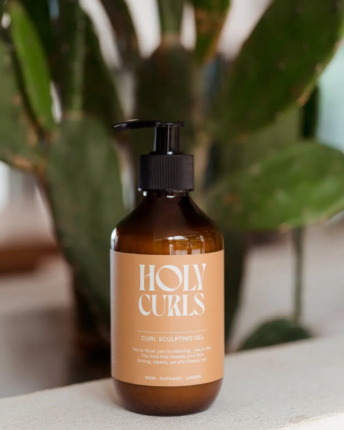
Holy Curls
Expressive white serifs on warm ochre with amber shoulders
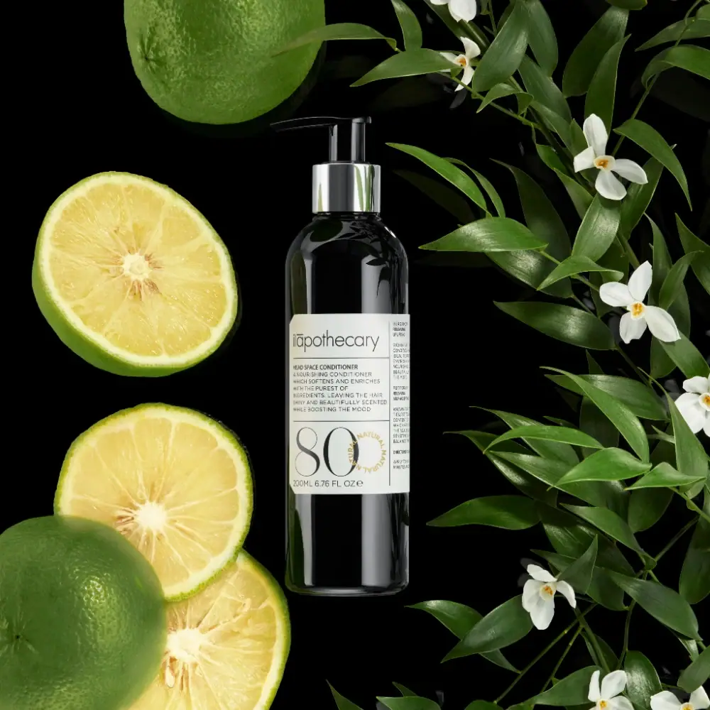
ilapothecary
Dark pump bottle with a ruled label and oversized 80
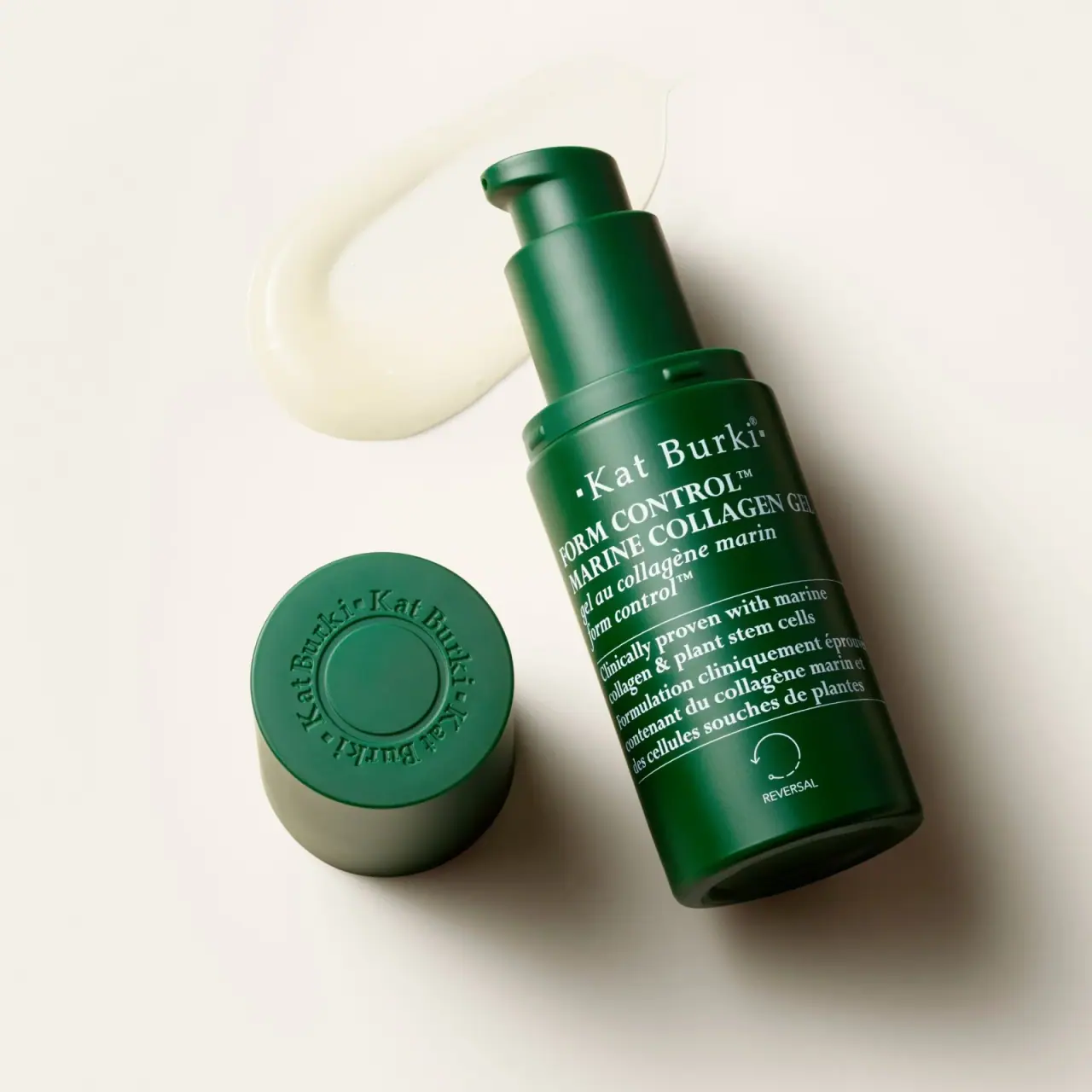
Kat Burki
Forest green, dense white serif text and sculpted cap
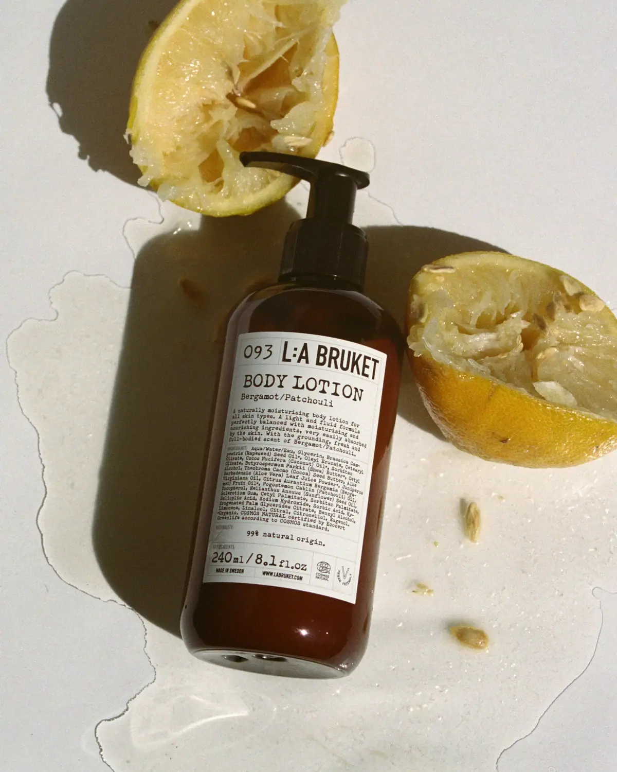
L:A Bruket
Amber pump bottle with a ruled typographic information label

D.S. & Durga
deadpan grotesk names on parchment labels

ACURE
Iridescent spectacle with practical, tightly ordered type

Aesop
a botanical still life around a disciplined apothecary label

AKT
Lilac stage directions with a quiet metallic detail