Photography: Norfolk Natural Living official photography. Images belong to their respective owners.
Norfolk Natural Living

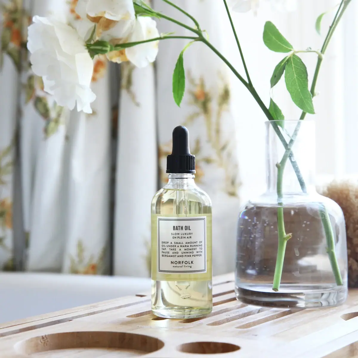
Double-bordered bath-oil label on a clear black-dropper bottle
En Plein Air Bath Oil is photographed in a tall clear bottle with pale yellow contents and a black dropper closure. A small pale rectangular label carries a fine double border and a compact sequence of product type, scent, use-oriented prose and maker signature. The visible internal pipette explains the dispensing format without an additional illustration. Flowers, a clear vase and a wooden bath bridge create the surrounding domestic context. The current official listing renders a 100 mL option, while the selected photo does not show a confidently readable capacity; the study keeps those two kinds of evidence separate.
- Body & bath
- Light pack
- Apothecary
- Clinical minimal
About this study
Selected En Plein Air Bath Oil dropper-bottle photograph. Current official listing renders 100 mL, but capacity is not independently read from the pictured unit; current and photographed wording are kept distinct.
Sources & evidence · Reviewed 2026-10-19Color Palette
Approximate colours interpreted from photography. These are screen references, not official brand colours or print specifications.
Pack body
Black dropper closure
#161A1A
Approximate bulb and ribbed collar colour. Their shared appearance does not prove identical materials.
Label
Soft white label
#F1F1E9
Approximate pale front panel, affected by the gentle daylight and yellow contents behind it.
Ink
Near-black text and border
#292C29
Approximate double rule, compact lettering and maker signature, visually echoed by the dark closure.
Accent
Pale yellow oil appearance
#E1DCA0
Approximate contents seen through the clear vessel. It is not evidence of yellow bottle resin or a colour-matched external coating.
Typography
Suggested visual alternatives, not confirmed brand typefaces. Any scale below is an illustrative estimate.
BATH OIL leads in a compact condensed uppercase style. Smaller spaced lines beneath identify SLOW LUXURY and EN PLEIN AIR. The middle of the label contains a short uppercase paragraph rather than a single slogan, giving the product an instructional and reflective voice. NORFOLK then closes the composition in a wider spaced uppercase line above a small lowercase natural living signature. The overall label is centred on the bottle, but the paragraph is a block of short lines rather than every element sharing identical centring. The double rule provides the main graphic enclosure.
Fonts
Original product-heading alternative
Barlow Condensed
- Looks like
- Compact condensed sans capitals
- Type
- Condensed sans serif
- Weight
- SemiBold, Bold
- Case
- Uppercase
- Tracking
- Normal to slightly open
- Fallback
- Arial Narrow, Arial, sans-serif
Give an original product role a clear short heading without filling the whole label. Check narrow counters when printing small dark letters on a pale stock.
Paragraph and maker alternative
Source Sans 3
- Looks like
- Plain spaced practical sans
- Type
- Humanist sans serif
- Weight
- Regular, SemiBold
- Case
- Uppercase for main information; lowercase for a small signature
- Tracking
- Moderately open in short names, normal in prose
- Fallback
- Arial, sans-serif
Keep the use paragraph readable instead of spreading every line to the border. Use a clear maker signature at the bottom with enough contrast to remain identifiable when the bottle is separated from its retail context.
Structure & Proportions
Visual proportions and finish previews are illustrative. Confirmed construction details and uncertainties are distinguished in the study notes.
Proportions
| Purpose | Value | Preview |
|---|---|---|
| Modest central label | The pale panel occupies a limited middle portion of the tall bottle, leaving clear shoulder and lower-body windows around it. | — |
| Tall narrow applicator | The black bulb adds a slim vertical extension above the ribbed collar and rounded shoulders, reinforcing the bottle's elongated outline. | — |
| Nested reading margins | The double border leaves a narrow pale margin around a compact text field. This relationship is visible, but physical margin widths and minimum text sizes are not measured. | — |
Shapes
| Element | Value | Preview |
|---|---|---|
| Bottle body | Straight cylindrical wall with rounded shoulders and a narrow neck. | |
| Dropper closure | Rounded black bulb above a short ribbed cylindrical collar. | |
| Front panel | Small upright rectangle enclosed by two fine dark rules. | |
| Paragraph field | Compact block of short uppercase lines between scent and maker. |
Finishes
Clear vessel appearance
Shoulders, lower bottle and visible pipette · transparent
Dark restrained closure appearance
Black bulb and ribbed collar · matte
Low-glare pale label
Bordered central information field · matte
Formats and materials
| Formats | Tall transparent cylindrical bottle with rounded shoulders, Black bulb-and-collar dropper closure, Visible internal pipette and pale liquid, Small double-bordered rectangular front label |
| Materials | The clear vessel has a glass-like appearance, but the inspected source does not provide a component material specification for the selected photographed bottle., The black bulb and collar may use different materials despite their coordinated colour; exact elastomer and polymer identities are unknown., Label stock, adhesive, wet-use coating and printing method are not documented. The current site's broad environmental wording is not expanded into a component-level finding for this dropper assembly. |
| Closures | The fitted closure has a tall rounded black bulb and a short vertically ribbed collar. The internal pipette is visible through the neck and liquid, making the dropper format legible. It is not removed, so the tip, graduations, neck seal and delivered amount are not measured. The current webpage's capful wording does not establish a calibrated capacity for this photographed dropper. No refill route or disassembly procedure is demonstrated. |
| Decoration | Fine double rectangular border, Condensed product-type heading, Small scent identity above a use-oriented paragraph, Separated lower maker signature, No botanical illustration printed on the visible label |
Front Panel
Schematic reading order. The diagram’s zone heights do not represent measured artwork proportions.
A double-line rectangular border contains the entire visible reading sequence. The product role comes first, followed closely by the scent name and a short prose block about adding oil to a bath and taking a moment to pause. The maker signs the composition at the bottom rather than occupying the largest top position. This gives the label a small instruction-card character. Its visual field appears orderly, but it sits on a cylindrical wall rather than a physically flat bottle face. The printed paragraph is a use prompt, not a measured dosage diagram.
| Zone | Content |
|---|---|
| Product heading | BATH OIL in compact bold condensed capitals. |
| Positioning and scent | Small SLOW LUXURY and EN PLEIN AIR lines immediately below the product type. |
| Use-oriented prose | Several short lines describing a bath ritual, with ingredient-related scent wording. No numbered dose or pipette graduation is visible here. |
| Maker signature | NORFOLK above smaller natural living at the lower centre. |
| Framing rules | Two fine rectangular borders defining the label without an illustrated or coloured variant band. |
Range System
The current Bath Oil listing includes several named scents and renders En Plein Air with a 100 mL size option in the accessed page. This corrects older shared wording that called the current listing 250 mL, but does not independently measure the photographed vessel. The label's close placement of product type and scent supports straightforward variant reading. Its photographed wording also should not be assumed to reproduce the current online note list exactly: editions and information can change. No other scent bottle is visually compared here.
- BATH OIL establishes format before the smaller En Plein Air name.
- The current listing supplies 100 mL context, while the image capacity remains unconfirmed.
- A hypothetical original series could keep the short product/scent pairing stable, but each formula's directions and descriptive copy should be checked individually.
Back of Pack & Shelf
The rear, underside and any outer packaging are not visible. The front's use paragraph is not a complete ingredient or directions panel.
- No barcode, batch field, full ingredient list or capacity placement is established on the selected physical pack.
- Current online instructions are not used to reconstruct a photographed reverse or to claim the pipette measures a specified dose.
- For original artwork, reserve a separate readable area for the product's own verified practical information rather than relying on a lifestyle paragraph alone.
On shelf
As a visual interpretation, the double border gives the otherwise small pale label a definite edge against clear liquid and changing backgrounds. The product-first heading helps identify its use before the maker is read. The cost of fitting a prose block into a small panel is reduced readability at a distance, especially around the cylinder's sides. A practical assessment would test the label on a wet bathroom counter and under ordinary indoor light, without assuming that the bright editorial photograph guarantees legibility or label durability.
Imagery
The bottle stands on a slatted wooden bath bridge beside a clear vase holding green stems and white flowers. Pale patterned curtains and soft window light create a quiet domestic setting. The vase echoes the bottle's transparency, while the black dropper gives the smaller object a distinct top. Neither flowers nor surrounding objects obscure the front label. They remain scene elements: the vase is not a supplied accessory, and the particular flowers should not be treated as a verified formula ingredient demonstration. Gentle reflections keep the pale contents visible without a strong coloured campaign background.
Guidelines
Editorial principles for an original design brief, not official brand guidelines.
Do
- Keep product type close to scent identification.
- Separate an evocative use paragraph from calibrated dose information.
- Check current size information against the actual photographed edition.
- Use a clear border to define a small label on a transparent body.
- Test compact prose at physical size and ordinary indoor light.
Don't
- Do not call the current accessed listing 250 mL.
- Do not assert the photographed capacity without a readable mark or exact confirmation.
- Do not infer dropper dose from generic capful instructions.
- Do not treat a global refill banner as proof of this format's refill system.
- Do not copy the exact double-border hierarchy and maker signature.
Sources & evidence
How this study was built
edition · Sourced fact
The accessed official listing renders Size 100ML and Scent En Plein Air, unlike the older 250 mL shared description.Bath Oil — Norfolk Natural Livingstructure · Visual observation
A clear cylindrical bottle shows pale liquid and an internal pipette below a black bulb-and-ribbed-collar closure.Bath Oil — Norfolk Natural Livinglabel · Visual observation
A pale rectangular label with double rules contains product type, scent, a short use paragraph and a lower maker signature.Bath Oil — Norfolk Natural Livingtypography · Visual observation
The heading is condensed and prominent; smaller prose creates a compact information block rather than a large decorative slogan.Bath Oil — Norfolk Natural Livingrange · Editorial interpretation
Current size and directions are not transferred into measured claims about the photographed dropper or unseen printed panels.imagery · Visual observation
The bath bridge, clear vase and white flowers create domestic context while leaving the small bordered label unobstructed.Bath Oil — Norfolk Natural Living
What remains unverified
- The photographed bottle's capacity is not readable; current listing size is context only.
- Exact materials, label stock, printing process, fonts and dimensions are unverified.
- The pipette's dose and refillability are not established by generic online wording.
- Reverse, underside and outer packaging are absent; current note lists need not match the photographed edition exactly.
Give your AI
packaging taste
Give your design or image tool a packaging study: palette, type, structure, front panel and principles for an original brief.
Export this styleFree with an email. PACK.md works in Claude, ChatGPT, Cursor and image tools.
More like this
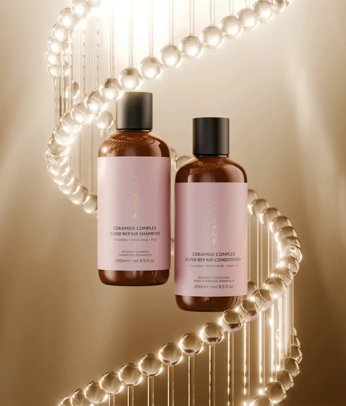
Monpure
Amber duo with rose labels and vertical gold identities
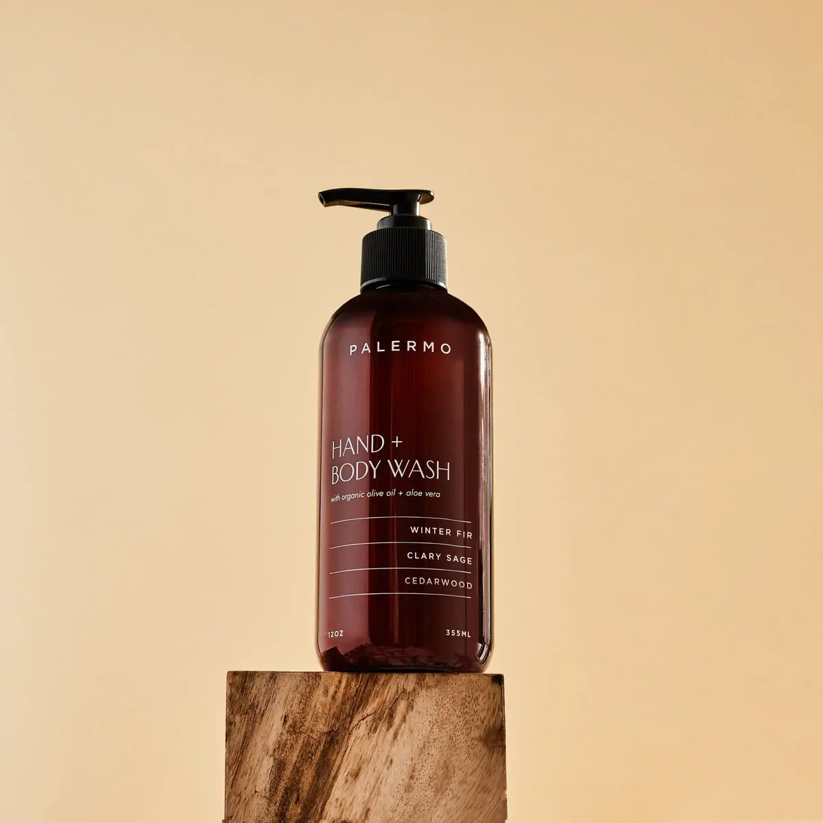
Palermo Body
Amber wash bottle with airy maker and ruled scent rows
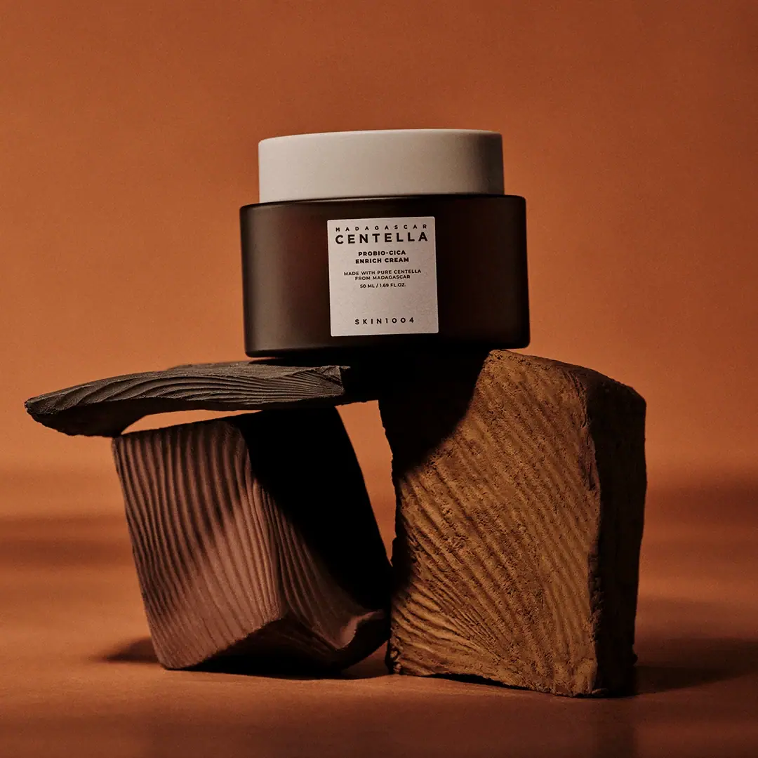
SKIN1004
cream lid above a brown jar and clinical panel
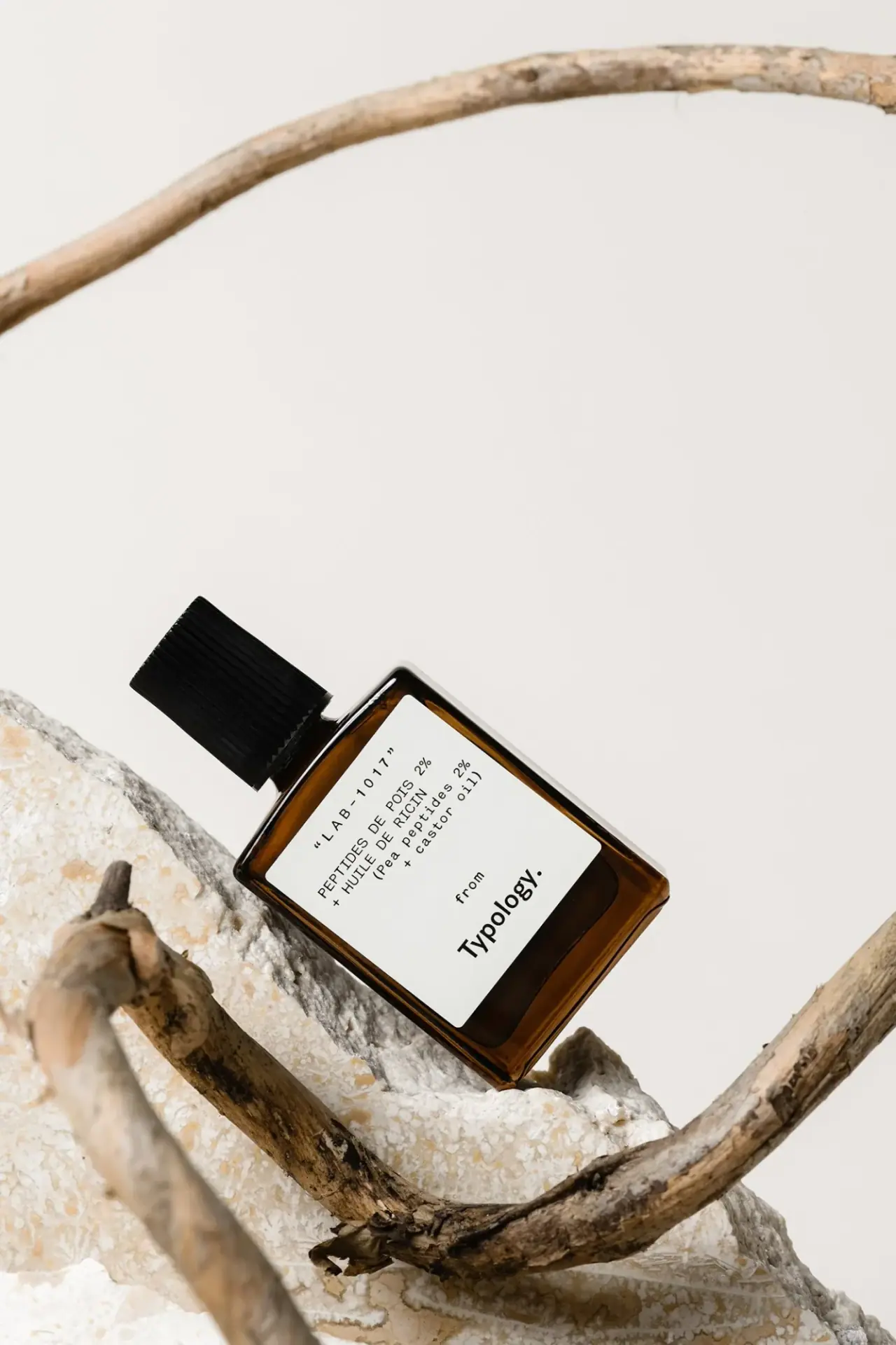
Typology
amber rectangle with a code-led bilingual white formula label

Aesop
a botanical still life around a disciplined apothecary label

African Botanics
Technical black label with a low serif signature

AussieZinc
Sun-yellow numerals on a tall, information-rich white cylinder

bareMinerals
a restrained black compact framing the powder itself