Photography: Palermo Body official photography. Images belong to their respective owners.
Palermo Body

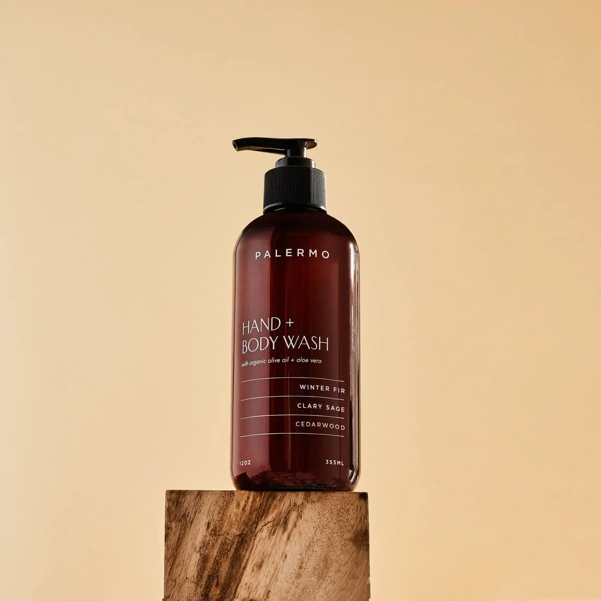
Amber wash bottle with airy maker and ruled scent rows
Winter Fir Hand + Body Wash uses a tall brown-toned pump bottle and pale typography, with a more varied alignment system than its quiet appearance first suggests. PALERMO is spaced near the shoulder; the large function name is left aligned; three scent rows align to the right between fine rules; and the two quantity marks sit at opposite lower corners. The seasonal identity comes through those words rather than a holiday illustration or bright badge. A black pump and simple warm setting keep attention on the front structure.
- Body & bath
- Dark pack
- Apothecary
- Clinical minimal
About this study
Selected Winter Fir 12 oz / 355 ml seasonal bottle. Holiday collection and older indexed seasonal product page accessed; regular Bergamot + Lavender refill specifications are kept separate.
Sources & evidence · Reviewed 2026-10-19Color Palette
Approximate colours interpreted from photography. These are screen references, not official brand colours or print specifications.
Pack body
Deep amber brown
#5B241E
Approximate filled-bottle appearance, with warmer translucent edges and darker central areas under the studio lighting.
Ink
Warm pale copy
#E2DAD1
Maker, function, scent lines, rules and quantities share a pale warm appearance against the brown body.
Accent
Pump black
#141412
Head, stem and ribbed collar form a dark upper silhouette with narrow warm reflections.
Typography
Suggested visual alternatives, not confirmed brand typefaces. Any scale below is an illustrative estimate.
The small PALERMO wordmark uses widely spaced uppercase sans letters near the shoulder. Lower down, HAND + and BODY WASH form the largest text in a thin, open sans style, aligned left. A tiny italic descriptor sits directly underneath. The scent names use smaller spaced capitals aligned right, one per ruled row. At the bottom, 12OZ and 355ML occupy opposite corners. The system creates hierarchy through weight, position and alignment rather than simply centering every line.
Fonts
Airy maker and large function
Raleway
- Looks like
- Light geometric sans
- Type
- Geometric sans-serif
- Weight
- Light, Medium
- Case
- Uppercase
- Tracking
- Wide maker spacing; natural open function spacing
- Fallback
- Arial, sans-serif
Use for an original short maker and a light two-line category name. Keep the maker modest in size and let the function title use the available width without tracing the source lettering.
Scent rows and small descriptor
Source Sans 3
- Looks like
- Compact neutral sans with italic
- Type
- Humanist sans-serif
- Weight
- Regular, Medium
- Case
- Uppercase scent rows; mixed-case descriptor
- Tracking
- Open scent spacing; natural italic spacing
- Fallback
- Arial, sans-serif
Alternative for right-aligned notes, small quantity and a brief italic ingredient-positioning line. Make sure the finest text survives curved-surface highlights.
Structure & Proportions
Visual proportions and finish previews are illustrative. Confirmed construction details and uncertainties are distinguished in the study notes.
Proportions
| Purpose | Value | Preview |
|---|---|---|
| Tall narrow body | A long straight front provides room for distinct maker, function, scent and quantity zones without filling every interval. | — |
| Upper breathing room | A substantial gap separates the shoulder-level maker from the larger product function below. | — |
| Ruled scent area | Fine lines extend farther left than the right-aligned note words, giving each row a clear shared width. | — |
| Compact pump | The black closure adds a modest upper extension relative to the tall bottle, with its head projecting left beyond the neck. | — |
Shapes
| Element | Value | Preview |
|---|---|---|
| Bottle silhouette | Tall cylinder with rounded shoulders and softly rounded base corners. | |
| Dispensing head | Flat black projecting pump above a fine-ribbed collar. | |
| Scent rows | Three narrow text bands divided by thin horizontal rules that curve with perspective. | |
| Function block | Two large left-aligned lines above a much smaller italic descriptor. |
Finishes
Brown reflective appearance
Body shows a broad warm highlight and darker central field; substrate and coating unverified. · gloss
Translucent edge appearance
Light passes through brown-toned side areas; not proof of glass or UV-filtering performance. · transparent
Formats and materials
| Formats | Tall rounded-shoulder pump bottle; photo and official seasonal product page show 12 oz / 355 ml |
| Materials | The brown body has a smooth translucent-looking appearance and a visible central internal line. The accessed seasonal listing does not identify glass, plastic resin, recycled content or a tinting method., The black pump includes a finely ribbed collar and a smooth flat head. Component polymers, spring material and refill compatibility are not specified for this exact seasonal bottle. Amber appearance alone does not establish a verified light-protection function. |
| Closures | A raised black pump points left with a flat elongated head, short visible stem and tall ribbed collar. Fine grooves provide a grip-like texture around the neck while the head catches a narrow highlight. Rounded shoulders lead smoothly into the straight body. The selected view does not reveal locking direction, dose, inner seal or the way the pump attaches beneath the collar. |
| Decoration | Spaced small maker near the shoulder, Large light-weight left-aligned function name, Tiny italic descriptor beneath function, Three right-aligned scent rows separated by rules, Split quantity marks at lower corners |
Front Panel
Schematic reading order. The diagram’s zone heights do not represent measured artwork proportions.
The front moves between three alignments while staying orderly. The maker is centered high, the function begins from the left, and the scent rows end against a consistent right edge. Fine rules connect the rows into one system, preventing the alternating alignment from feeling arbitrary. The bottom quantities are split across the available width. No colored badge announces the seasonal edition; the Winter Fir wording does that work within the same restrained structure.
| Zone | Content |
|---|---|
| Maker | PALERMO appears near the shoulder in small widely spaced pale capitals. |
| Function | HAND + BODY WASH is arranged across two light-weight left-aligned lines. |
| Small descriptor | A tiny italic line references organic olive oil and aloe vera as photographed label wording. |
| Scent information | WINTER FIR, CLARY SAGE and CEDARWOOD form three right-aligned rows between fine rules. |
| Net contents | 12OZ sits at the lower left and 355ML at the lower right; the source lists the same size. |
Range System
The official holiday collection identifies Winter Fir as a limited edition, and its linked seasonal product page confirms the size. That page separately links a Bergamot + Lavender refill; it is not evidence of a Winter Fir refill. The selected front shows how a seasonal scent can fit into a restrained wash-bottle layout, but broader material or refill rules are not established for the entire brand.
- Use explicit scent rows when the bottle color remains quiet and consistent.
- Let different alignment roles organize maker, function and notes without adding multiple panels.
- Document a refill as its own product and scent instead of transferring its properties to every bottle.
Back of Pack & Shelf
The reverse, underside and open pump are unseen. The seasonal product page's ingredient text is not used to reconstruct a back label, particularly because its listed scent ingredients do not clearly match the Winter Fir front.
- Inspect the actual rear label before confirming formula or instruction layout.
- Do not assign the regular wash refill's equivalence statement to this seasonal bottle.
- Confirm component materials before stating a recycling route.
On shelf
Interpretively, the familiar amber-and-black structure gives the bottle an apothecary association, while the light function lettering keeps it less dense than a traditional pharmacy label. Small right-aligned notes invite closer reading after the larger category is recognized. Because the body is dark and reflective, fine pale rules can fade under glare. An original design should test the full system with a partly empty bottle and in ordinary sink-side lighting, not only on a warm studio pedestal.
Imagery
The bottle stands on a warm wood-grain block against a plain tan background. Its position on the narrow pedestal gives the pump and long silhouette a clear outline. Side light reveals the brown transparency and pale copy without adding many competing objects. The wood grain belongs to the support, not a printed bottle pattern or a verified packaging material. No fir branch or literal holiday ornament is needed for the scent wording to carry the seasonal reference.
Guidelines
Editorial principles for an original design brief, not official brand guidelines.
Do
- Assign different alignments clear roles.
- Keep scent rows readable with restrained rules.
- Record the seasonal edition separately from regular refills.
- Use the actual visible quantity and source size together.
- Check fine pale text on the reflective brown field.
Don't
- Do not describe the whole front as centered.
- Do not assume amber means glass or UV protection.
- Do not transfer a different scent's refill specifications.
- Do not turn the wood pedestal into package material.
- Do not resolve inconsistent source ingredients by inventing a formula.
Sources & evidence
How this study was built
edition · Sourced fact
Official holiday collection labels Winter Fir limited edition; linked product page specifies 12 oz / 355 ml.Palermo Body — Holiday Collection · Palermo Body — Hand + Body Wash Winter Firstructure · Visual observation
Brown rounded-shoulder cylinder has a black raised pump with finely ribbed collar.Palermo Body — Hand + Body Wash Winter Firtypography · Visual observation
Spaced maker sits above thin large function text and smaller italic descriptor.Palermo Body — Hand + Body Wash Winter Firlabel · Visual observation
Function aligns left, scent rows align right, and quantity marks occupy opposite lower corners.Palermo Body — Hand + Body Wash Winter Firpalette · Visual observation
Brown body, pale copy and black pump define the pack; tan background and wood remain external.Palermo Body — Hand + Body Wash Winter Firimagery · Visual observation
Wood pedestal and warm plain background emphasize the tall silhouette without literal seasonal illustration.Palermo Body — Hand + Body Wash Winter Firrange · Editorial interpretation
Text-based seasonal differentiation is transferable; a linked regular-scent refill does not prove a matching Winter Fir refill.
What remains unverified
- Non-www product URL failed; linked www page returned an older indexed rendering.
- Bottle/pump composition, tinting, print process and refill compatibility unverified.
- Source ingredient list not treated as definitive seasonal formula because of apparent scent mismatch.
- Reverse, pump internals, original fonts and measured dimensions unseen or unknown.
Give your AI
packaging taste
Give your design or image tool a packaging study: palette, type, structure, front panel and principles for an original brief.
Export this styleFree with an email. PACK.md works in Claude, ChatGPT, Cursor and image tools.
More like this
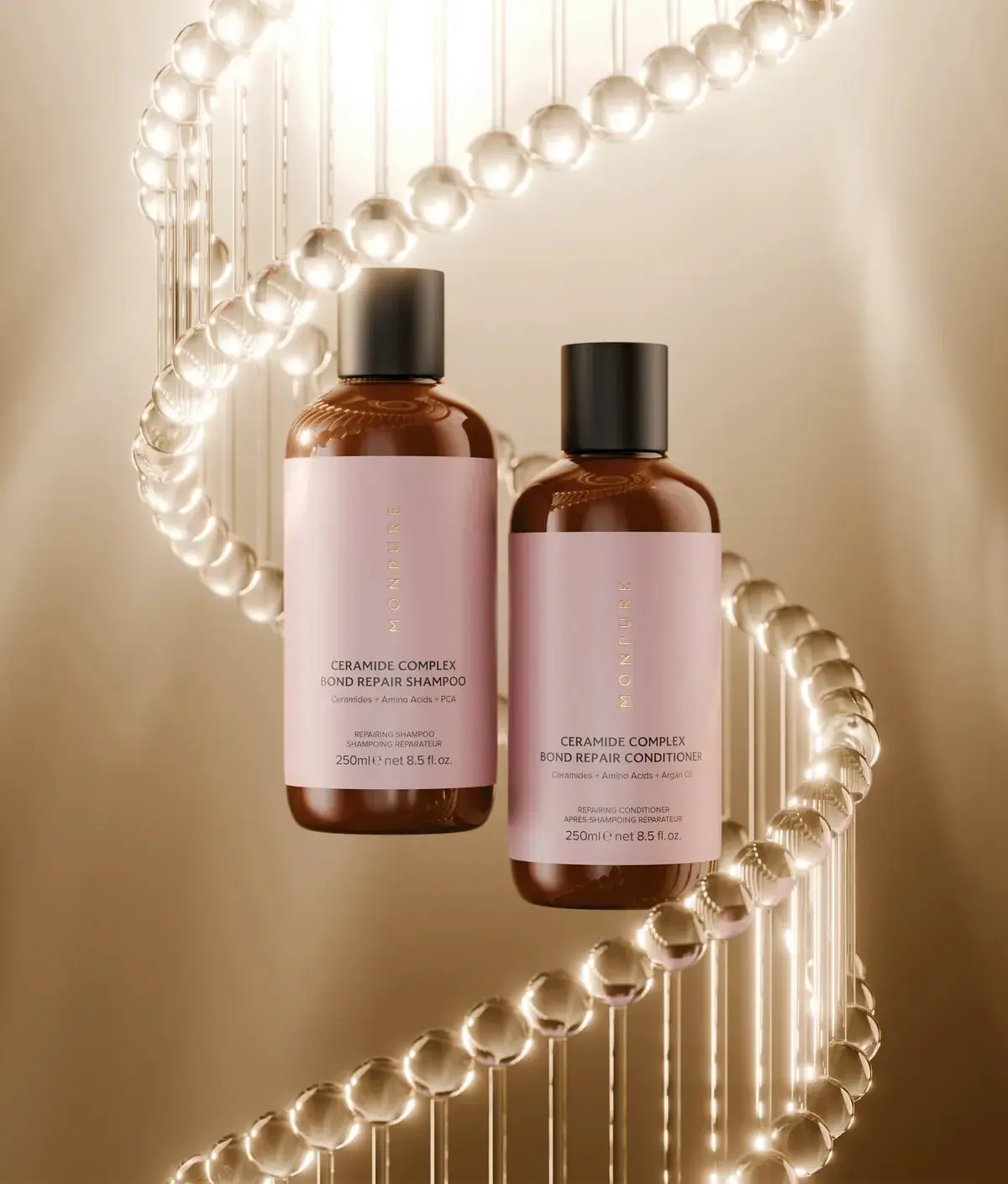
Monpure
Amber duo with rose labels and vertical gold identities
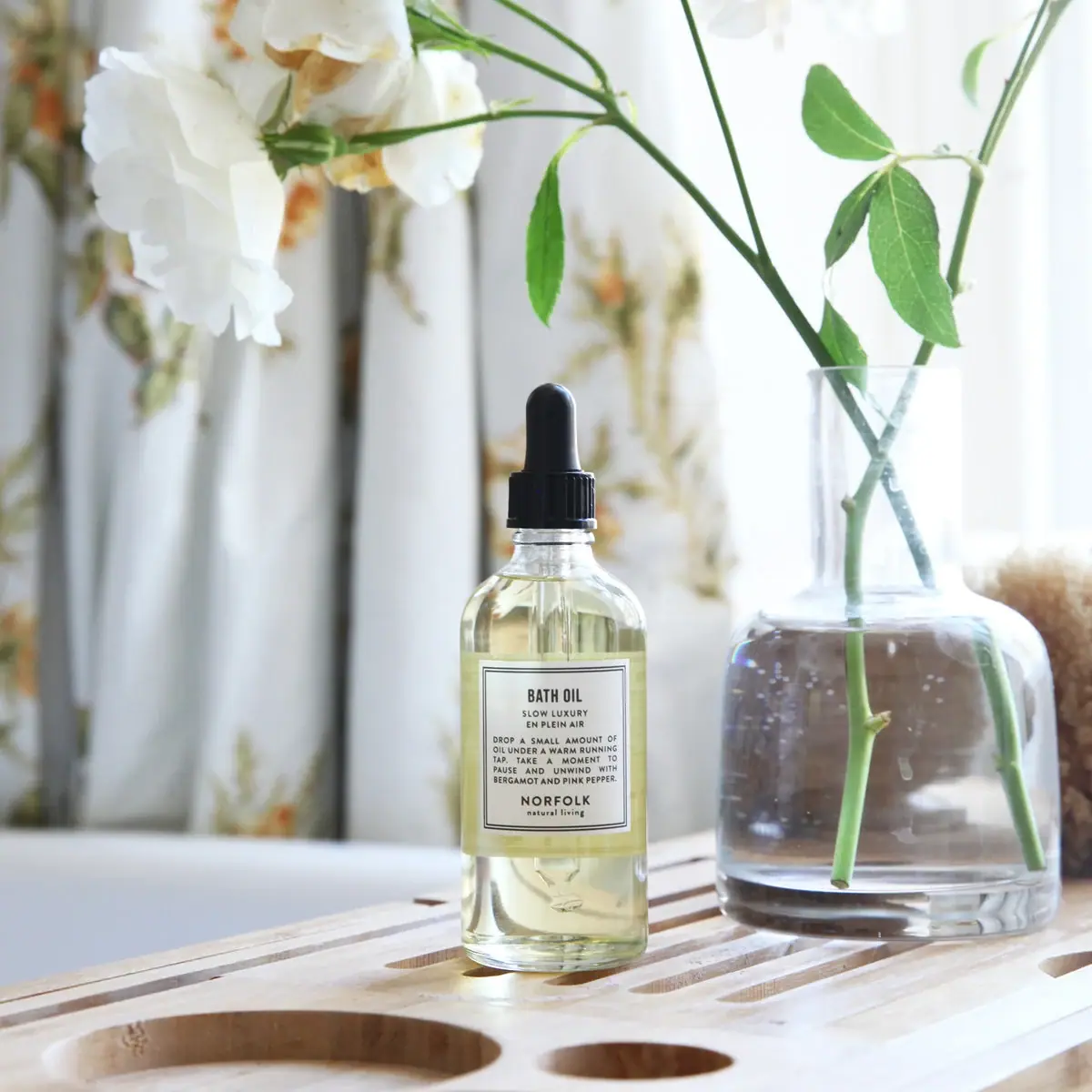
Norfolk Natural Living
Double-bordered bath-oil label on a clear black-dropper bottle
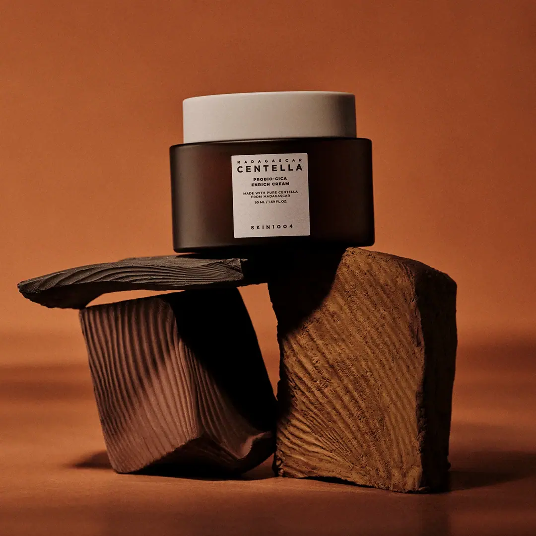
SKIN1004
cream lid above a brown jar and clinical panel
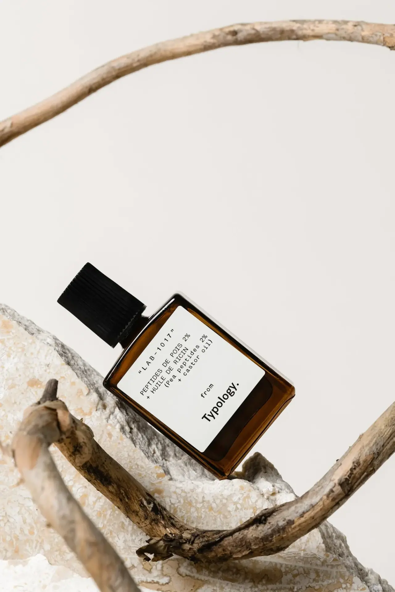
Typology
amber rectangle with a code-led bilingual white formula label

Aesop
a botanical still life around a disciplined apothecary label

African Botanics
Technical black label with a low serif signature

AussieZinc
Sun-yellow numerals on a tall, information-rich white cylinder

bareMinerals
a restrained black compact framing the powder itself