Photography: Solara Suncare official photography. Images belong to their respective owners.
Solara Suncare

Spacious white cylinder with handwritten name and sunshine-coloured facts
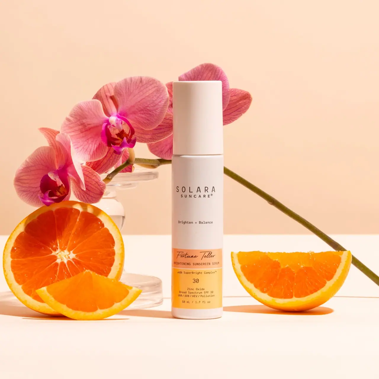
Fortune Teller balances a tall, mostly white bottle with a compact orange-and-yellow information panel near the base. Widely spaced SOLARA lettering and a small Brighten + Balance line occupy the open upper field. The lower panel changes character: a cursive product name sits above condensed functional wording, then a separate 30 and compact sunscreen facts. The selected front reads 50 mL / 1.7 fl oz. Its long fitted cap conceals the dispensing mechanism, while orange fruit and pink orchid in the official photograph amplify warmth without becoming printed package graphics.
- Suncare
- Light pack
- Clinical minimal
- Colour-coded range
About this study
Selected capped Fortune Teller front with 50 mL mark and orange-yellow panel. Current MicroTint options are contextual; no tint or formula edition is assigned to the image.
Sources & evidence · Reviewed 2026-10-19Color Palette
Approximate colours interpreted from photography. These are screen references, not official brand colours or print specifications.
Pack body
Warm white body and cap
#F0E2D8
Approximate white appearance under peach-toned light. The warm cast is not proof of a deliberately pink substrate.
Label
Apricot name strip
#F2AA72
Upper coloured section carrying the cursive product name and small descriptor.
Golden yellow facts
#F5C45C
Lower field containing the protection identifier and compact information. It is separate from the orange fruit prop.
Ink
Dark brown-black copy
#403027
Maker, script name and fine facts appear dark against light fields; exact ink hue is unverified.
Typography
Suggested visual alternatives, not confirmed brand typefaces. Any scale below is an illustrative estimate.
The upper maker uses widely spaced narrow capitals, with a smaller SUNCARE line below. A distant small benefit phrase follows in the open white area. Near the base, Fortune Teller switches to a loose handwritten script, making the product name feel distinct from the controlled maker. Condensed uppercase functional copy sits immediately below the script. A white divider leads to the lower yellow zone, where a plain 30 receives its own line above smaller technical wording and volume. The type system mixes personality and utility through changes in letterform, spacing and position rather than enlarging every element.
Fonts
Original spaced maker alternative
Barlow Condensed
- Looks like
- Narrow restrained sans capitals
- Type
- Condensed sans serif
- Weight
- Regular, Medium
- Case
- Uppercase
- Tracking
- Wide
- Fallback
- Arial Narrow, sans-serif
Build a different maker with measured spacing, ensuring that a short name still reads as a word rather than scattered letters on a narrow bottle.
Original handwritten title alternative
Caveat
- Looks like
- Light flowing script
- Type
- Handwritten
- Weight
- Regular, Medium
- Case
- Title case
- Tracking
- Natural
- Fallback
- cursive
Use a new product title with a readable handwritten rhythm. Avoid tracing Fortune Teller and test joins and thin strokes against a coloured field at actual size.
Compact factual alternative
Roboto Mono
- Looks like
- Plain technical monospace
- Type
- Monospace
- Weight
- Regular, Medium
- Case
- Mixed case and numerals
- Tracking
- Normal
- Fallback
- monospace
A useful original companion for short numbers and specifications. It is not an attribution of the observed font, and longer mandatory information must not be compressed simply to fit the visual style.
Structure & Proportions
Visual proportions and finish previews are illustrative. Confirmed construction details and uncertainties are distinguished in the study notes.
Proportions
| Purpose | Value | Preview |
|---|---|---|
| Open upper field | Most of the visible body above the coloured panel is white, giving the small maker and mid-body phrase separate breathing room. | — |
| Concentrated lower information | The coloured panel gathers many short lines into the lower portion rather than distributing technical copy evenly down the entire bottle. | — |
| Tall fitted cap | The plain cap is long enough to contribute strongly to the vertical silhouette, while its aligned width avoids a pronounced shoulder break. | — |
Shapes
| Element | Value | Preview |
|---|---|---|
| Closed bottle | Slender straight cylinder with softly rounded upper and lower edges. | |
| Opaque cap | Long plain cylindrical cover aligned closely with the body. | |
| Name strip | Short horizontal apricot band wrapping the lower body. | |
| Facts panel | Larger yellow rectangle immediately below a fine white divider. |
Finishes
Quiet white exterior
Body and fitted cap; tactile process unknown · matte
Flat coloured information appearance
Orange and yellow lower panel; stock and varnish unknown · matte
Formats and materials
| Formats | Tall slim cylindrical bottle, Long fitted opaque cap aligned with body width, White upper body and coloured lower information panel, Selected front reads 50 mL / 1.7 fl oz |
| Materials | Opaque white body and cap are visible, but their substrate and recycled content are not verified., No clear boundary establishes whether the lower colours are printed directly or carried on an applied label., The catalogue identifies a pump-bottle format, but the selected capped photograph does not expose the pump or prove airless construction. |
| Closures | The cap occupies a substantial upper section and meets the body at a narrow horizontal seam. Its plain white surface continues the cylindrical silhouette without visible grip ribs or a contrasting collar. The pump, nozzle and neck remain concealed. Attachment, internal assembly, dose, travel lock and refill access are not established. This closed presentation therefore supports analysis of the clean outer form rather than a technical account of its dispensing system. |
| Decoration | Spaced upper maker with substantial surrounding white space, Small isolated benefit phrase at mid-body, Cursive title on an apricot strip, Golden lower block with centred number and fine factual copy |
Front Panel
Schematic reading order. The diagram’s zone heights do not represent measured artwork proportions.
The label architecture has two very different densities. The upper white region isolates maker and a short benefit phrase; the lower coloured panel carries the product name and practical details. Fortune Teller is cursive rather than a block of uppercase title lettering. Its orange strip includes a small sunscreen-serum descriptor, and a fine white rule separates that identity section from the yellow factual field. The larger 30 is followed by smaller zinc-oxide and broad-spectrum wording, additional printed claims and volume. Those claims are recorded as visible communication, not independently evaluated performance evidence.
| Zone | Content |
|---|---|
| Upper maker | Spaced SOLARA with smaller SUNCARE underneath. |
| Mid-body phrase | Small Brighten + Balance wording on an otherwise open white field. |
| Apricot identity strip | Handwritten-looking Fortune Teller above a compact uppercase sunscreen-serum descriptor. |
| Yellow factual field | SuperBright wording, separate 30, compact protection-related copy and 50 mL / 1.7 fl oz. |
Range System
The current official page offers MicroTint 1 and MicroTint 2 under the Fortune Teller tinted-serum listing. No readable MicroTint designation appears on the selected front, so neither option is assigned to this photograph. The lower panel demonstrates a potential colour-bearing variant area, but the study does not infer a complete brand-wide palette or assert that the two current tints use different packaging colours. The useful repeatable principle is a stable maker field above a more detailed product field. Each other product or edition needs its own image before that principle becomes a verified range rule.
- The selected front names Fortune Teller and shows SPF-related information without identifying a current MicroTint number.
- The current source lists two MicroTint options; a default website selection is insufficient to identify this image.
- An original range could retain a quiet upper maker while varying a lower product panel, provided explicit variant text remains readable.
Back of Pack & Shelf
Reverse, base markings and opened dispensing top are not visible. The dense lower front is not a substitute for a complete packaging review.
- No full ingredient declaration, barcode, batch or expiry position is established.
- Current formula percentages and website claims are not inserted into unseen photographed artwork.
- The front's quantity is readable, but no physical dimensions or packaging material specification follows from it.
On shelf
The white cylinder offers a calm silhouette, while the coloured foot helps distinguish this product within a pale display. This is a visual inference rather than a tested recognition result. The small maker benefits from open space but may be less legible at distance than the lower colour block. A practical review would check the script title and compact protection facts at real size, including glare and curved edges. The generous white area should not be mistaken for proof that all of the information is equally easy to read.
Imagery
The bottle stands upright among cut oranges, a pink orchid stem and clear pedestal-like objects on a warm peach set. Strong directional light produces defined shadows and makes the orange-and-yellow panel feel related to the citrus props. The pink flowers supply a separate colour accent that does not appear on the package itself. Neither orchid nor orange pieces establish the complete ingredient list or exact source of any active. The clear props support the composition but are not evidence that the bottle is glass. The selected cap remains fitted throughout the image.
Guidelines
Editorial principles for an original design brief, not official brand guidelines.
Do
- Distinguish script product naming from spaced maker lettering.
- Use colour blocks to group related information.
- Preserve the visible 50 mL quantity without inventing dimensions.
- Keep current tint options separate from an unidentified photographed variant.
- Test small factual copy at real size.
Don't
- Do not assume an airless pump from a closed white cylinder.
- Do not turn orchid pink into a packaging colour.
- Do not assign MicroTint 1 merely because it is the website default.
- Do not describe the whole front as plain white when its lower panel is coloured.
- Do not copy SPF or clinical claims into an untested fictional concept.
Sources & evidence
How this study was built
range · Sourced fact
Official current page lists Fortune Teller SPF 30 with MicroTint 1 and 2 options.Fortune Teller Tinted Brightening Serum SPF 30 — Solara Suncarelabel · Visual observation
Selected front reads 50 mL / 1.7 fl oz, with no readable MicroTint number.Fortune Teller Tinted Brightening Serum SPF 30 — Solara Suncaretypography · Visual observation
Spaced maker contrasts with cursive Fortune Teller and compact lower factual copy.Fortune Teller Tinted Brightening Serum SPF 30 — Solara Suncarepalette · Visual observation
Apricot upper strip and yellow lower field are separated by a fine white rule.Fortune Teller Tinted Brightening Serum SPF 30 — Solara Suncarestructure · Visual observation
Long opaque cap conceals the dispensing mechanism and aligns with the white cylinder.Fortune Teller Tinted Brightening Serum SPF 30 — Solara Suncareimagery · Editorial interpretation
Orchid, oranges and clear props create context without establishing package materials or full formula contents.Fortune Teller Tinted Brightening Serum SPF 30 — Solara Suncare
What remains unverified
- No opened pump, reverse, material or decoration-process specification.
- No selected MicroTint identifier or formula-edition date.
- Exact typefaces and production colours unknown.
- Printed protection-related claims are observed artwork, not independently tested findings.
Give your AI
packaging taste
Give your design or image tool a packaging study: palette, type, structure, front panel and principles for an original brief.
Export this styleFree with an email. PACK.md works in Claude, ChatGPT, Cursor and image tools.
More like this

Byoma
candy-coloured barrier science on a shelf
CeraVe
white pump bottles split by a coloured diagonal

Cocokind
sideways lowercase on spa-water pastels
FEKKAI
Green styling duo with vertical hairline maker and white actuators
Glossier
clean white tubes with candy accents

Herbivore
pastel tinted vessels with a white tag
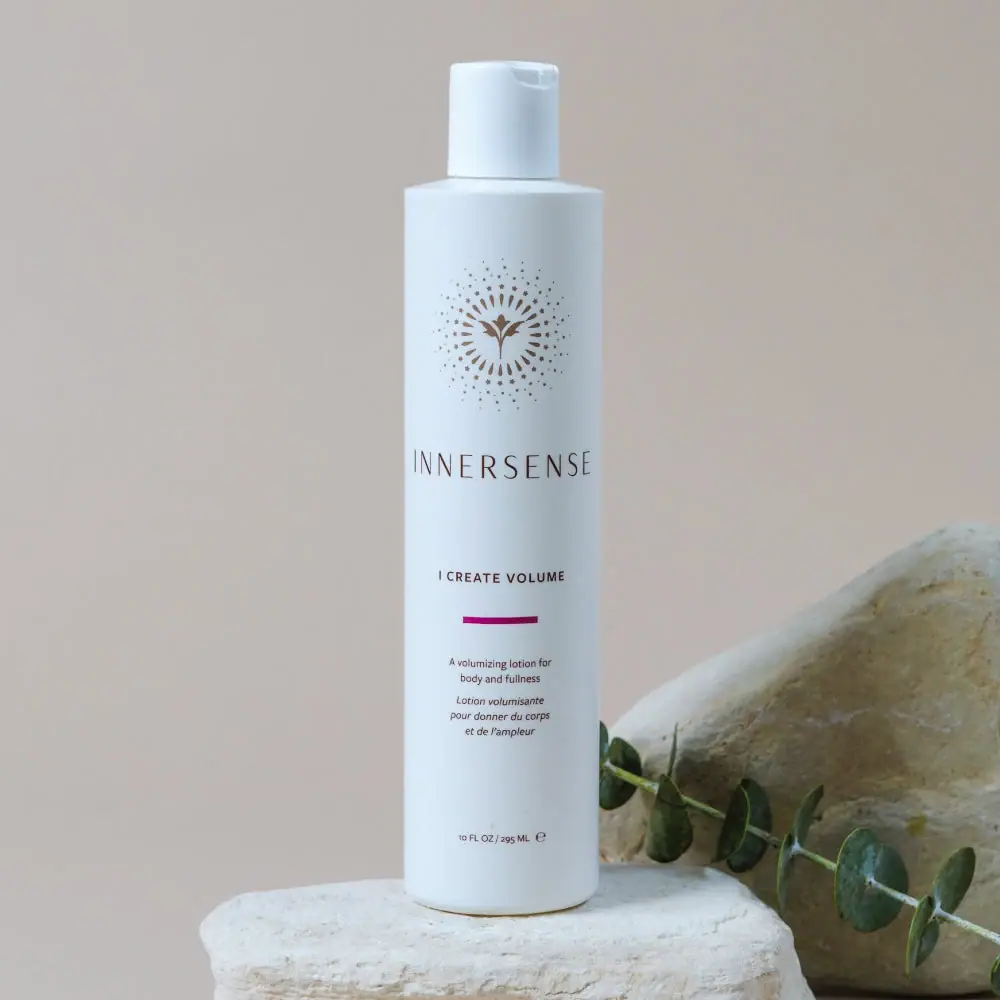
Innersense
Radiating bird emblem and magenta bar on a pale cylinder

Malin+Goetz
pharmacy label set in bracketed helvetica