Photography: House of Bō official photography. Images belong to their respective owners.
House of Bō
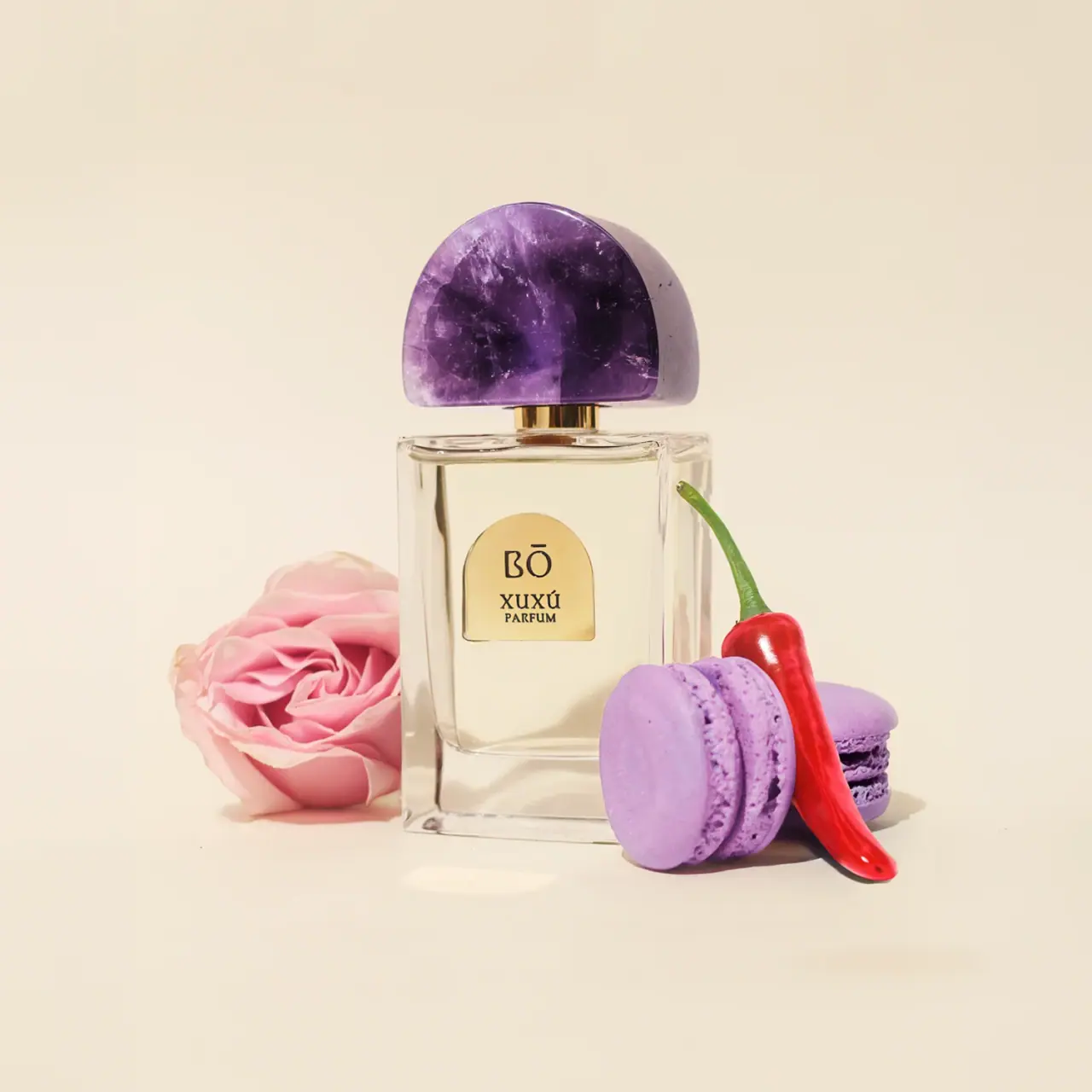
Amethyst arch above clear glass and a small gold plaque
Xuxú 75 mL pairs a clear rectangular glass decanter with a large purple amethyst cap shaped as a broad arch. A much smaller gold-looking arched plaque repeats that curve on the front, holding the BŌ maker, fragrance name and concentration in dark lettering. Most of the bottle remains visually open, so the cap's internal colour variation and the clear base carry more presence than the sparse text. The official source confirms the stone and glass, while plaque composition and closure mechanics remain unverified. Rose, purple macarons and chili pepper translate the scent narrative into the selected scene.
- Perfume
- Light pack
- Bold typographic
About this study
Selected Xuxú 75 mL official still life. Glass and amethyst are source-backed; plaque material, cap fit and smaller formats remain outside verified construction scope.
Sources & evidence · Reviewed 2026-10-19Color Palette
Approximate colours interpreted from photography. These are screen references, not official brand colours or print specifications.
Ink
Dark identity lettering
#221A11
Compact maker, fragrance name and concentration against the gold-looking field.
Accent
Amethyst violet
#683A83
Approximate central stone colour. Pale veins, dark inclusions and changes in translucency belong to this naturally variable component, not a single uniform coating specification.
Gold-looking plaque and neck
#D4AF5E
Approximate warm reflective accents on the small front plaque and short neck. Matching appearance does not establish identical materials.
Typography
Suggested visual alternatives, not confirmed brand typefaces. Any scale below is an illustrative estimate.
The small arched front plaque contains a vertically stacked identity. BŌ appears at the top, using distinctive letter shapes and a visible macron above the O. XUXÚ sits below in smaller capitals, with PARFUM immediately beneath. The acute accent on the fragrance name is preserved and contributes to the compact text silhouette. Because the surrounding bottle is largely clear, this modest block remains easy to locate without expanding across the whole front. The cap is the first visual landmark; typography supplies precise identification after that structural impression.
Fonts
Original refined maker alternative
Cormorant Garamond
- Looks like
- Light sculptural serif
- Type
- Display serif
- Weight
- Medium, SemiBold
- Case
- Uppercase with required language accents
- Tracking
- Optically spaced
- Fallback
- Georgia, serif
Develop an independent short maker that remains clear on a small reflective field. Do not trace the BŌ letterforms, and ensure accent marks are designed as part of the identity rather than added as decorative bars.
Fragrance-name alternative
Libre Baskerville
- Looks like
- Compact sturdy serif capitals
- Type
- Transitional serif
- Weight
- Regular, Bold
- Case
- Uppercase
- Tracking
- Normal to slightly open
- Fallback
- Georgia, serif
Use a robust small title and concentration line that survive reduced scale and reflected highlights. Maintain a clear gap between the two lines rather than making the concentration appear part of the name.
Structure & Proportions
Visual proportions and finish previews are illustrative. Confirmed construction details and uncertainties are distinguished in the study notes.
Proportions
| Purpose | Value | Preview |
|---|---|---|
| Cap prominence | The stone cap approaches the bottle's width while remaining distinctly shorter than the glass body, creating a broad sculptural top rather than a small conventional cylinder. | — |
| Small identity anchor | The plaque occupies a limited central portion of the front, leaving broad clear margins and visible liquid around it. | — |
| Lower visual weight | The clear-looking base forms a substantial band beneath the inner liquid area. This is an optical observation, not a measurement of glass thickness or weight. | — |
| Repeated curve at two scales | The broad upper arch and compact plaque arch share a family resemblance without being identical shapes or requiring the whole bottle to become rounded. | — |
Shapes
| Element | Value | Preview |
|---|---|---|
| Glass decanter | Tall rectangle with softened corners and a broad clear front. | |
| Stone cap | Broad domed arch with a near-flat lower edge and visible depth. | |
| Front plaque | Small gold-looking rectangle capped by a semicircular arch. | |
| Short neck | Narrow reflective cylindrical connector visible between stone and bottle. |
Finishes
Polished amethyst
Large upper cap; natural variation is part of the sourced material · gloss
Transparent glass
Main decanter and lower base · transparent
Gold-looking accent surfaces
Front plaque and neck; exact metal process unspecified · metallic
Formats and materials
| Formats | 75 mL parfum in a tall rectangular glass decanter, Broad flat-looking front with softly rounded corners, Large arched amethyst cap over a short gold-looking neck, Small arched front plaque and substantial-looking clear base |
| Materials | The official product page identifies a glass decanter and an amethyst stone cap., The brand describes hand sculpture and polishing of natural-stone caps, with slight colour, shape and tonal variation., The front plaque and neck appear gold-toned, but their substrates and surface treatment are not specified in the inspected source., Visible liquid and background transmission affect the bottle colour; no exact formula hue or glass tint is assigned. |
| Closures | The cap has a broad curved top, nearly straight lower edge and visible depth at the right side. A short gold-looking neck separates it from the bottle shoulder, creating a narrow visual gap. The cap is fitted, so the sprayer, attachment insert and retention mechanism remain hidden. No magnetic fit, thread system or refill access is established. The stone's visual mass is evident, but its actual weight, balance in the hand and mechanical tolerances cannot be derived from the photograph. |
| Decoration | Large cap arch repeated by a smaller front plaque arch, Minimal three-level maker, name and concentration stack, No continuous opaque label covering the glass, Natural stone pattern supplies detail instead of printed ornament |
Front Panel
Schematic reading order. The diagram’s zone heights do not represent measured artwork proportions.
The front uses a single small arched plaque as its entire readable identity zone. The arch echoes the cap and creates a recognisable boundary without an additional printed outline or full-width label. Dark maker lettering occupies the upper area; the fragrance name and PARFUM form a tighter pair below. The compact treatment lets the bottle's transparency and the stone remain visible. A fine edge around the plaque catches light, but the photograph does not determine whether it is a metal plate, coated component or another decorated substrate. No readable capacity is placed into an invented front position.
| Zone | Content |
|---|---|
| Plaque crown | BŌ maker with a visible macron over the O. |
| Plaque lower identity | XUXÚ in dark uppercase lettering, followed by smaller PARFUM. |
| Clear surrounding face | Broad visible glass and liquid area with no additional readable front text. |
| Upper sculptural feature | Purple stone cap rather than a second printed identity panel. |
Range System
The official page offers links to smaller formats alongside the selected 75 mL product. Those listings establish product options, not a claim that each uses the same stone dimensions or bottle construction. The most useful verified range principle is natural variation: the brand explicitly allows differences between stone caps. Consistency therefore comes from the general form and identity architecture rather than perfectly identical purple patterning. A library should not mistake a different vein or tone for a new fragrance variant unless the product identity also changes. No complete gemstone-to-fragrance mapping is inferred from Xuxú alone.
- The selected 75 mL presentation has a large arched purple cap and compact matching plaque geometry.
- Natural stone variation can change this component's appearance without changing the product name.
- Smaller linked formats require their own inspection before reusing this study's structural description.
Back of Pack & Shelf
The reverse, underside, carton and removed cap are not shown. The selected front is an identity view rather than a complete technical label.
- No barcode, batch coding, full ingredients or quantity placement is established from the photograph.
- The official 75 mL designation identifies the selected product listing, not a transcribed front mark.
- Hidden sprayer components, cap insert, disassembly and refill access remain unverified.
On shelf
The broad purple arch is the strongest likely recognition cue, followed by the small warm plaque against clear glass. That reading is an interpretation rather than tested shelf performance. The naturally varied stone gives each cap visual detail at close range, while the restrained front keeps the bottle from competing with it. The small lettering would need real-size testing under reflective retail light. Clear glass can also lose its outline against pale backgrounds, so the cap alone should not be treated as a substitute for readable product identification in every display condition.
Imagery
The official still life places a pink rose to the left and purple macarons with a red chili pepper to the right of the clear bottle. Those objects correspond to notes in the brand's scent narrative; they do not establish that literal food pieces are present in the formula. The purple pastries echo the amethyst colour while the red pepper provides a sharper accent. A pale warm background keeps the glass outline and gold-looking plaque readable. The props overlap the lower body slightly but leave the maker and cap unobstructed. Their colour is excluded from the pack palette.
Guidelines
Editorial principles for an original design brief, not official brand guidelines.
Do
- Connect a distinctive closure to a smaller repeated shape.
- Treat natural stone pattern as variable material evidence.
- Keep exact maker accents and product spelling accurate.
- Distinguish sourced glass and amethyst from unverified plaque material.
- Test small lettering on reflective surfaces at actual size.
Don't
- Do not infer magnetic fit or refillability from a fitted cap.
- Do not describe gold-looking parts as solid gold.
- Do not copy the stone's pattern as a uniform production specification.
- Do not assign packaging design authorship to the perfumer.
- Do not repeat gemstone healing claims as material facts.
Sources & evidence
How this study was built
structure · Sourced fact
Exact page identifies 75 mL parfum, glass decanter and amethyst cap.Xuxú 75 mL Parfum — House of Bōstructure · Sourced fact
Brand describes natural-stone hand sculpture and polishing with variation between caps.Xuxú 75 mL Parfum — House of Bōlabel · Visual observation
A small gold-looking arch repeats the broad cap curve and contains BŌ, XUXÚ and PARFUM.Xuxú 75 mL Parfum — House of Bōtypography · Visual observation
Maker is larger than the fragrance name and concentration; diacritics remain visible within the compact stack.Xuxú 75 mL Parfum — House of Bōimagery · Sourced fact
Rose, blackberry-macaron and chili-pepper narrative explains the selected props without establishing literal formula ingredients.Xuxú 75 mL Parfum — House of Bōrange · Editorial interpretation
Natural pattern differences should not automatically be catalogued as separate packaging variants.Xuxú 75 mL Parfum — House of Bō
What remains unverified
- Plaque substrate, neck metal and decoration process are unspecified.
- Cap is not removed; attachment and refill access are unknown.
- No production colour, actual component weight or exact font attribution.
- Smaller linked formats and packaging-design authorship are not independently inspected.
Give your AI
packaging taste
Give your design or image tool a packaging study: palette, type, structure, front panel and principles for an original brief.
Export this styleFree with an email. PACK.md works in Claude, ChatGPT, Cursor and image tools.
More like this

Akro
soft pink interrupted by an assertive black signature
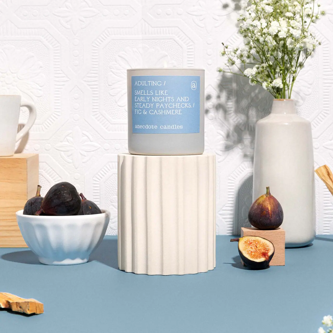
Anecdote Candles
A pale-blue label tells its story through punctuation
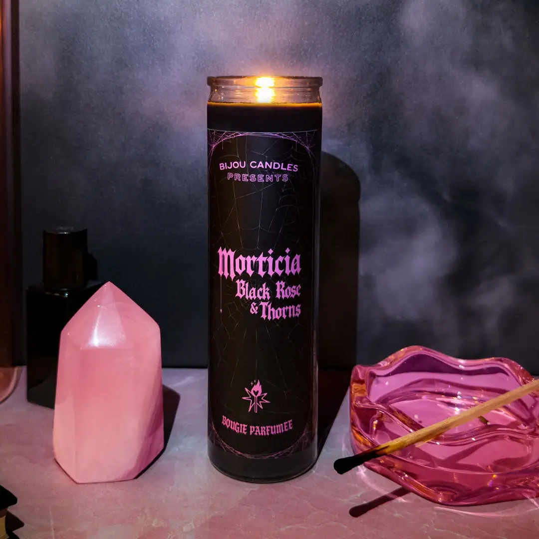
Bijou Candles
Pink blackletter and fine webs on a tall dark candle
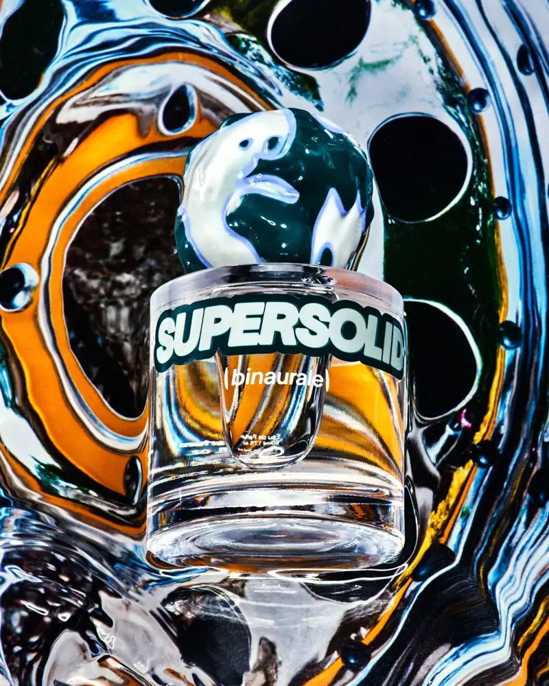
Binaurale
Globular teal cap above slanted pale fragrance lettering
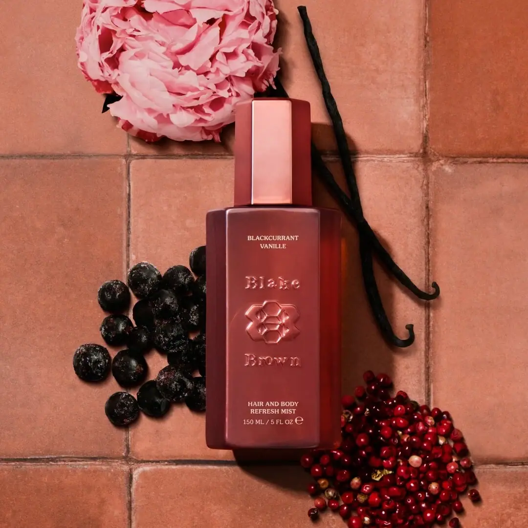
Blake Brown
sculptural rose-brown fragrance with a jewel-like centre

Boy Smells
candy-shell flacons over blush pink glass

D.S. & Durga
deadpan grotesk names on parchment labels
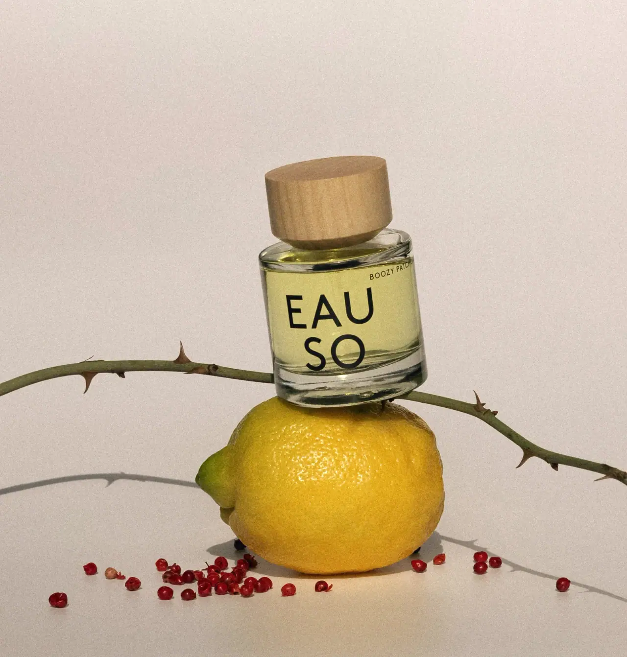
EAUSO VERT
Oversized stacked lettering on a clear round perfume bottle